How To Design A Clear, Concise Presentation — Without Bullet Points
When it comes to presentation design, we want engaging, we want interesting, we want memorable. So why are we still using bullet points?
Well, you might say: what else are we supposed to use?
The truth is, everyone is so familiar with bullet points in documents, in web articles, emails, etc., that it’s hard to think of another way to structure our content. And bullet points are great for long form writing. But for presentation design? The jury’s still out…
In many instances, using bullet points encourages us to write more. And if you include too much text on your presentation slides, you’ll be doing your overall message more harm than good.
So what should we use instead of bullet points? What other options are out there to engage our audiences?
Let’s find out.
- A presentation is not a document
- Content before design
- Split: Use a slide for each bullet point
- Iconify: Replace bullet points with icons
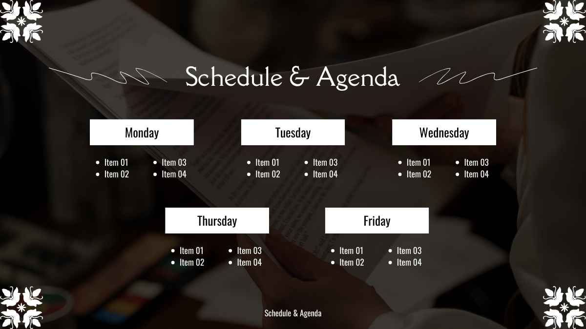
- Chunking: Split text into columns
- Lastly: remember the white space!
- Try designing your next presentation bullet point free!
A presentation is not a document
Unlike a document, your presentation is not necessarily about depth. You aren’t putting a thesis onto your slides — or at least, you shouldn’t be! Instead your presentation slides are about solidifying the main message, complementing the words you’re speaking, and giving your audience a visual pathway to follow.
It’s this combination of visual and auditory content that encourages your audience to retain information. So when you choose to write lengthy bullet points, you’re actually distracting your audience by giving them too much to read.
And then they stop listening!
Leading corporate presentations coach Jerry Weissman has diagnosed our reliance on bullet points in presentation design as part of a larger mis-use of presentation decks as a whole. Where really a presentation should be a visual tool, too often PPTs and Keynotes are treated as handouts — needing to capture all the information, not just the key points.
Jerry calls this Presentation-as-Document Syndrome. And we all suffer from it. So don’t worry if you’ve fallen victim before! While there might not be a quick cure, we can combat PDS by making everything on our slides more skimmable. In other words: ditch the bullet points.
Okay, we hear you. Not every presentation is a slideshow either. They can’t all have zero text and be one outstanding visual after another.
So how do we find the right balance?
Content before design
We’re going to share three design structures that you can use as better alternatives to bullet points. But before you get into selecting your alternative, you need to make sure you’ve nailed your content.
How many words do you have? What is the purpose of each sentence? Really analyze and evaluate what you’ve included. Any text on your slides should add value to the presentation — if not, cut it! For these design structures to work, your text needs to be clear and concise.
Okay, now onto the good stuff! Next time you’re tempted to hit your audience with a list of bullet points, try one of these strategies instead…
1. Split: Use a slide for each bullet point

Presenters often try to cram lots of ideas onto a single slide, assuming that this is the most efficient approach. But this isn’t necessary in a digital world.
Cramming might be logical if, for whatever reason, you have a slide limit. But in the majority of cases, there is no upper limit to how many slides you can have. And it’s not as simple as fewer slides equals shorter presentation time, either.
In fact, changing slides more frequently keeps your audience engaged. It helps you avoid situations where they have to stare at the same few points for 15 minutes, and reduces the risk of you going off on a tangent due to nerves or over-excitement.
So how do you do it? Simply write up your presentation content on paper first. Then give each planned bullet point its own presentation slide.
This way, you’ll have more freedom to include relevant visuals for each and, most importantly, it will be more captivating for the audience. Combining your text with visuals, be it graphs or images, allows you to land your message visually and audibly, at the same time.
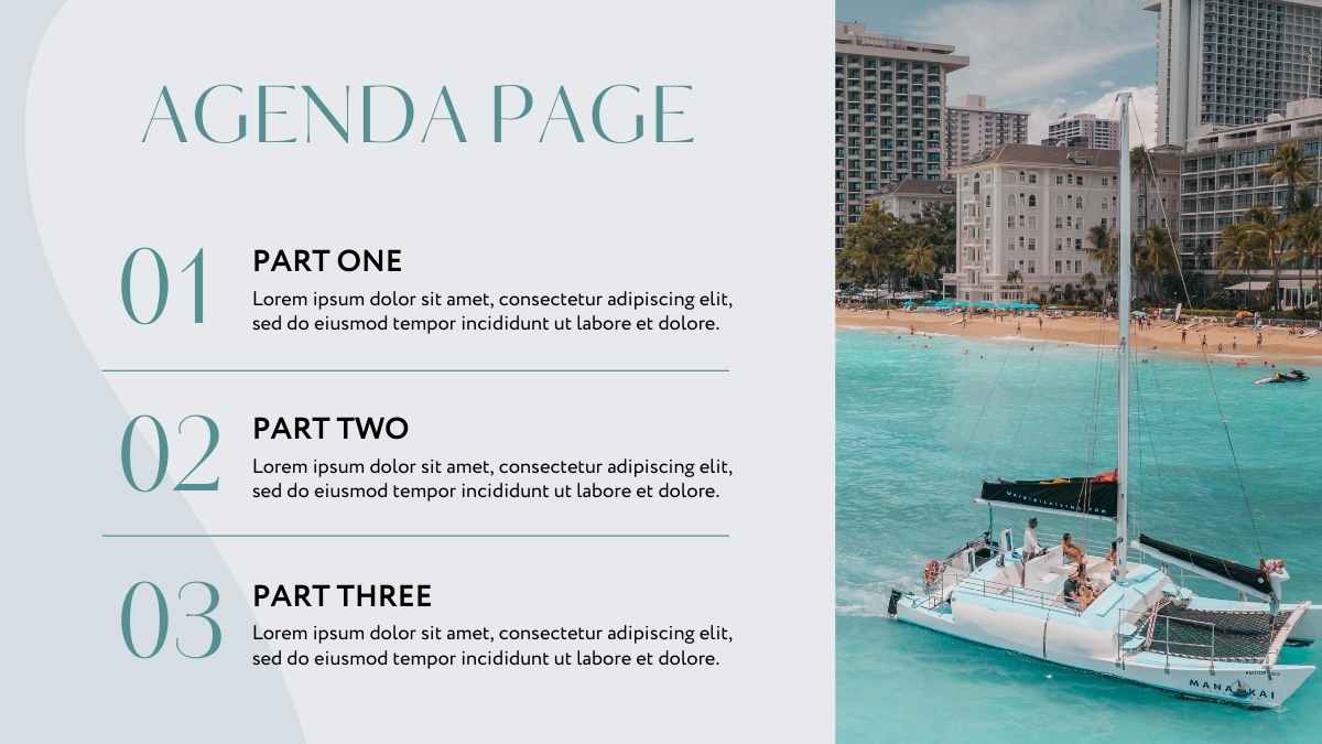
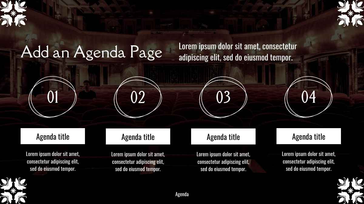
If you want your audience to have an idea of the broader context or how each slide links together, include an introductory slide where you outline the relevant points to be discussed, before diving into each of them individually.
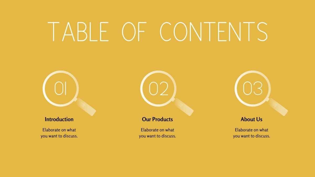
2. Iconify: Replace bullet points with icons
If that seems a bit too much of a departure from the norm, then this second option may be for you.
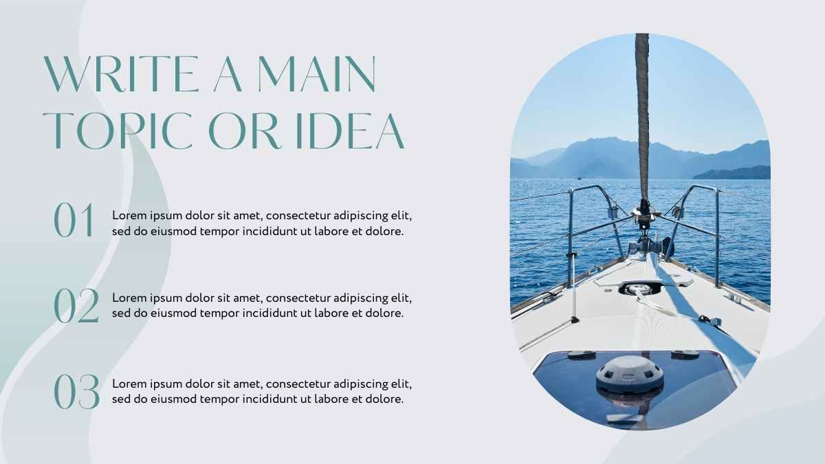
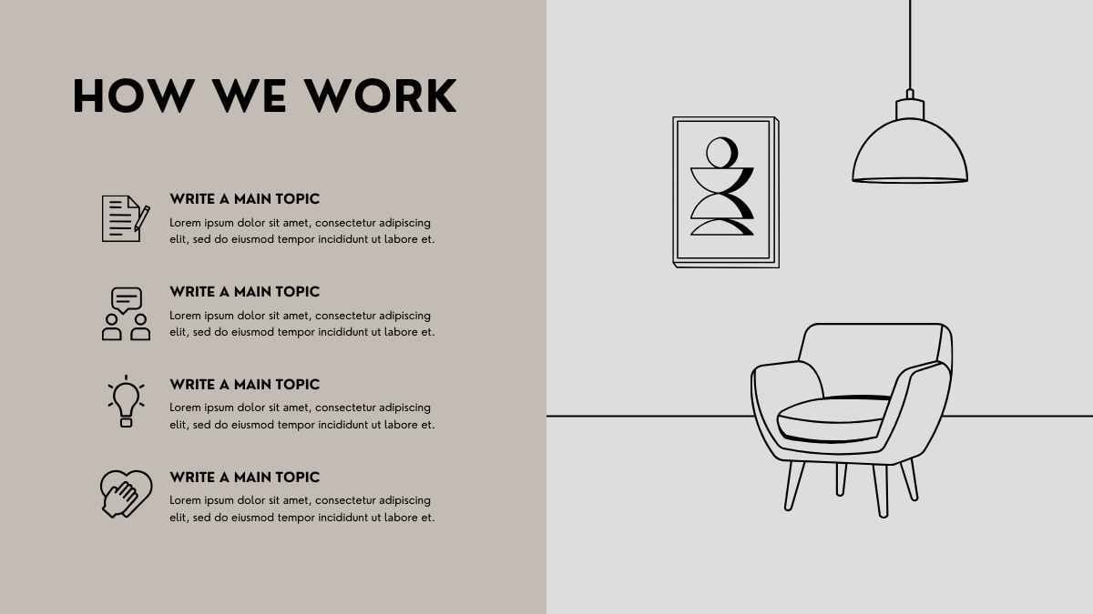
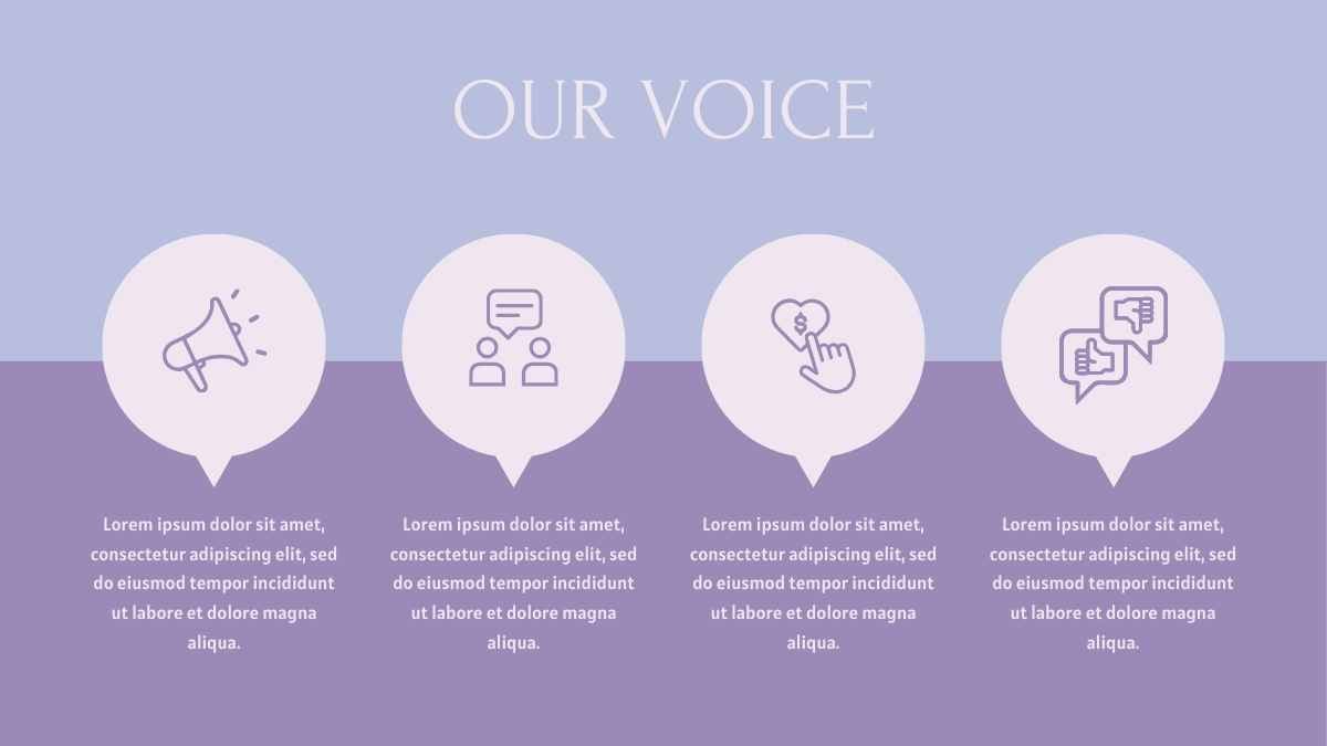
Here we lean on the bullet point structure we’re all familiar with, but instead of a bullet point in front of the text, we use an icon.
Icons have better visual appeal and — like other graphic elements, such as images, colors, and graphs — they make each point you’re communicating stand out.
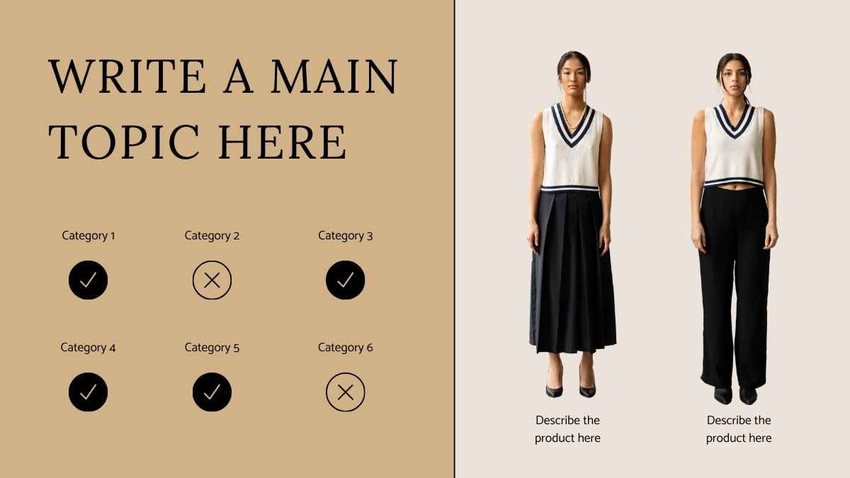
Just be sure to use an icon that makes sense. If you’re talking about good versus bad points, you can go with check marks vs. crosses, thumbs up vs. thumbs down, or smiley face vs. frowny face.
Get creative with your icons! You can use a different icon for each point. It takes only a split second to understand what an icon is signifying, and that meaning then influences the reader’s understanding of the text — meaning you can have less of it!
Worried that you won’t find the icons you need? You’ll find a surprising amount of icons in PowerPoint, Keynote or Google Slides. And you can always search online for more.
With the range of icons, emojis, and clip art out there, you only need to exercise your imagination and think metaphorically to see that virtually any message can be reinforced by the right icon.
Say, for example, you’re talking about financials. Use a currency icon, coin icon, or cash icon. If your point is about security, you can use a shield icon or a lock icon. Icons add visual appeal and make an otherwise text-heavy slide feel clear.
Icons and text, when combined, reinforce each other, which increases retention of the message you want to communicate. You’ll often find when you speak to your audience that well-used and semiotic icons will help them remember the point much better than speech alone ever could.
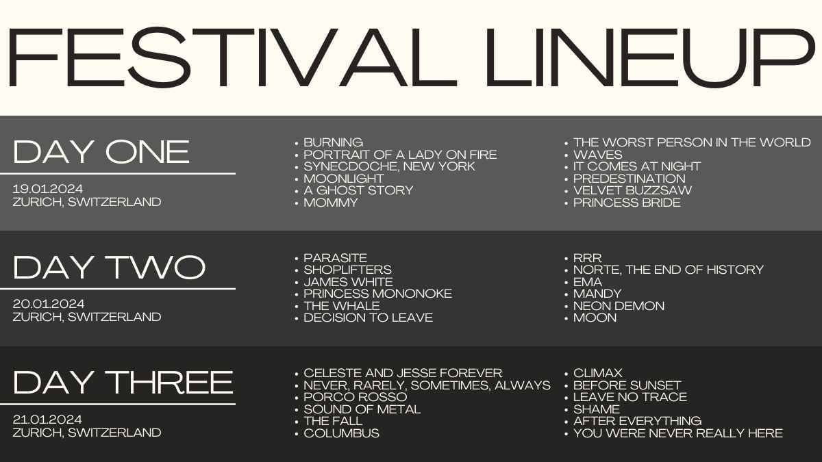
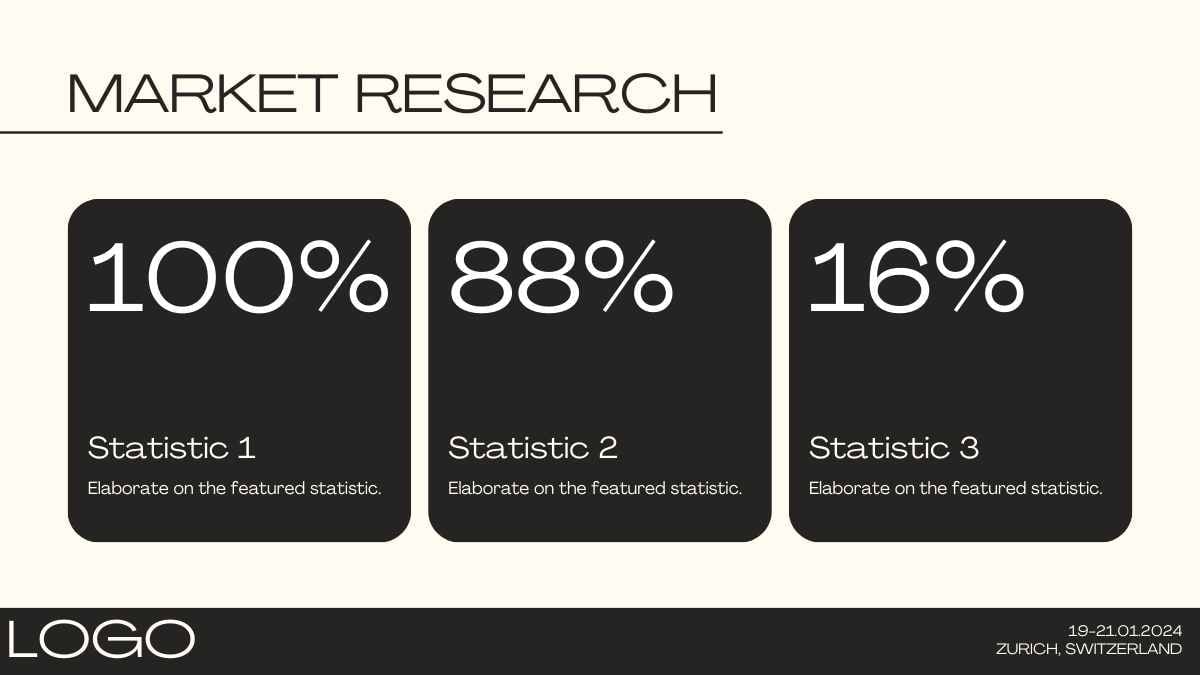
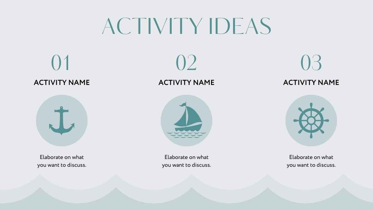
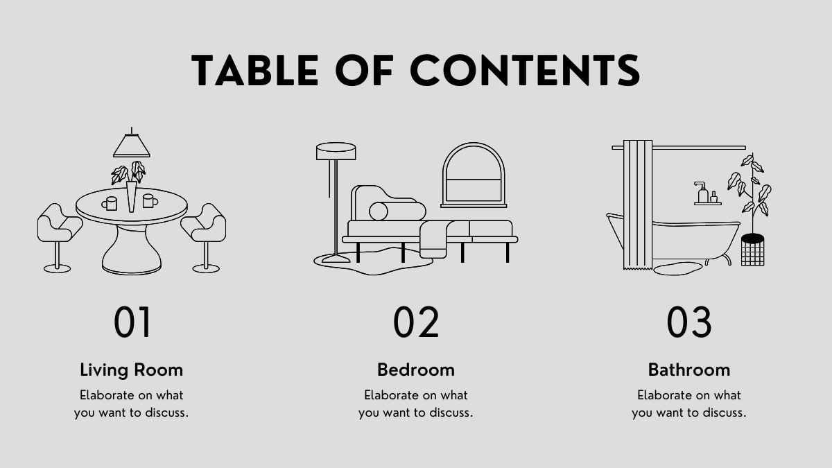
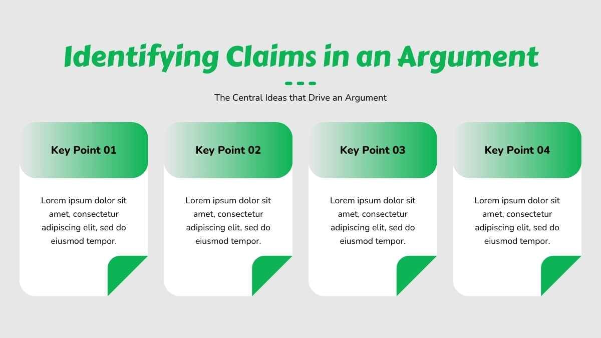
3. Chunking: Split text into columns
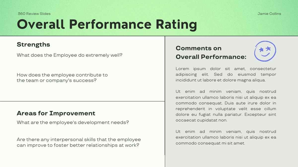
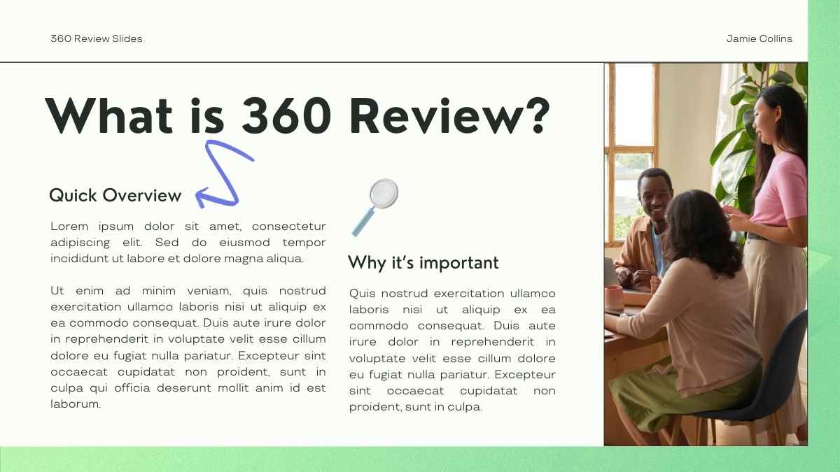
Our third option asks you to think about the context in which you’ll be presenting.
You’ll likely have your slides projected onto a large-format screen or video wall, so you should think about making it easier for your audience to read the text.
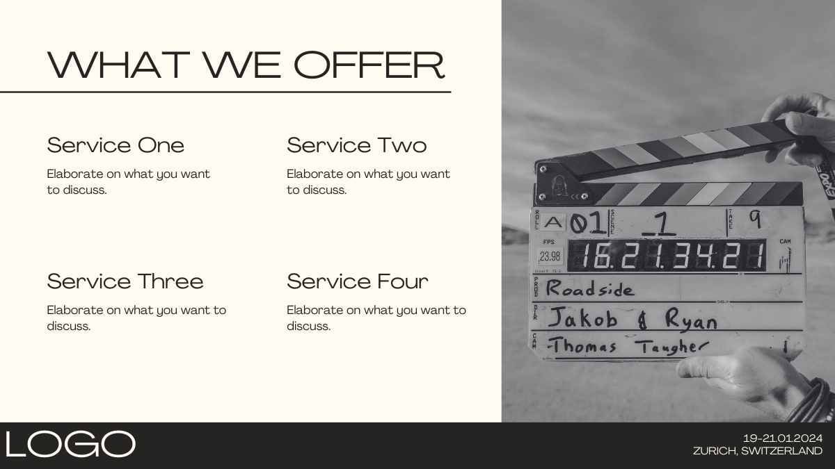
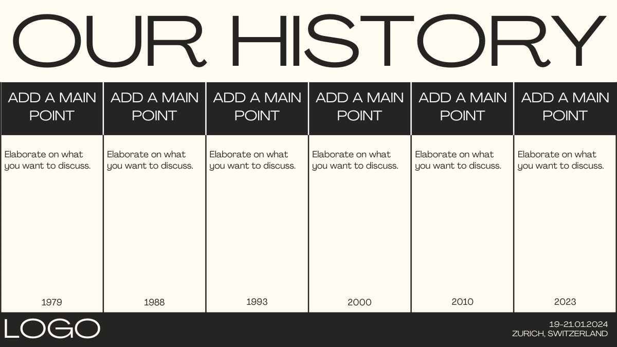
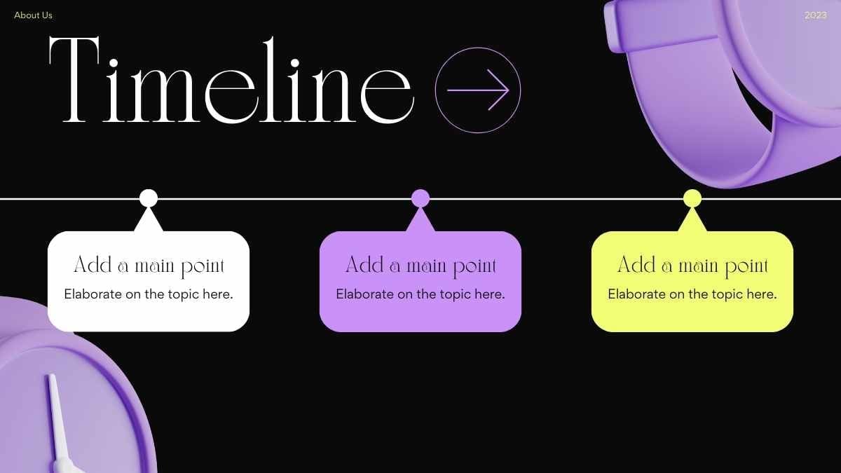
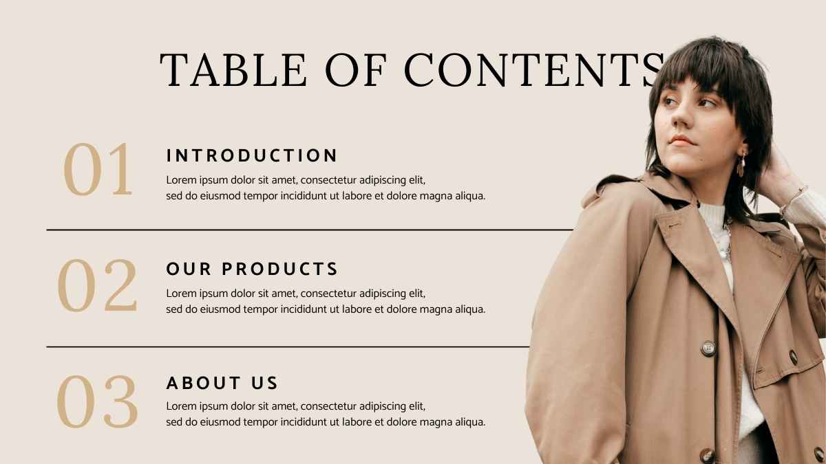
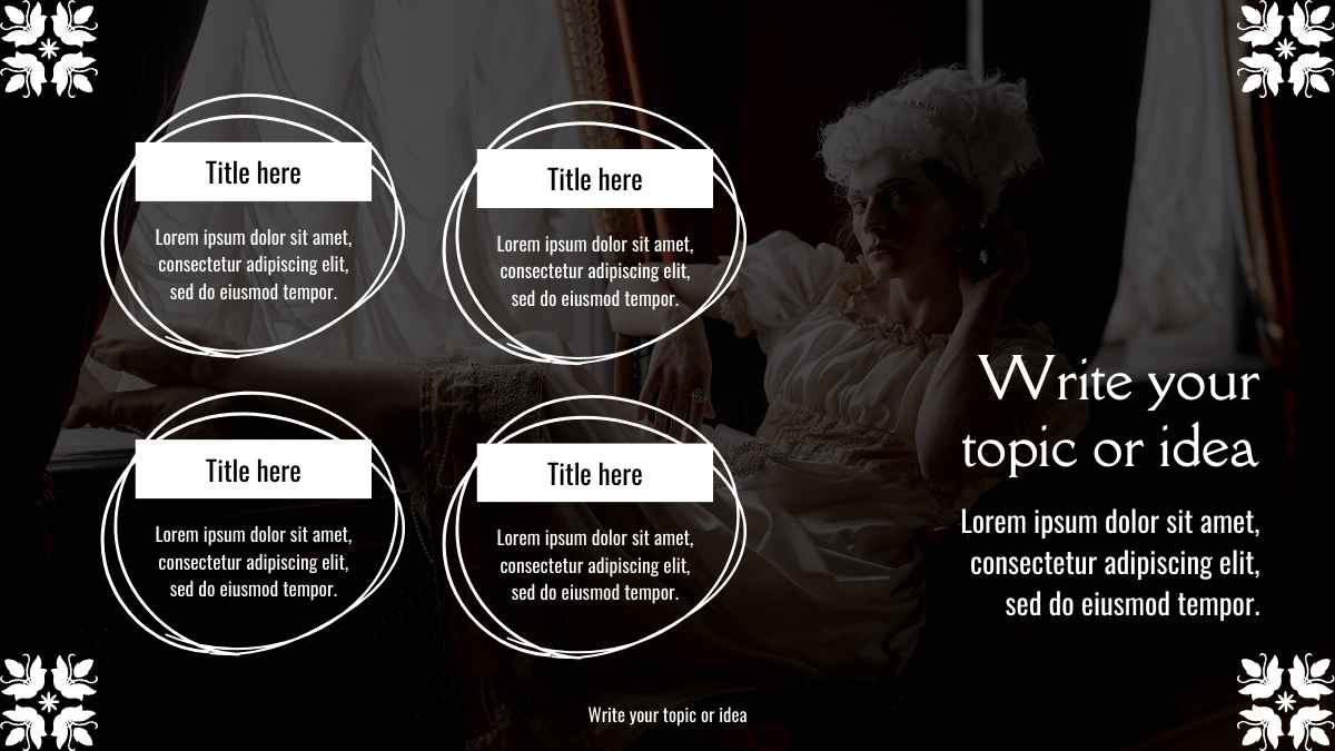
Instead of using the whole width of the screen, you can put different points into their own columns.
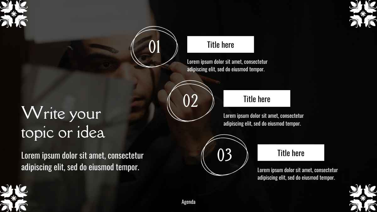
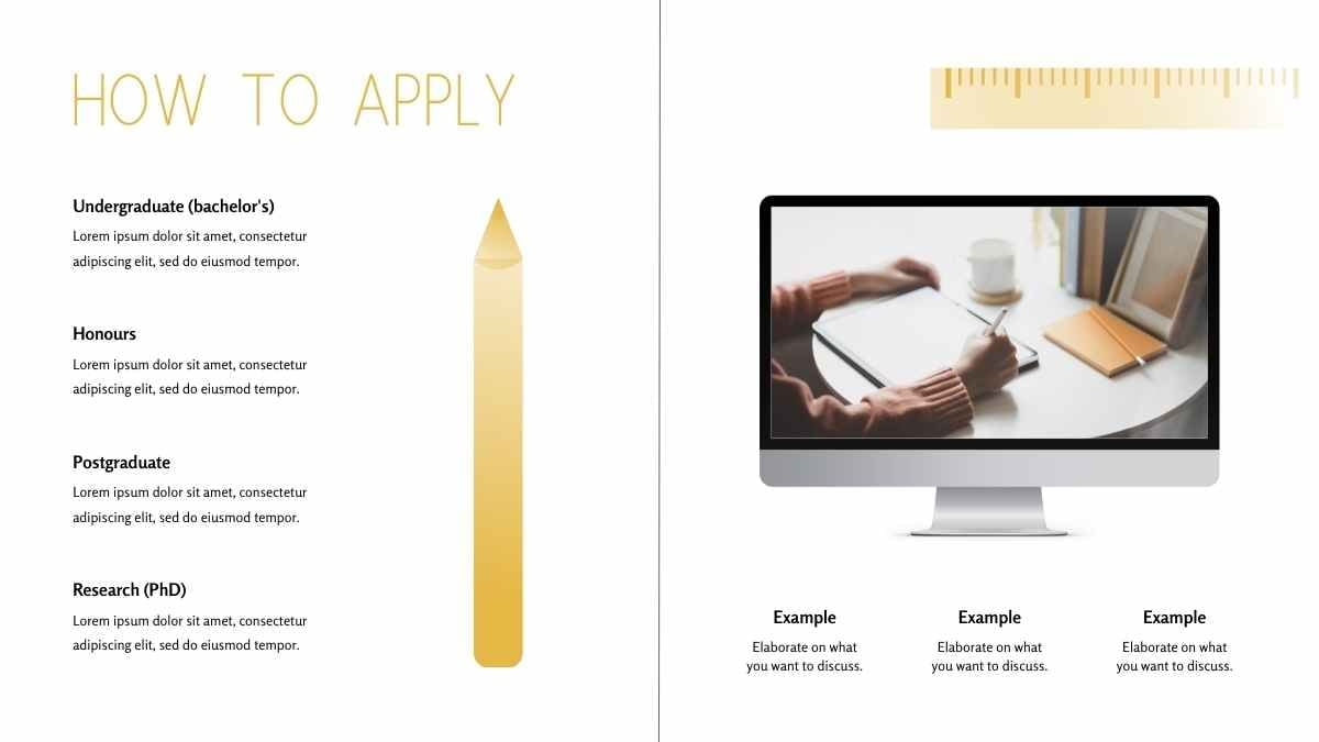
The column view is more pleasant to the eye than text that runs the full width of the chart. And — as a handy bonus — eliminates the need to use bullet points! Up the game by using shapes in the background of each column to highlight the start of the section, or add headlines, icons, and numbers to each column if it makes for your narrative.
Lastly: remember the white space!
When playing around with columns, icons, and graphics, be mindful of the white (i.e. empty) space on each slide. This is actually a very powerful design element.
White space keeps the focus on the slide’s content. It helps viewers home in on the must-see elements and avoids over-cluttering your layout.
No matter which of these three techniques you choose for your presentation, remember to keep plenty of white space.
Try designing your next presentation bullet point free!
Moving away from bullet points in your presentations might feel like setting off into the great unknown, or might even make you feel a little insecure. But it’s a journey you need to take.
Ultimately, what your audience sees on the screen influences how much they remember (or don’t remember) about your presentation, as well as how they feel about it.
Keep in mind that you’re the one doing the telling, the presentation is just a powerful visual aid to help you get your point across.
Try using these techniques in your next presentation and find which bullet point free layout you like best!
Looking for more presentation design ideas?
At SlidesCarnival, we have a collection of free presentation templates that you can download, edit, and customize. Find great design ideas and give them a try now!


