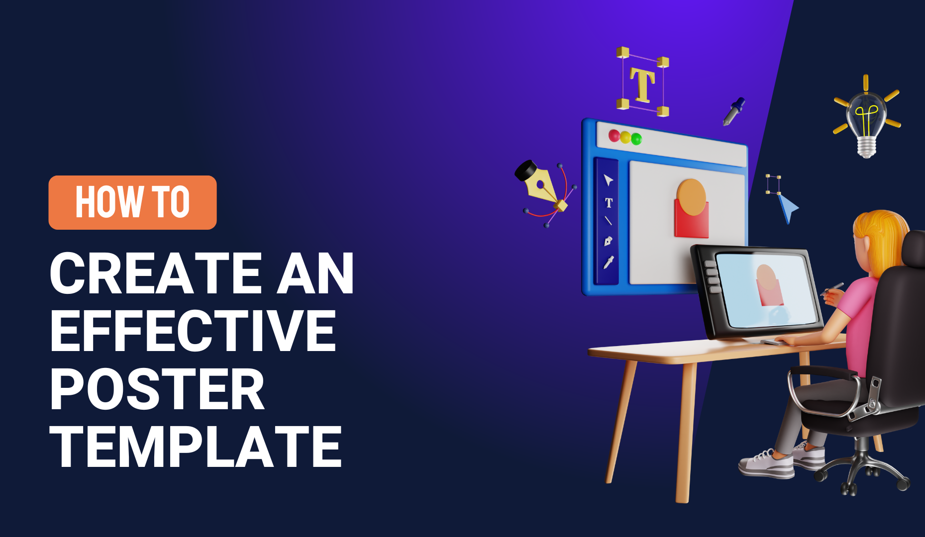
How to create an effective poster presentation (plus 3 free templates)
Posters are often used within the academic community to share knowledge on a particular area of research.
The very best academic poster presentations summarize information concisely and attractively. They successfully publicize research findings and generate discussion using a mixture of text, tables, graphs and images.
Dishearteningly, perhaps, the visual appeal of an academic poster might actually be more influential than its content. In one particular study, 94% of delegates agreed that poster imagery (rather than content) is most likely to draw a viewer’s attention.
This raises the question of how many enlightening research results fail to make an impact on the scientific community simply because they weren’t presented in a visually appealing way.
Don’t let your valuable research fall by the wayside because of bad academic poster design! Follow these tips to ensure an engaging poster and those all-important opportunities to share your knowledge.
Get creative with your title design
There’s no getting away from it. Manuscript titles are often pretty dull. They usually describe the basic findings of a research paper and aren’t designed with audience engagement in mind.
With your poster title design, however, you can afford to be a little more creative. The right title design will help to catch a viewer’s attention and draw them in, giving you the chance to explain your research in more detail.
To make your title design stand out from the crowd, use a bold font over a brightly colored background. You could also make use of geometric shapes and other graphic elements to attract the eye.
Creating this kind of contrast in your poster title will attract attention. But it will also improve the legibility of your title, even for readers on the other side of a room.
Choose your fonts wisely
Squeezing your research summary onto a single poster page can be a challenge. Choosing the right font will help you to make the most of the space you have available.
A condensed font allows you to fit more text onto your poster. Sans serif condensed fonts are considered the easiest to read, even at small font sizes.
This leads us to the next important factor to consider when choosing a font style — legibility.
Some fonts are decorative and distinctive. Whilst these fonts are sure to catch the eye, they aren’t usually all that legible. Elaborate fonts often make text difficult to read and off-putting for a reader.
A less note-worthy font is your safest bet. Readers can focus fully on your content rather than the complexities of your font choice.
Use clear visual grammar
What do we mean by visual grammar? Visual grammar is a kind of graphic hierarchy — the visual clues we use to guide a reader through a poster (or any other kind of presentation).
When visual grammar is clear, a reader will understand the order in which to read the poster. And they’ll instantly know which information is the most important.
To achieve clear visual grammar, include the following elements in your poster design:
Consistent titles and subtitles
Use the same formatting for all titles and subtitles. They should be consistent in font, size, color and weight.
Columns
Use columns to organize the content of your poster. You can usually fit two columns onto a portrait poster and three to four columns on a landscape layout.
Columns make it easier for a reader to navigate the poster and read your content in the right order.
White space
White space refers to the parts of your poster that don’t include any text or images.
This white (or empty) space can be used to separate different sections of content, again making it easier for readers to follow your thread.
A good visual balance of text, charts, images and white space will prevent a reader from feeling overwhelmed by the information you include on your poster.
Remember that simple, clean graphics communicate data relationships quickly
If you want your poster to really pack a punch, you need statistics, numbers and quantitative evidence to illustrate your points. That’s where beautifully designed charts, graphs and infographics can be used to great effect.
So how can you ensure your data makes the greatest impact possible?
Don’t try to fit too much data onto the page. Include every scrap of data you’ve gathered and you’ll end up overwhelming your readers. Remember that you’ll be there to elaborate once your poster has attracted audience attention.
Highlight the key insights. You can do this by customizing your charts and graphs. Use color, a simple layout and employ good data storytelling. All of this will make your data more legible and focus audience attention on what matters most.
Use color as emphasis — but don’t overdo it
Color always attracts attention and no poster is complete without it.
However, it’s important to achieve a balance between visual impact and legibility. We never want design (in this case, a liberal use of color) to eclipse and confuse your message. When deciding on how to use color in your poster design, consider the following points…
Aim to create contrast
We recommend choosing a light color background and a dark color font for your poster. This creates a good level of contrast.
Light text on a dark background also creates contrast, but this combination tends to be more difficult to read.
Stick to a color scheme
If you’d like to use a few different colors in your poster, stick to a color scheme that includes two or three shades. Then use them in a consistent pattern.
For example, dark green for headings, light green for subheadings and yellow for section borders.
This contributes to the visual grammar of your poster, helping readers make sense of the information you’re presenting.
Think about accessibility
One word of warning. If you’re using colors as part of your visual grammar, take a moment to consider readers who might be color blind.
The most common form of color blindness involves the confusion of greens, reds and yellows so try to avoid using all of these colors in your poster color scheme.
Keep content simple
A poster should never be simply an enlarged copy of your manuscript!
The most successful posters are graphically rich presentations of research. They highlight and summarize main research points, with the poster presenter filling in the details.
So — as hard as it may be to distill your research down to just a few paragraphs — try to keep text to a minimum. You should also use graphic tricks to highlight keywords within a sentence or paragraph.
Bold fonts, different colors and background highlights can all help to make certain key phrases stand out from the rest of your text. This will catch the viewer’s attention and make it easier for them to scan your copy.
Use a template and simplify the process of poster creation
Good design can’t fix bad content. But bad design can really ruin your academic poster, no matter how brilliant your research.
Luckily, you don’t need to moonlight as a graphic designer in order to create a poster that attracts and interests your audience.
Here at SlidesCarnival, we’ve created three exclusive academic poster templates. They’re free to use and completely customizable. Just drop in your content and your data. Then tweak the design as much or as little as you like.
From perfect color schemes to beautiful charts and graphs, present your research in a comprehensive and visually appealing way with one of the templates below.


