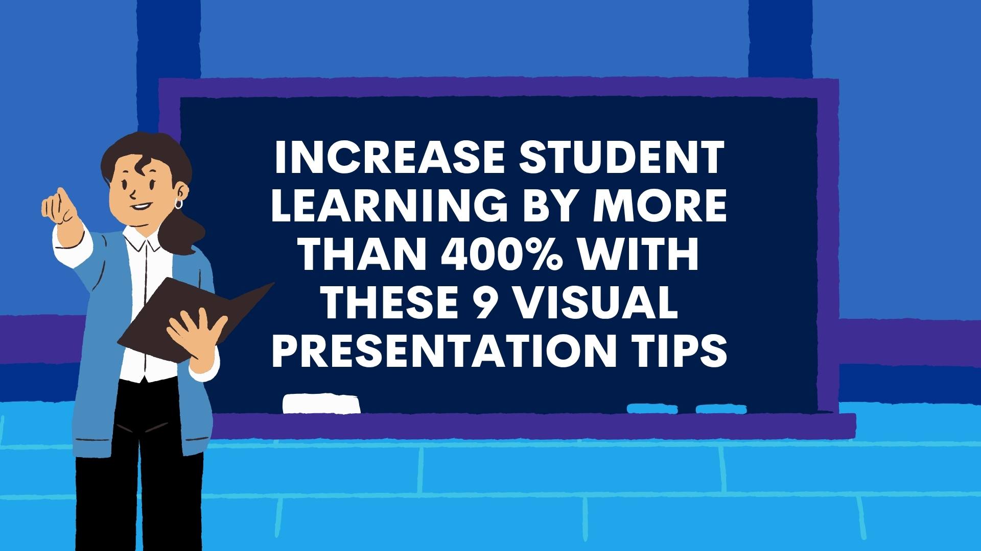
Increase student learning by more than 400% with these 9 visual presentation tips
Few teachers truly understand the power visual design plays in the learning process.
Those who do, though, tend to have more engaged students and see better academic performance across the class. Why?
For one, well over half of the world’s population are visual learners, meaning they take in information faster and more effectively via graphs, charts and images.
What’s more, quality visual presentations can enhance understanding by more than 400%, and actually help students absorb the material better than a strictly verbal lecture.
In one particular study, people could remember the content of 2500 pictures with over 90 percent accuracy 3 days later — and that’s after looking at them for only 10 seconds! Perhaps even more interesting, a year later participants in the same study could recall those images with 63% accuracy.
Without a visual aid, students only remembered 10% of a lecture 3 days later!
When studying these facts, it’s clear that accompanying your teaching with some sort of visual support is a great way to help students absorb content more easily.
But how, exactly, should you use visuals? What type of visual presentation is right for your audience? What colors, format, and layouts should you use in your presentation?
This article outlines 9 best practices for creating attractive, attention-grabbing presentations that will get your students invested in learning, and eager to get involved.
Let’s begin!
- Tip #1: Ensure that your presentation reflects your core message
- Tip #2: Always consider the age of your audience in both presentation design and length
- Tip #3: Both content and design should be simple and complementary
- Tip #4: Don’t be afraid to switch it up!
- Tip #5: Choose your colors wisely
- Tip #6: Use graphics to simplify your message
- Tip #7: Always make it interactive!
- Tip #8: Make sure your presentation reflects your environment
- Tip #9: Don’t be afraid of feedback!
- Recap. It’s time to get visual!
Tip #1: Ensure that your presentation reflects your core message
When first designing your presentation, start by thinking about your core message or subject. Is it historical? Artistic? Natural? Elements such as color, shapes, images or illustrations can go a long way in enhancing your material, piquing the interest of your students and providing better understanding.
For example, a PowerPoint template like the one below creates a very historic or geographical tone, and would be a great choice for a project about famous explorers or cartographers:

While something like this one below is a better choice for a more scientific presentation — think Albert Einstein, NASA or Marie Curie, perhaps?
Don’t worry, there are a huge range of templates available for all fields of study. So applying a themed presentation that’s in-line with your core message can be an impactful and easy way to present your information visually — way more so than just using plain slides with colors and text.
Tip #2: Always consider the age of your audience in both presentation design and length
Of course, the design theme matters — but don’t forget to think about the age of your students, either.
For example, if you opt for a design that has a more elementary feel, high school students might find your presentation to be too basic, and may lose interest more quickly. And if you choose a design that’s too advanced or too serious, younger children may become disinterested, confused or distracted.
Striking the right balance is key!

Age also comes into play when considering the length of your presentation.
According to NASA, presentations to grades K-2 should be around 20 minutes maximum, while 3rd-5th graders can hang on for about 30-45 minutes.
Presentations can be longer for grades 6th and above, but for all of the aforementioned, it’s good practice to take a 10-20 minute break after the first 20 minutes of the presentation to answer questions or to get the students moving — which we’ll discuss in tip #7!
You can also follow Guy Kawasaki’s universal 10-20-30 rule, and apply it to presentations for students of any age:
- There should be a maximum of 10 slides
- The presentation should last no longer than 20 minutes (this is about the time eyes begin to glaze over! Be sure to leave time for questions and discussion). Try to stick to the information you planned to share, and avoid rambling!
- Font size should be a minimum of 30pt (your students will read faster than you talk, so less information on the slides means that there is less chance of the audience being distracted).
Tip #3: Both content and design should be simple and complementary
In presentations used for teaching purposes, the visuals or design of your presentation should only be used to enhance your content, it shouldn’t overpower it.
When choosing a template for your presentation, then, it’s important to choose one that allows your information to be the star, whilst also keeping everything neatly organized and easy to understand.
It’s a delicate balance, for sure:
- If a template doesn’t leave you enough room for the information you need to present, or you feel it overwhelms that information, try toning down the design a bit
- On the other hand, presenting too much information on one slide can be overwhelming to your audience and cause them to lose interest in the visual
- Try to avoid over-saturating your slides with text. If you have a lot of information to include on a slide, try breaking it down into bullet points or shorter sentences.

If you aren’t experienced in designing slide presentations, you can study slide makeovers to get a better feel of the perfect balance of word and visual. Here are a few hard and fast rules, though, to get you started:
- Stick to one image per slide
- If you’re including a quote, put it on its own slide
- Take the rule of thirds into consideration
- Try not to use generic stock photos on all your slides, you’ll want to vary your design (which we’ll talk about in the tip below!).
Tip #4: Don’t be afraid to switch it up!
Not all slides in your presentation should be completely uniform. While the theme and color scheme should stay consistent, it’s important to use a variety of slide layouts to maintain your student’s interest.
For example, don’t have your entire presentation be 20 slides with images on the left and text bullets on the right. Incorporate slides that have graphs, charts, quotes, or even just large text or images on them will do the trick.
If you’re using Powerpoint or Google Slides, switching things up is super easy as they rather conveniently offer a few different slide layouts within the same template.

As you’re looking over your content, take a moment for each point to think about which layout will help to convey your information in the best way possible. Does one of your points have a lot of data? Consider a pie chart. Does one of your slides contain reference to a famous individual? Include a photo!
Slide after slide of the same layout quickly becomes repetitive, so shake things up and always keep your audience on their toes.
Tip #5: Choose your colors wisely
Color plays a bigger role in your presentation than just ‘decoration’. In fact, color has a huge impact on the emotional response your presentation provokes.
Studies show that the color palette you use will have the same semiotic meaning to most people — even students! Therefore, it’s important to consider the general feeling or vibe you want your presentation to give off before choosing a color scheme.
You’ll also want to consider the psychology of your color choices, too, as well as how best to pair certain tones.
An attractive color combination keeps eyes interested. When you compliment your lectures with well-chosen color, your students’ minds will be less likely to wander — and that’s the key to being a great teacher.
Color can also be used as a tool to visualize information, and can be particularly helpful in:
- Creating contrast: If you need a particular point to really stand out, consider choosing a bold color for it that grabs attention
- Grouping elements: If you need to make a correlation or relationship between two points super obvious in your presentation, color can help you visually pair them
- Encoding quantity: Color encoding, also called color mapping, is a method that represents numbers or text as colors. Color encoding schemes are useful to help perceive the absolute or relative size of numbers.

Tip #6: Use graphics to simplify your message
Thanks to the internet, it’s never been easier to find the perfect image for our classroom presentations.
Graphics are a great way to capture and keep the attention of your students, and also help to explain ideas in a more interesting and engaging way. So, once you’ve outlined the key points of your presentation, always go back through it and pick out any opportunities where you might be able to present information visually.

No matter what the subject, there will always be a funny GIF or eye-catching photo that can help to teach your class in a funny or entertaining way. Icons, clipart, and videos are also great tools to help you simplify complex information. Again, you’ll want to follow some best practices.
There are several great free sites where you can search and download royalty free stock images and illustrations. My favorites that I use regularly in SlidesCarnival are Unsplash and Undraw.
These sites have varying rules when it comes to listing credit to the photographer or illustrator, so be sure to look those over before using any image in your presentations.
Tip #7: Always make it interactive!
One of the best things you can do to ensure your students don’t lose interest in your material is to get them involved!
Making your presentation interactive, and asking for some audience engagement, is a fun way to keep your students guessing, and — ultimately — will help them to retain what they’re learning.
There are several ways to include interactive elements in your presentation, such as:
- Play games: encourage students to get up and move around a bit to regain some energy and focus in the middle of a longer presentation
- Take a poll: use interactive software to offer students the chance to interact with your presentation in real-time
- Insert pop quizzes and offer rewards for the winners
- Ask open-ended questions to create some conversation
- Ask for real-life stories from your students that apply to your lesson
- Present problems in your presentation and ask your audience to solve them (it’s proven to help them build self-confidence and encourage risk-taking!)
- And even more ideas
And remember: as the teacher, you can always help to answer questions, guide the students in a particular direction, or give clues and hints in any of the above activities.

As we discussed in Tips #5 and #6, you can also highlight these different activity slides with your chosen design. In order to make them really stand out and grab your students’ attention, try a bold color change to the slide background color, or even add in eye-catching icons, graphics or illustrations.
However you choose to do it, the key is to always use visuals to guide your students to wherever they need to be!
And if none of the above is working for your class, you could always try refocusing their attention with a blank slide.
Sure, it may sound pretty counterintuitive to what we’ve been discussing today — but one empty slide in a presentation filled with color and content is sure to grab the attention of your class in no time! Just remember to make the most of the opportunity, and remind your class of what they’ve learnt so far and what’s still to come.
Tip #8: Make sure your presentation reflects your environment
The environment we create is a reflection of our state of mind. Think about how you feel in a spa vs. how you might feel at a rock concert — the environment of those two different places are purposely set up to support a certain mood or focus — relaxation vs. energy and fun.
You can apply this same principle to your presentations, and use it to create lessons that cleverly consider and incorporate the environment of your classroom into the way you teach.
No one knows your classroom better than you.
Understanding your room’s size, shape, and lighting will help you create the most appropriate and cohesive design for your students.
For example, if your classroom is naturally very dark, perhaps throw out the blacks and browns and consider a lighter background that will draw-in focus. Or if your classroom is very colorful and busy, consider going with a more simplistic background that will complement the environment instead of competing with it.

And if your classroom is quite large, perhaps you need to go with larger font and graphics to ensure that everyone can see your presentation clearly; or if it’s on the smaller size, maybe you might want to use more intricate photos to really draw focus on what you’re presenting.
The key is to always consider your surroundings and design your presentation, accordingly.
What’s more, it’s also best practice to take into account the student audience’s accessibility.
For example, visually impaired students may not be able to fully access a presentation that’s filled with animation, graphics and bright colors. To account for this, it’s always a good idea to have alternate resources ready, such as a visually simplified handout, for example.
Tip #9: Don’t be afraid of feedback!
Just as many of us learn from seeing, many of us also learn from doing.
Once you’ve delivered a visual presentation for your students, ask them for suggestions on how to improve or change future lesson material.
This will not only help to give you new ideas for future presentations, but it will also encourage your students to take ownership of what happens in the classroom, which will keep them more invested in what you present next time. Who knows, they may even perk up and pay attention to see if you’ve implemented their suggestions!
It’s time to get visual!
So, let’s do a quick recap! There are 9 essential things you can do to help students engage with, enjoy and absorb new teachings:
- Ensure that the design of your presentation complements your message or topic
- Take age into consideration for both the look and length of your presentation
- Don’t make content compete with design — deliver material first, style second!
- Always use a variety of layouts in your slides, but use a consistent theme and color scheme throughout
- Learn about color psychology and apply its teachings to your presentations
- Use graphics that actually help you tell your story in an interesting way, not just as a visual distraction
- Make presentations interactive, and get your audience involved as much as possible
- Consider what environment you’ll be giving your presentation in, and use it to help your presentation stand out
- Get feedback after each presentation, and continue to improve using your student’s suggestions.
Some scholars believe that in the future, students who have fully developed visual thinking will have a positive advantage in our new ‘high-tech’ workplaces. Today’s jobs draw heavily upon information visualization technologies and techniques, in business, technology, art and science.
Exercising these skills during school will help them become more naturally applicable in the future, which is why it’s so important to always consider visual aids when designing presentations for your classes.
That said, it is of course important to not prioritize any ‘type of learner’ over others, or to focus solely on one learning approach. However, it is always helpful to think about how you can implement visual learning broadly across all subjects, including those that are not typically ‘visual’ like math and science.
In the end, education is about balance — and that’s the key to creating the best classroom presentations you can. So don’t be afraid of color, but don’t forget that information is always the priority!
Looking for more presentation inspiration?
At SlidesCarnival, you can find the best Google Slides and PowerPoint templates that are completely free to download, edit, and customize. Browse the collection to discover great design ideas that are sure to make your presentation stand out.


