
Search


- English
Trends
TRANSITIONAL SERIF FONT
Alike
Alike is a free serif from Google Fonts, with transitional, even letterforms. Its readable forms suit body text, headings, and editorial design.
Say hello to Alike
Specimen
Alike is a transitional serif with even, balanced letterforms and a calm, readable character. It works for both body text and headings, and its restrained design keeps the focus on the words. It suits editorial and traditional layouts.
Body Text / 18pt Regular
Alike Font Details
Aa
Regular
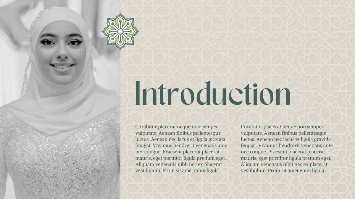
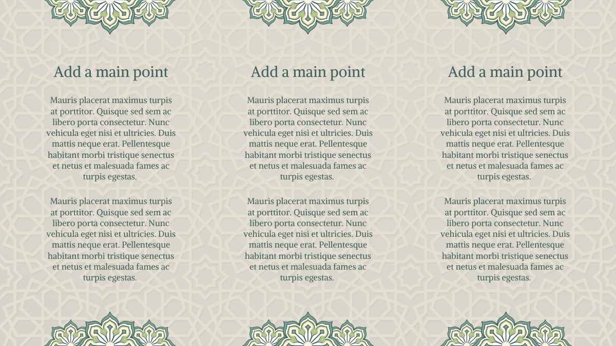
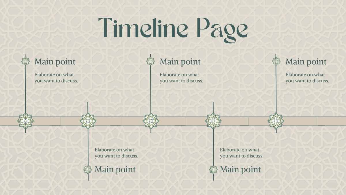
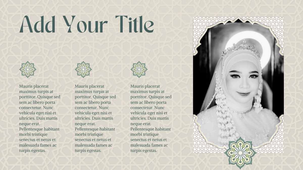
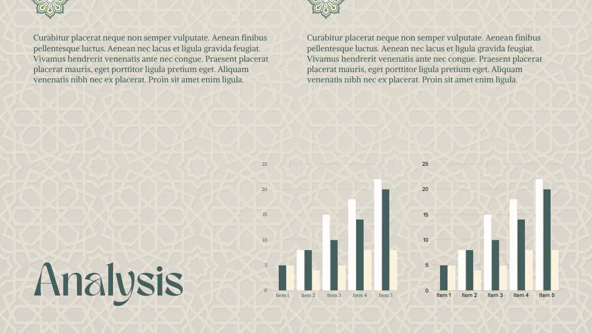
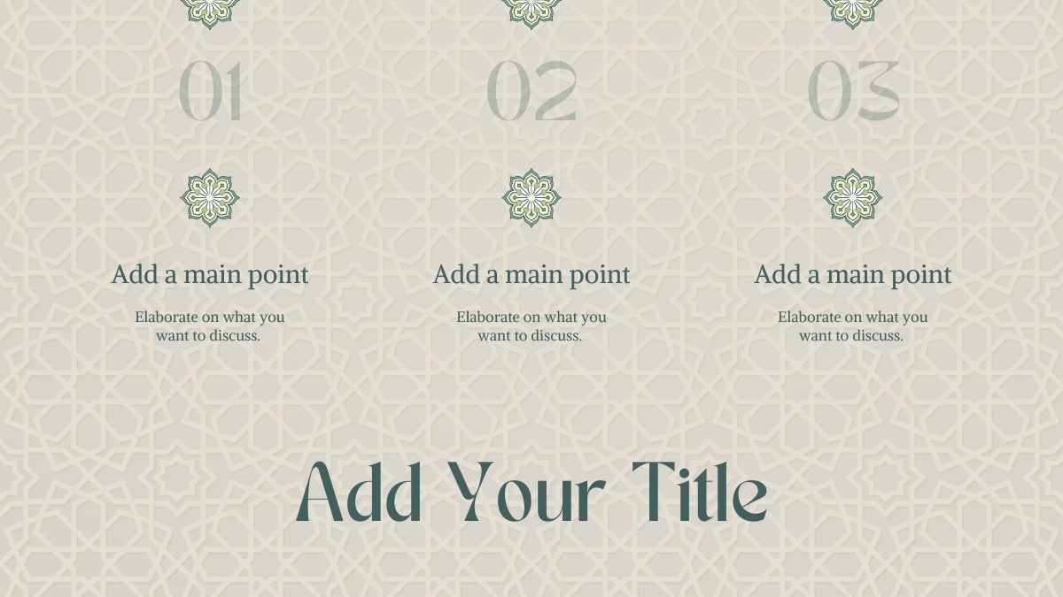
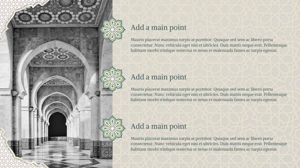
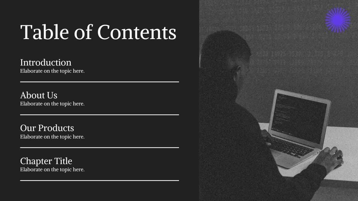
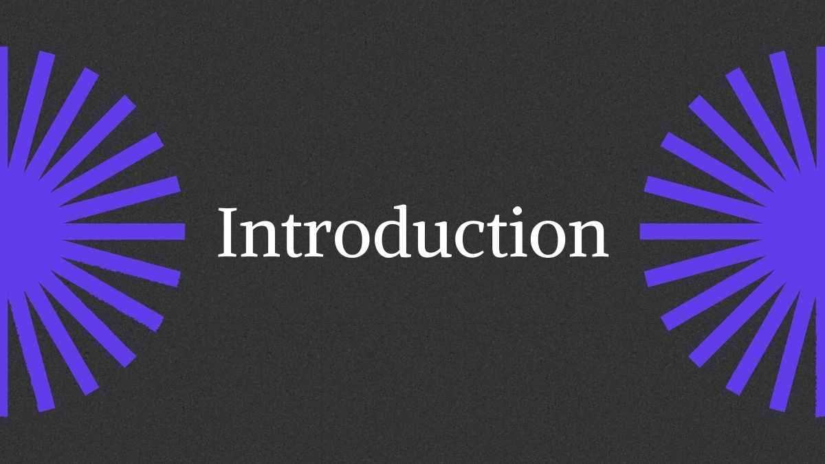
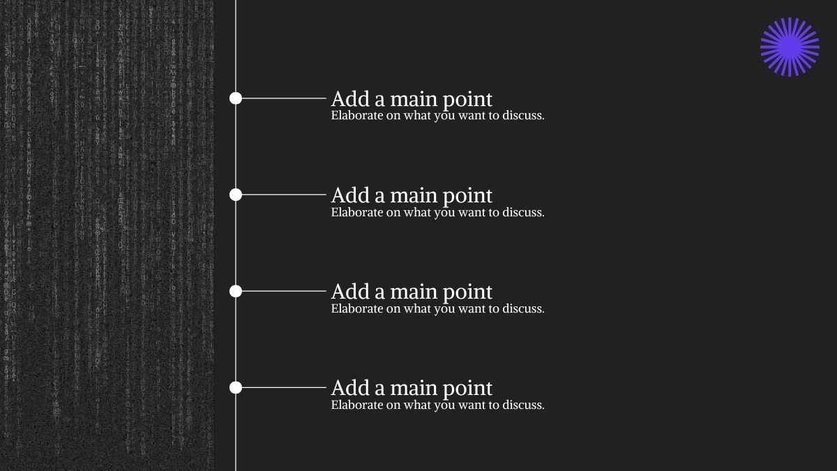
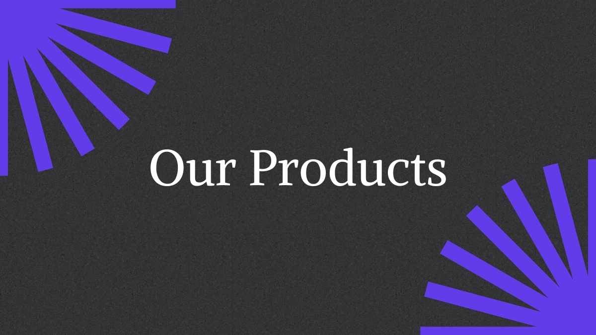
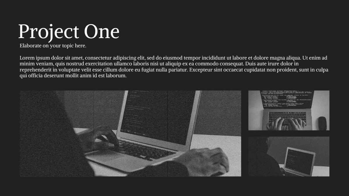
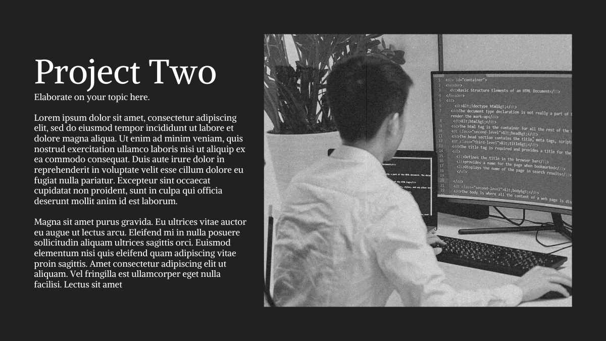
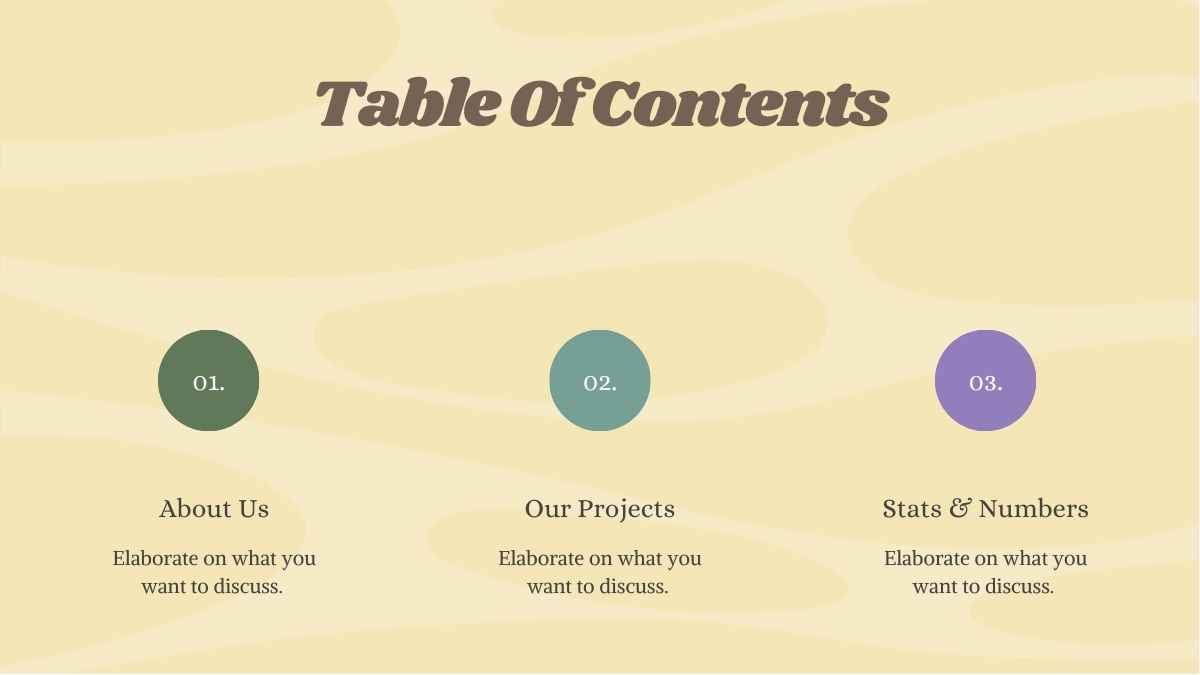
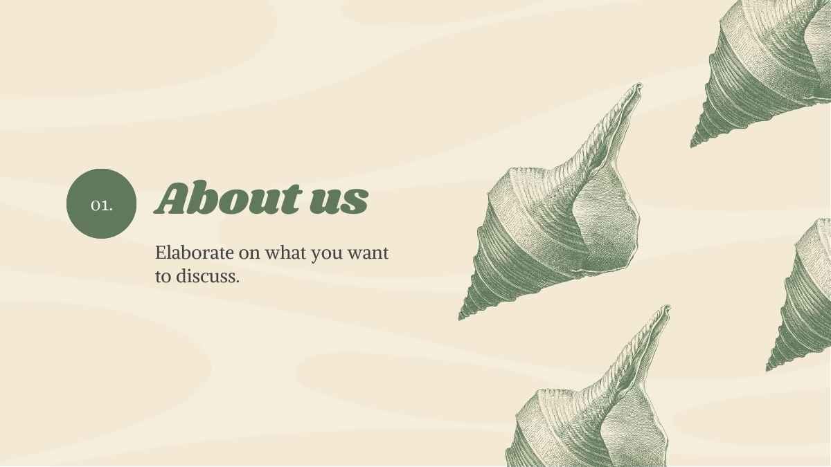
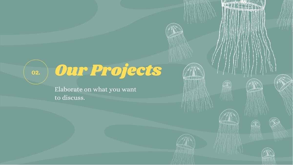
Templates using the font Alike
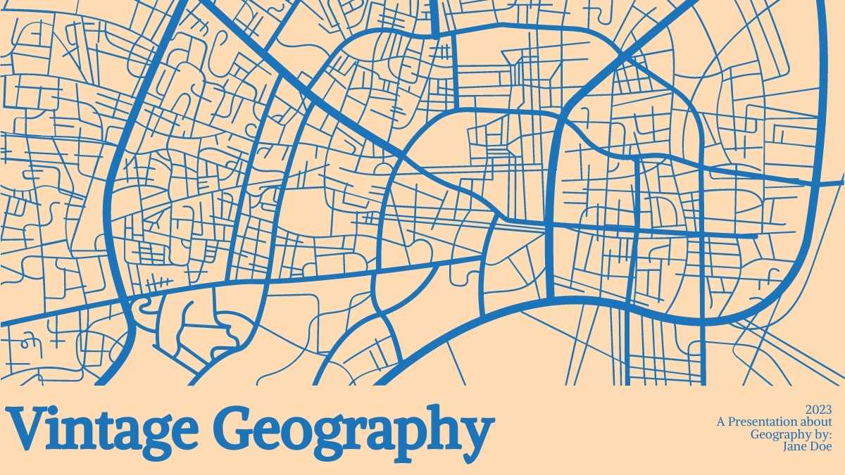
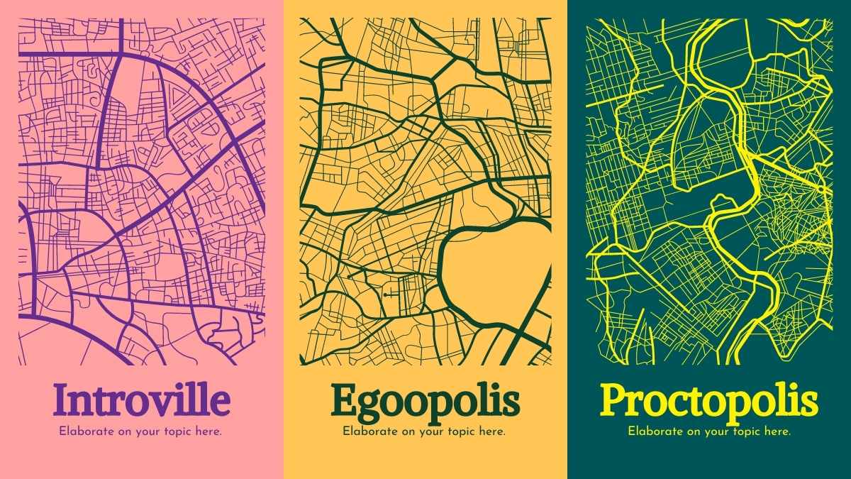
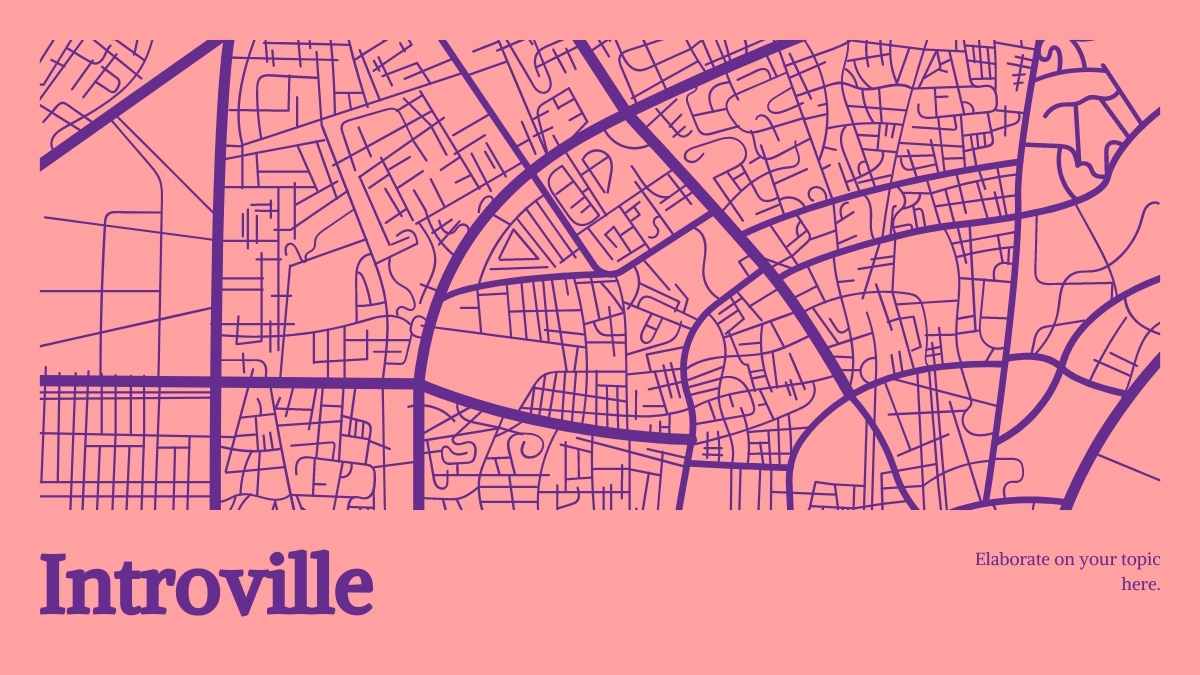

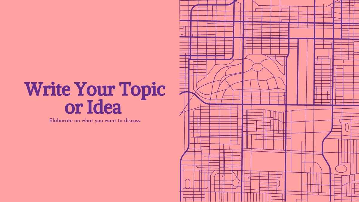
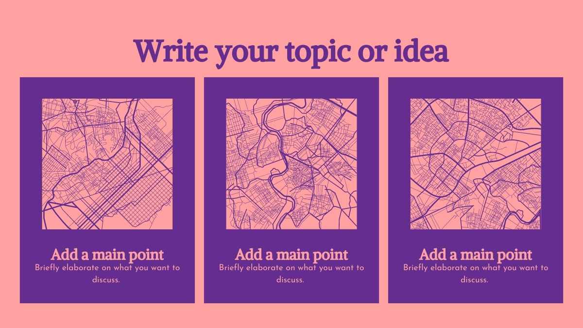
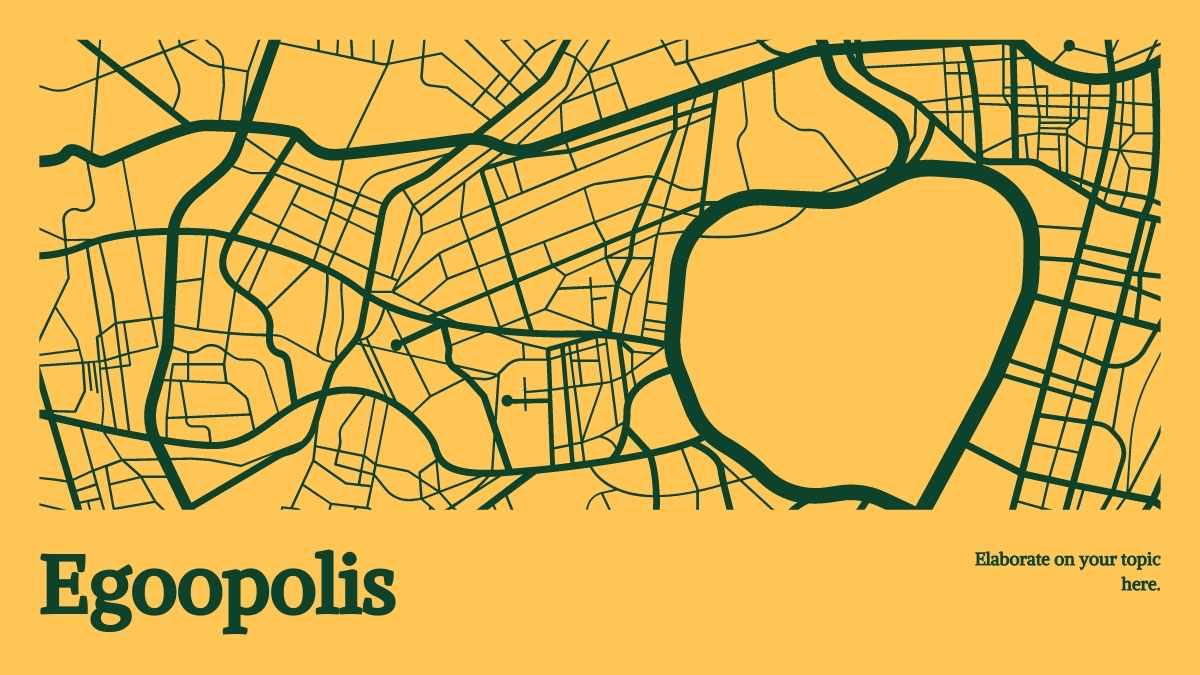
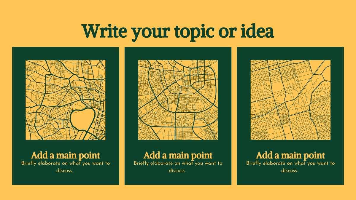

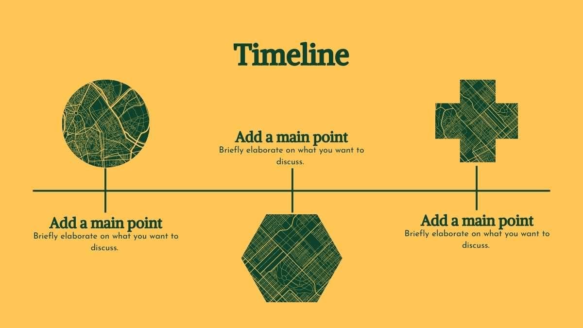


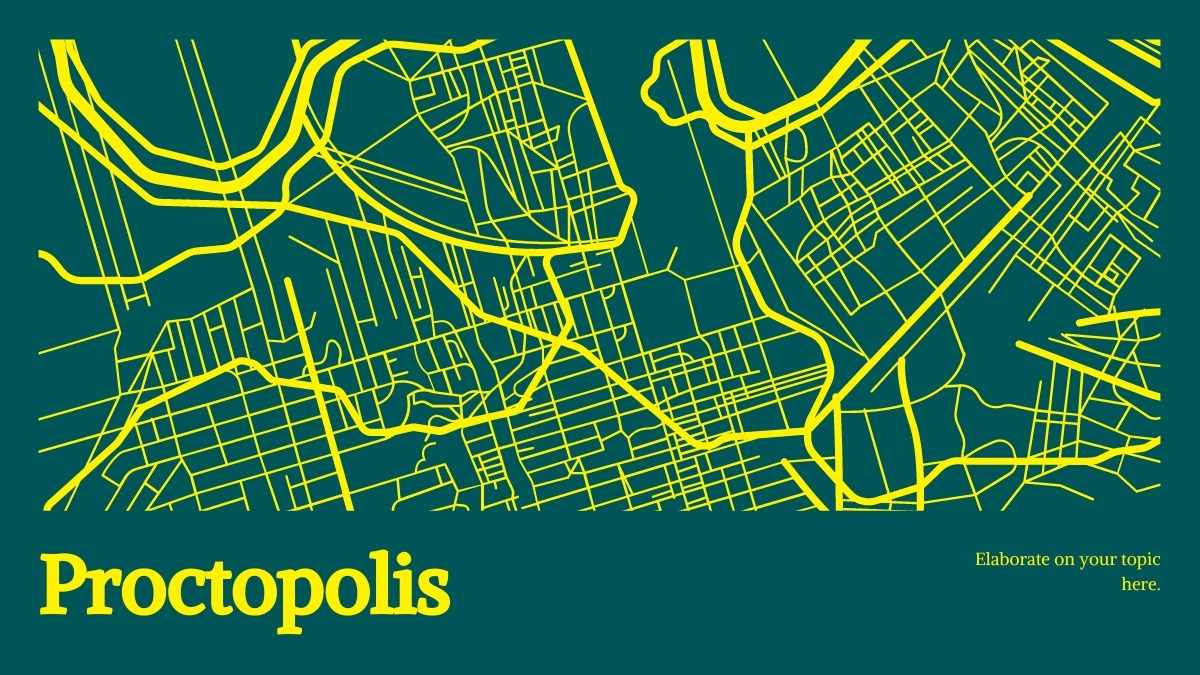
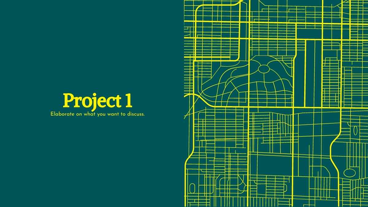



 15
15











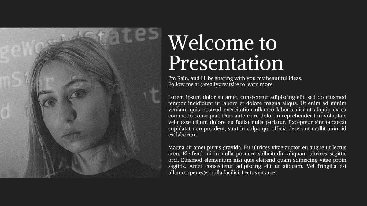
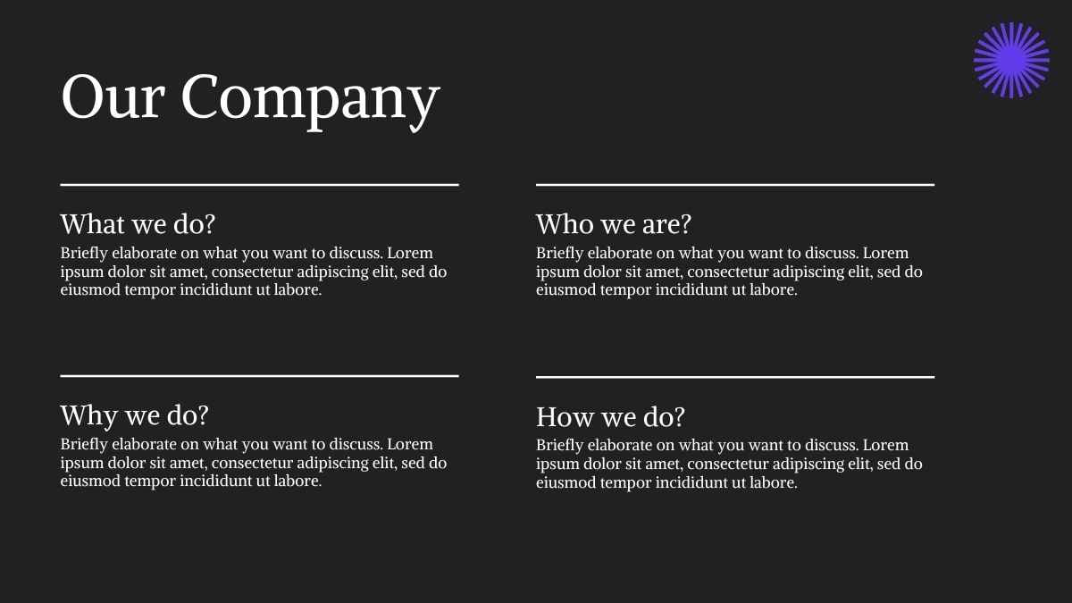
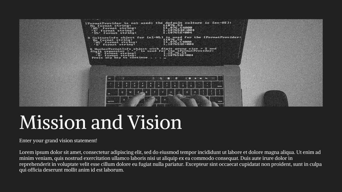

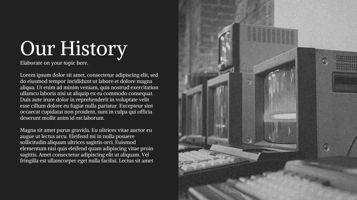


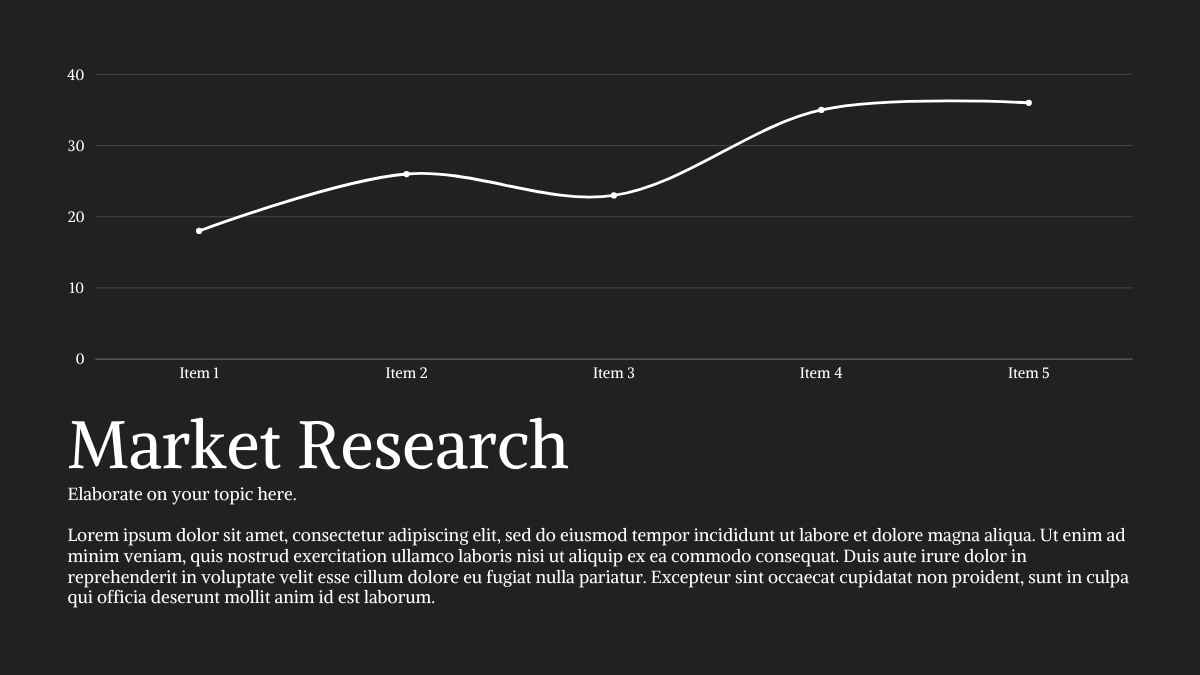


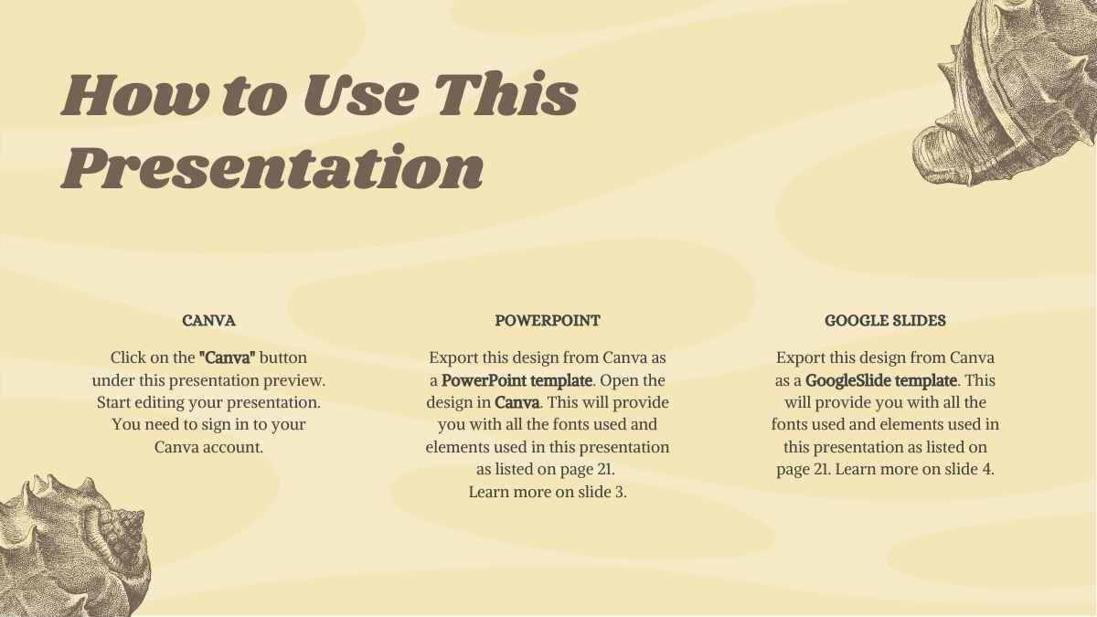
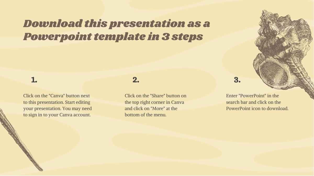
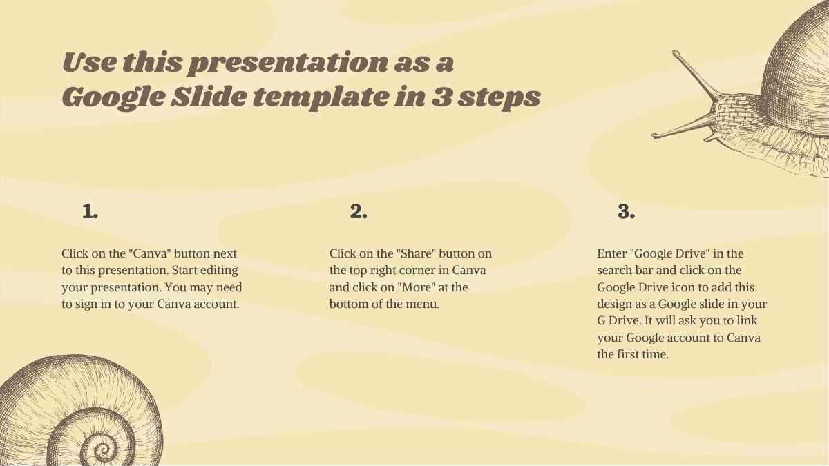






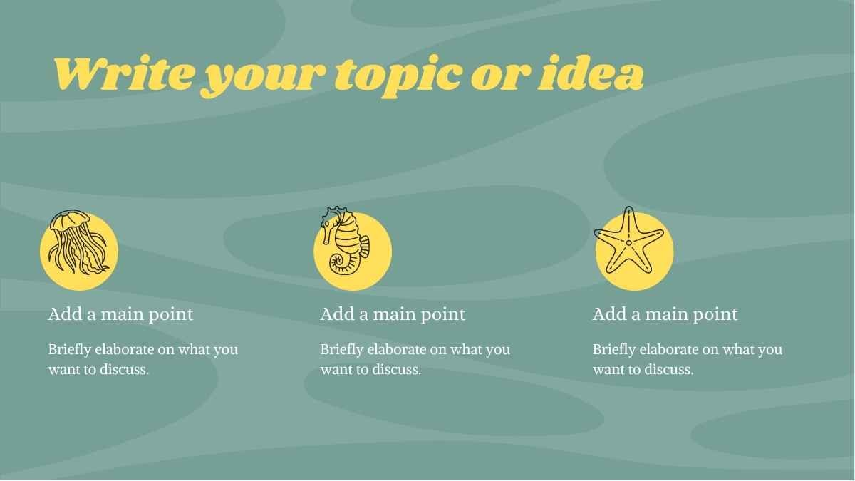

Best font pairs for Alike
Alike pairs well with Montserrat, Roboto, and Open Sans.
EDITORIAL CONTRAST
Montserrat + Alike
Modern headings, classic reading
Montserrat's crisp geometric headlines pair with Alike, a vintage-flavored serif, in the body. Use Montserrat for headings and Alike for the body on blogs and editorial pages.
CLASSIC & CLEAN
Alike + Roboto
A transitional serif headline
Alike's serif with a vintage feel gives headlines a distinctive tone, then Roboto's even body keeps long text plain. A readable pairing for articles and essays.
READABLE & WARM
Alike + Open Sans
Classic headings, clean reading
Alike and Open Sans read comfortably together; Alike's characterful serif heads while Open Sans's plain body carries the text. A dependable pairing for blogs and documentation.
Alternatives to Alike
If you need an alternative to Alike, readable serifs like Lora, PT Serif, and Noto Serif read well in body text.
Lora
This is a Lora headline
And this is body text in Lora. It's worth considering as an alternative to Alike.
View morePT Serif
This is a PT Serif headline
And this is body text in PT Serif. It's worth considering as an alternative to Alike.
View moreNoto Serif
This is a Noto Serif headline
And this is body text in Noto Serif. It's worth considering as an alternative to Alike.
View moreVollkorn
This is a Vollkorn headline
And this is body text in Vollkorn. It's worth considering as an alternative to Alike.
View moreBitter
This is a Bitter headline
And this is body text in Bitter. It's worth considering as an alternative to Alike.
View moreGelasio
This is a Gelasio headline
And this is body text in Gelasio. It's worth considering as an alternative to Alike.
View moreFrequently asked questions about Alike
Is Alike free to use?

What kind of font is Alike?
What font pairs well with Alike?
Is Alike good for body text?
What fonts are similar to Alike?