
6 Easy Tricks for Designing a Text-heavy Presentation
Here at SlidesCarnival, we always recommend keeping your slides simple, with minimal text and absolutely no bullet points.
But what if, hard as you try, your content just isn’t compatible with this advice?
Perhaps you’ve created a slide deck for a colleague, and won’t be presenting it yourself. In this situation, your slides will need to be much more detailed than if you were there in the room to expand on them.
Perhaps you are presenting the slide deck yourself — but you need to demonstrate a detailed process that just wouldn’t make sense if split over multiple slides.
Or, maybe you’re creating a flipped learning session for your students — and won’t be on hand to provide additional information.
All of these scenarios require a considerable amount of text per slide. So, is it possible to include text-heavy slides and make them look visually impressive?
If you follow the professional design tips below, the answer is a confident yes!
- Make the most of text hierarchy
- Format your text like a pro
- Hold onto white space
- Introduce, then separate your content
- Vary layout to maintain interest
- Let your audience take a breath
1. Make the most of text hierarchy
Text hierarchy might sound complicated. But it’s a simple process that you’re probably already pretty familiar with.
Text hierarchy means separating your content into different sections. This makes it easier for your viewers to skim, scan, and understand what they’re reading.
So, how do you achieve this?
First, you’ll want to break up any big chunks of text with subheadings. You should also try to keep sentences and paragraphs short and snappy.
Then, play around with color and layout.
Use a limited palette of contrasting colors to separate subheadings from the main body of text.

Columns or boxes can also help a viewer to categorize the text they’re seeing and work out what’s most important.
Making use of a consistent text hierarchy will help draw your audience’s eye to the most relevant information first — and reduce the mental effort it takes to read the text.
What’s more, a successful text hierarchy will make all of your content more memorable. And that’s exactly what you’re trying to achieve!
2. Format your text like a pro
The easier your slides are to read, the better job they’ll do at holding your viewer’s attention.
And guess what? A few easy formatting tricks can enhance readability in just a few clicks.

Font
Not all fonts are created equal.
Some are much easier to read than others. And some fonts are just plain painful to look at (we’re looking at you, Comic Sans).
For this reason, it’s important to be really careful when choosing your font.
Your font choice provides your audience with a crucial first impression — and subconsciously tells them whether to take your presentation seriously or not.
Choosing the right font can also help you to make optimum use of your slide space. Big, fancy fonts will use up too much space — so avoid them if you can. You will make a much better use of your slide space if your font is slightly condensed.
Line spacing
The distance between each line of text affects its readability.
Ideally, you should set line spacing to around 1.2. You should also leave extra space above and below paragraphs so that there’s a clear separation between different — albeit linked — ideas.
Alignment
When you center text, each line begins in a slightly different place. This slows a reader down.
By aligning text to the left, your audience’s eyes will automatically know where to find the next line of text — making reading your slides a much quicker process.
Lower case
Avoid writing whole sentences in capital letters.
You may find it improves your text hierarchy to capitalize headings. But as a general rule, humans aren’t used to reading in this way — so standard lower case is preferred.
3. Hold onto white space
White space refers to the areas of your slides that are kept completely empty.
And white space is more important than ever when you’re including a lot of text.
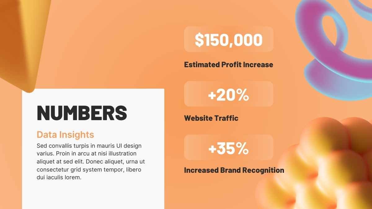
Studies have shown that white space increases reader comprehension by almost 20%! It can make slides much easier on the eye, easier to scan, and easier to digest.

This is undoubtedly easier said than done — especially when you have a specific word count to fit onto a standard size slide.
But if you’re struggling for space, it’s actually better to use a slightly smaller font size than to reduce your margins.
Trust us — your slides will look more professional for it.
4. Introduce, then separate your content
Tons of text? Don’t worry. There are a couple of things you can do to make your content less daunting for your reader.
First, include an introductory slide. This should give a succinct overview of the bullet points you’ll detail on the following slide.

This slide should also be relatively empty — giving your audience a chance to relax for a moment, before getting their brains back in gear.
Follow this with a more detailed slide — containing the rest of your important information!
With this slide, visuals and layout are definitely your friends.
Try replacing bullet points with icons. The icons you use should ideally represent the meaning of the text that follows them — meaning they’ll communicate information before your viewer has even started to read.
There are a surprisingly good selection of icons you can use for this purpose within PowerPoint, Keynote, and Google Slides.
5. Vary layout to maintain interest
Remember — a little variety goes a long way.
Page after page of the same presentation layout can become repetitive and boring — and will risk losing your viewer’s attention.
Avoid formatting all of your slides with images on the left and text on the right. And definitely stay away from slide after slide of unbroken text.

If you want to keep your audience interested in what you have to say, you should be varying the layout of your slides.
To do this, use the full range of presentation design tools available to you.
Images, backgrounds, and text boxes themselves can be used in a variety of ways to create slides that catch and hold your audience’s interest.
Mix up your layouts and your presentation will feel both dynamic and informative.
6. Let your audience take a breath
When we’re presented with lots of new information, it’s easy to get overwhelmed.
So, give your audience a chance to process what they’ve just read or heard. A little break in proceedings gives your message time to sink in.
This could come in the form of a recap at the end of each section. A quick summary of the points you’ve just covered will help your audience to keep up and consolidate the new information they’ve learned.

Or, you might want to start each new section with a simple (but beautifully designed!) introductory slide. This will help viewers to follow the narrative flow of your presentation — and prepare them for what’s coming next.
Including a few simple slides in your presentation will ensure your audience doesn’t feel bombarded by information — making it more likely that they’ll stay engaged with the presentation as a whole.
Looking for designs to make your text-heavy presentation pop?
Creating a presentation that conveys lots of information — but also looks amazing — can be tricky.
But — if you want to avoid a sea of bored or confused faces staring back at you, it’s definitely worth the time and effort.
SlidesCarnival has a huge library of free presentation templates that will help you both convey your important message and ace your design. Check out our range of professionally designed slides to help you succeed in your upcoming presentation!


