
Search


- English
Trends
HIGH-CONTRAST DISPLAY SERIF FONT
Prata
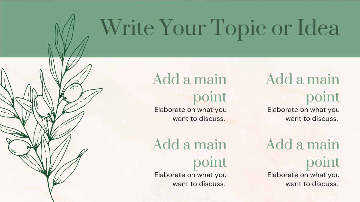
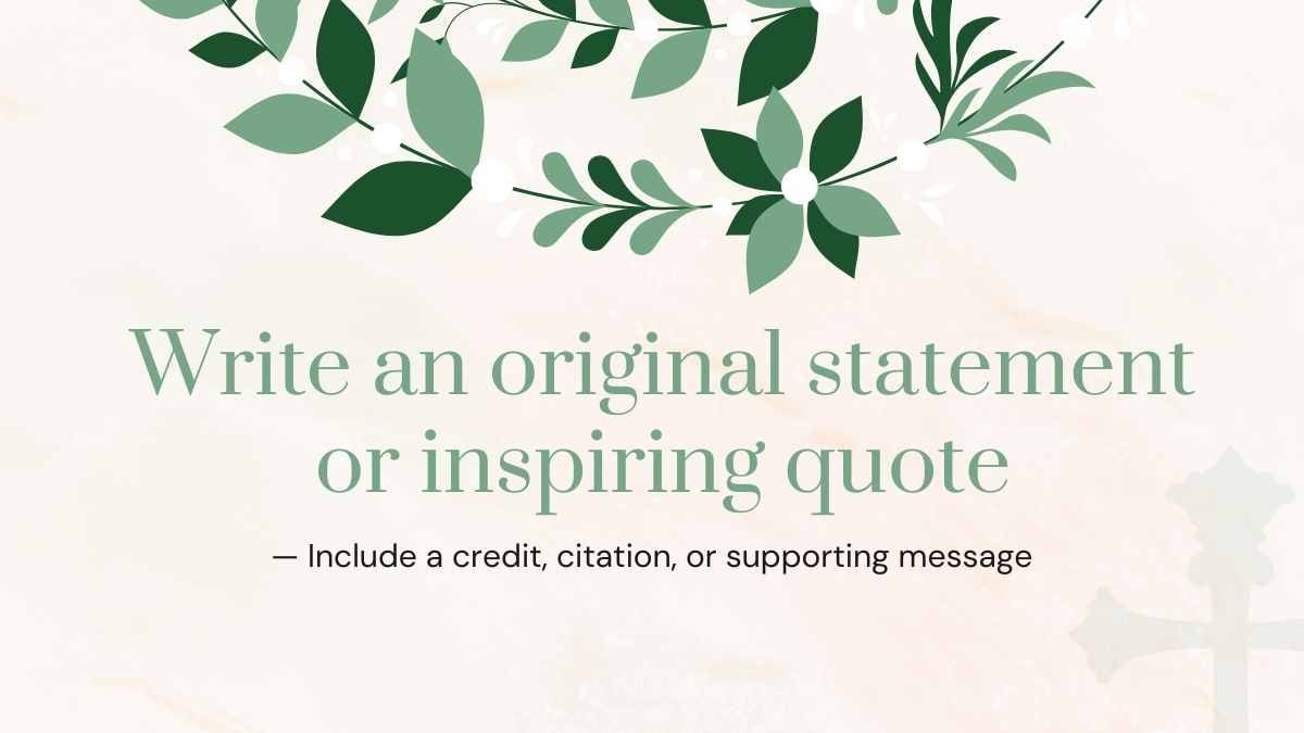
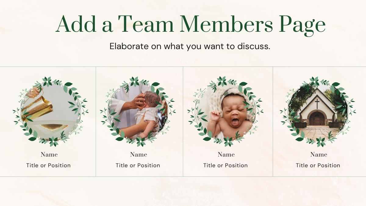
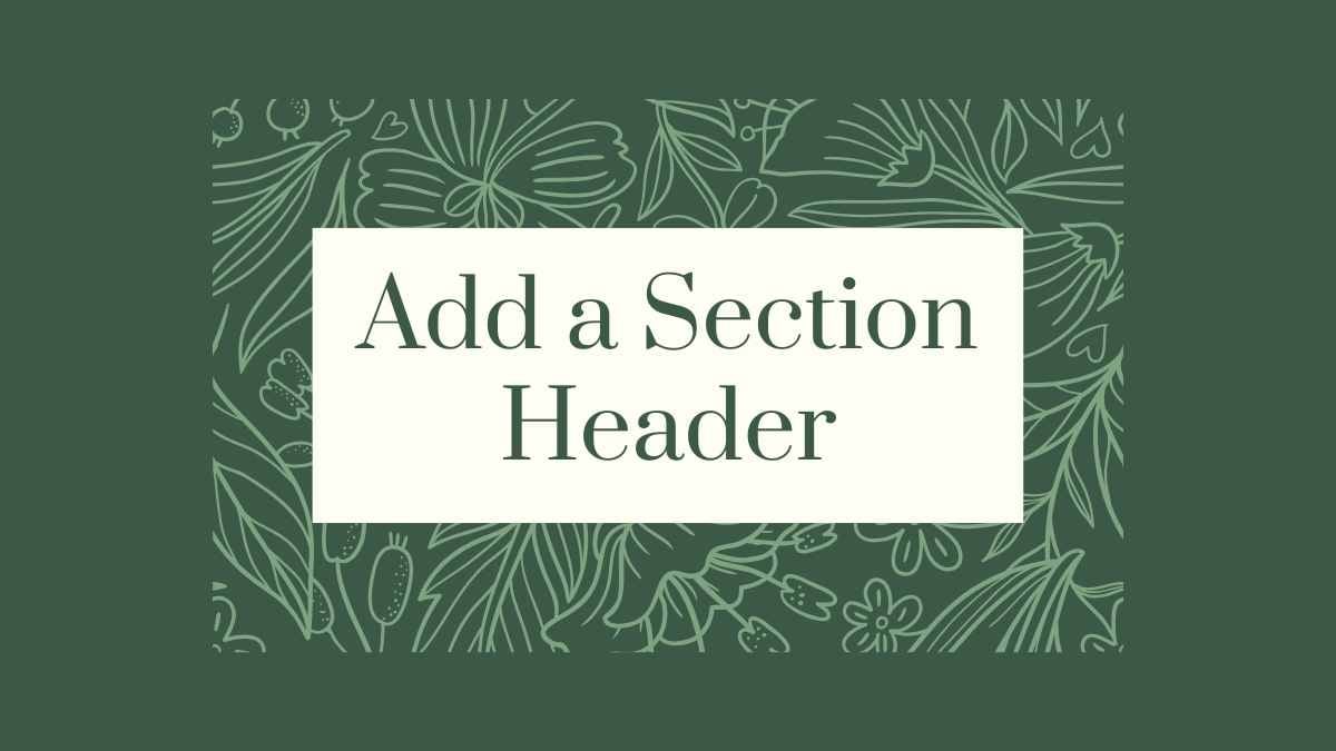
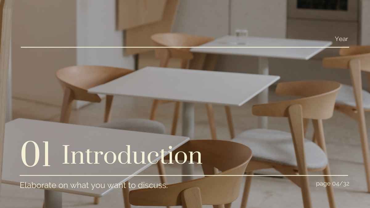
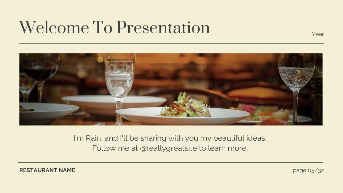
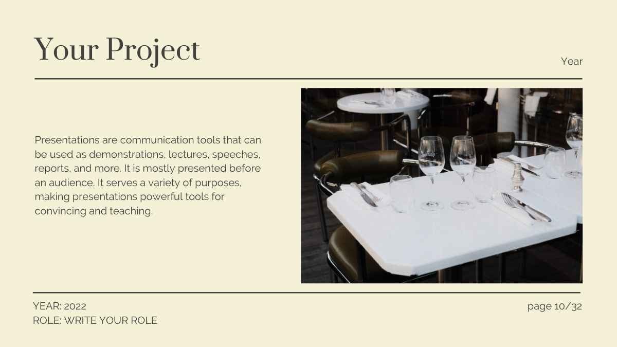
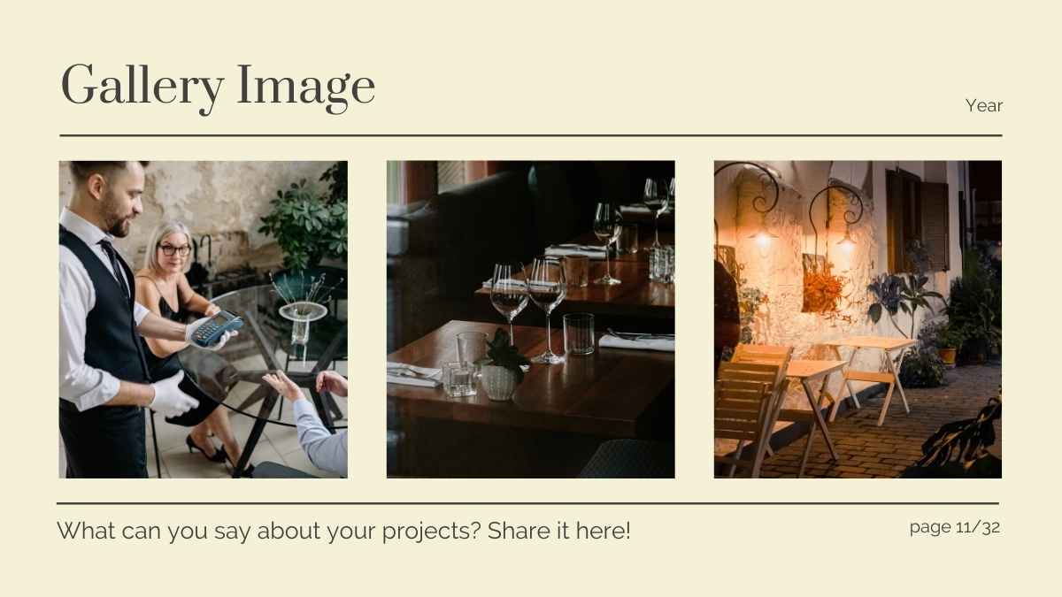
Prata is a free display serif from Google Fonts, with elegant, high-contrast letterforms in a classic didone style. Its refined character suits fashion and editorial headlines.
Prata at a glance
Specimen
Prata is an elegant display serif in the classic didone style, with high contrast between thick and thin strokes. Its refined character suits fashion, beauty, and editorial headlines. Pair it with a clean sans for body text.
Body Text / 18pt Regular
Prata Font Details
Aa
Regular
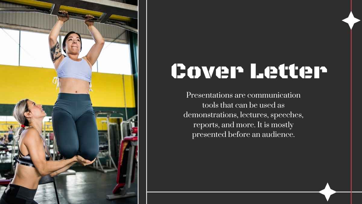
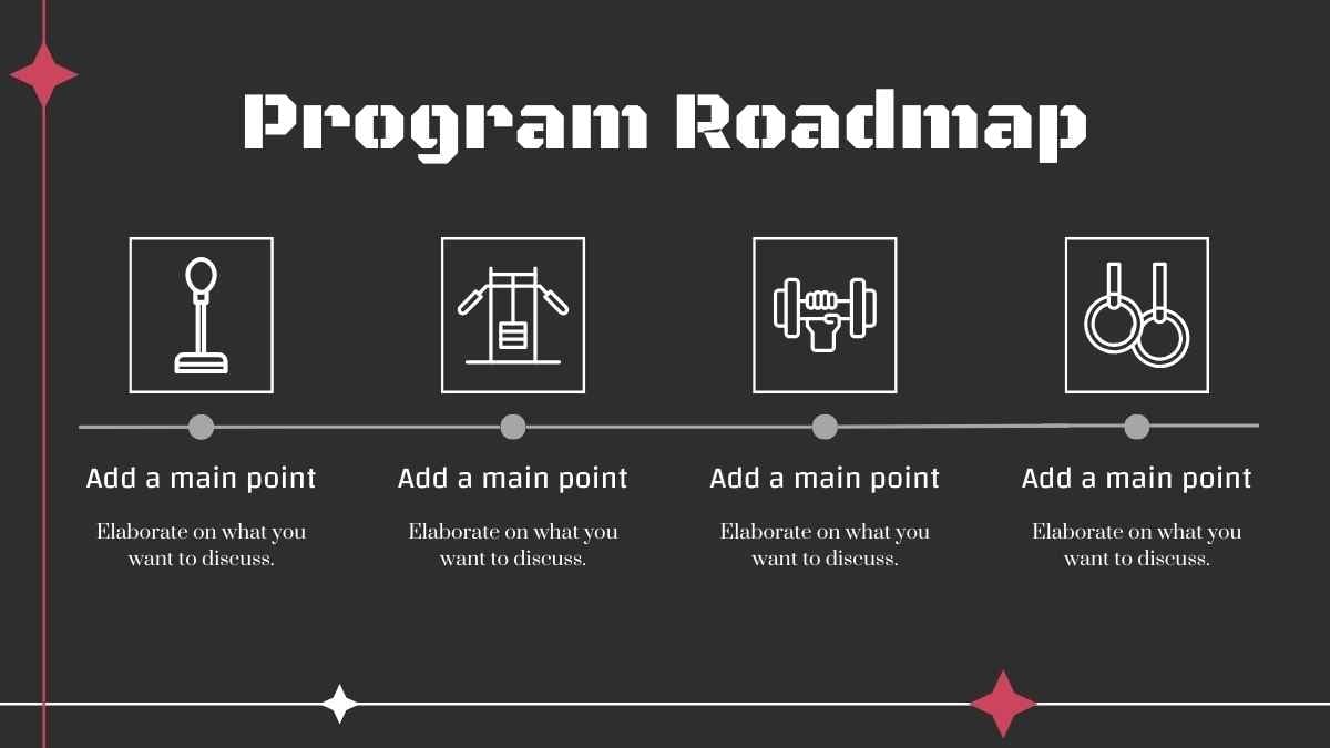
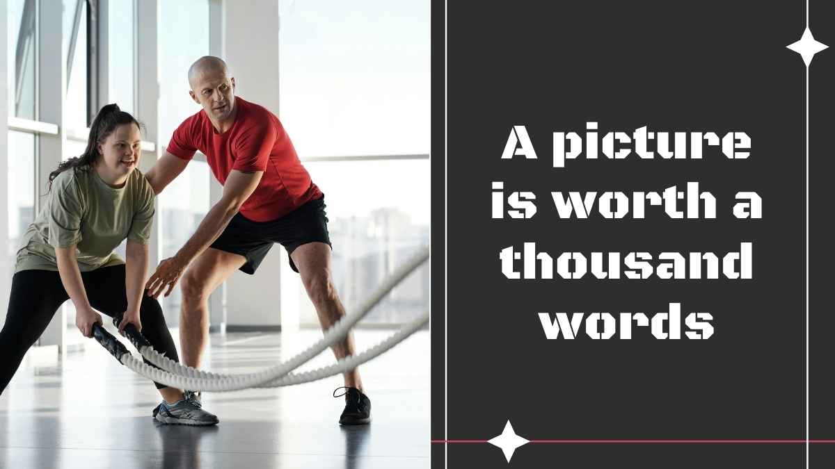
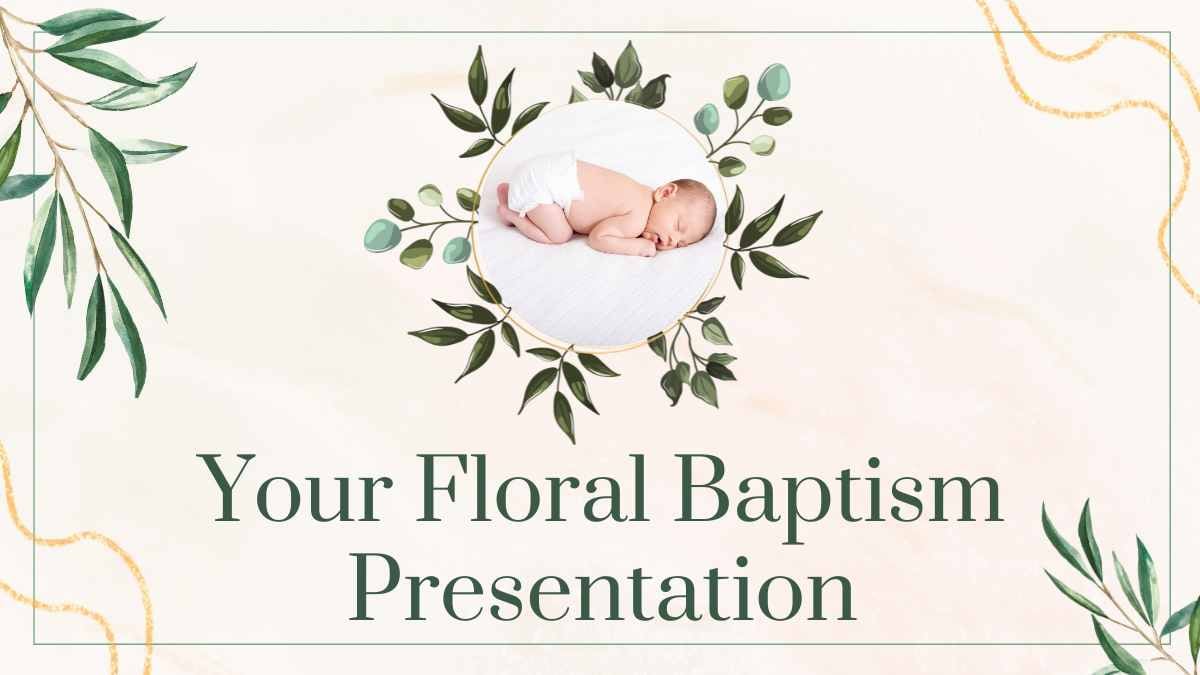
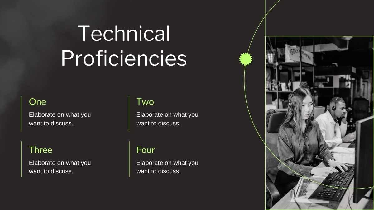
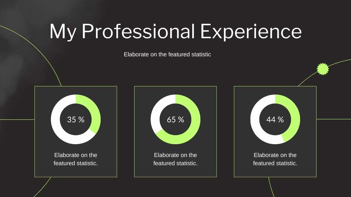
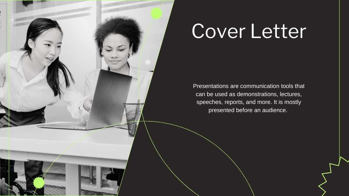
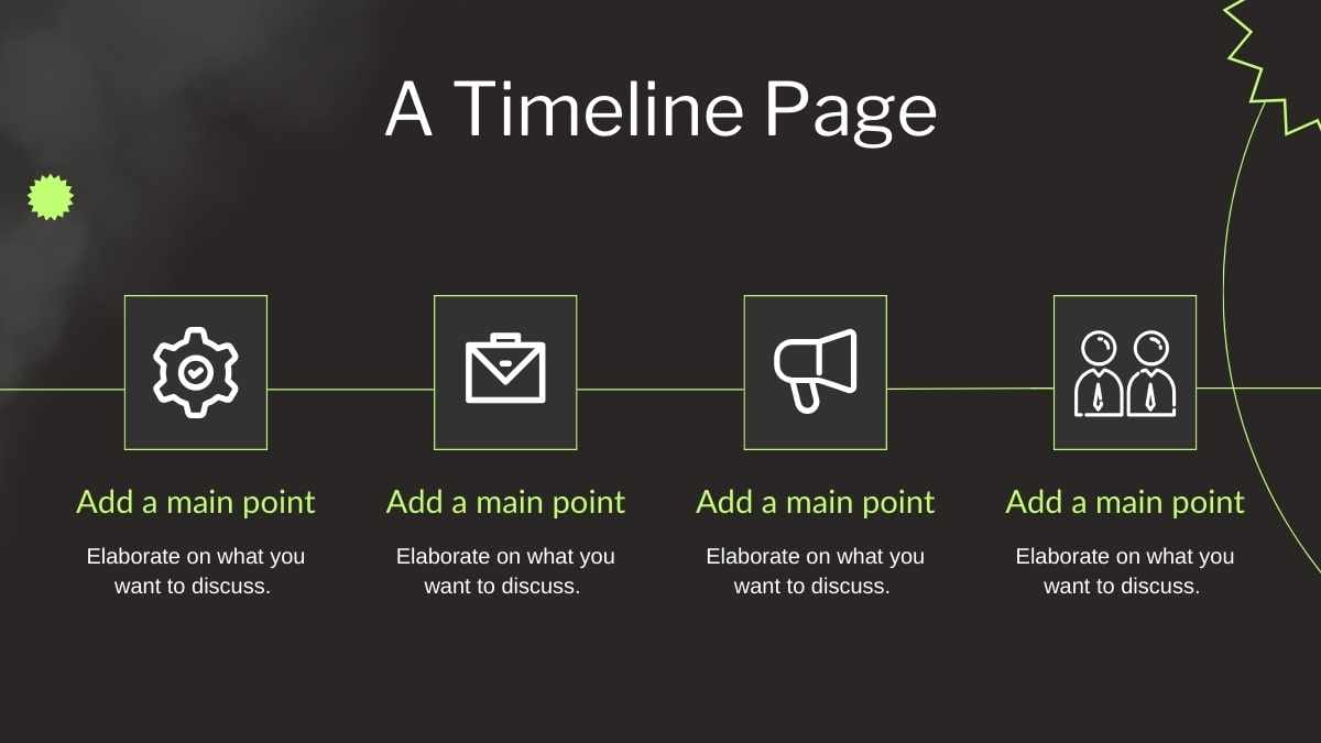
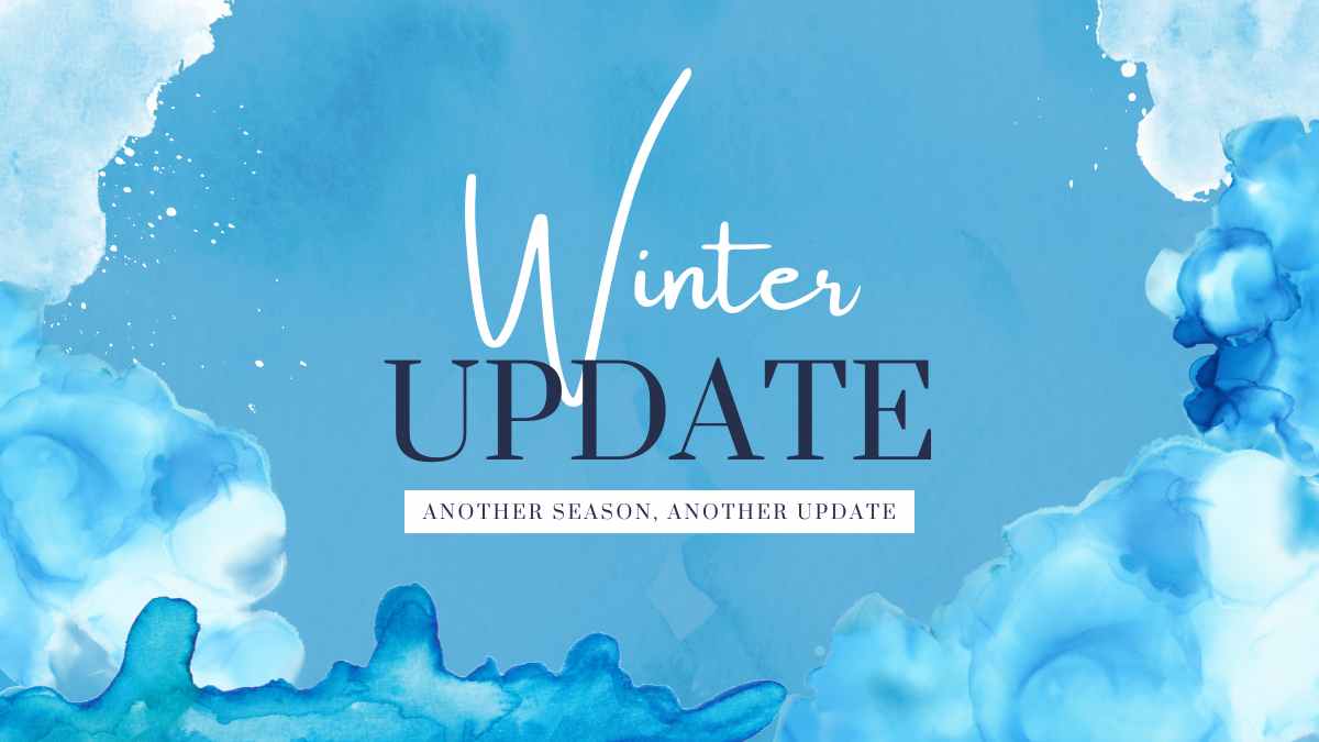
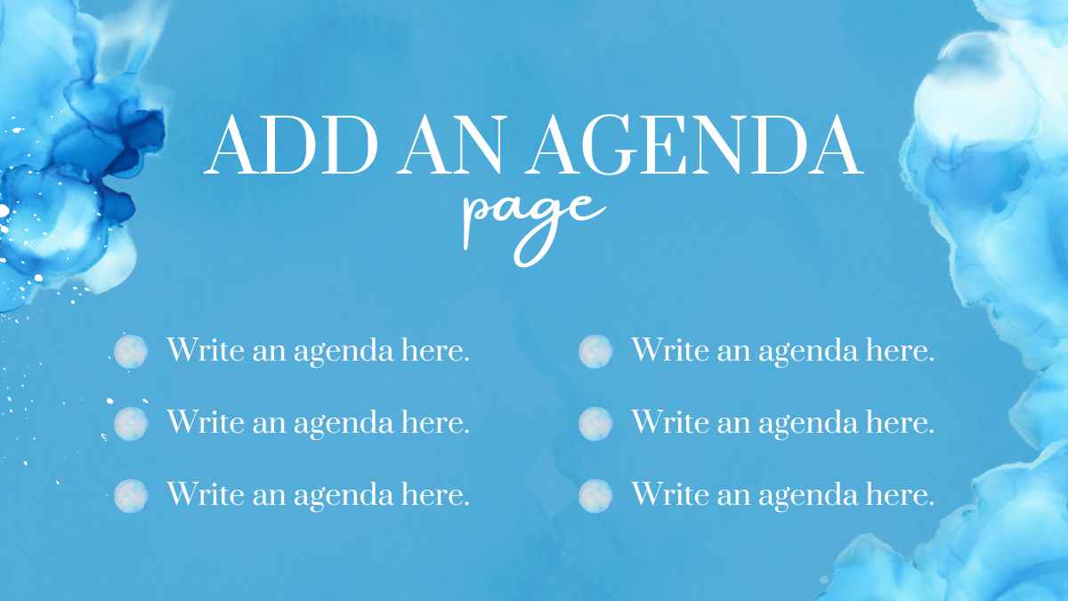
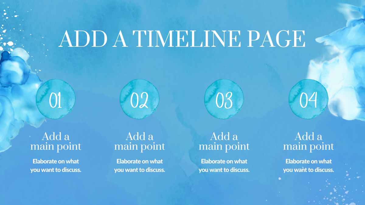
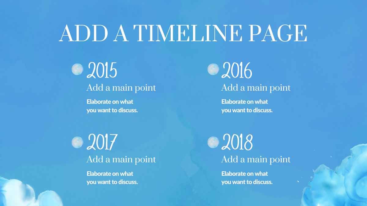
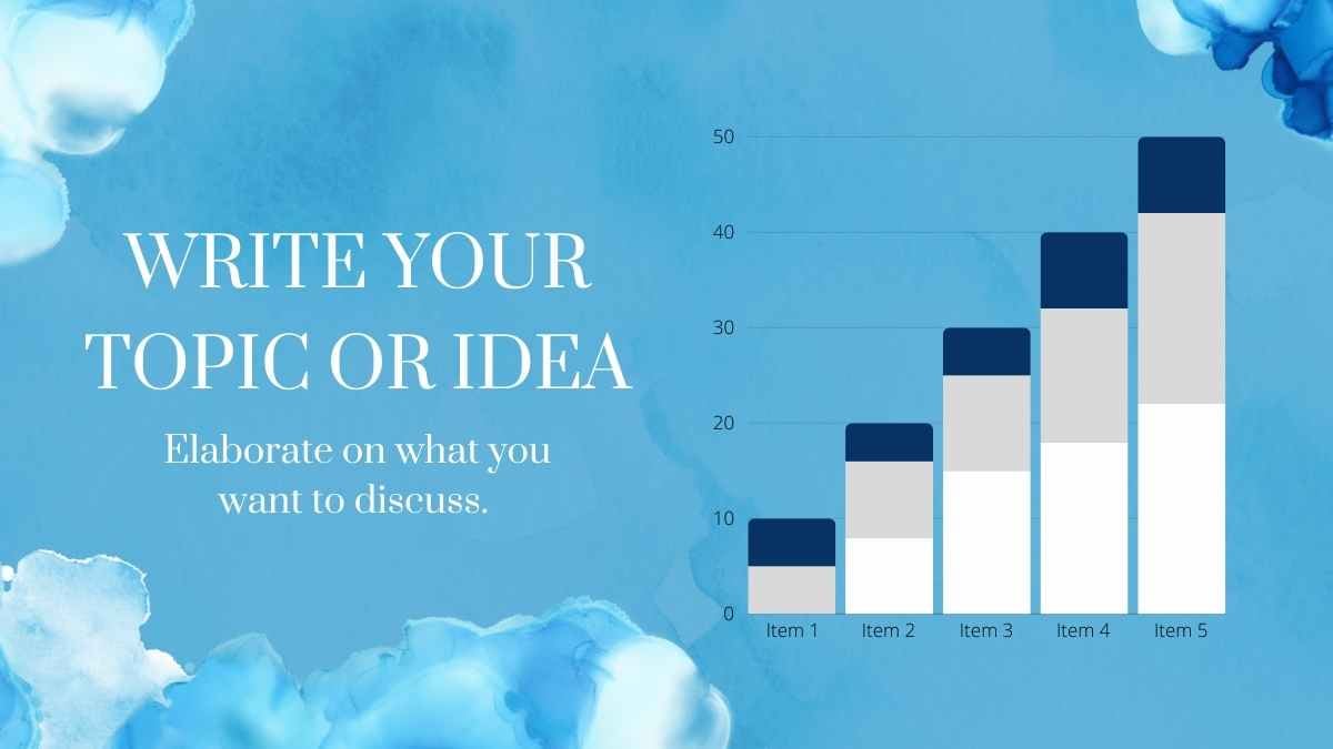
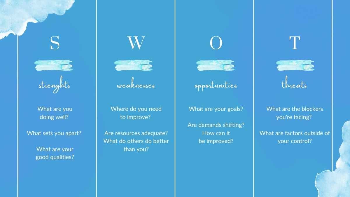
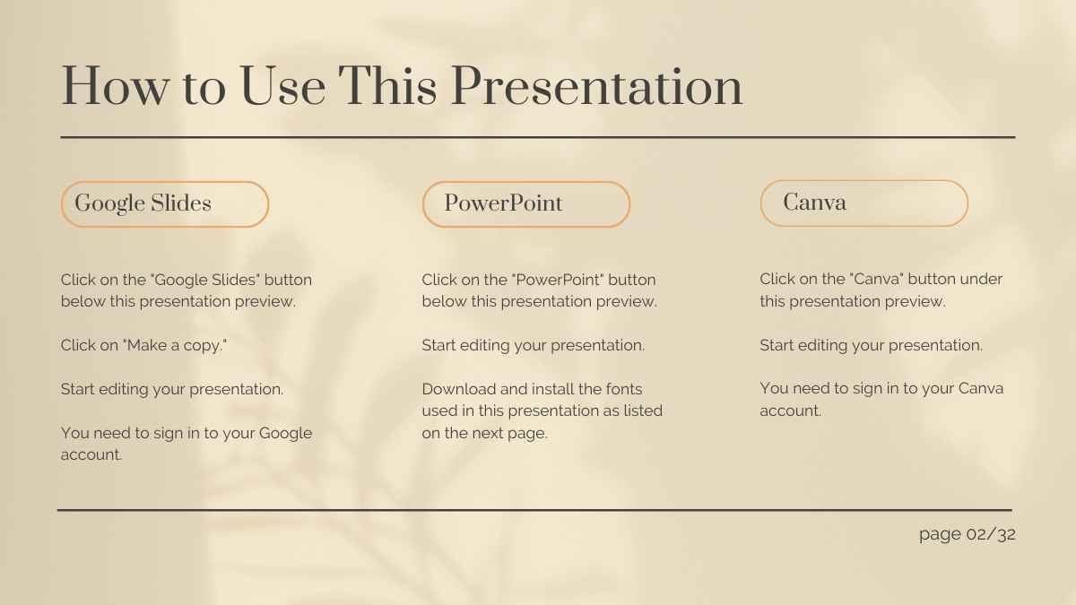
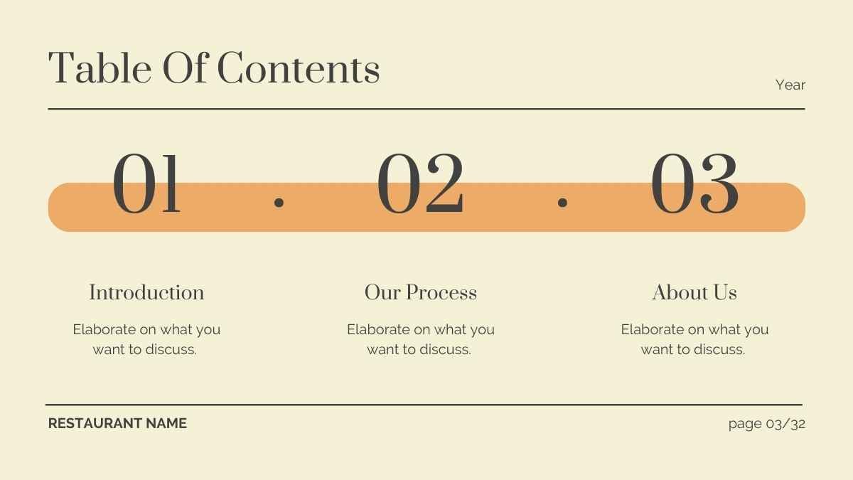
Templates using the font Prata

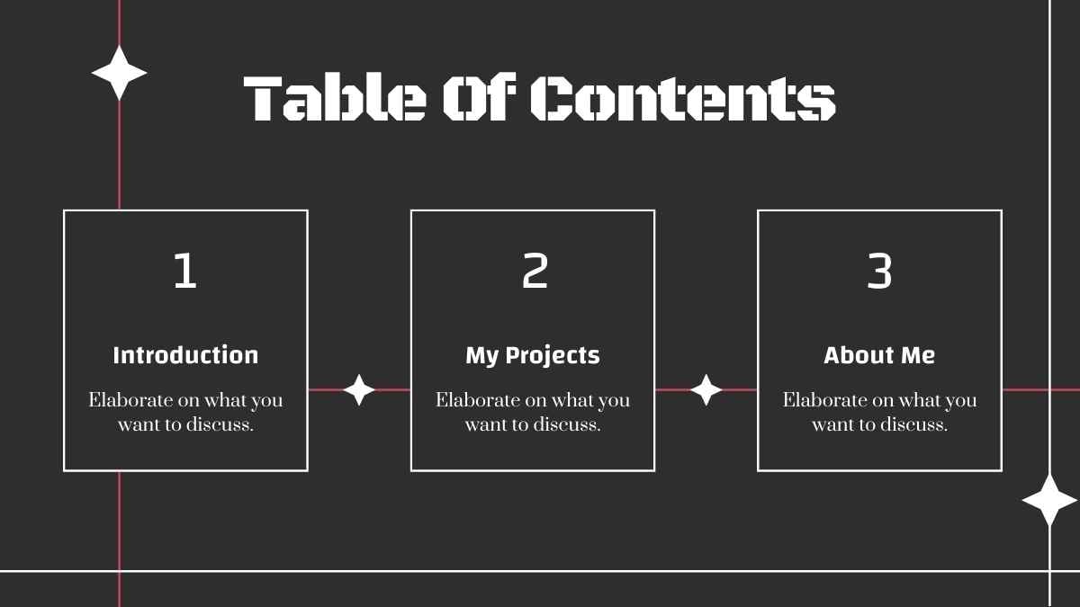


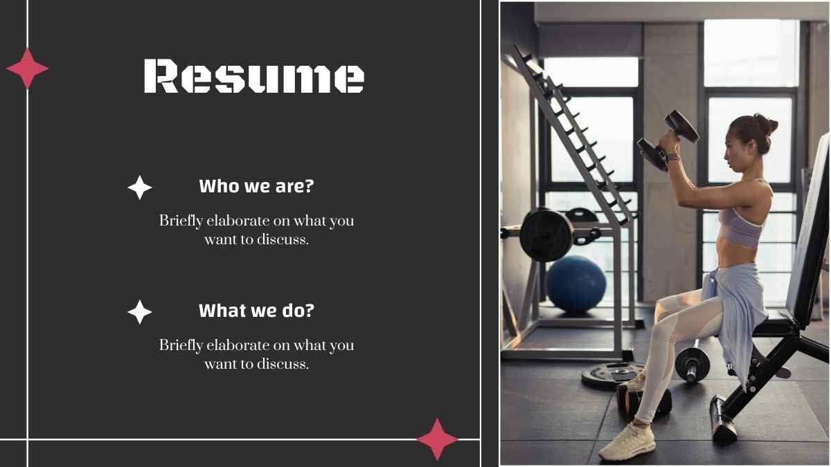
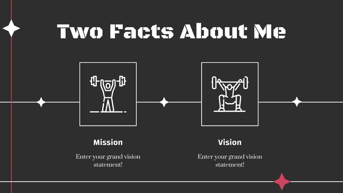
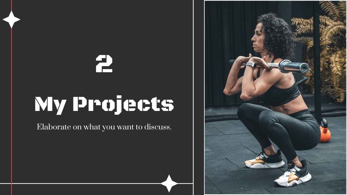
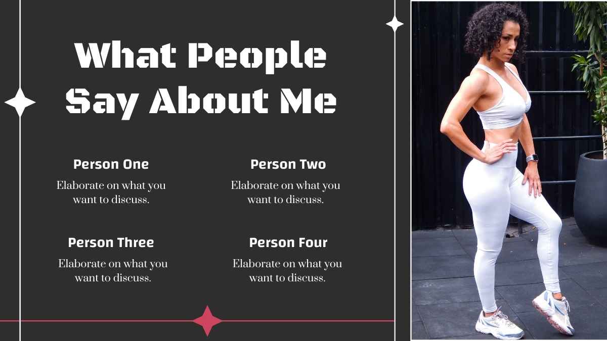
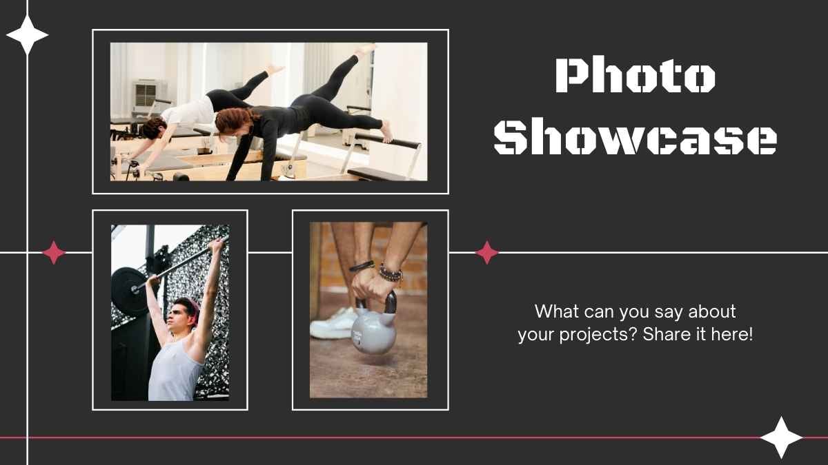
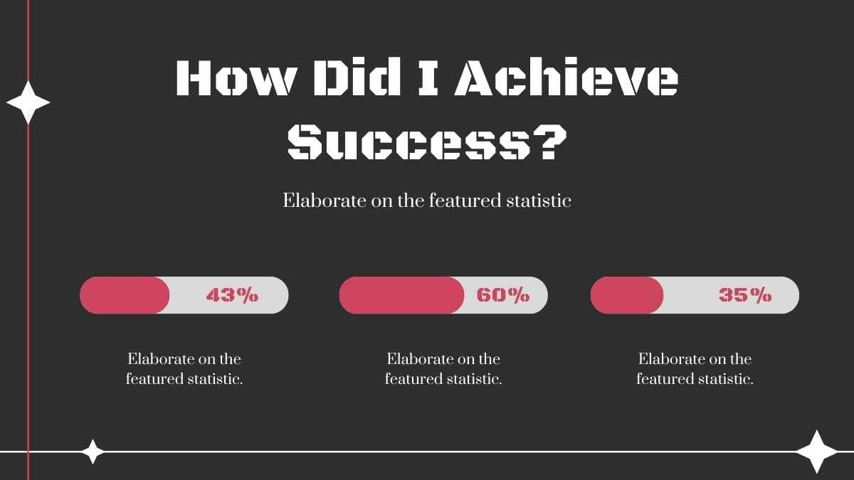

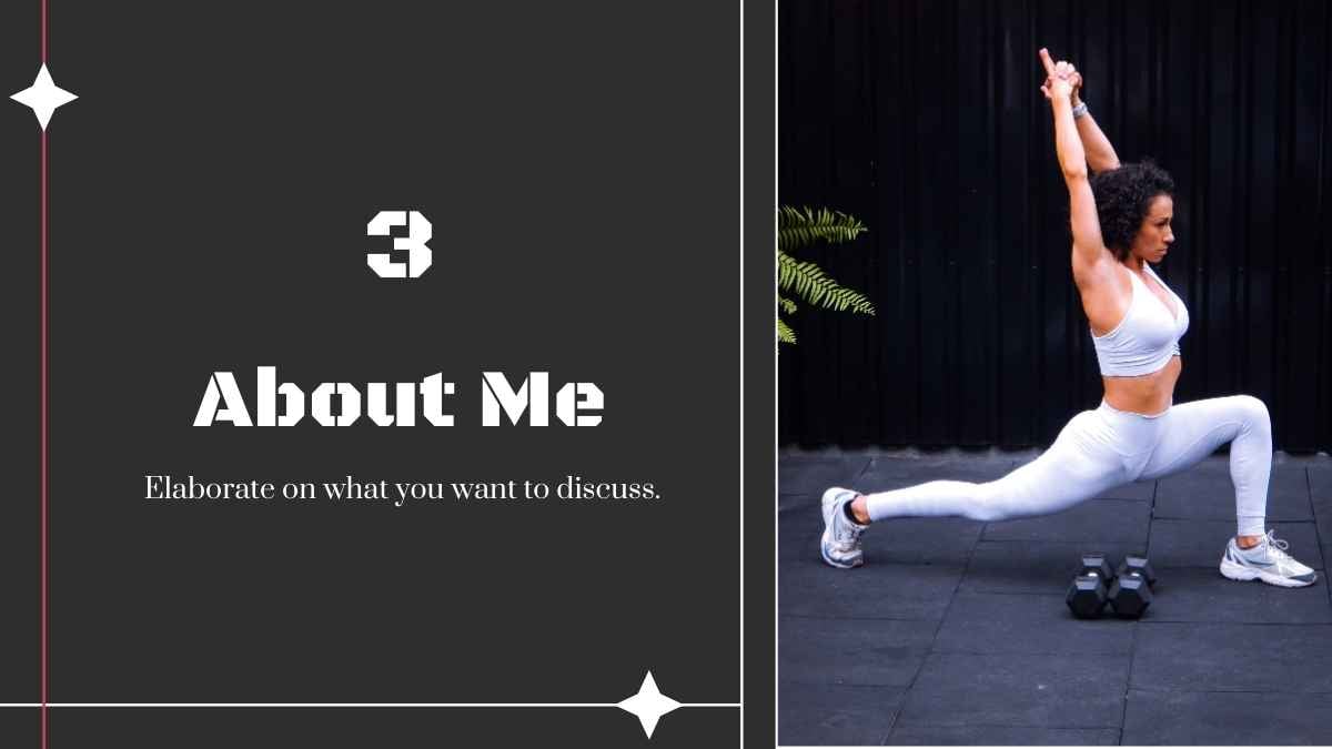



 15
15

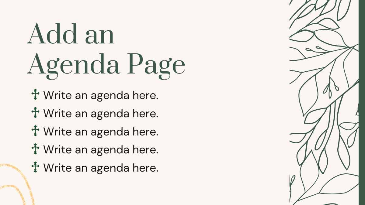
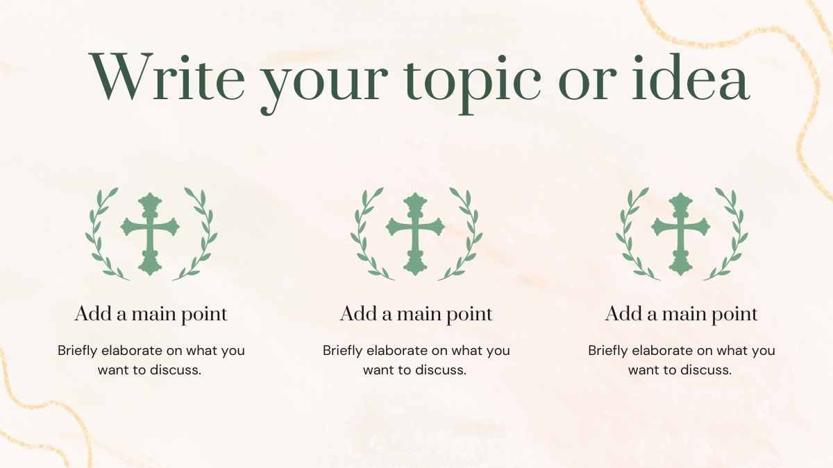



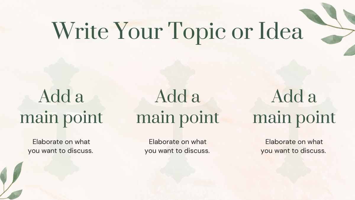
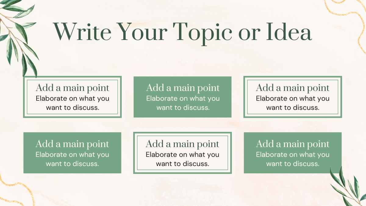



































Best font pairs for Prata
Prata pairs well with Montserrat, Lato, and Open Sans.
ELEGANT & EDITORIAL
Prata + Montserrat
An elegant editorial headline
Prata is an elegant, high-contrast display serif whose refined headlines contrast with Montserrat's clean geometric body. Use Prata for headings and Montserrat for body on fashion and editorial pages.
FASHION & LUXURY
Prata + Lato
A refined, luxury headline
Prata's fine, high-contrast serif looks best large, so keep it for headlines and let Lato's sturdy humanist body carry the text. A refined pairing for luxury and brand pages.
CLASSIC CONTRAST
Prata + Open Sans
A classic, elegant headline
Where Prata's elegant high-contrast serif sets a stylish headline, Open Sans's plain body reads cleanly. Pair Prata headings with Open Sans body on editorial and fashion pages.
Alternatives to Prata
If you need an alternative to Prata, high-contrast display serifs like Playfair Display, Cormorant Garamond, and DM Serif Display offer a similar elegant character.
Playfair Display
This is a Playfair Display headline
And this is body text in Playfair Display. It's worth considering as an alternative to Prata.
View moreCormorant Garamond
This is a Cormorant Garamond headline
And this is body text in Cormorant Garamond. It's worth considering as an alternative to Prata.
View moreDM Serif Display
This is a DM Serif Display headline
And this is body text in DM Serif Display. It's worth considering as an alternative to Prata.
View moreAbril Fatface
This is a Abril Fatface headline
And this is body text in Abril Fatface. It's worth considering as an alternative to Prata.
View moreBodoni Moda
This is a Bodoni Moda headline
And this is body text in Bodoni Moda. It's worth considering as an alternative to Prata.
View moreYeseva One
This is a Yeseva One headline
And this is body text in Yeseva One. It's worth considering as an alternative to Prata.
View moreFrequently asked questions about Prata
Is Prata free to use?

What kind of font is Prata?
What font pairs well with Prata?
Is Prata good for body text?
What fonts are similar to Prata?