
Search


- English
Trends
MODERN UI SANS-SERIF FONT
Inter
Inter is a free sans-serif from Google Fonts, designed for user interfaces and screens. Its tall x-height and clear forms keep text legible at small sizes.
A peek at Inter
Specimen
Inter was designed by Rasmus Andersson specifically for computer screens and user interfaces. Its tall x-height, open apertures, and careful spacing keep text sharp at small sizes. It is a dependable choice for apps, dashboards, and dense layouts.
Body Text / 18pt Regular
Inter Font Details
Aa
Bold
Aa
Regular
Aa
Light
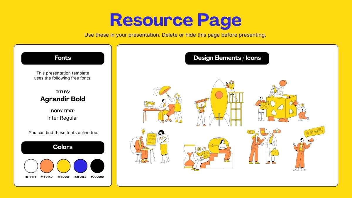
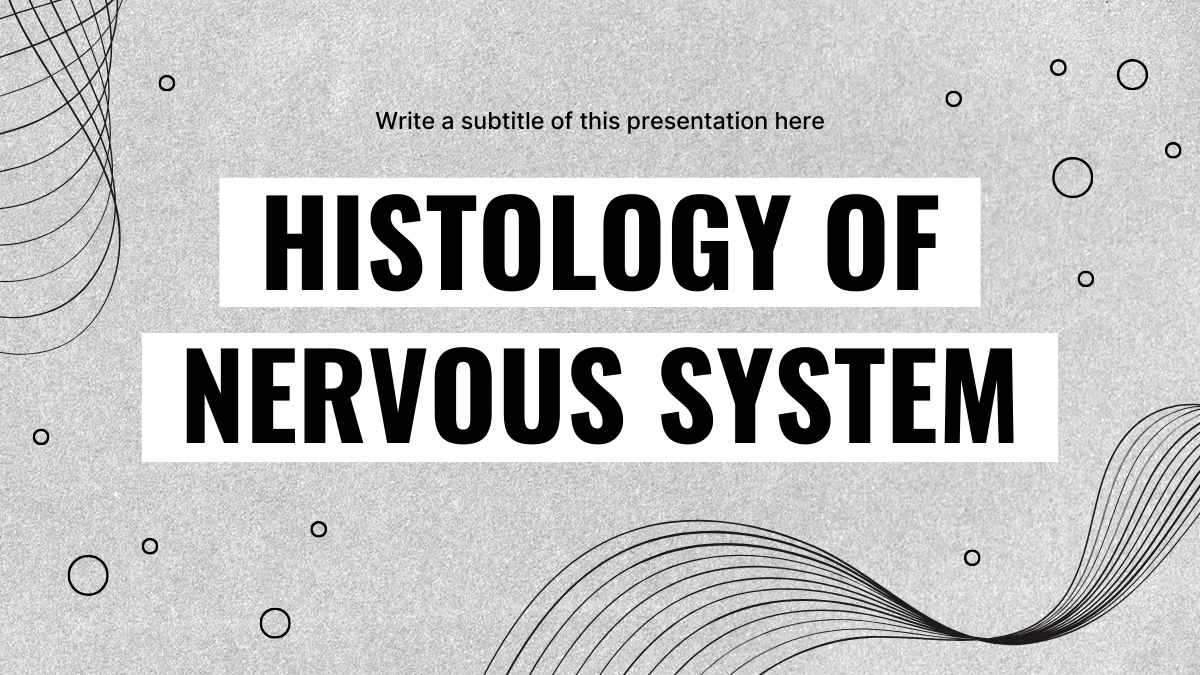
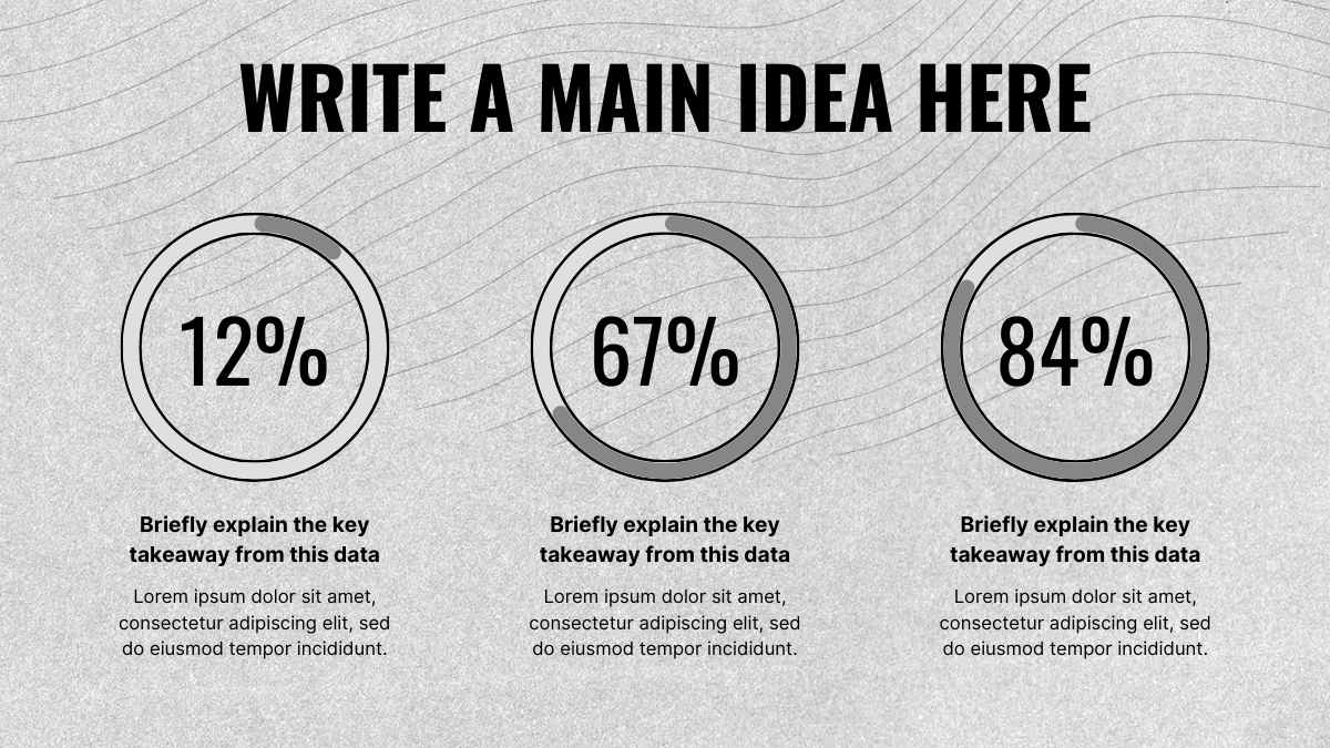
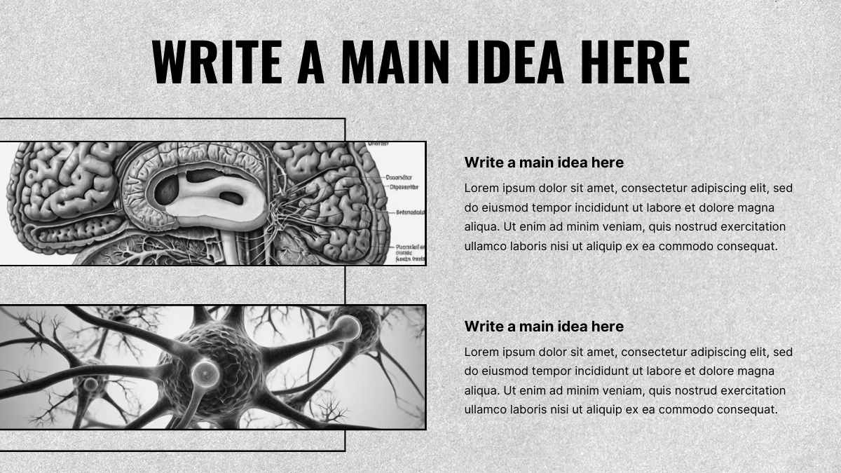
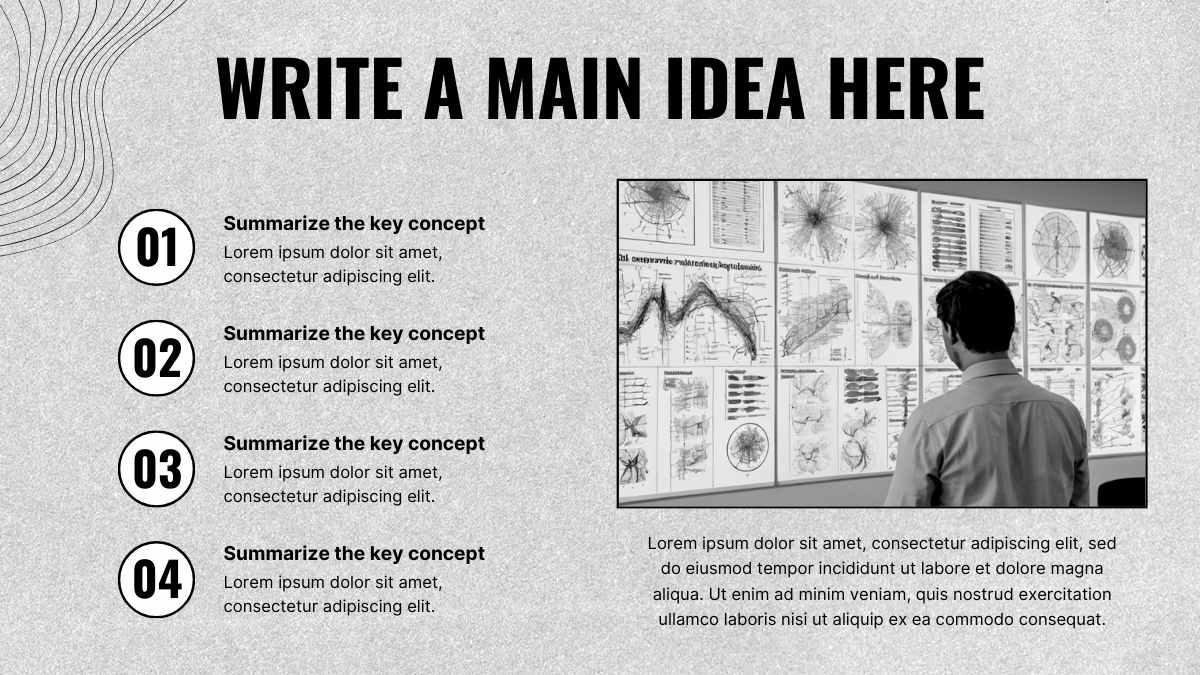
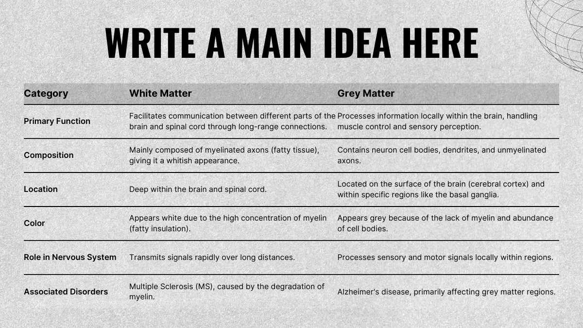
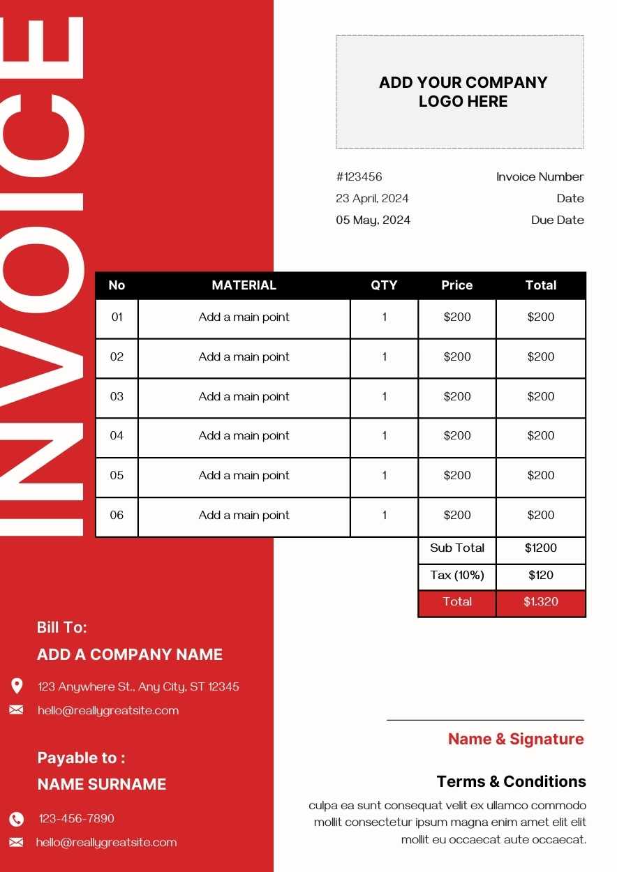
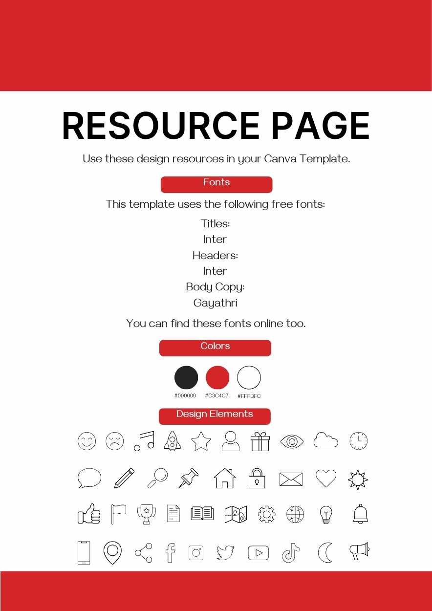
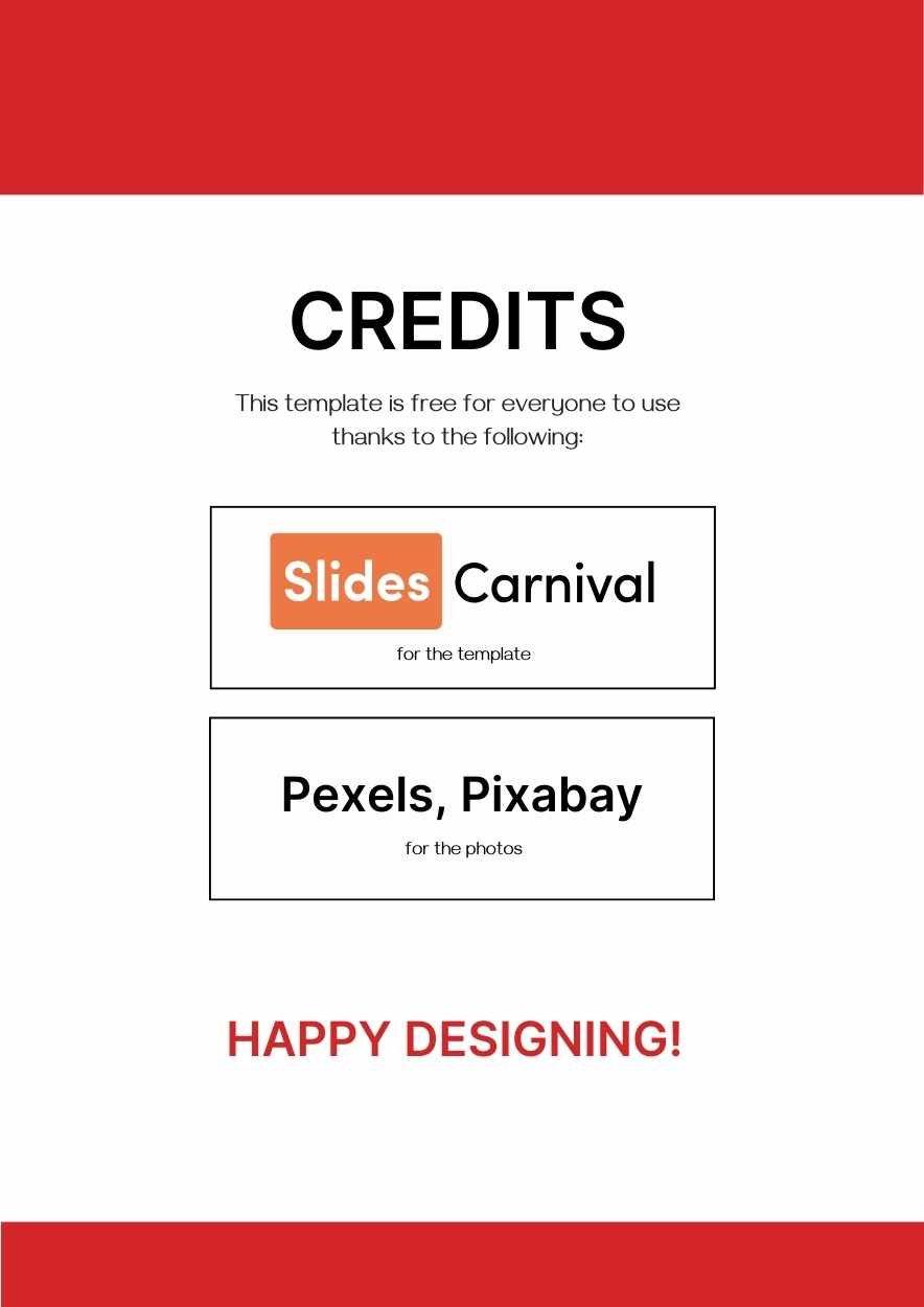
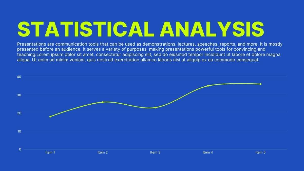
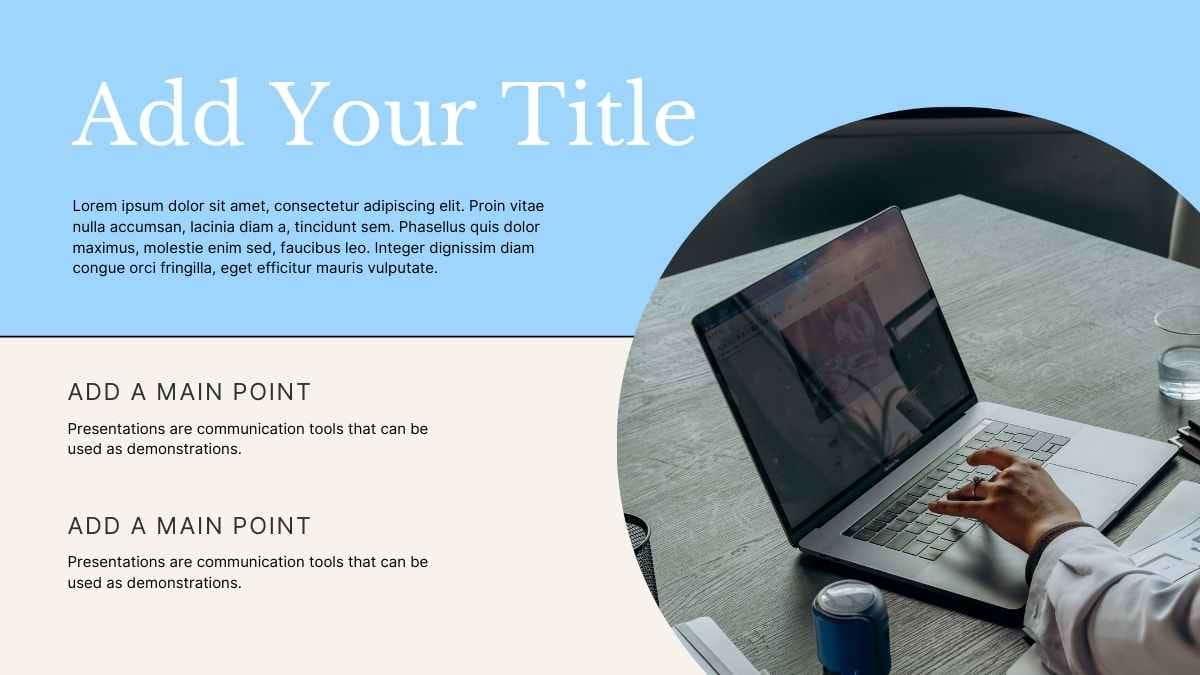
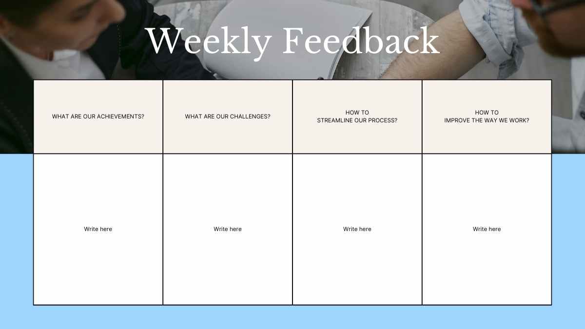
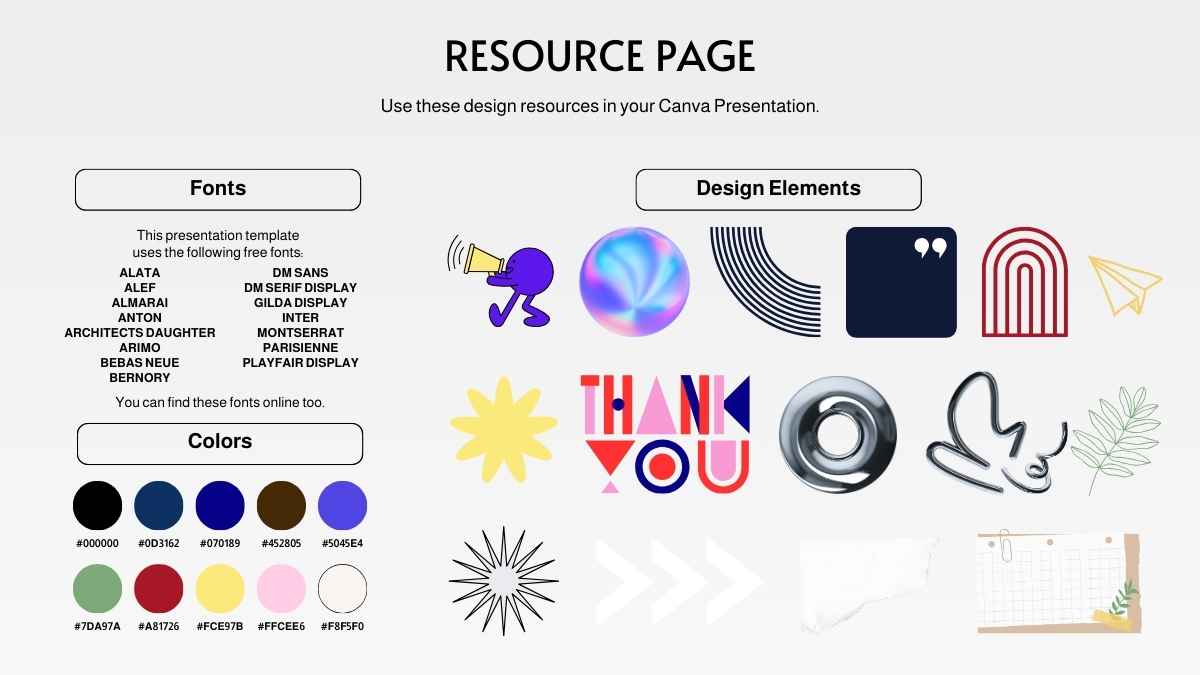
Templates using the font Inter















 14
14





















































Best font pairs for Inter
Inter pairs well with Roboto for interfaces, Playfair Display for editorial contrast, and Lora for warm reading.
MODERN & MINIMAL
Inter + Roboto
Clean, modern headings
Inter and Roboto are both screen-native UI sans-serifs; Inter's taller x-height and wider apertures give the headings a touch more clarity, while Roboto's familiar body reads cleanly. A natural pairing for apps and dashboards.
EDITORIAL CONTRAST
Playfair Display + Inter
An elegant editorial look
Playfair Display's elegant, high-contrast serif headlines contrast sharply with Inter's plain, screen-tuned body. Headlines in Playfair Display, body in Inter, good for portfolios, blogs, and editorial sites.
MODERN & WARM
Inter + Lora
Modern headings, classic reading
Inter's clean, neutral headings set up Lora, a contemporary serif with gentle stroke modulation built for comfortable on-screen reading. Inter heads, Lora carries the paragraphs, on articles and blogs.
Alternatives to Inter
If you need an alternative to Inter, screen-first sans-serifs like Roboto, Work Sans, and Manrope work well for interfaces and body text.
Roboto
This is a Roboto headline
And this is body text in Roboto. It's worth considering as an alternative to Inter.
View moreWork Sans
This is a Work Sans headline
And this is body text in Work Sans. It's worth considering as an alternative to Inter.
View moreManrope
This is a Manrope headline
And this is body text in Manrope. It's worth considering as an alternative to Inter.
View morePlus Jakarta Sans
This is a Plus Jakarta Sans headline
And this is body text in Plus Jakarta Sans. It's worth considering as an alternative to Inter.
View moreHanken Grotesk
This is a Hanken Grotesk headline
And this is body text in Hanken Grotesk. It's worth considering as an alternative to Inter.
View moreDM Sans
This is a DM Sans headline
And this is body text in DM Sans. It's worth considering as an alternative to Inter.
View moreSource Sans 3
This is a Source Sans 3 headline
And this is body text in Source Sans 3. It's worth considering as an alternative to Inter.
View moreFrequently asked questions about Inter
Is Inter free to use?

What kind of font is Inter?
What font pairs well with Inter?
Is Inter good for small text and interfaces?
What fonts are similar to Inter?