
Search


- English
Trends
HIGH-LEGIBILITY SANS-SERIF FONT
Atkinson Hyperlegible
Atkinson Hyperlegible is a free sans-serif from Google Fonts, designed by the Braille Institute to maximize legibility for low-vision readers. Its distinct letterforms suit body text, UI, and accessibility-focused design.
A peek at Atkinson Hyperlegible
Specimen
Atkinson Hyperlegible was developed by the Braille Institute to help readers with low vision. It exaggerates the differences between easily confused characters, like the capital I and lowercase l, so they stay distinct. The result is a clear, practical sans for accessible interfaces and text.
Body Text / 18pt Regular
Atkinson Hyperlegible Font Details
Aa
Bold
Aa
Regular
Aa
Light
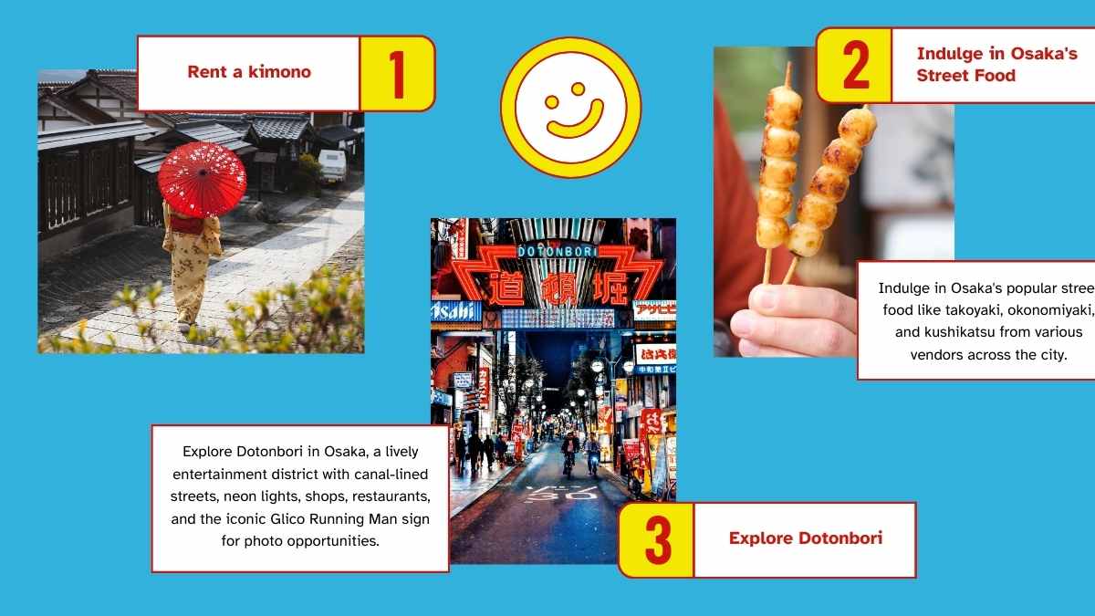
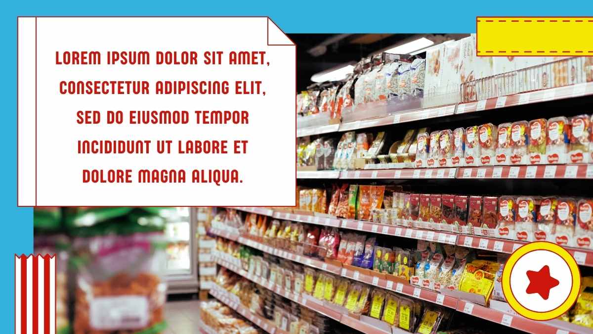
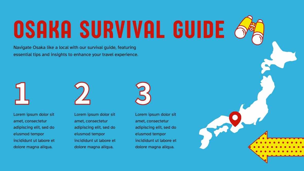
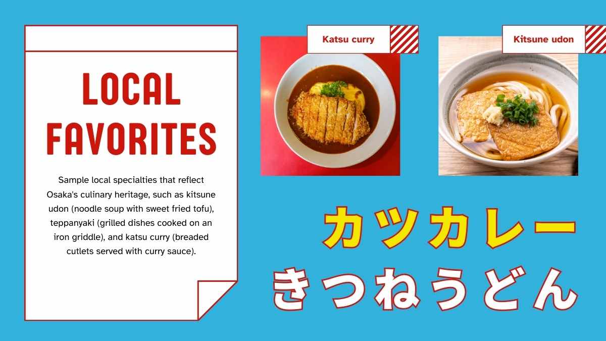
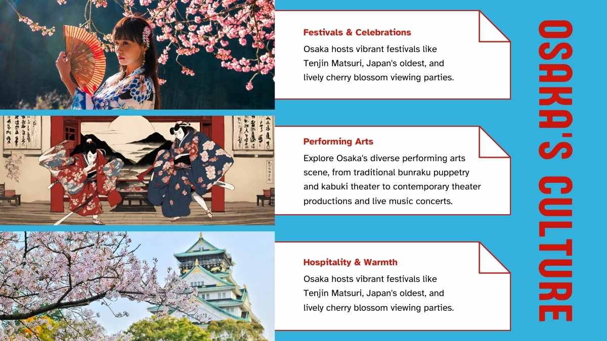
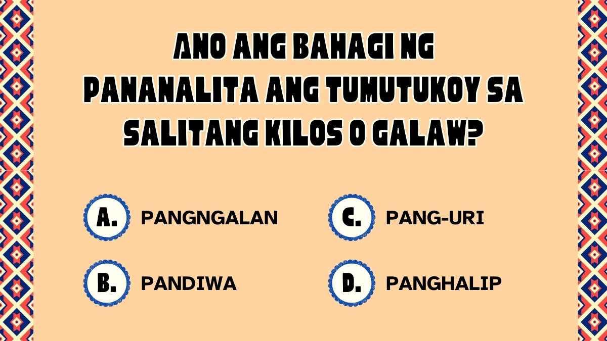
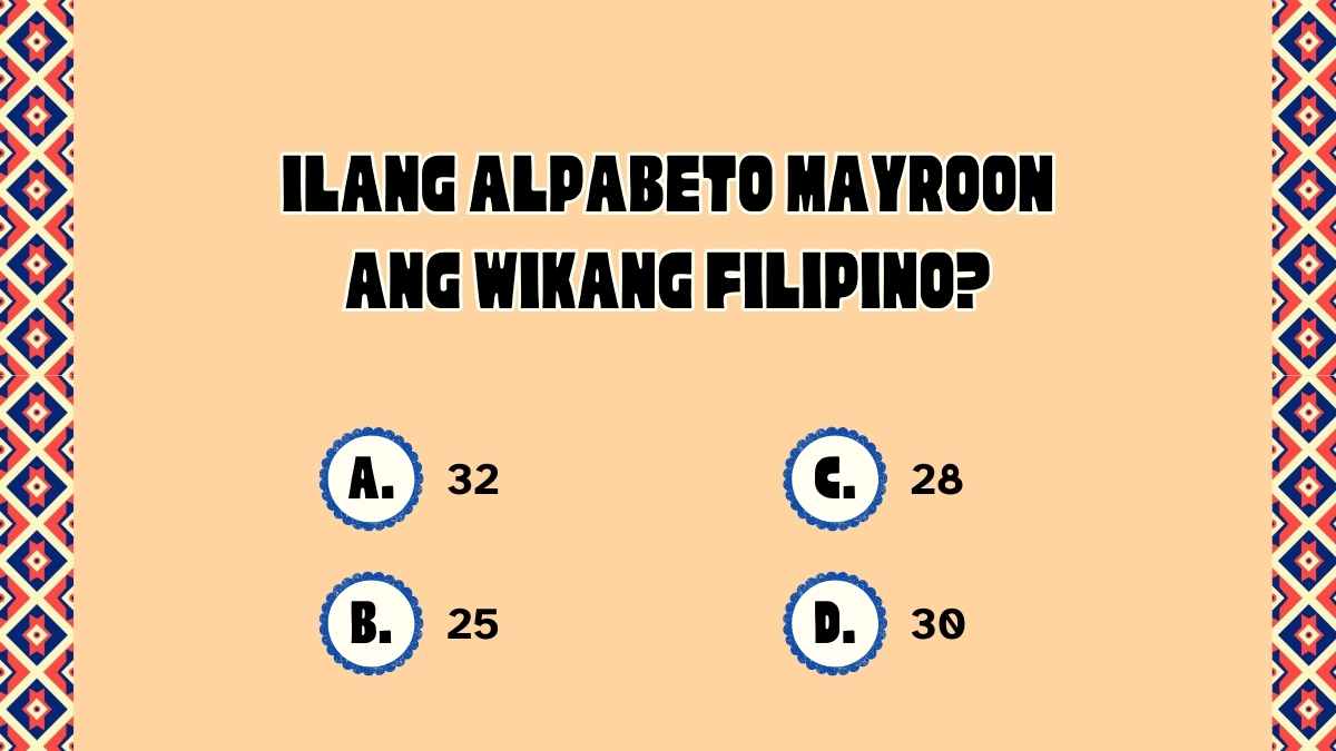
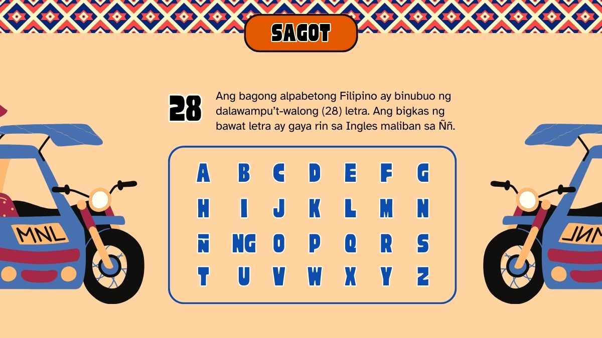
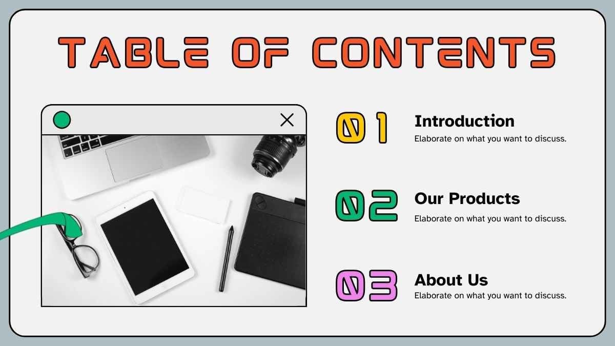
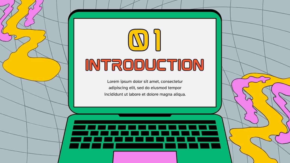
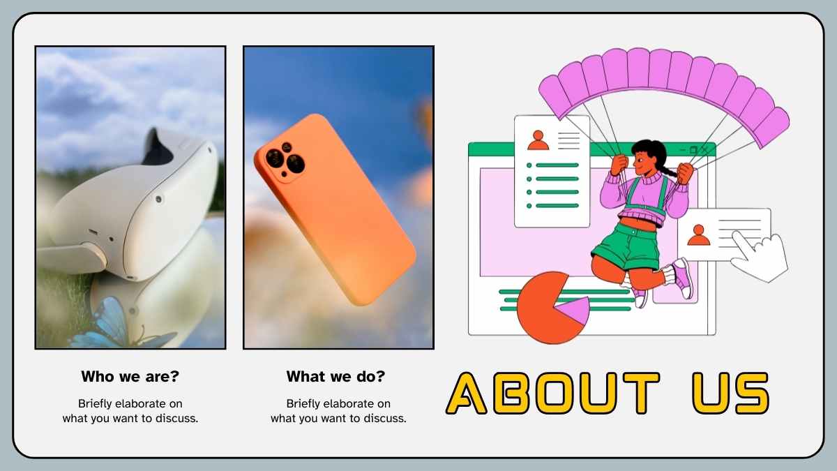
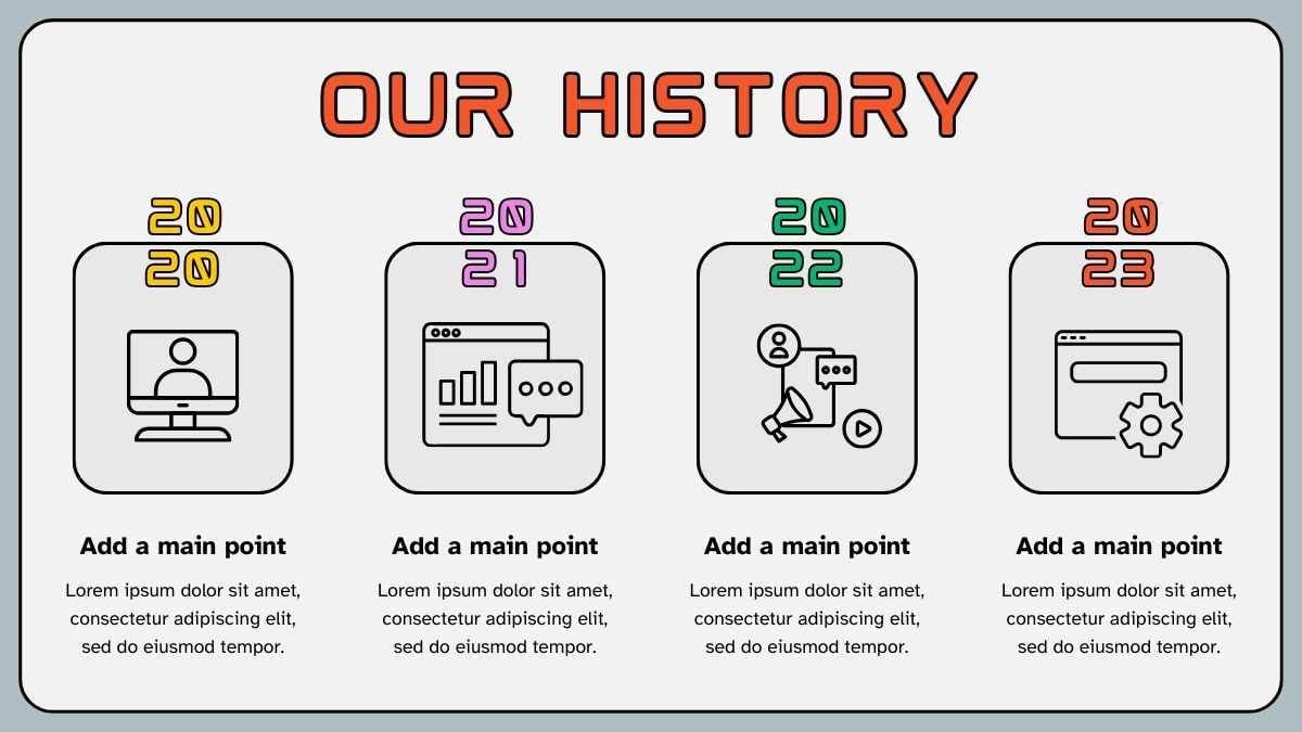
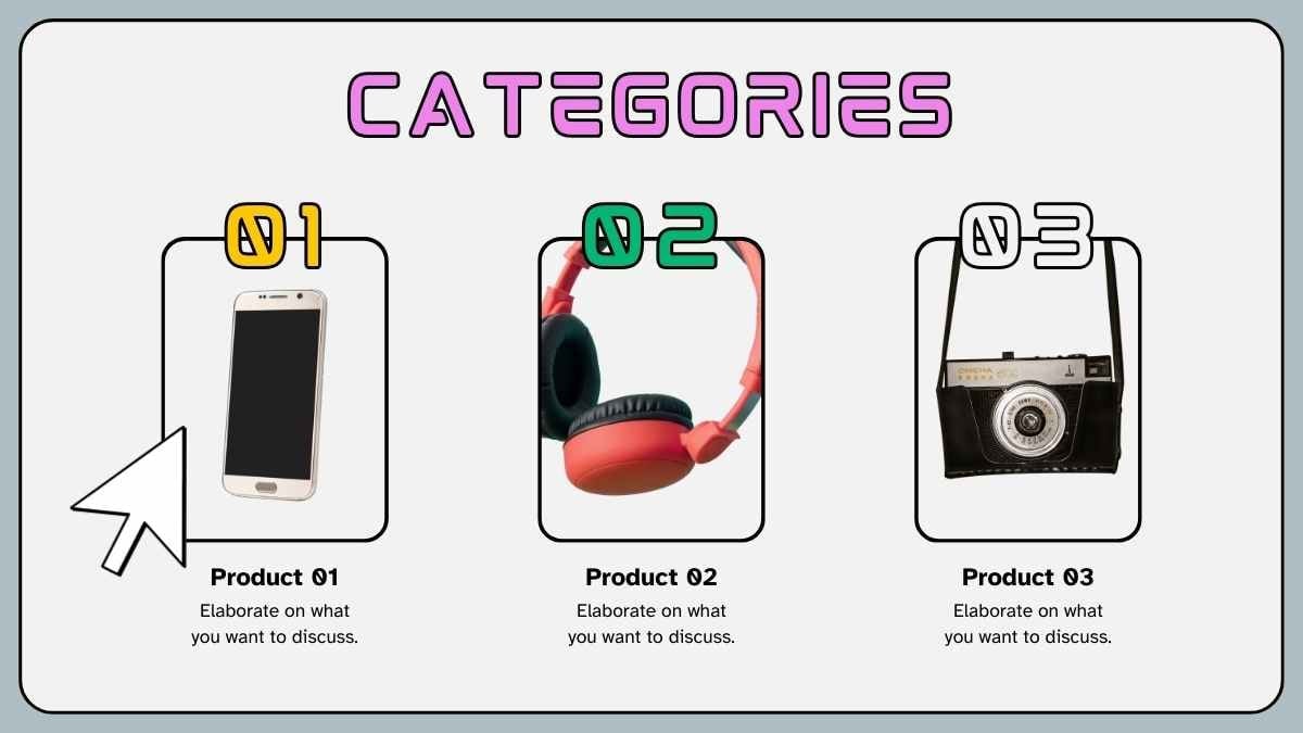
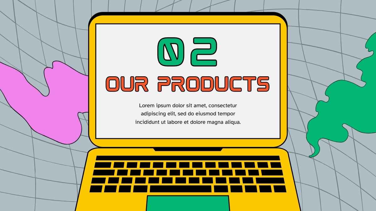
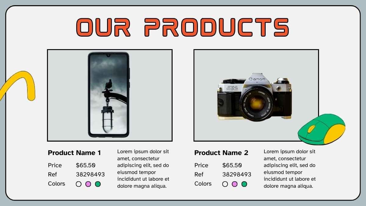
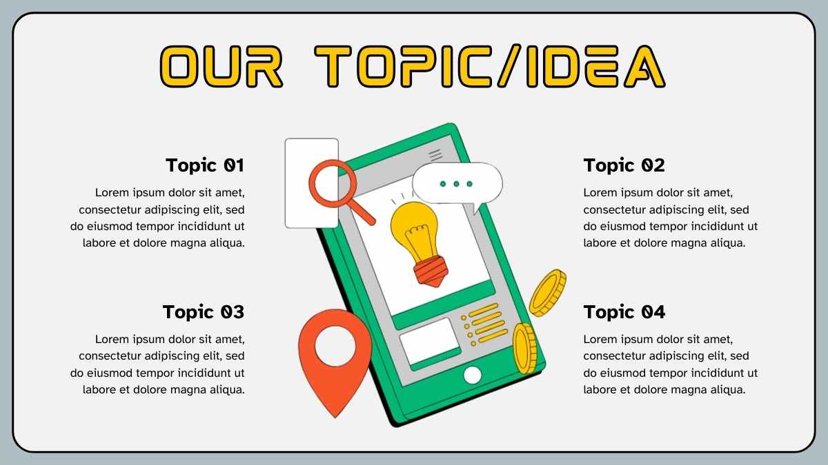
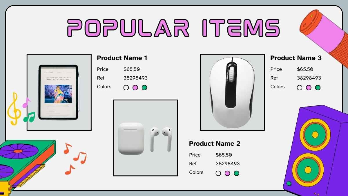
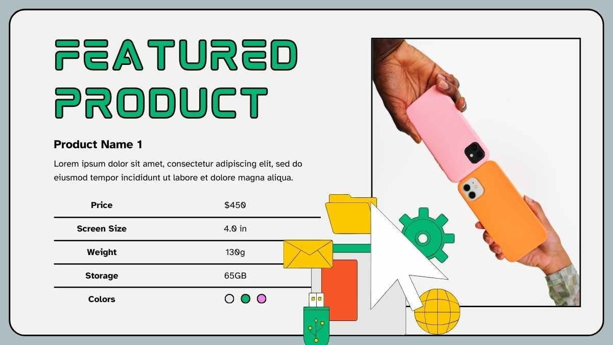
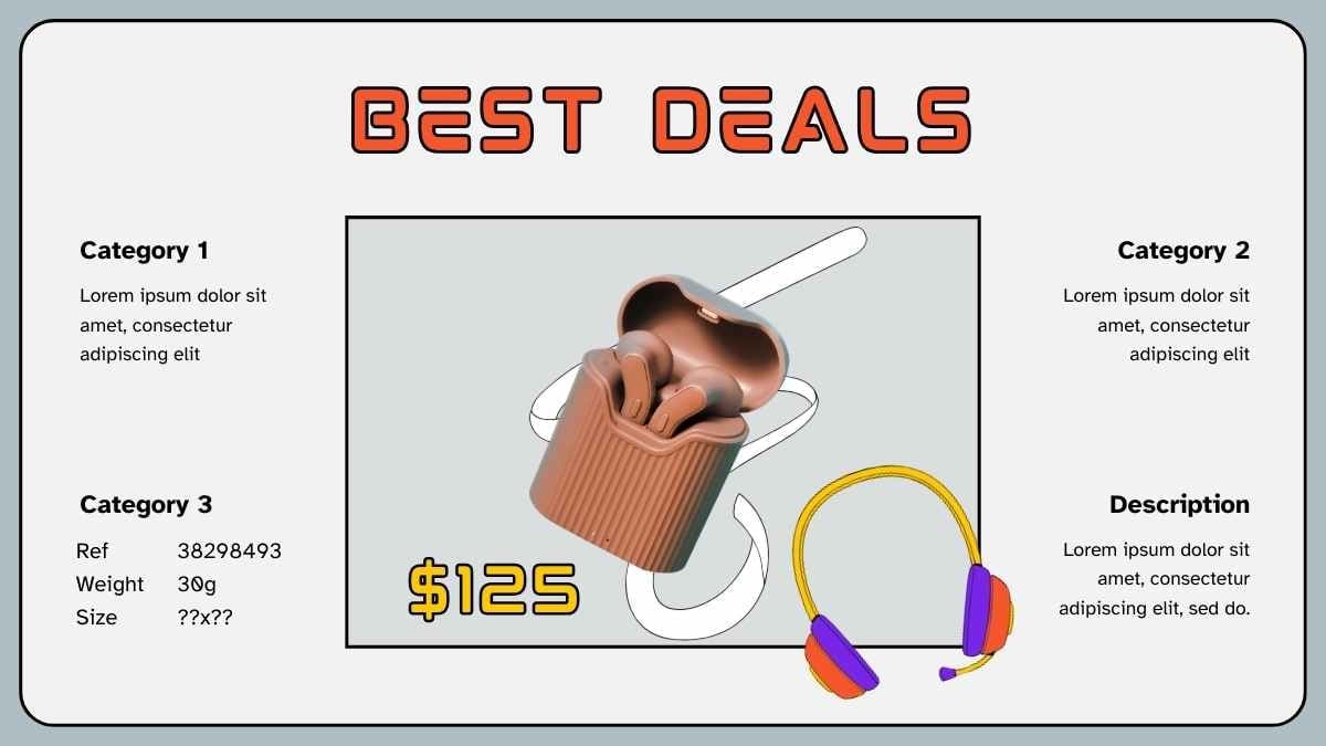
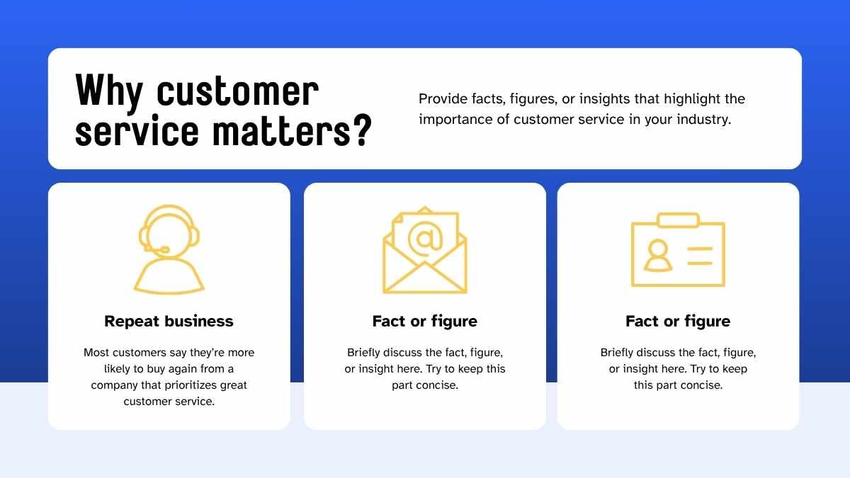
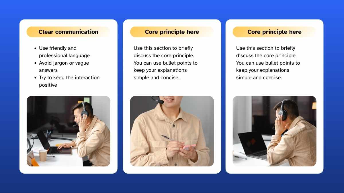
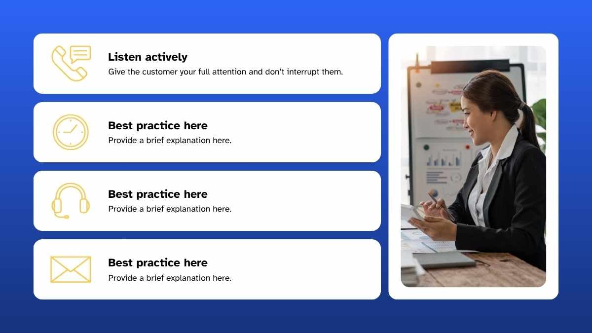
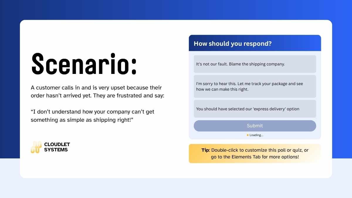
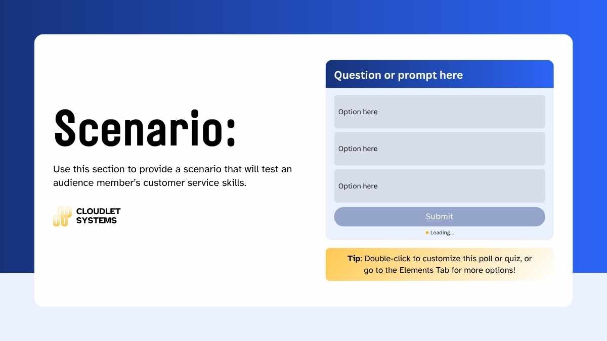
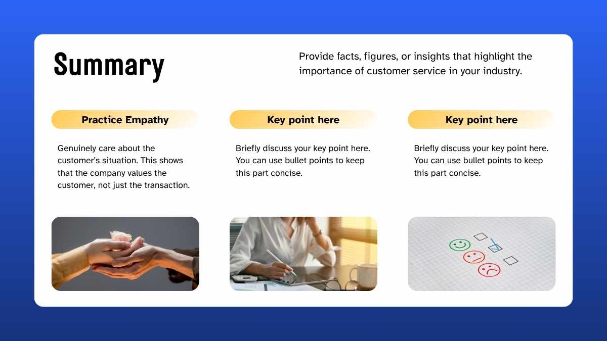
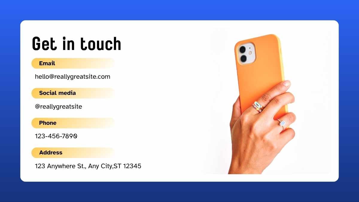
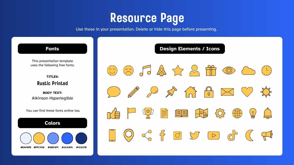
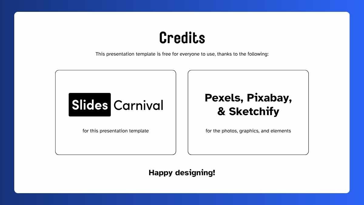
Templates using the font Atkinson Hyperlegible
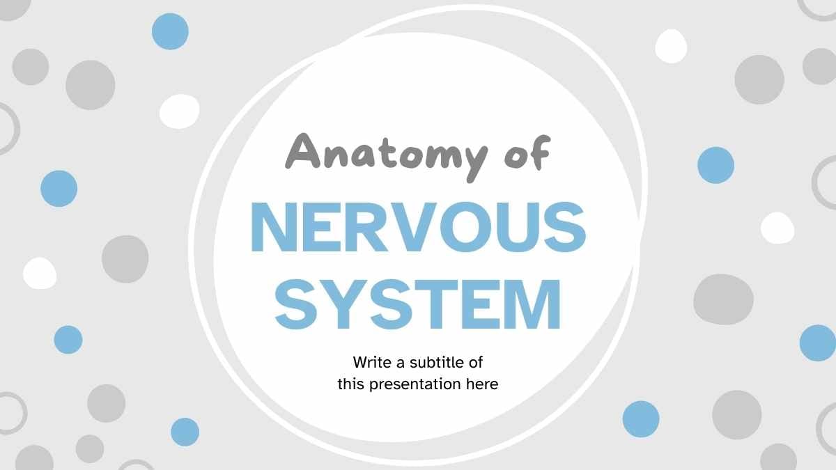
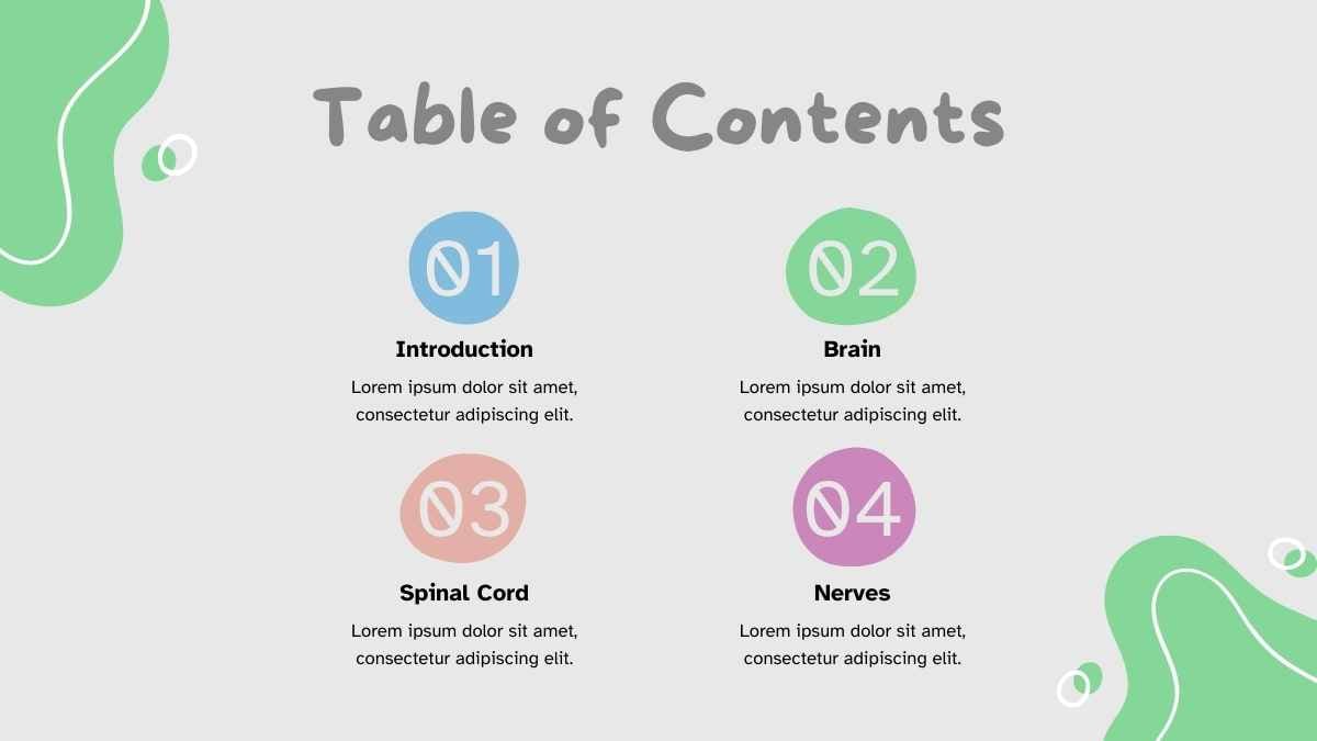

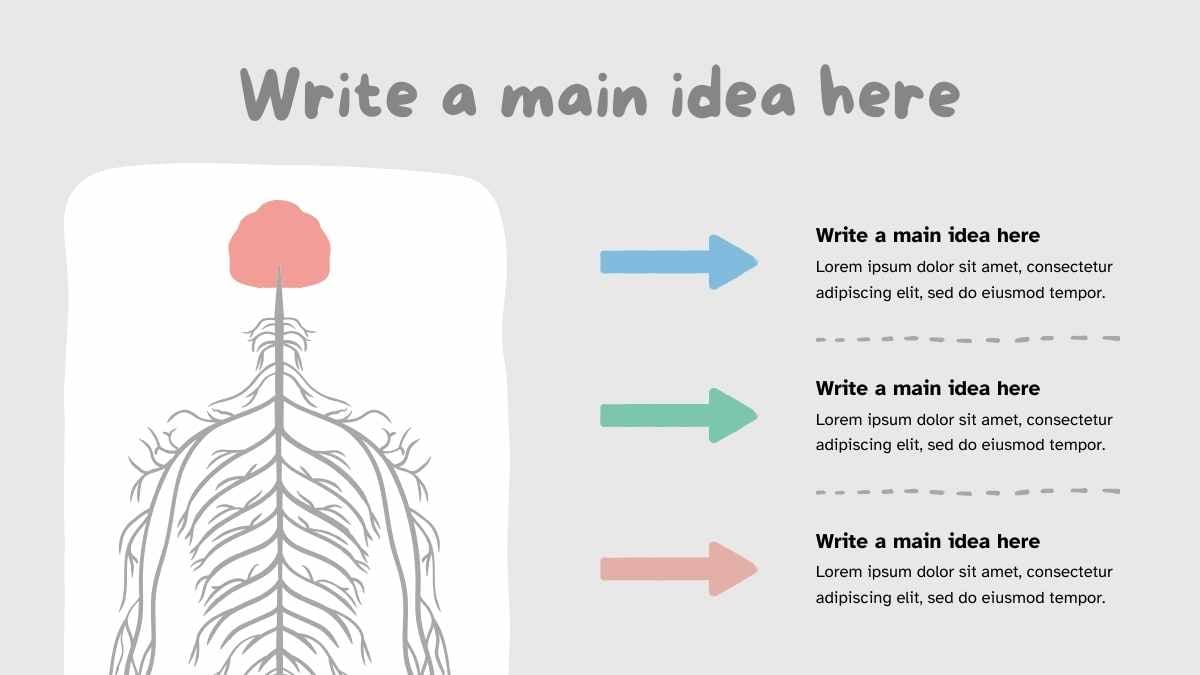
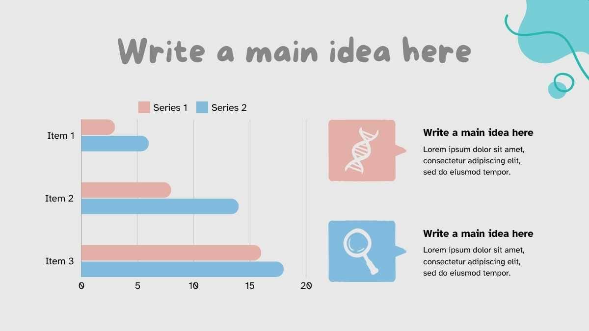

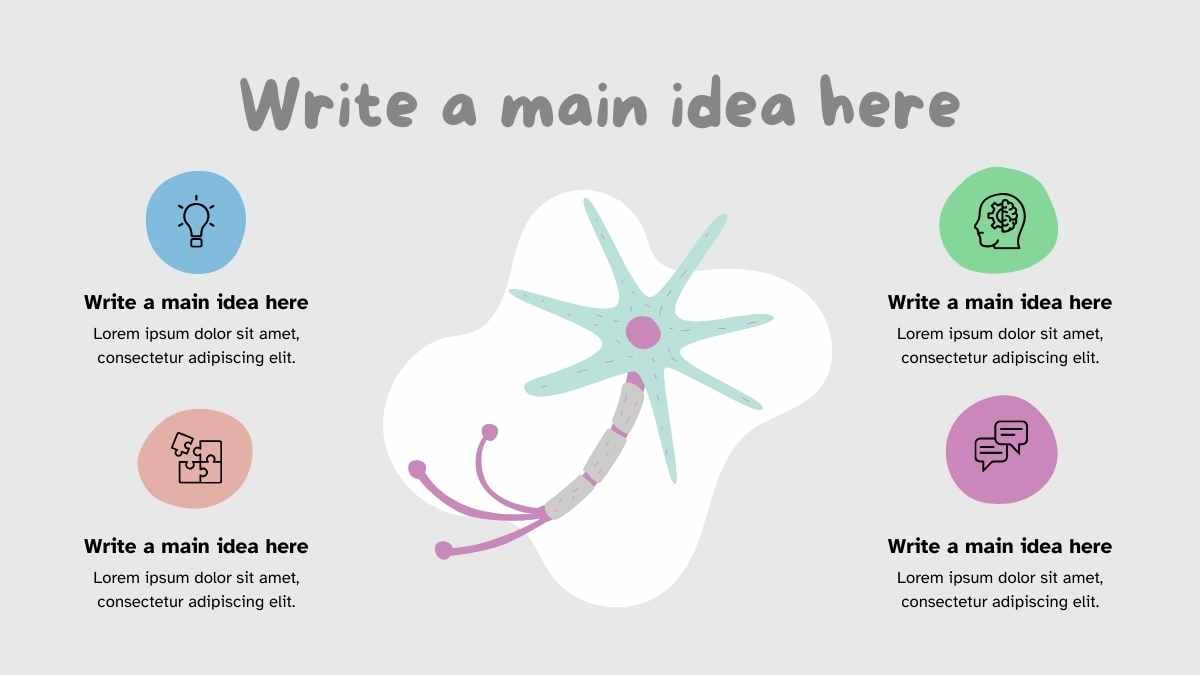


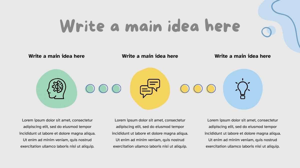
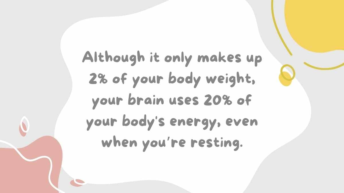
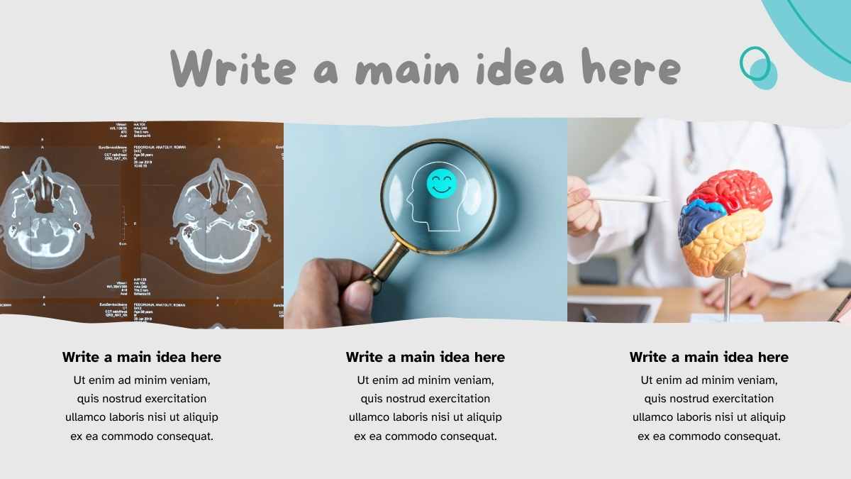

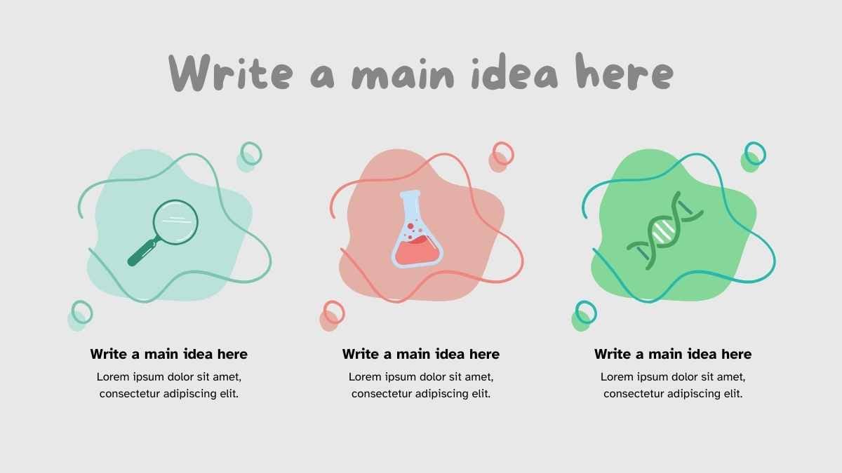



 15
15


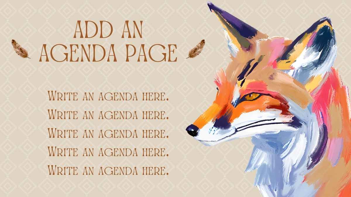

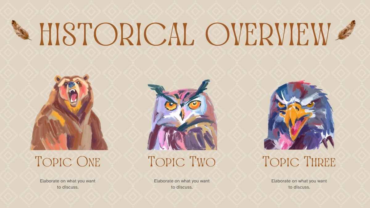

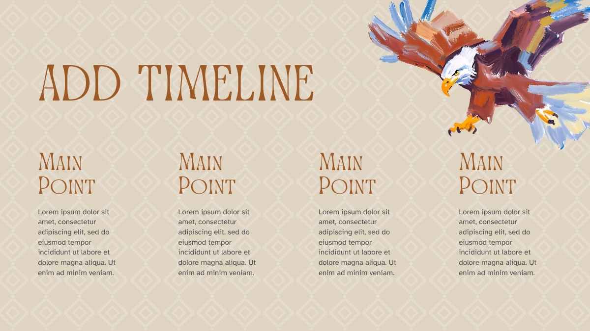











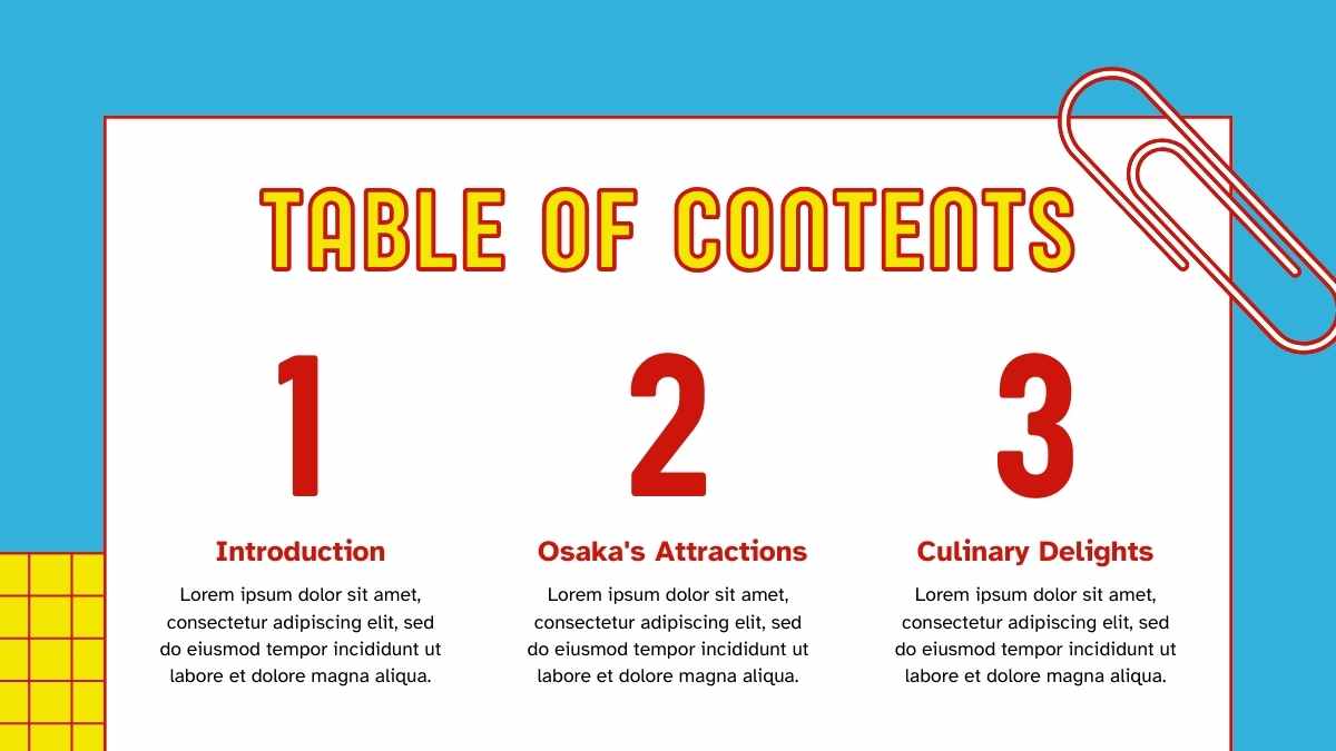


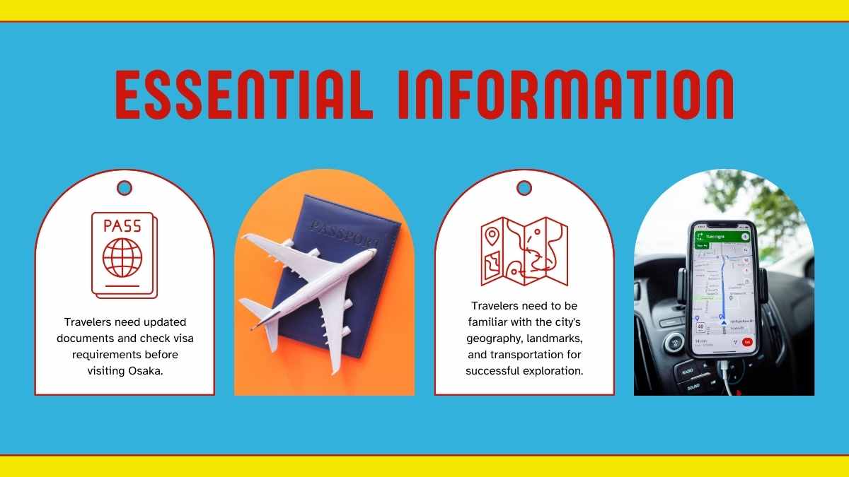
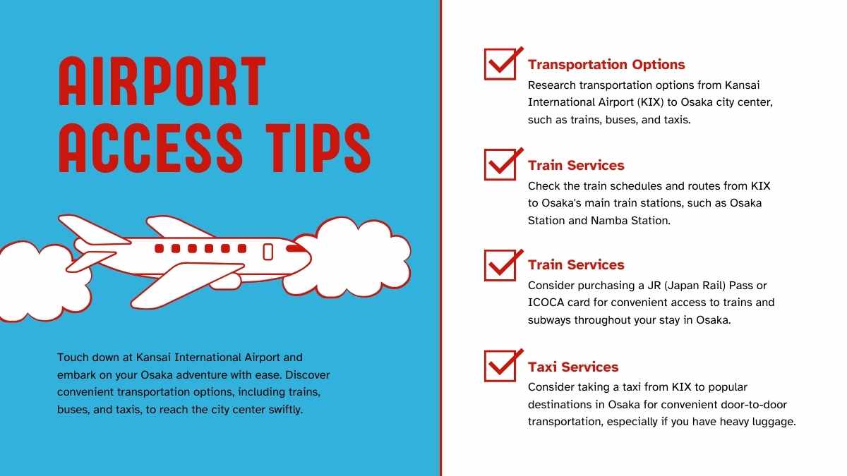












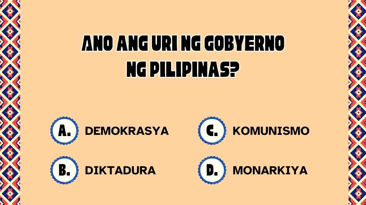
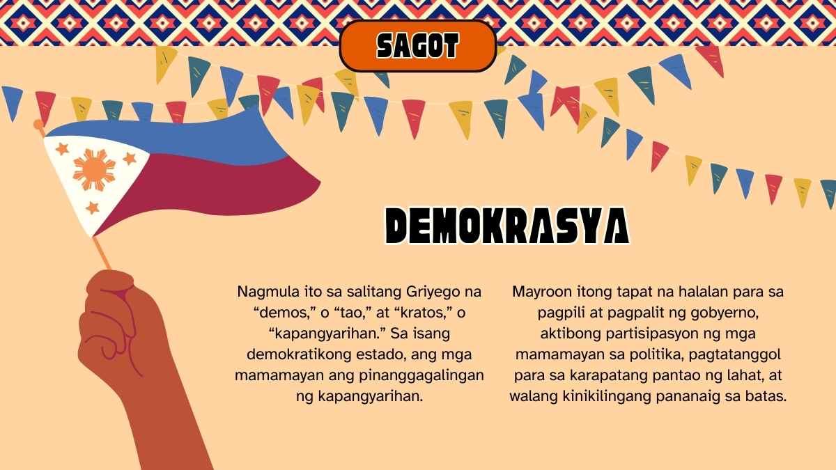
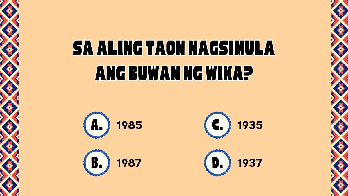















Best font pairs for Atkinson Hyperlegible
Atkinson Hyperlegible pairs well with Roboto for interfaces, Merriweather for easy reading, and Playfair Display for editorial contrast.
CLEAR & ACCESSIBLE
Atkinson Hyperlegible + Roboto
A clear, accessible headline
Atkinson Hyperlegible was designed by the Braille Institute to maximize legibility for low-vision readers, with letterforms that resist confusion; pair its clear headings with Roboto's familiar body. A practical pairing for accessible interfaces.
READABLE & WARM
Atkinson Hyperlegible + Merriweather
Clear headings, easy reading
Atkinson Hyperlegible keeps headings exceptionally clear, distinguishing similar characters, while Merriweather's sturdy serif handles long body reading. A dependable pairing for accessible articles and documentation.
EDITORIAL CONTRAST
Playfair Display + Atkinson Hyperlegible
An elegant, readable look
Playfair Display's decorative, high-contrast serif headlines sit over Atkinson Hyperlegible's clarity-first body for striking yet readable layouts. Playfair Display up top, Atkinson Hyperlegible for the body on editorial and accessible sites.
Alternatives to Atkinson Hyperlegible
If you need an alternative to Atkinson Hyperlegible, clear, legible sans-serifs like Inter, Public Sans, and Lexend work well for accessible text.
Inter
This is a Inter headline
And this is body text in Inter. It's worth considering as an alternative to Atkinson Hyperlegible.
View morePublic Sans
This is a Public Sans headline
And this is body text in Public Sans. It's worth considering as an alternative to Atkinson Hyperlegible.
View moreLexend
This is a Lexend headline
And this is body text in Lexend. It's worth considering as an alternative to Atkinson Hyperlegible.
View moreRoboto
This is a Roboto headline
And this is body text in Roboto. It's worth considering as an alternative to Atkinson Hyperlegible.
View moreOpen Sans
This is a Open Sans headline
And this is body text in Open Sans. It's worth considering as an alternative to Atkinson Hyperlegible.
View moreSource Sans 3
This is a Source Sans 3 headline
And this is body text in Source Sans 3. It's worth considering as an alternative to Atkinson Hyperlegible.
View moreNoto Sans
This is a Noto Sans headline
And this is body text in Noto Sans. It's worth considering as an alternative to Atkinson Hyperlegible.
View moreFrequently asked questions about Atkinson Hyperlegible
Is Atkinson Hyperlegible free to use?

What kind of font is Atkinson Hyperlegible?
What font pairs well with Atkinson Hyperlegible?
What makes Atkinson Hyperlegible different?
What fonts are similar to Atkinson Hyperlegible?