
Search


- English
Trends
GEOMETRIC SANS-SERIF FONT
Poppins
Poppins is a free geometric sans-serif from Google Fonts, built almost entirely from circles. Its even, architectural forms read cleanly from big headings down to small interface text.
Poppins at a glance
Specimen
Most sans-serifs are drawn for a single alphabet. Poppins was built to carry two at once, Latin and Devanagari, with letterforms based on near-perfect circles. That geometric discipline gives it an even, almost architectural rhythm that holds up whether it's setting a headline or a caption.
Body Text / 18pt Regular
Poppins Font Details
Aa
Light
Aa
Regular
Aa
Medium
Aa
SemiBold
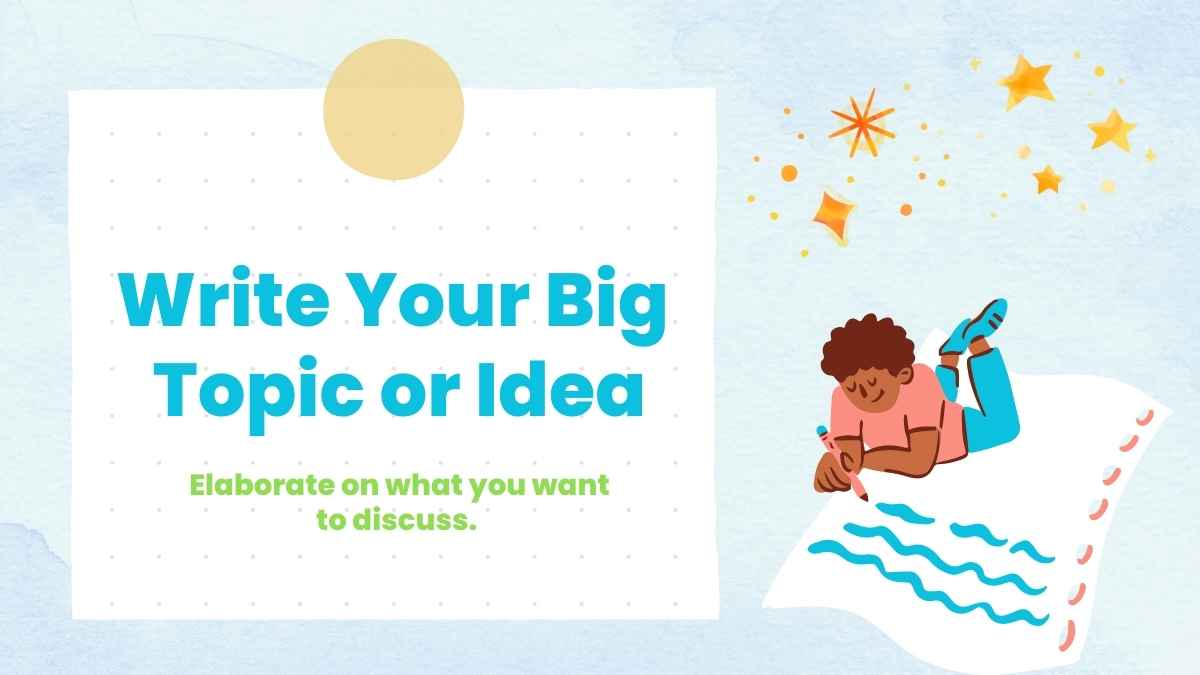
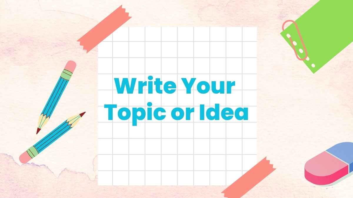
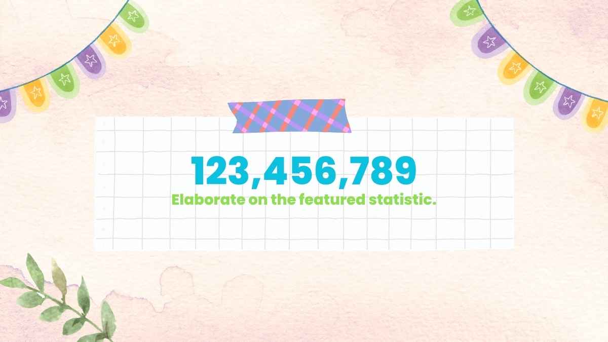
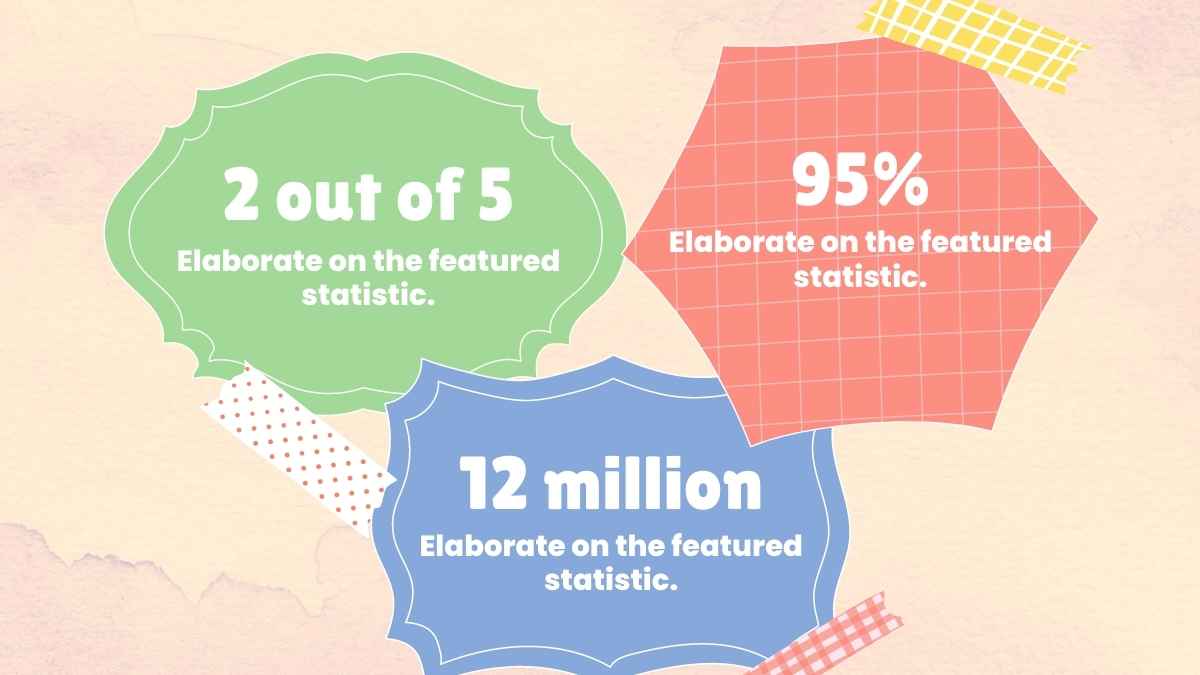
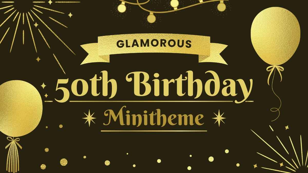
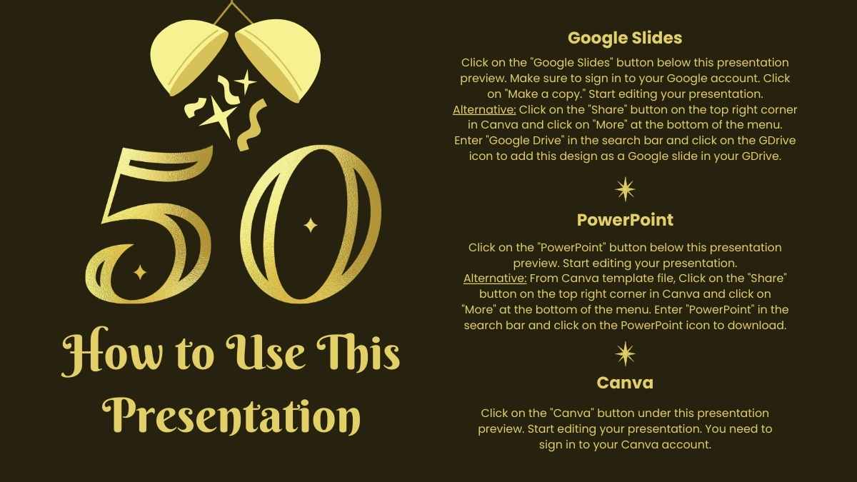
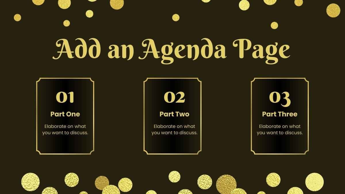
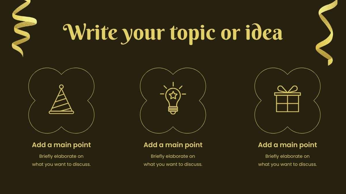
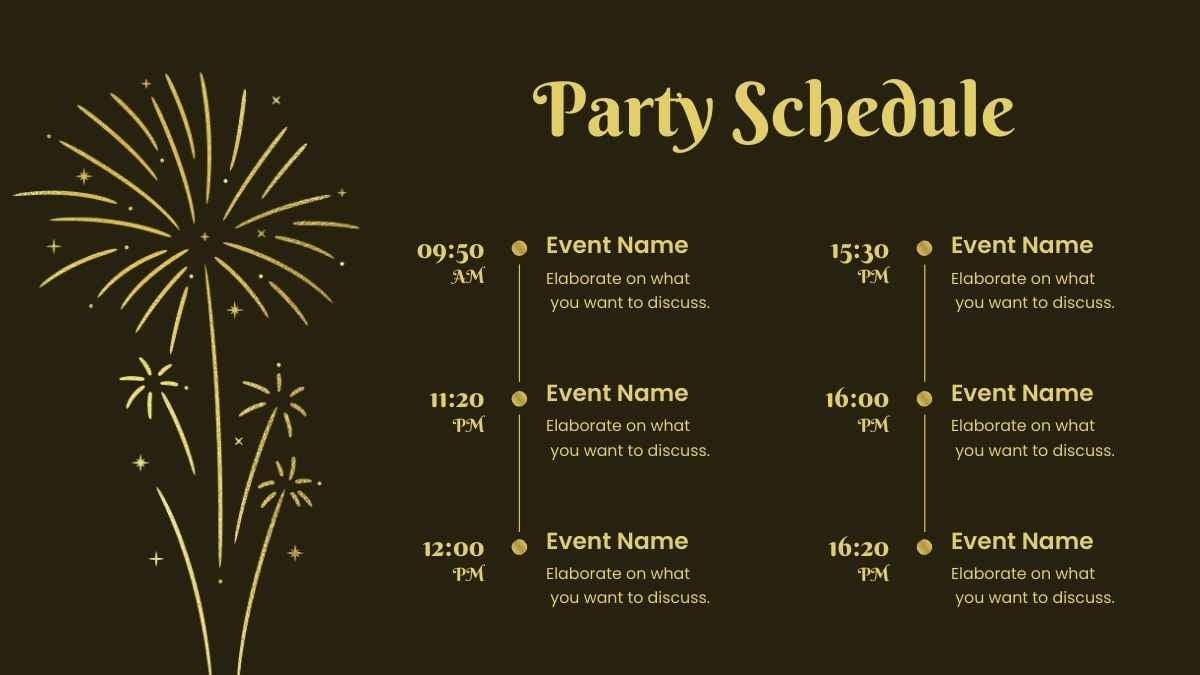
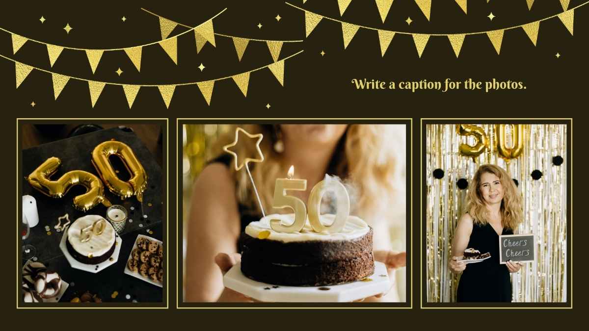
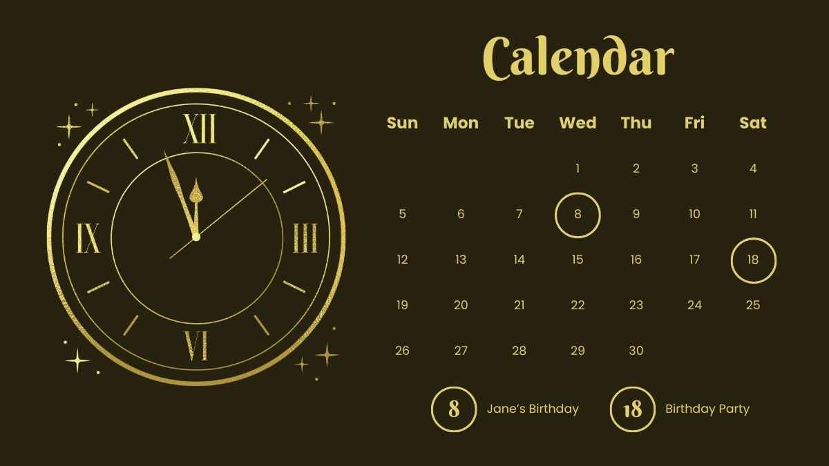
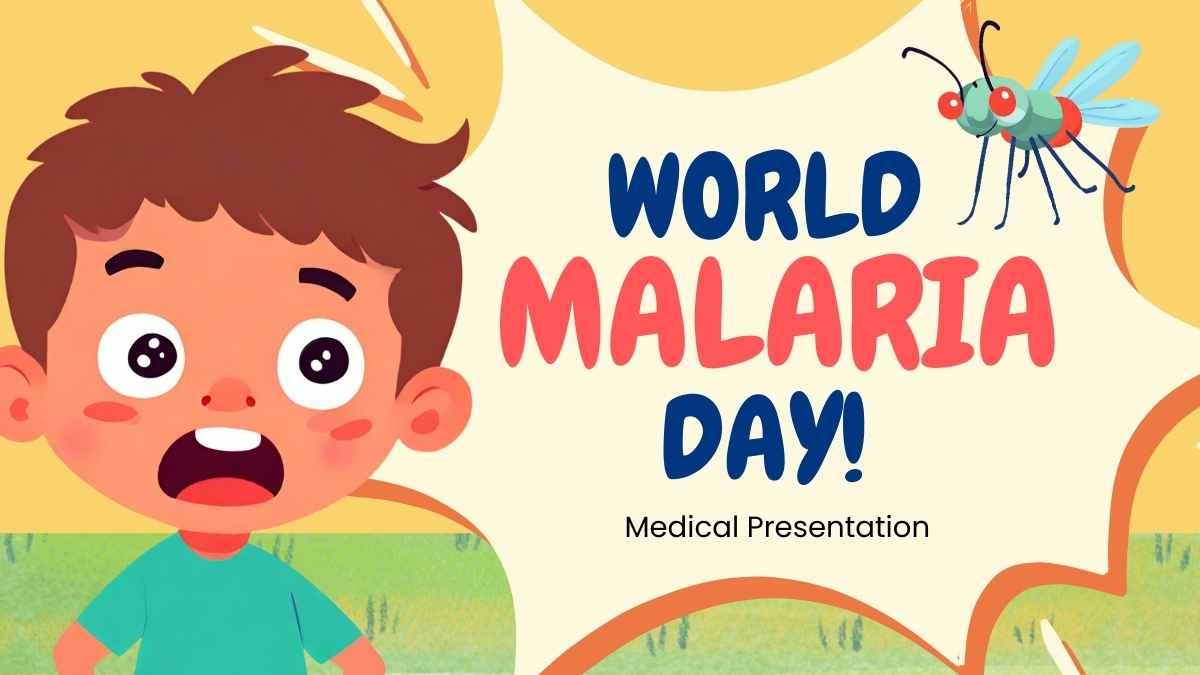
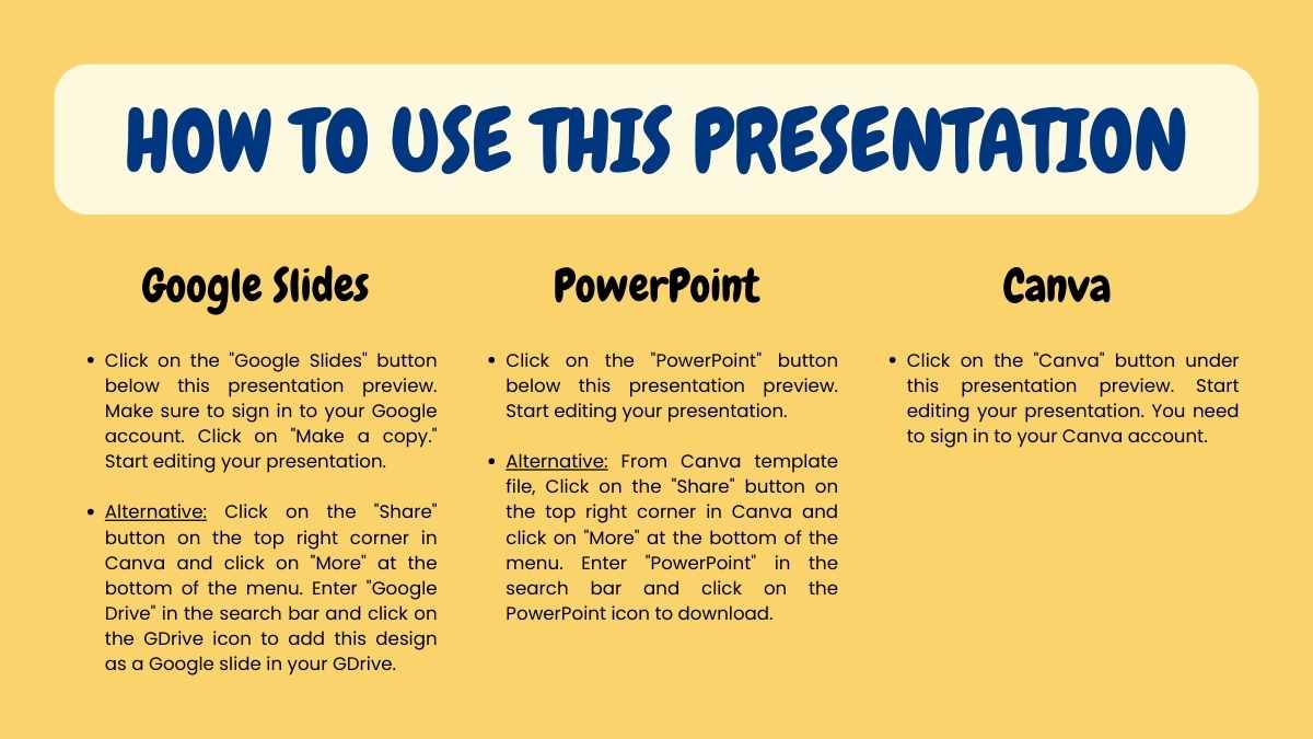
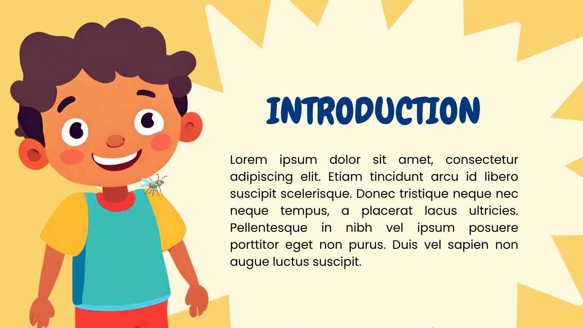
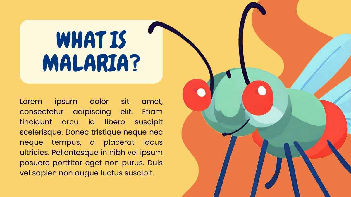
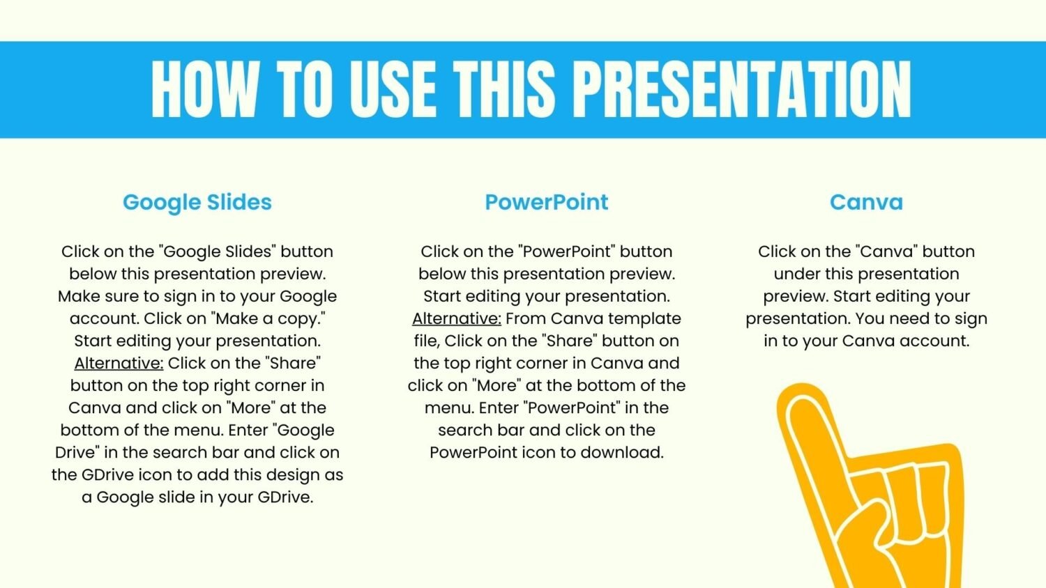
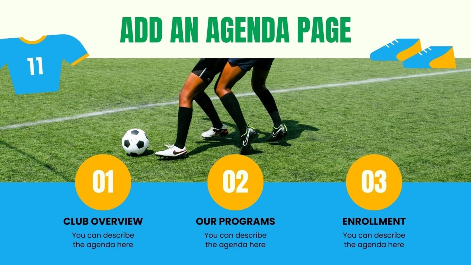
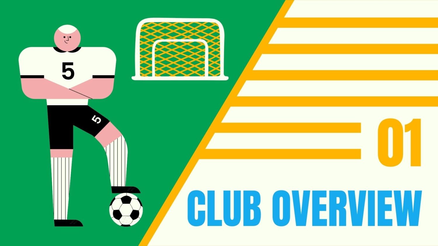
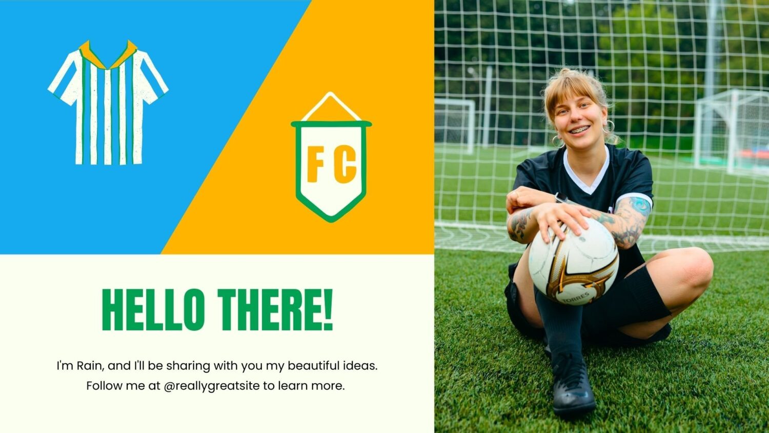
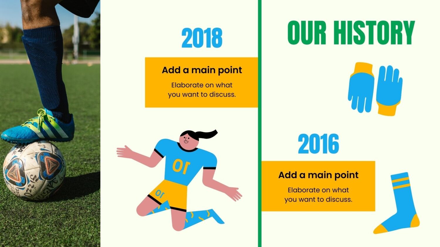
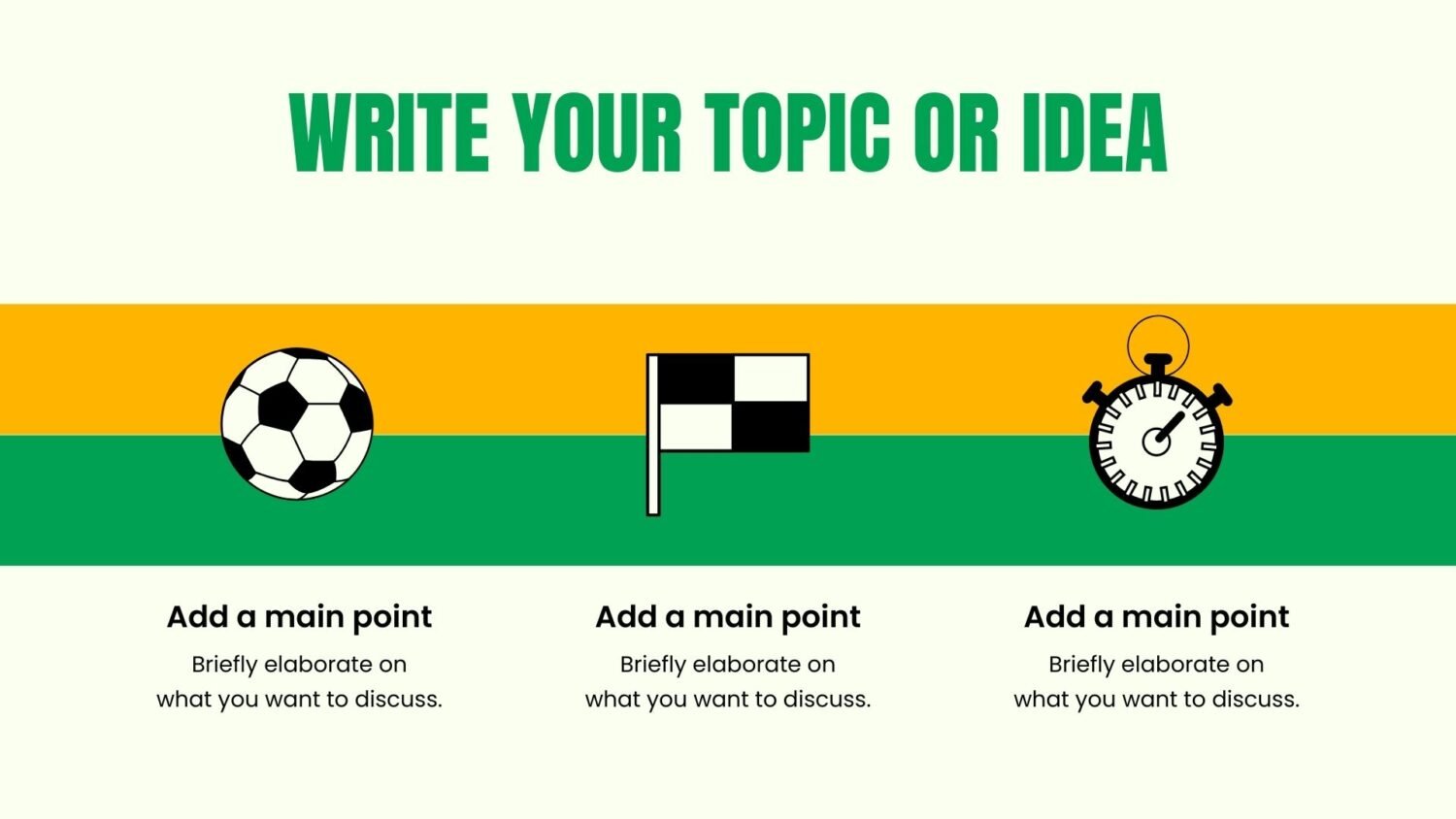
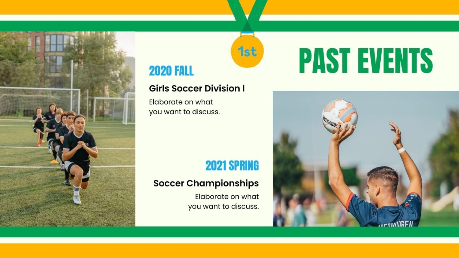
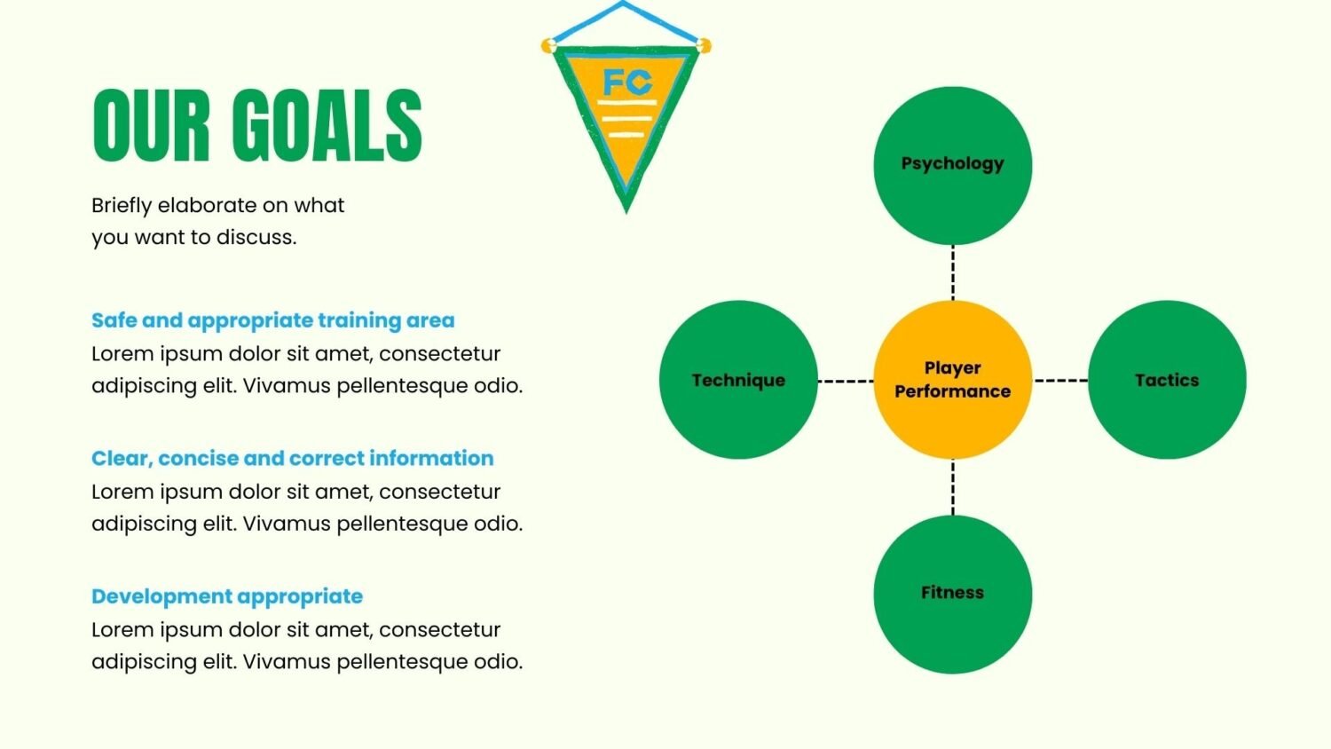
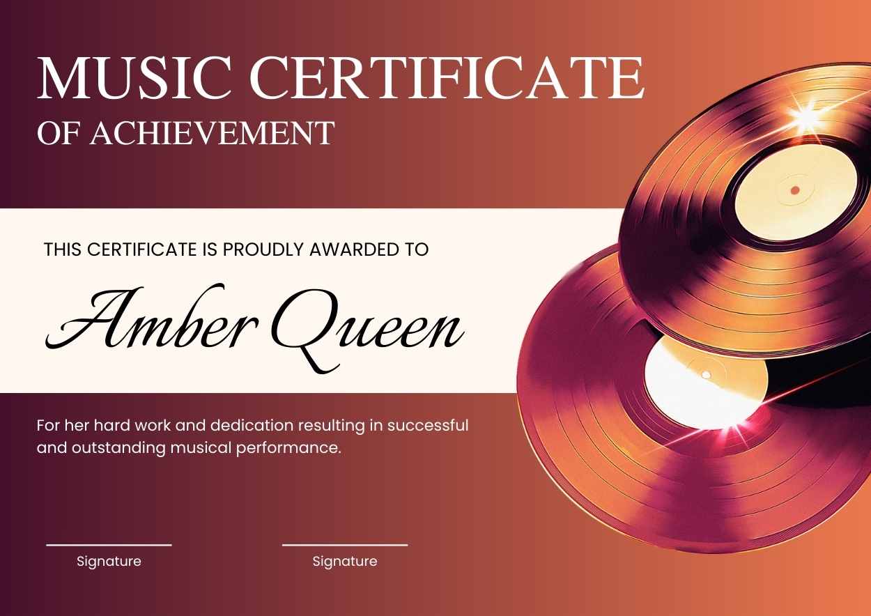
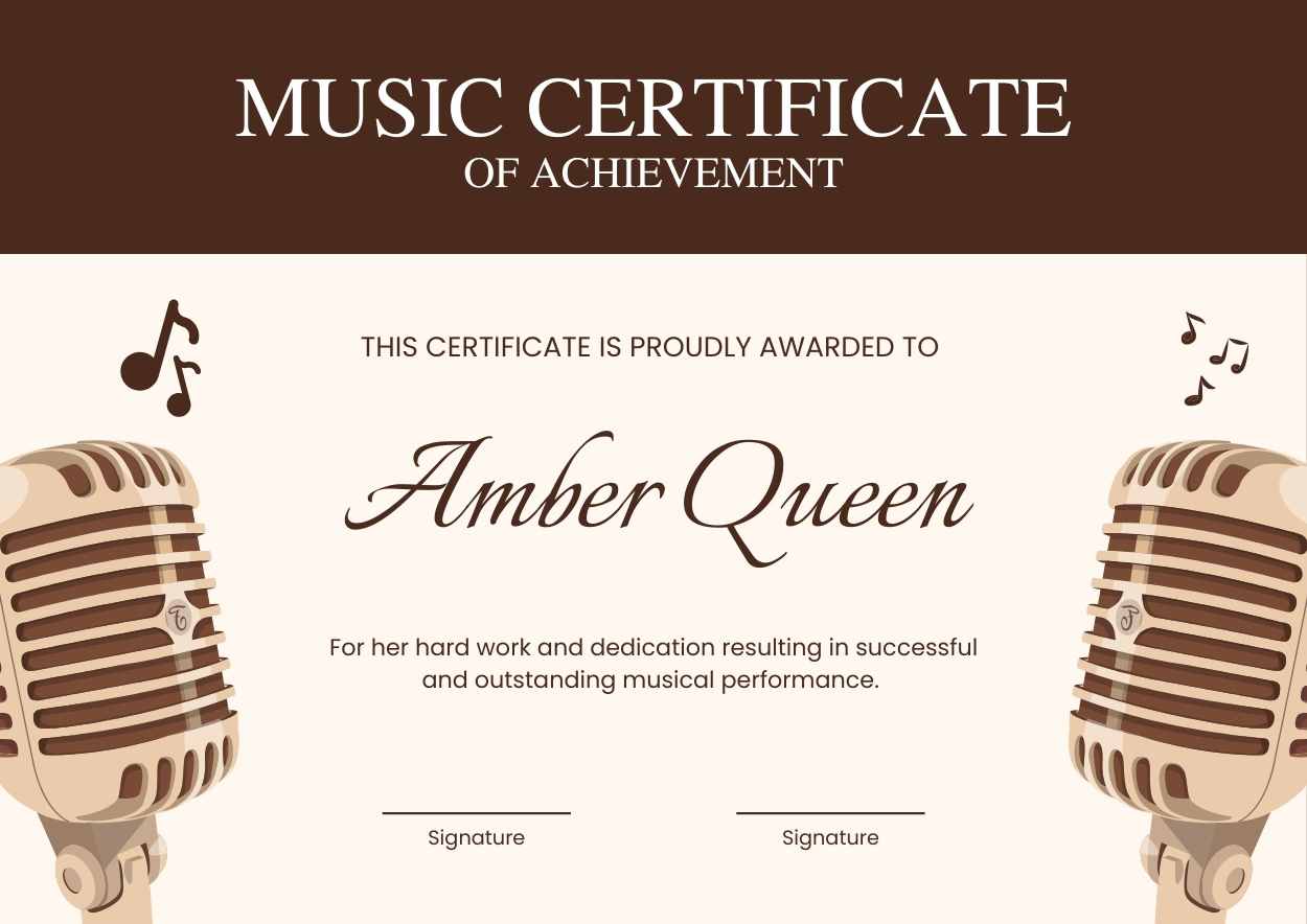
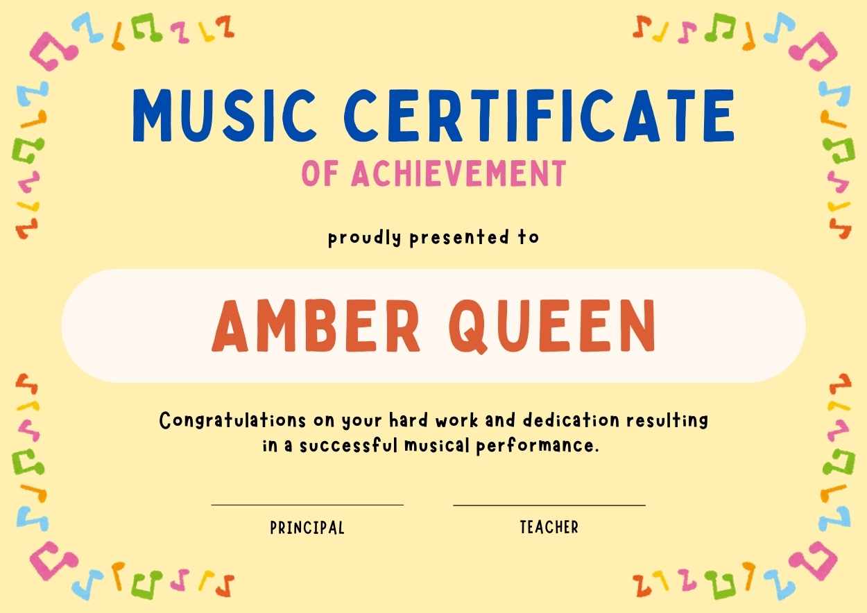
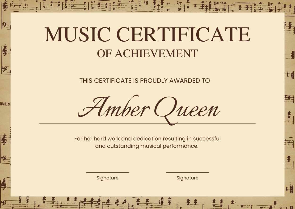
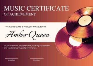
Templates using the font Poppins
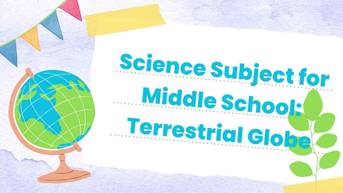

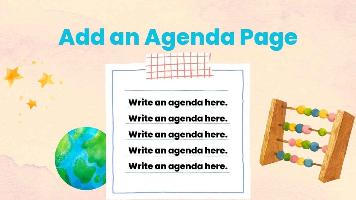
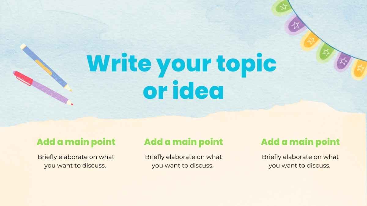

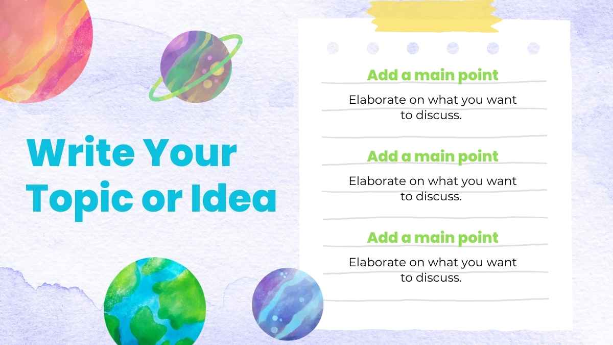

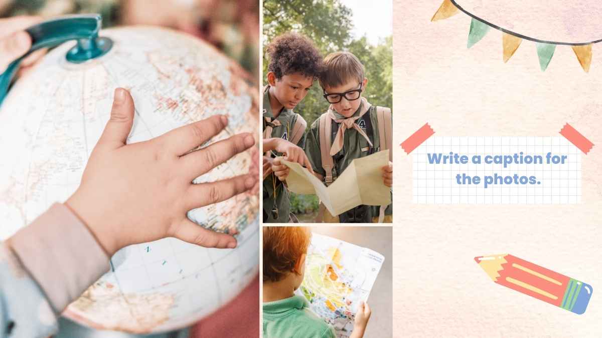
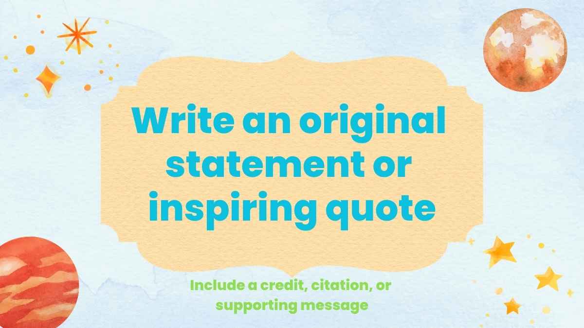
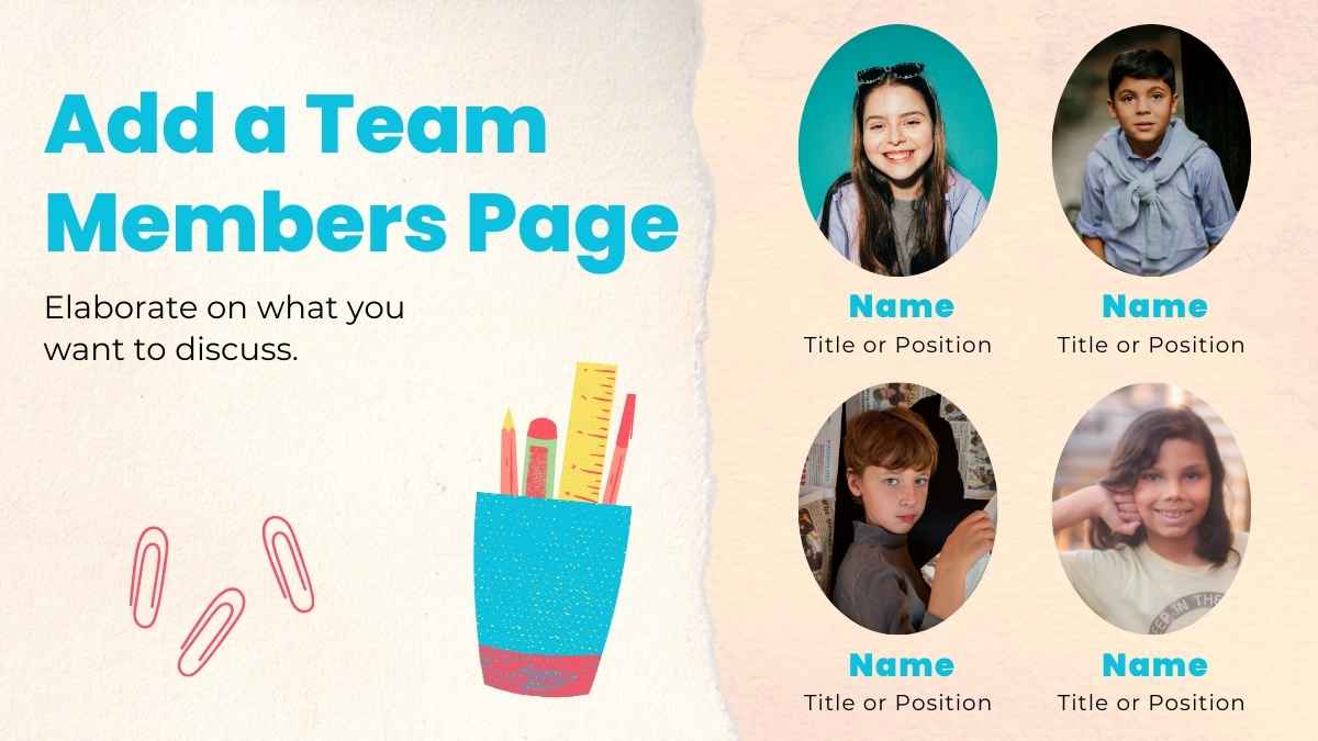
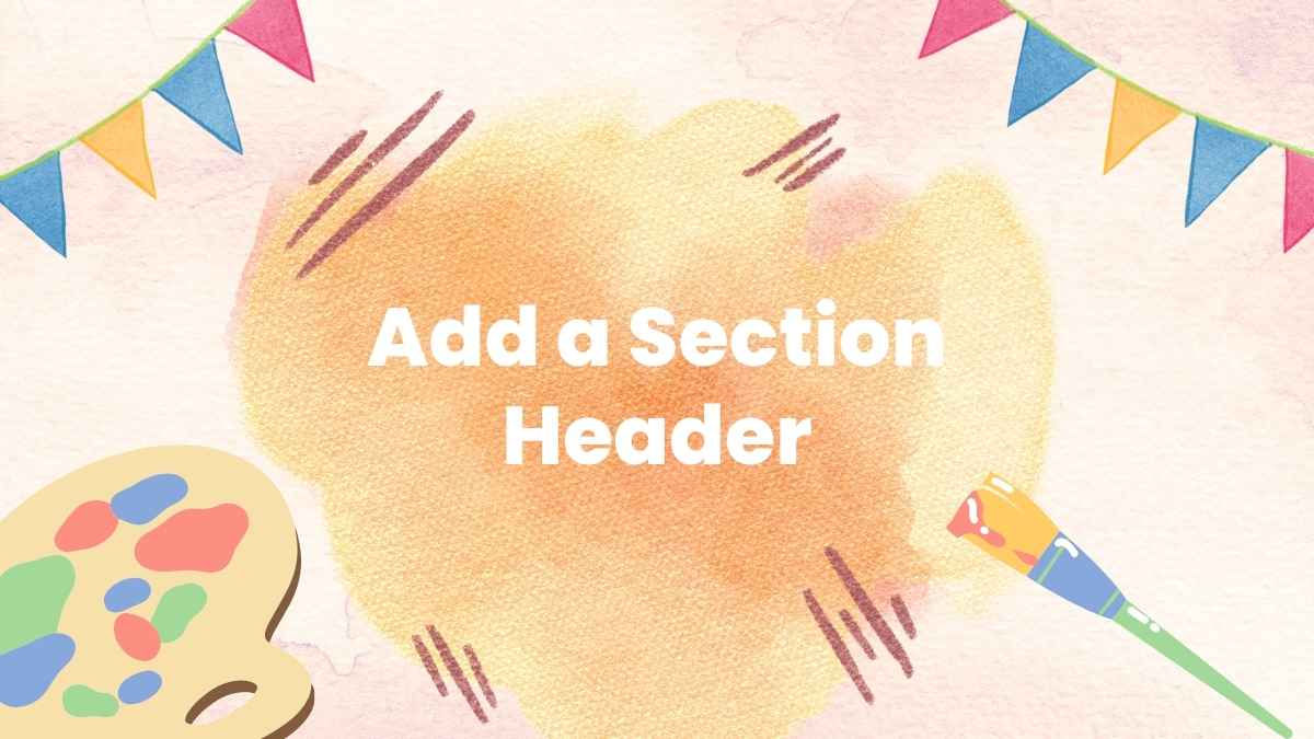



 15
15



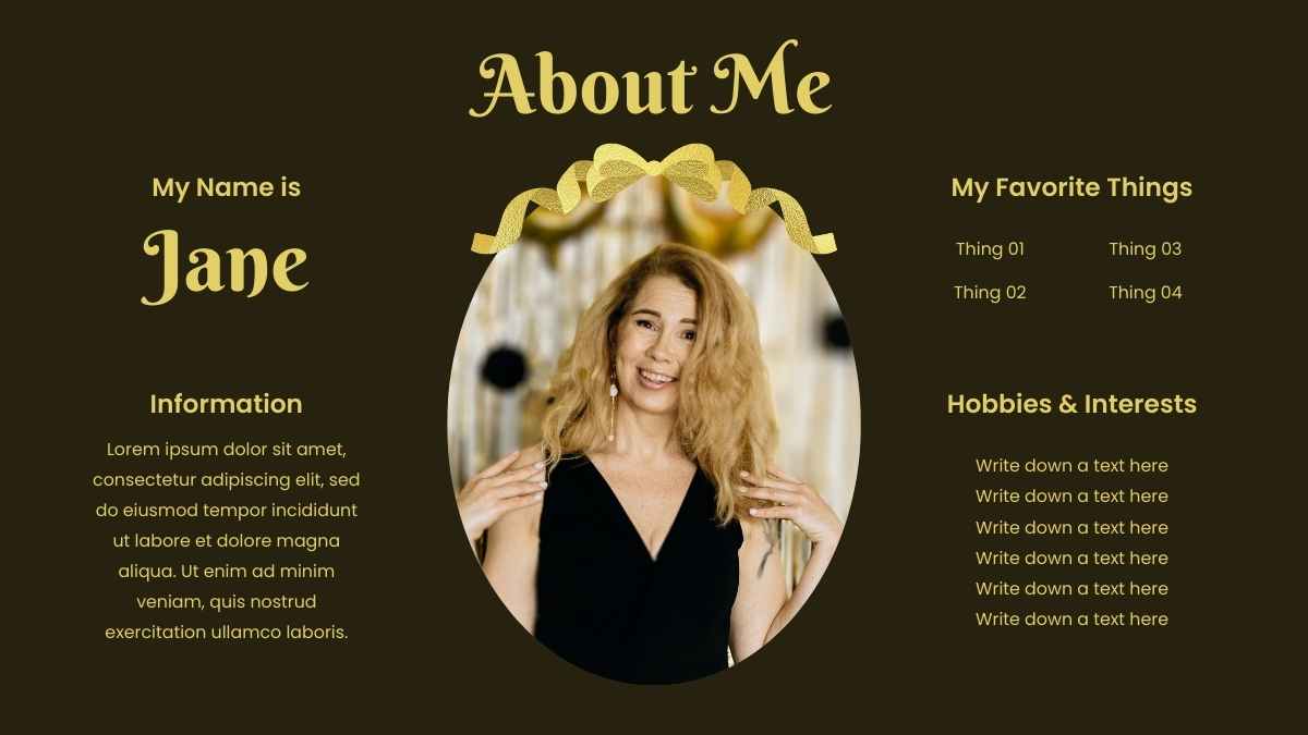
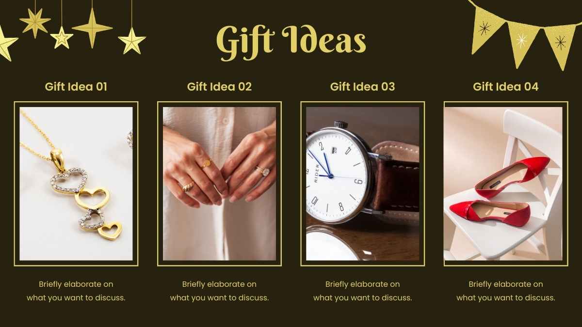


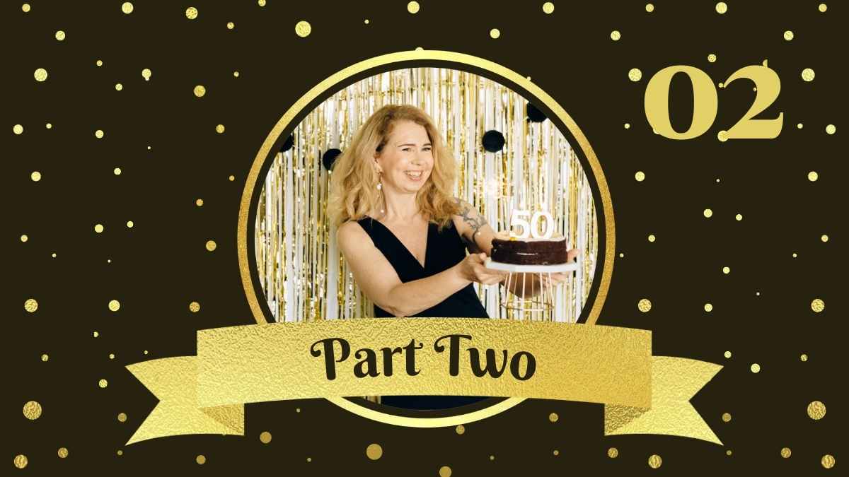

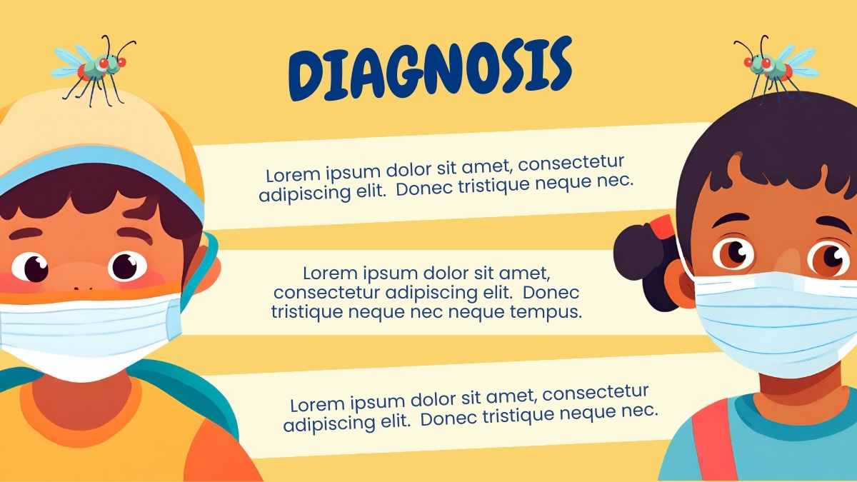

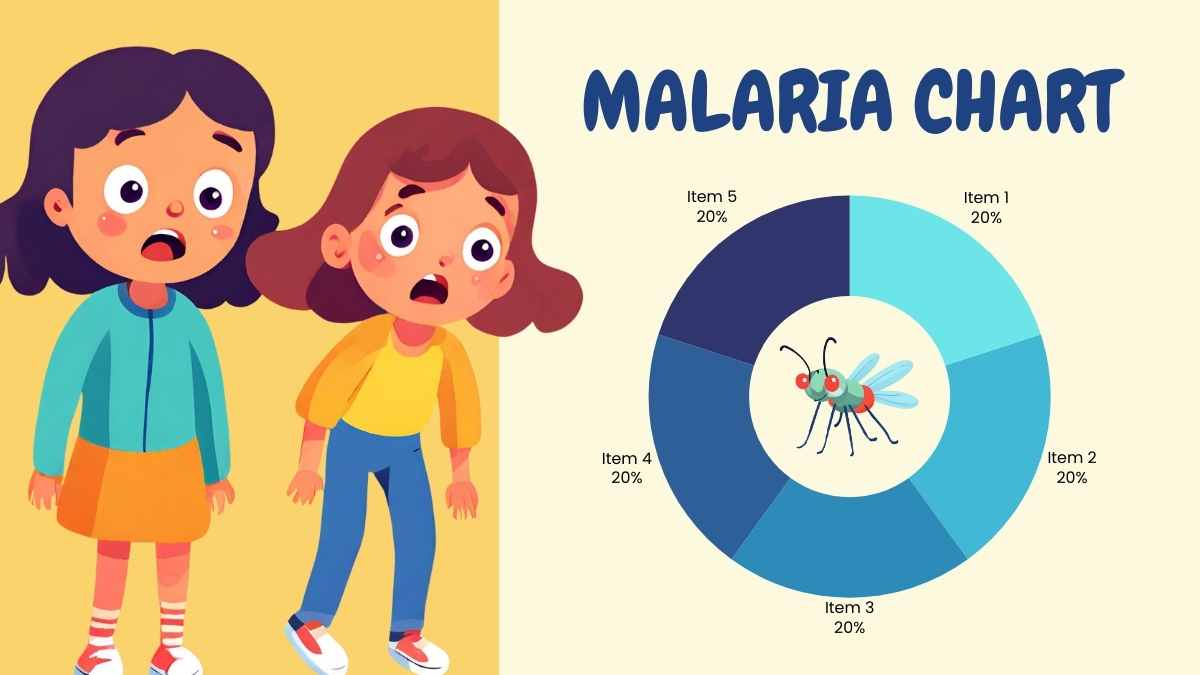

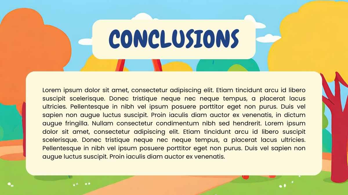


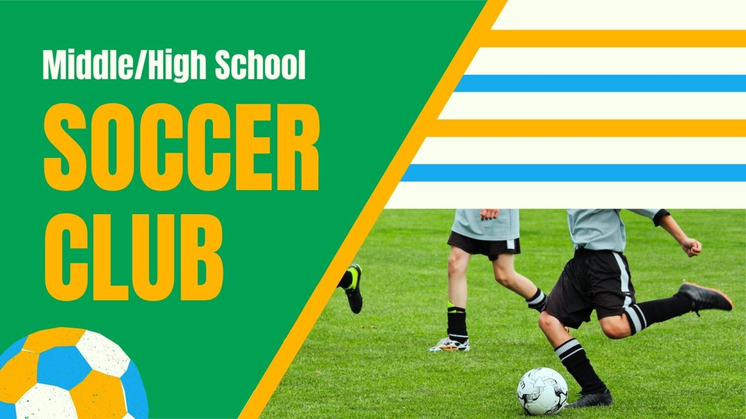

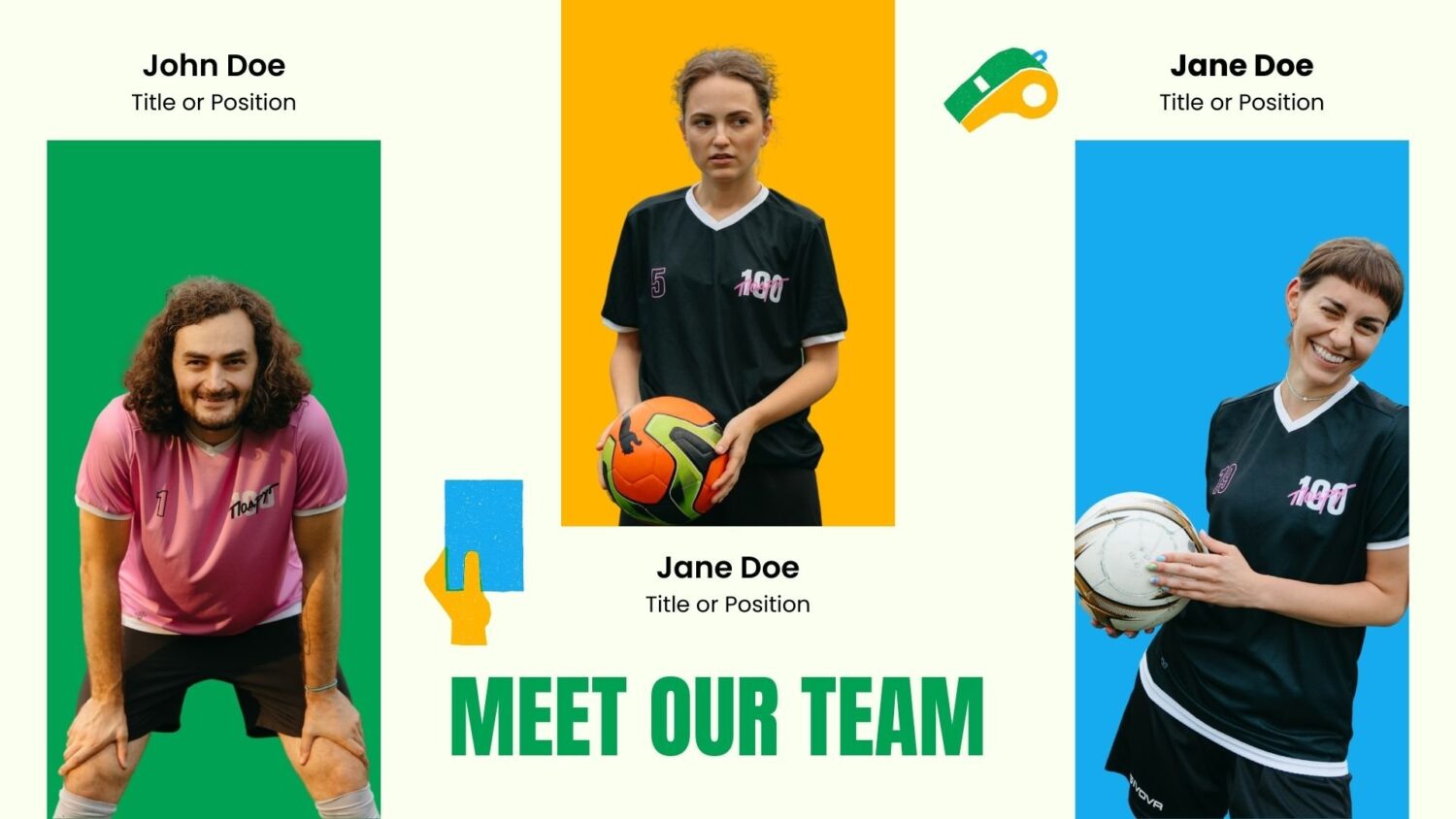
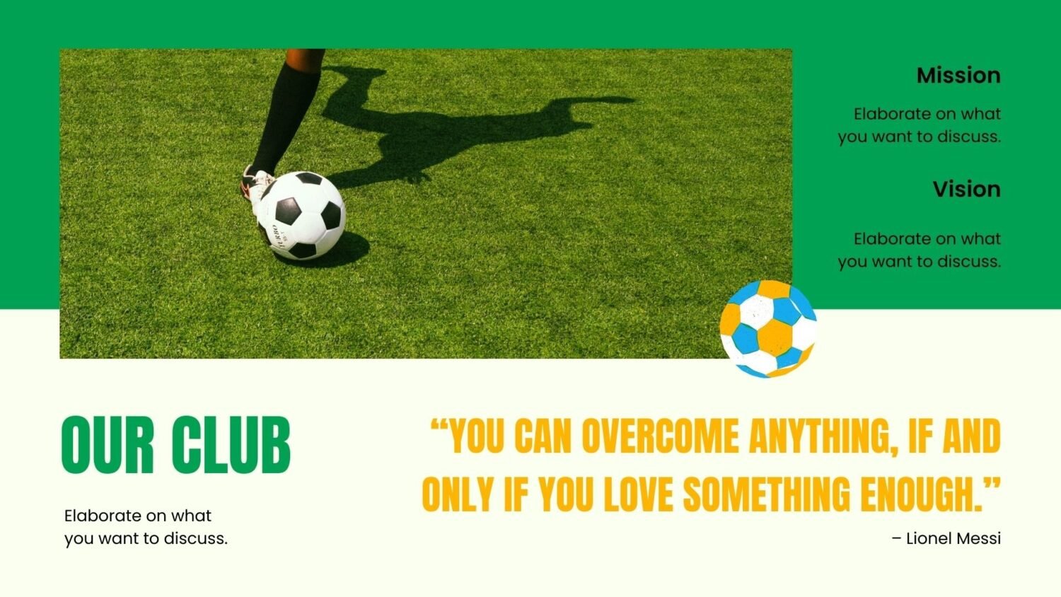
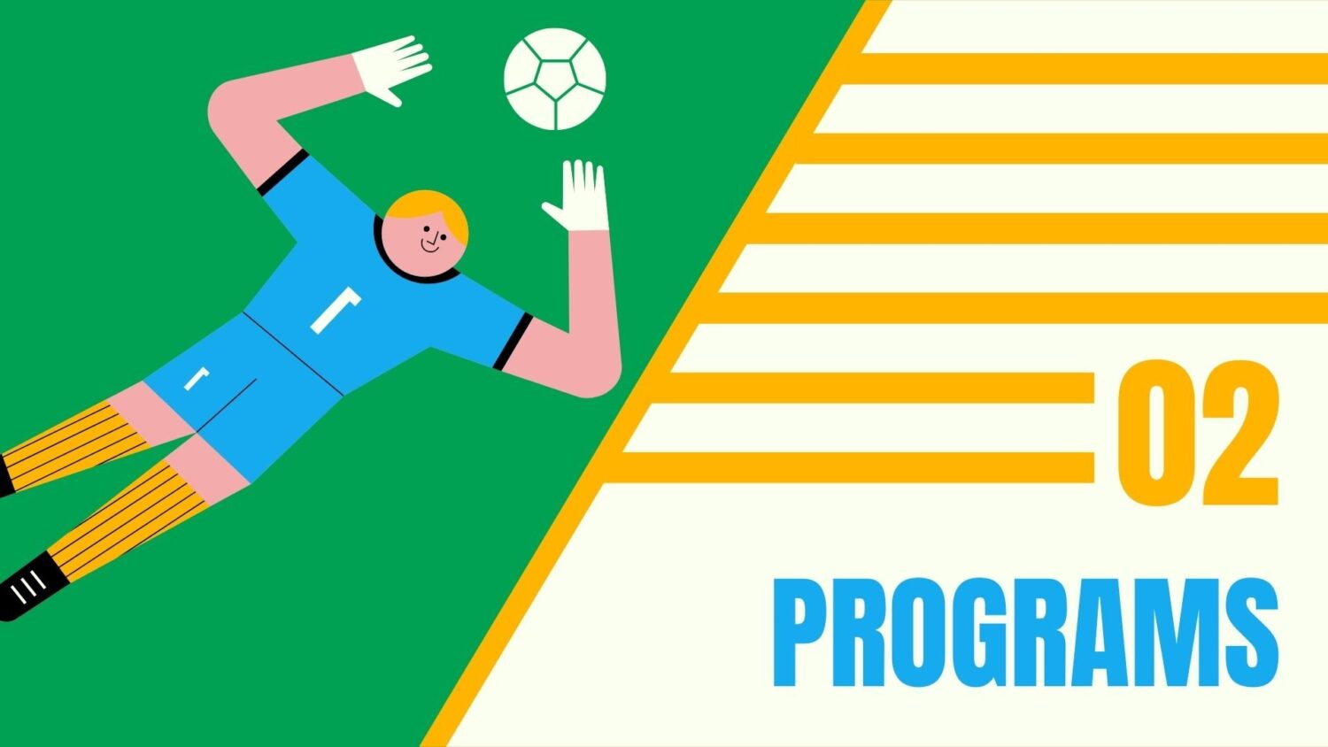
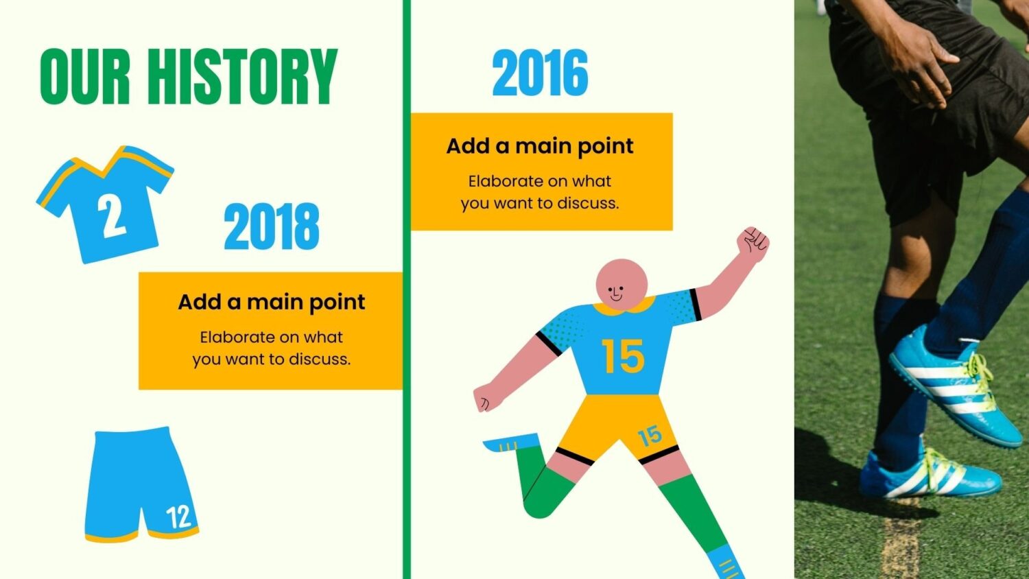



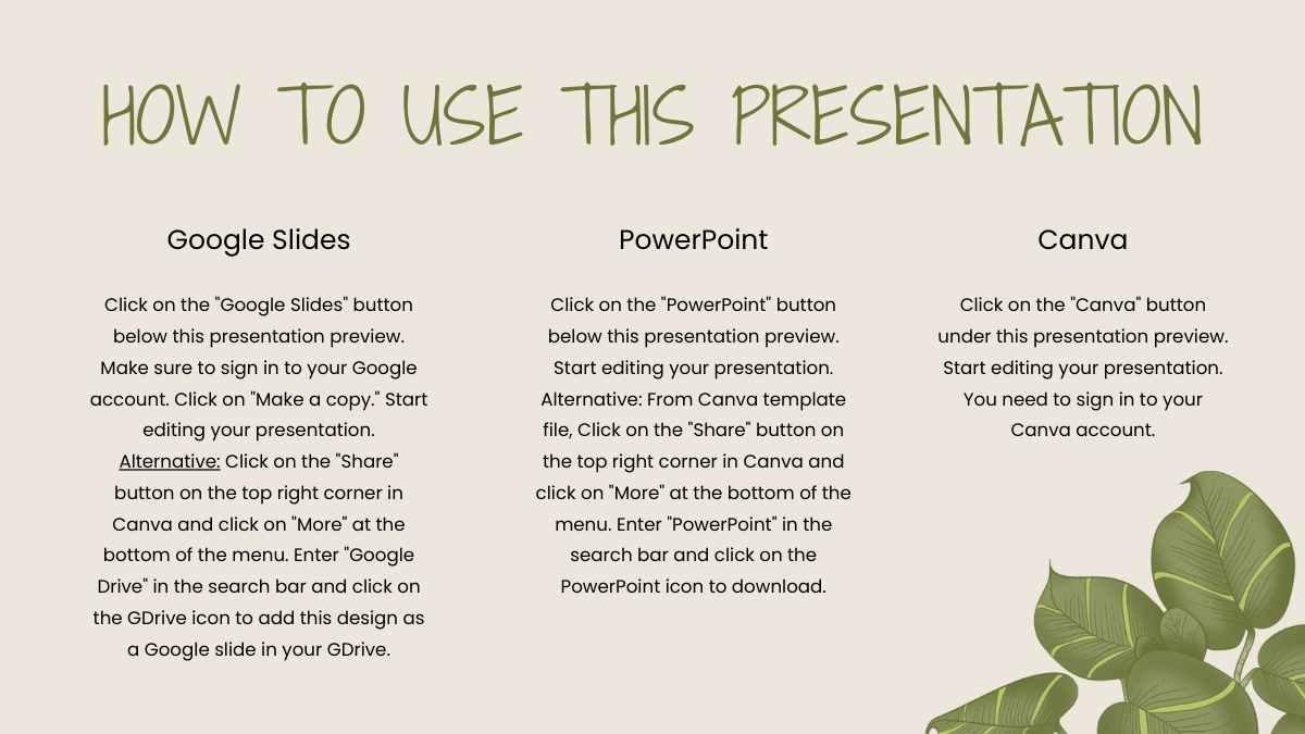
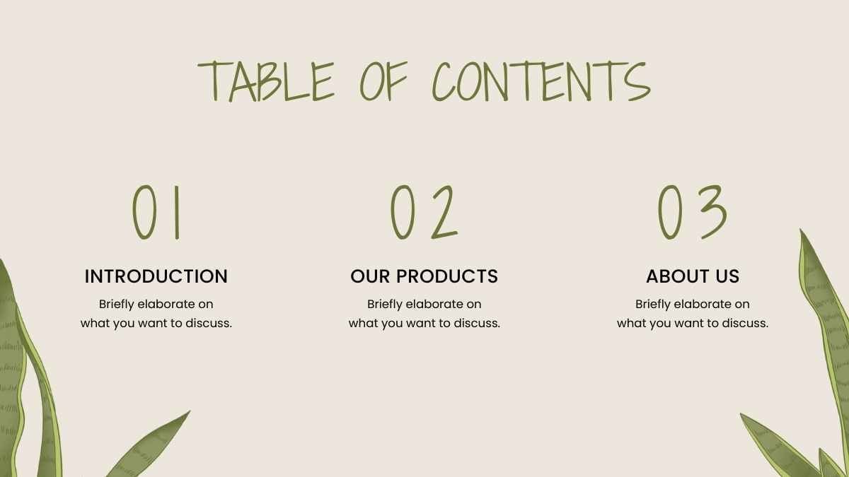
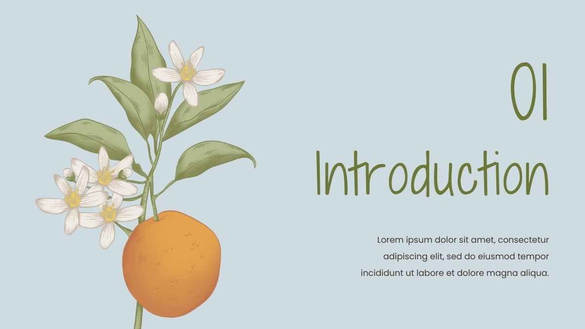
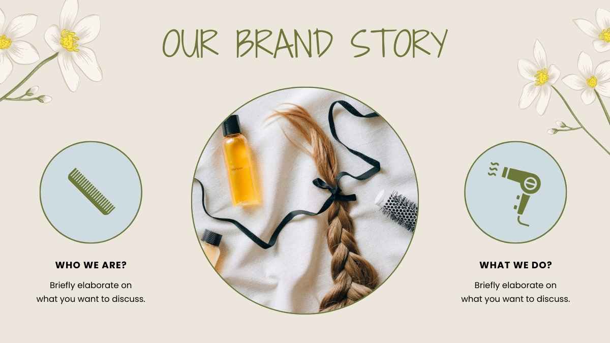
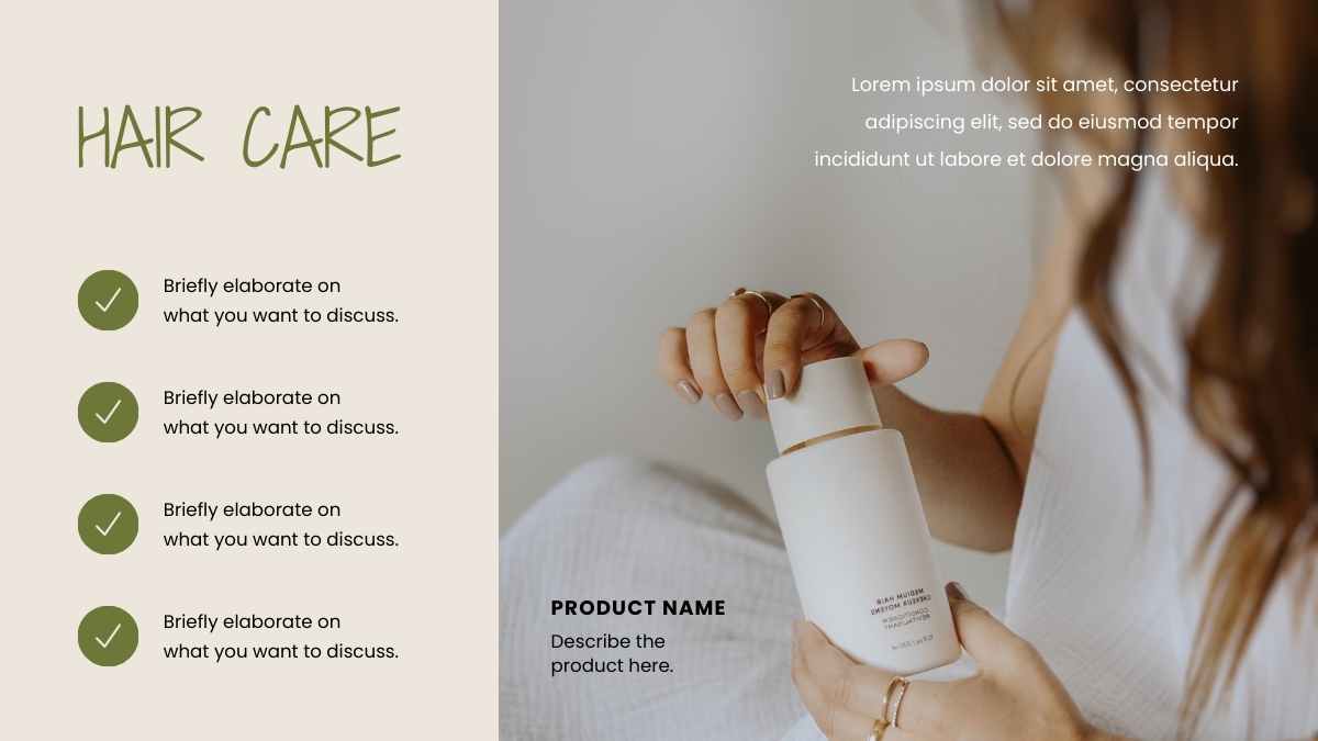
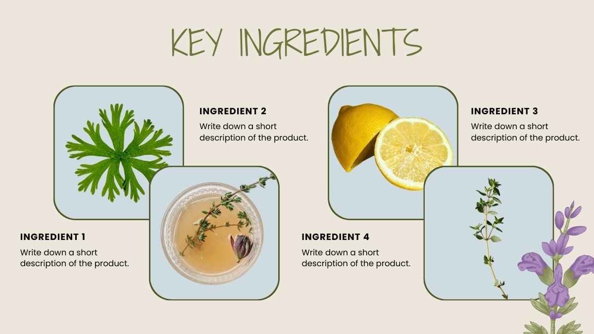
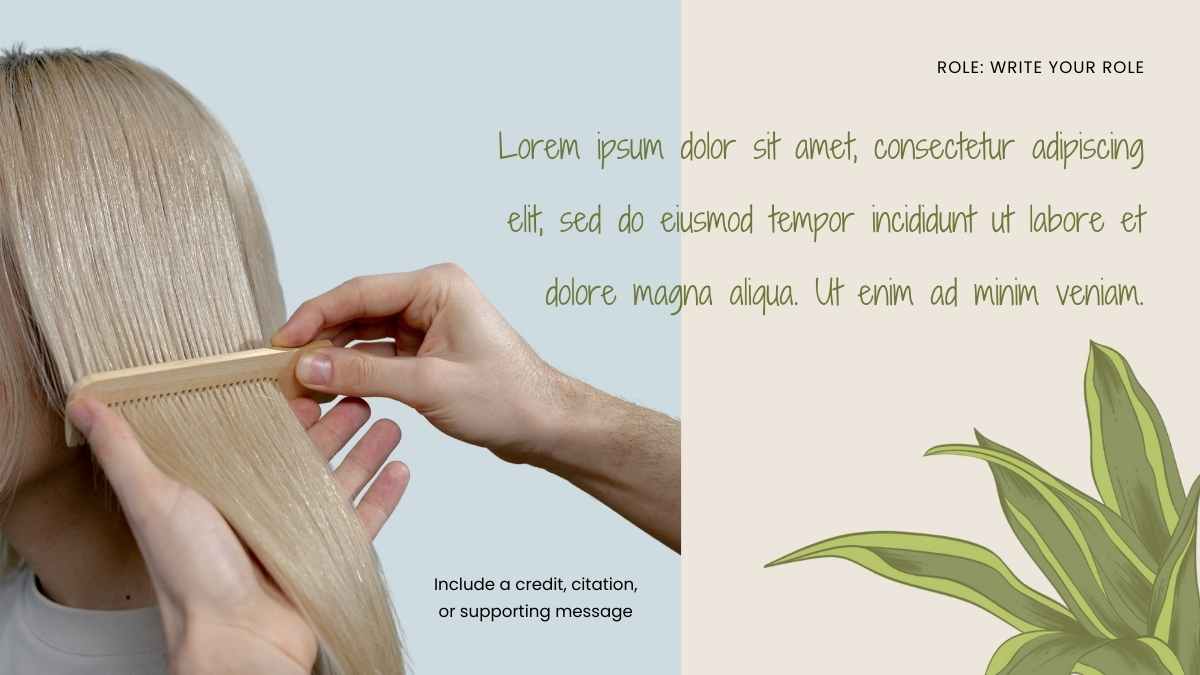
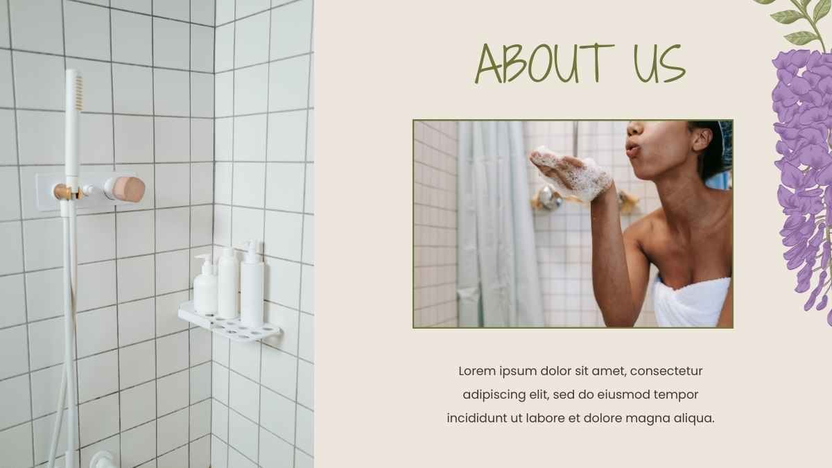
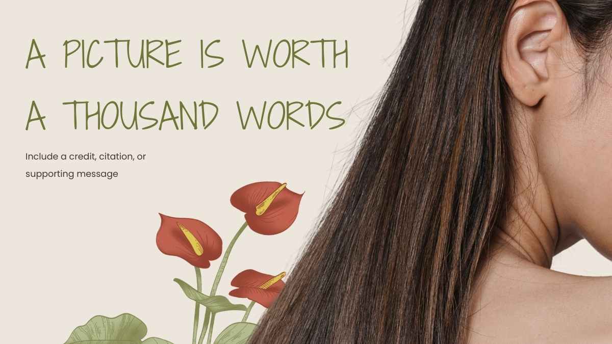
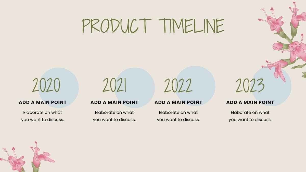
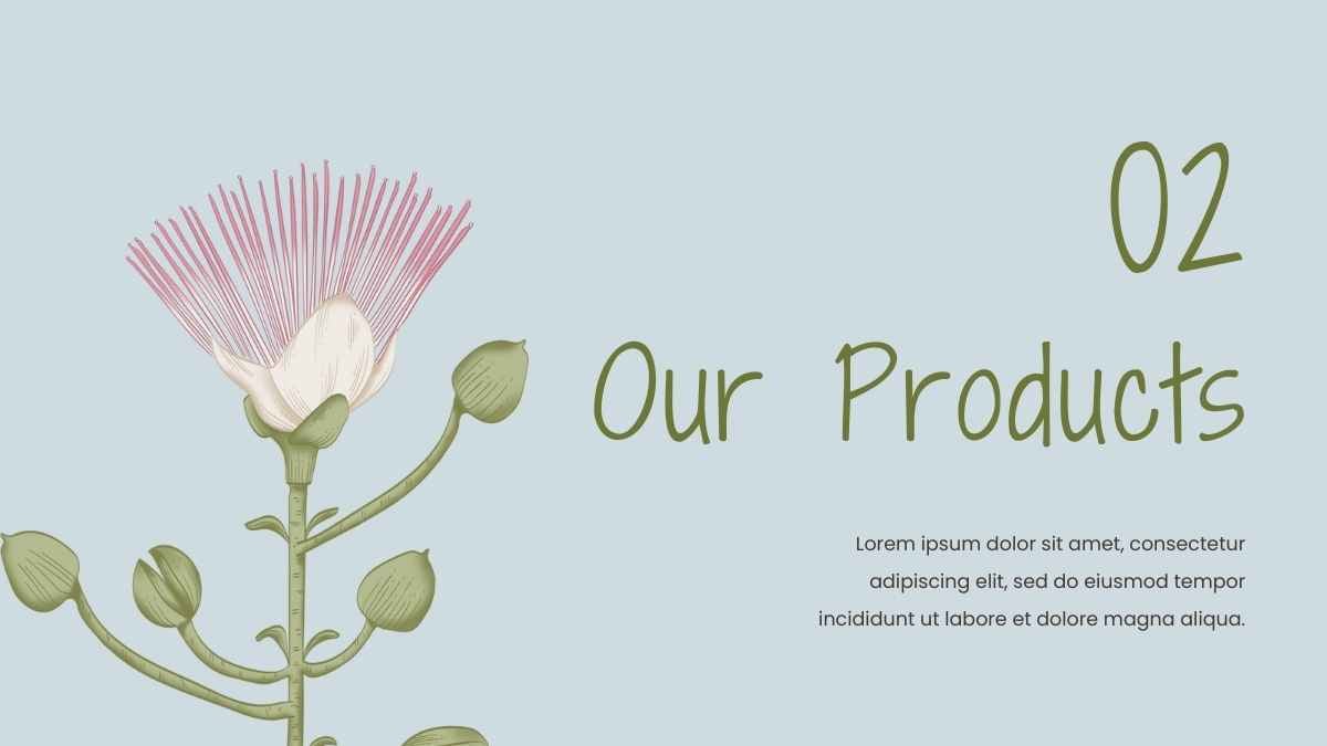


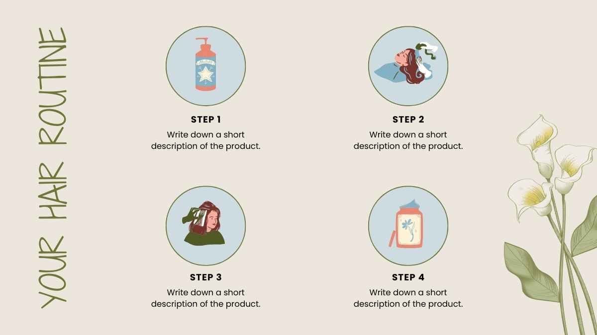

Best font pairs for Poppins
Poppins pairs well with Inter for modern interfaces, Playfair Display for editorial contrast, and Roboto for business decks.
MODERN & MINIMAL
Poppins + Inter
Round, modern headings
Poppins's near-perfect circles look generous in a heading but run wide in a paragraph; Inter, drawn narrower for screens, sets the body more compactly. A clean split for dashboards, apps, and product pages.
EDITORIAL CONTRAST
Playfair Display + Poppins
An elegant editorial look
Playfair Display's hairline serifs and steep stroke contrast give headlines a couture edge, while Poppins's monolinear, geometric body stays quiet beneath. Set headlines in Playfair Display, body in Poppins, across portfolios and editorial sites.
BUSINESS & CORPORATE
Poppins + Roboto
Clear, professional headings
Poppins brings rounded, geometric headings while Roboto's tighter forms keep body text neutral and compact. A reliable pairing for business decks and corporate sites.
Alternatives to Poppins
If you're after an alternative to Poppins, rounded geometric sans-serifs like Montserrat, Quicksand, and Rubik give a similar friendly, modern look.
Montserrat
This is a Montserrat headline
And this is body text in Montserrat. It's worth considering as an alternative to Poppins.
View moreQuicksand
This is a Quicksand headline
And this is body text in Quicksand. It's worth considering as an alternative to Poppins.
View moreJost
This is a Jost headline
And this is body text in Jost. It's worth considering as an alternative to Poppins.
View moreRubik
This is a Rubik headline
And this is body text in Rubik. It's worth considering as an alternative to Poppins.
View moreManrope
This is a Manrope headline
And this is body text in Manrope. It's worth considering as an alternative to Poppins.
View moreMukta
This is a Mukta headline
And this is body text in Mukta. It's worth considering as an alternative to Poppins.
View moreComfortaa
This is a Comfortaa headline
And this is body text in Comfortaa. It's worth considering as an alternative to Poppins.
View moreQuestrial
This is a Questrial headline
And this is body text in Questrial. It's worth considering as an alternative to Poppins.
View moreFrequently asked questions about Poppins
Is Poppins free to use?

What kind of font is Poppins?
What font pairs well with Poppins?
Is Poppins good for body text?
Does Poppins support languages beyond English?