
Search


- English
Trends
LOW-CONTRAST GEOMETRIC FONT
Dm Sans
DM Sans is a free low-contrast geometric sans-serif from Google Fonts, tuned to stay sharp at small sizes. That makes it a quiet, reliable pick for UI text, captions, and body copy.
This is DM Sans
Specimen
DM Sans is the anti-display font. Where most geometric sans-serifs are drawn to look striking when blown up large, DM Sans was engineered to stay legible when shrunk down, with low contrast and tight spacing that survive in captions and dense interfaces. It began as a reworking of Poppins and grew into its own understated workhorse.
Body Text / 18pt Regular
Dm Sans Font Details
Aa
Bold
Aa
Regular
Aa
Light
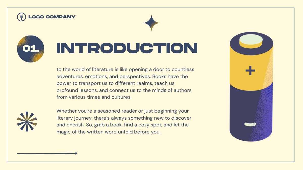
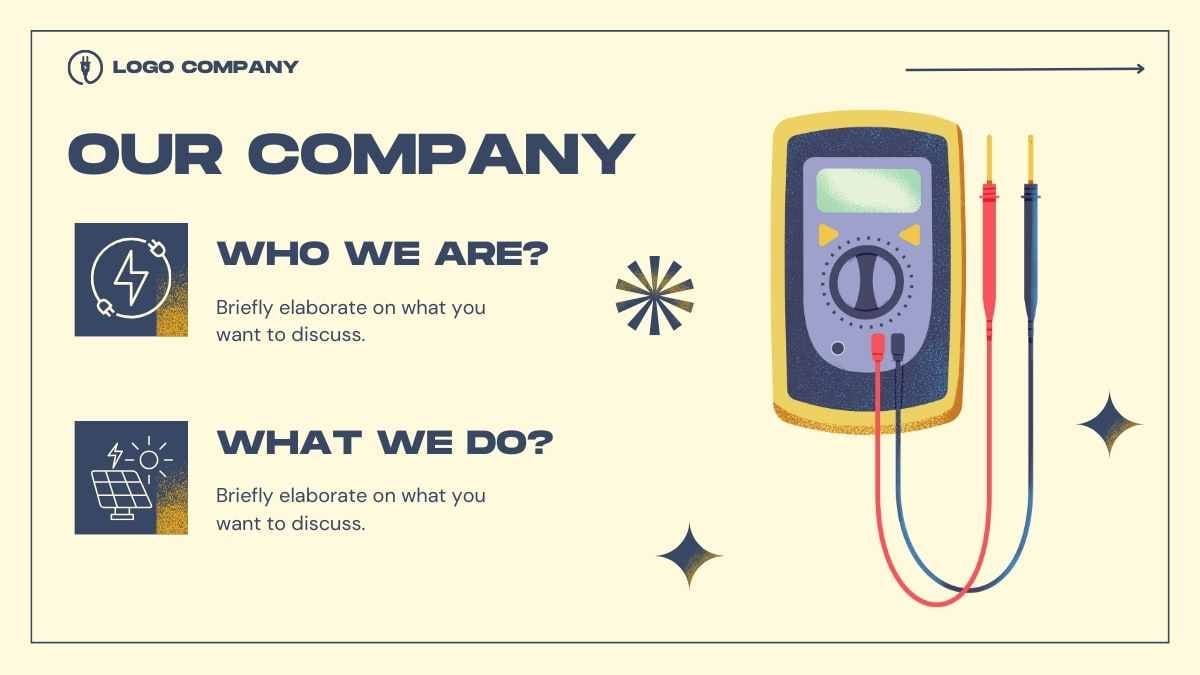
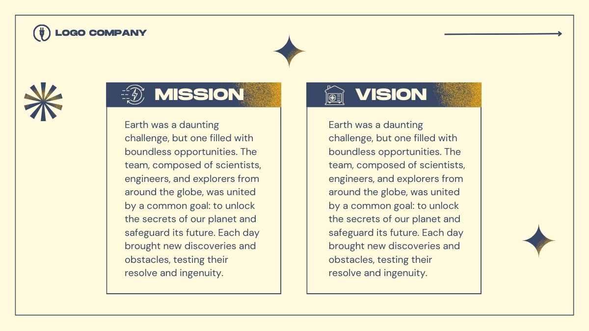
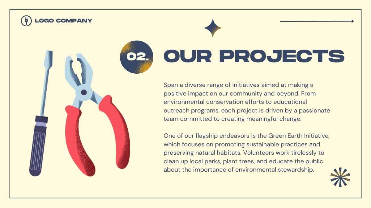
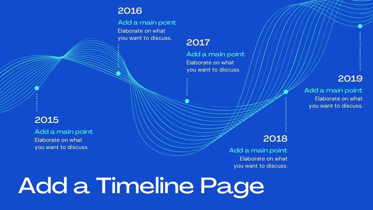
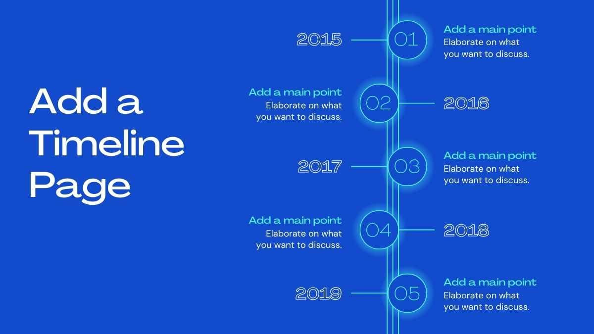
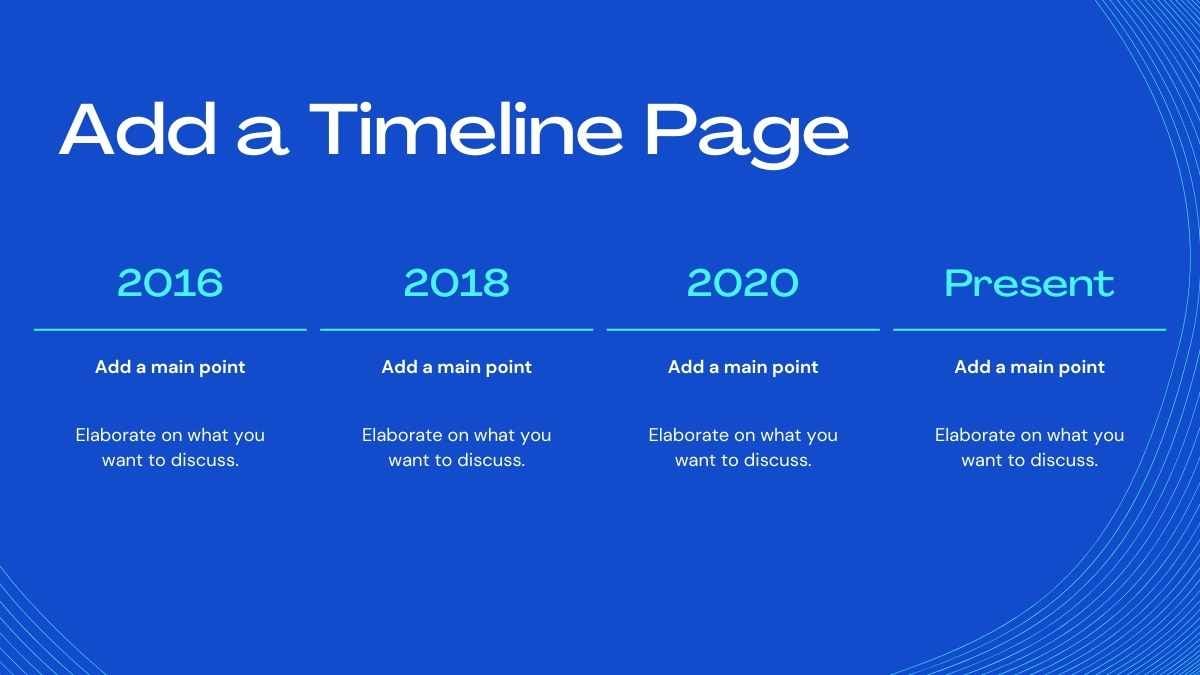
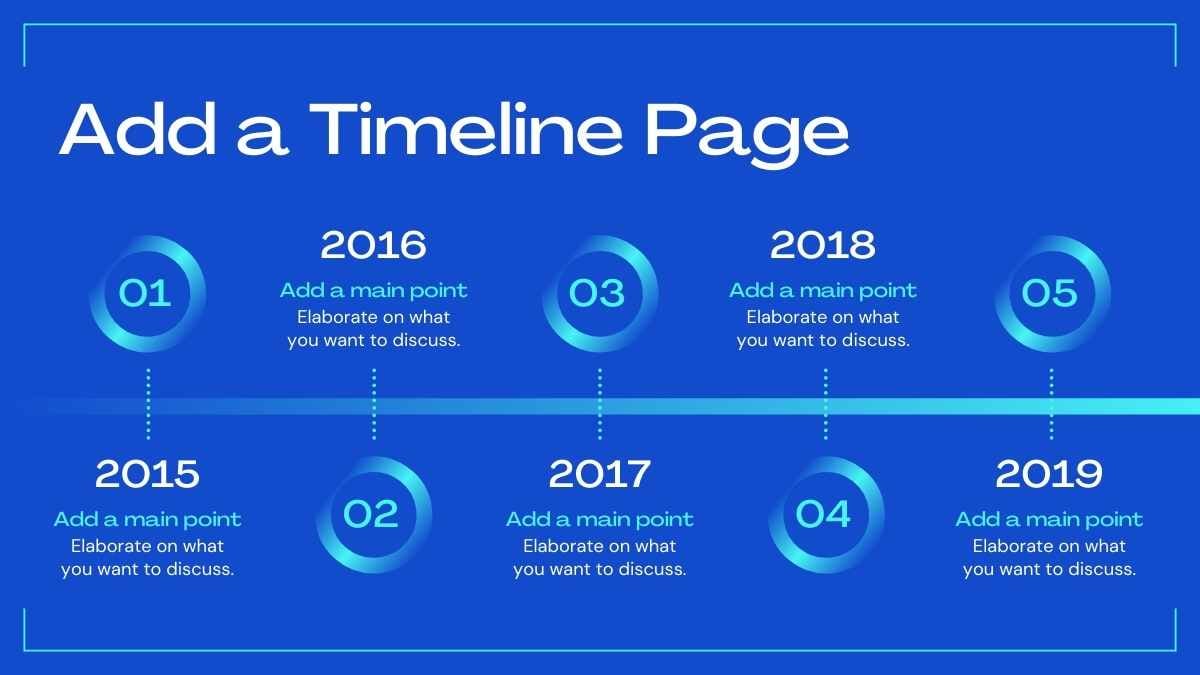
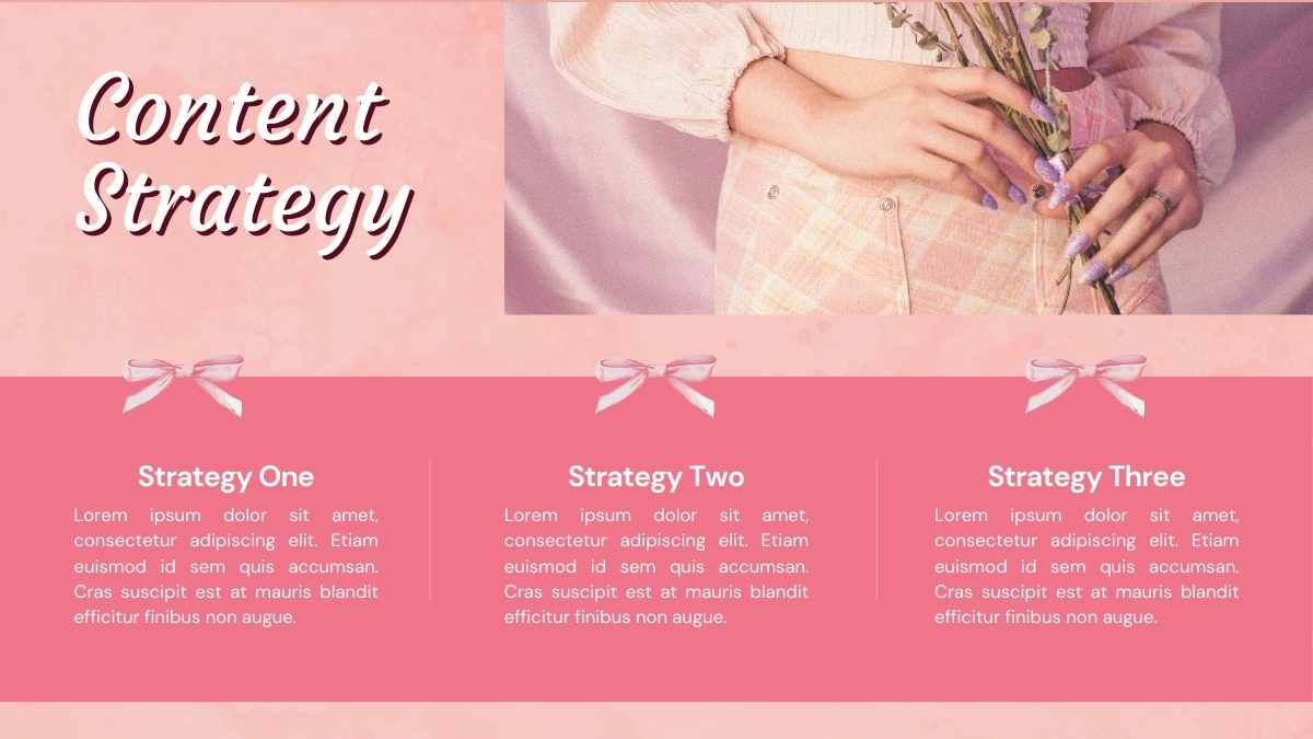
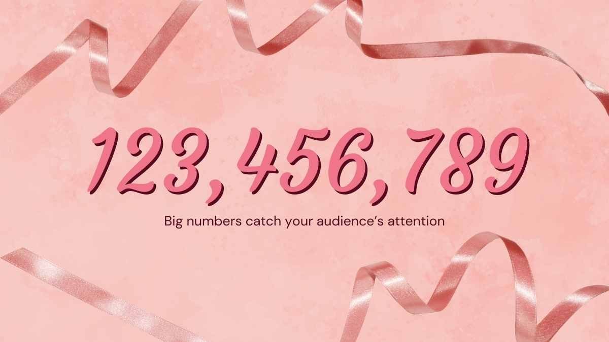
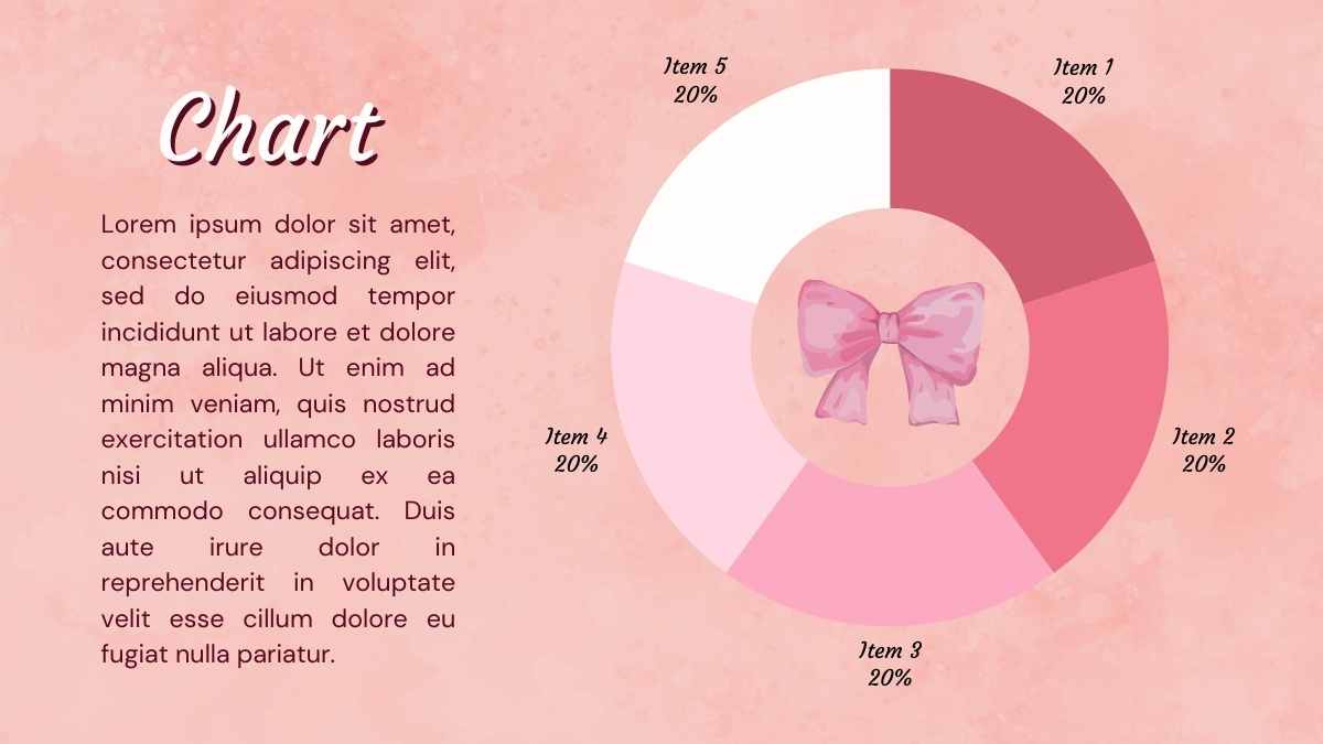
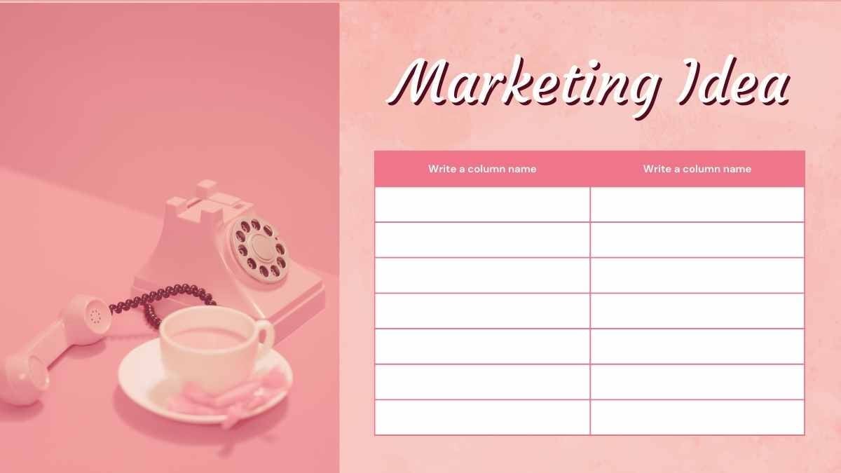
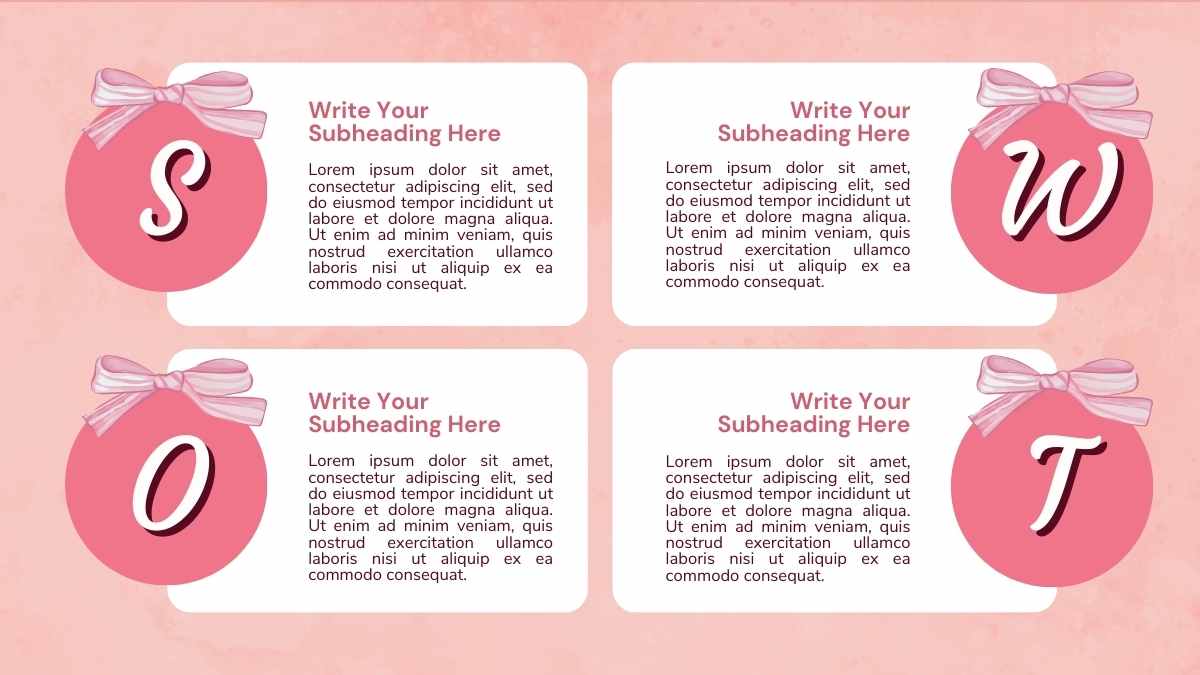
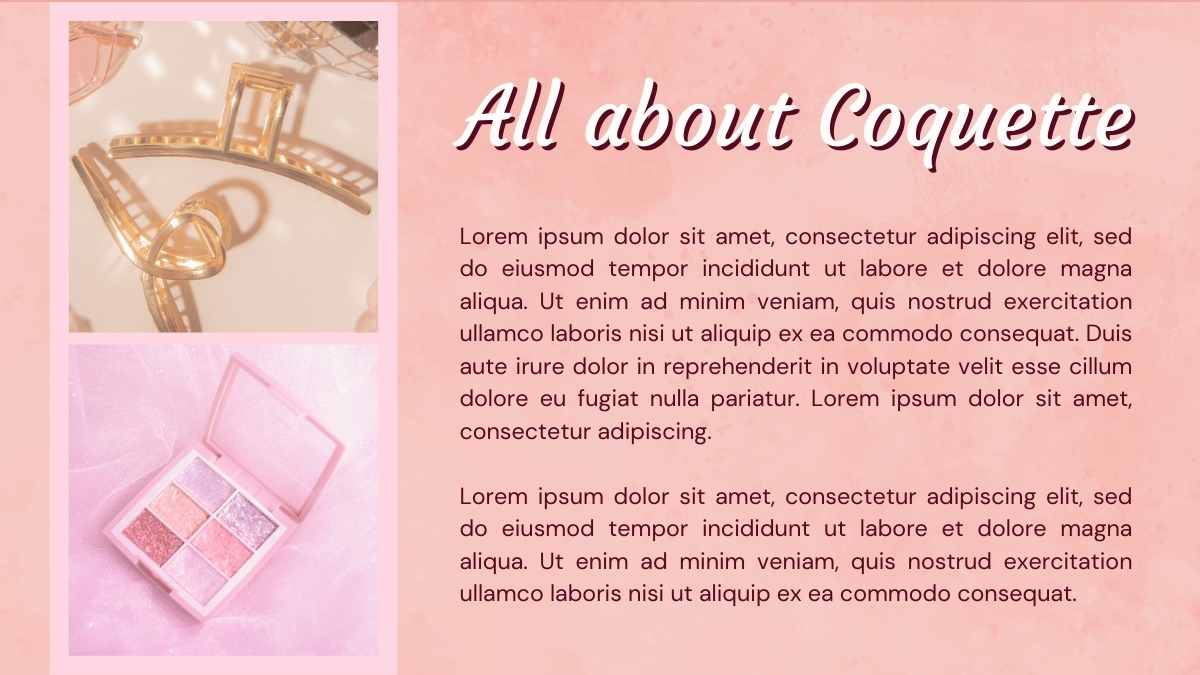
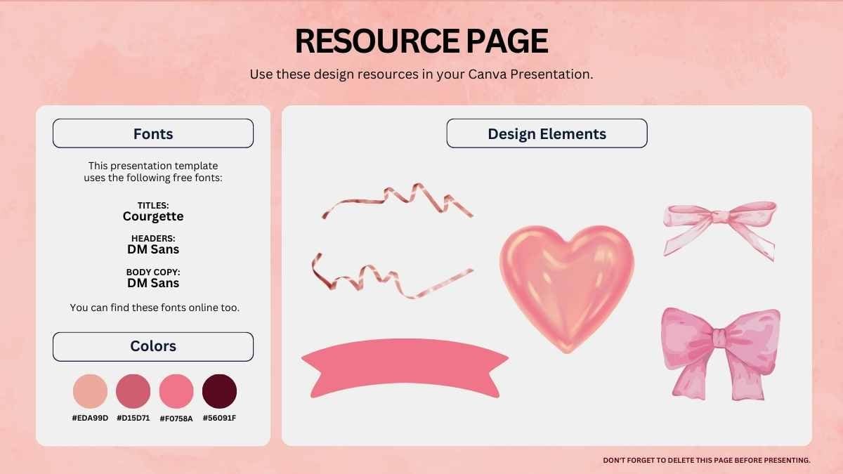
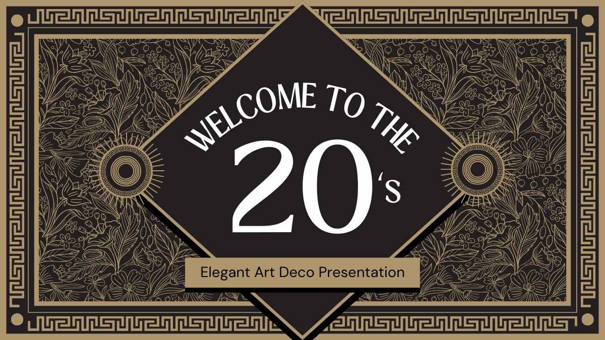
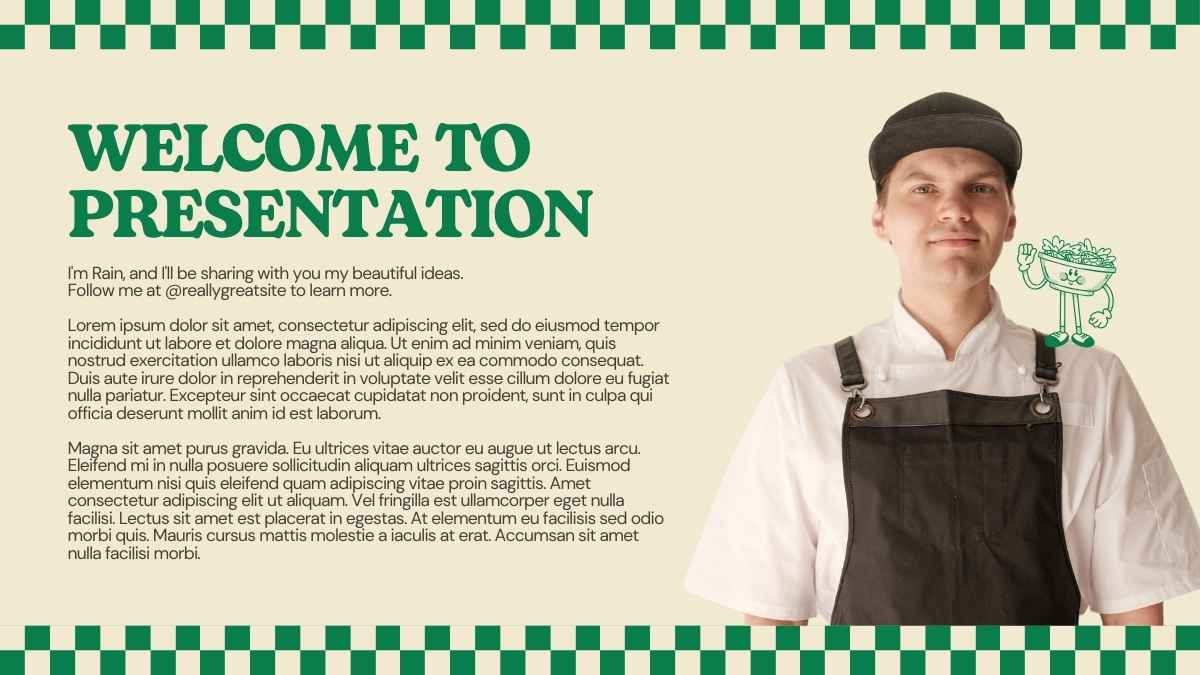
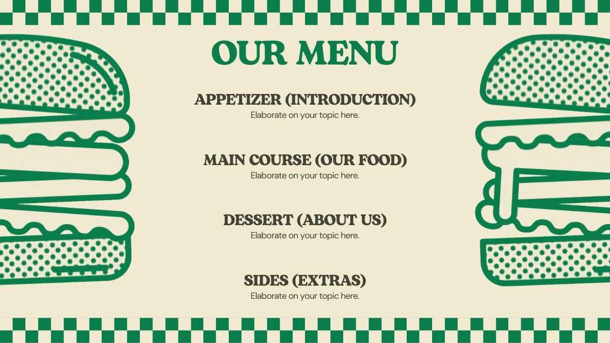
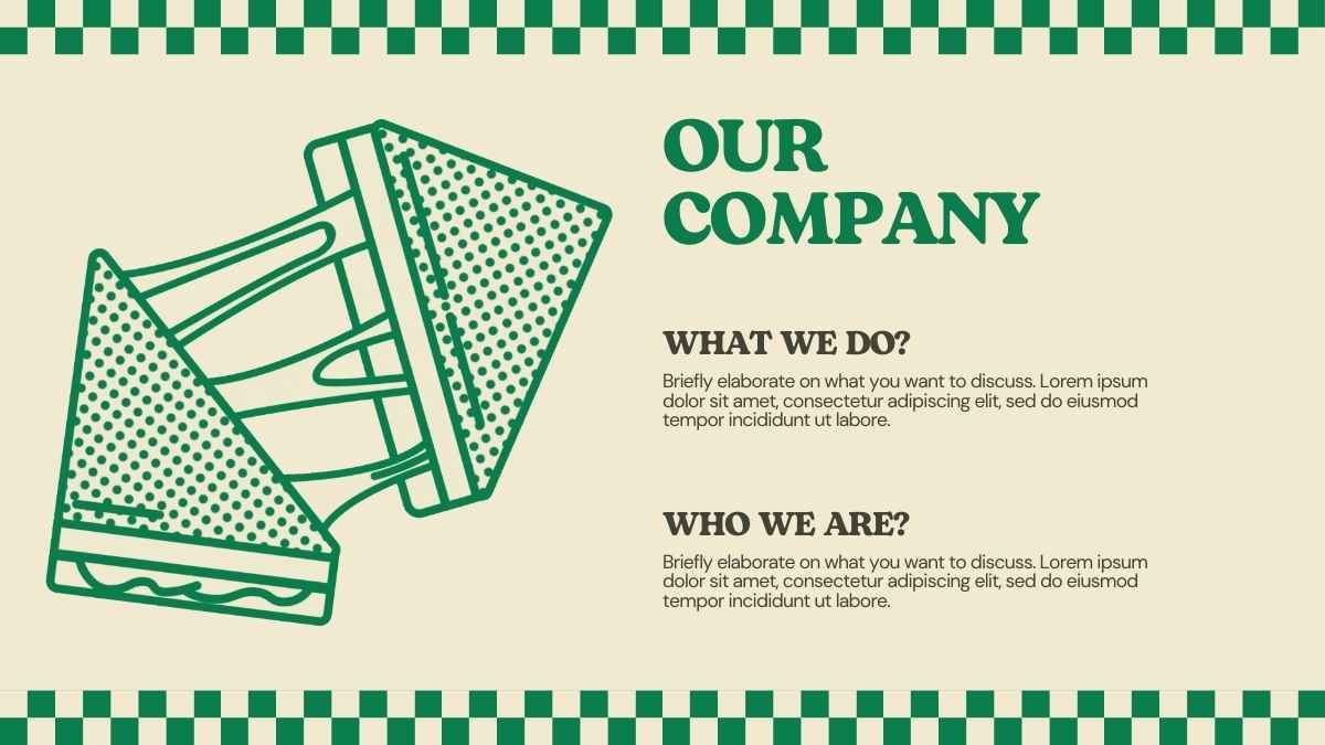
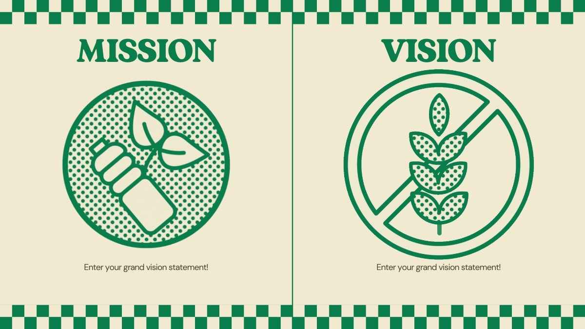
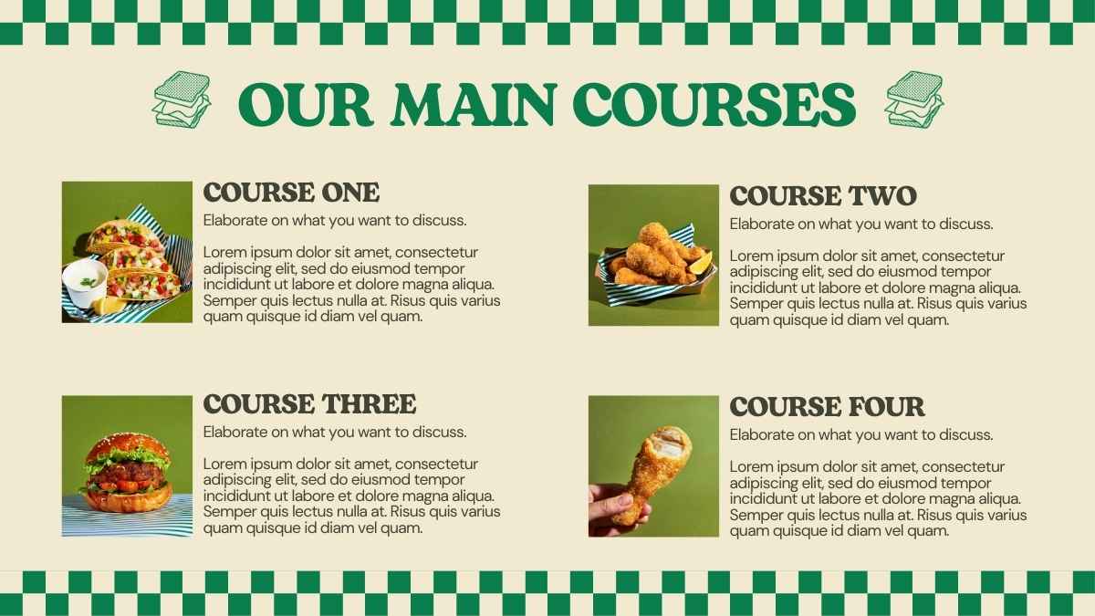
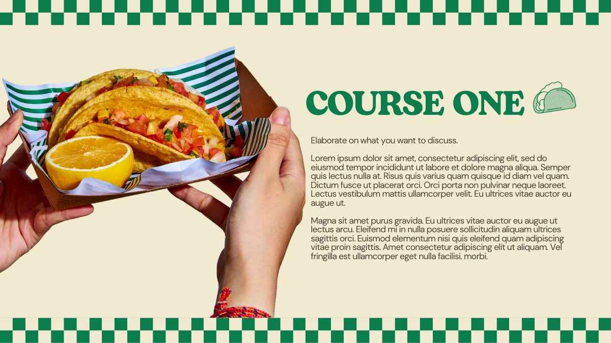
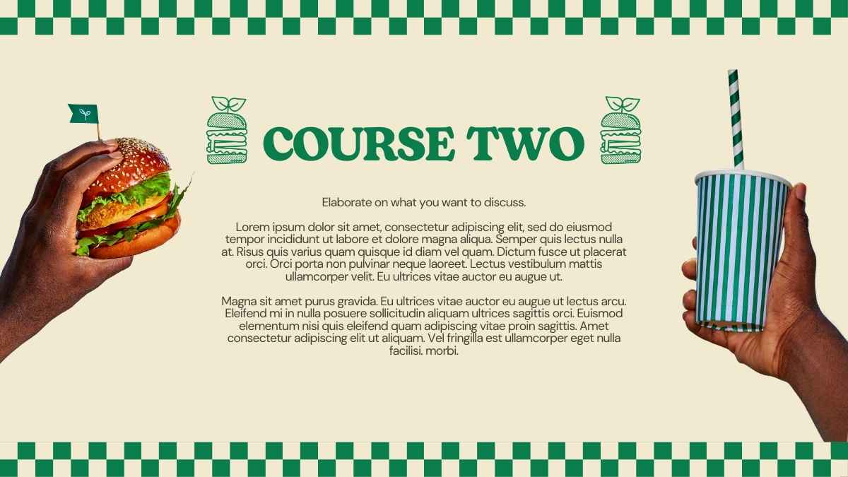
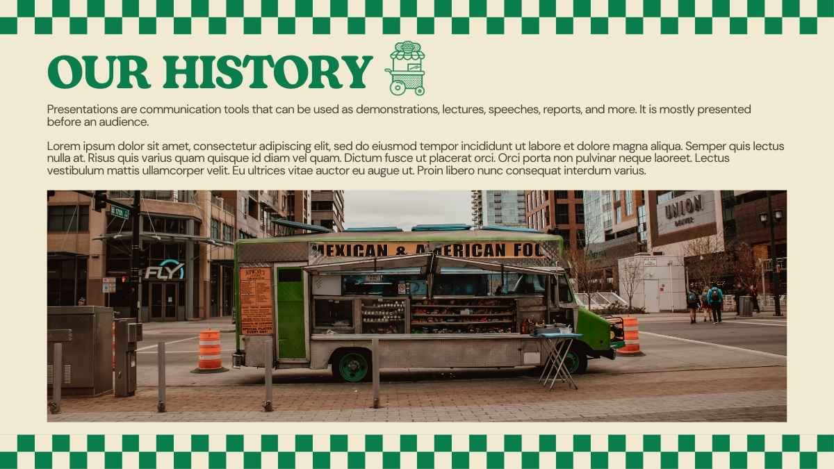
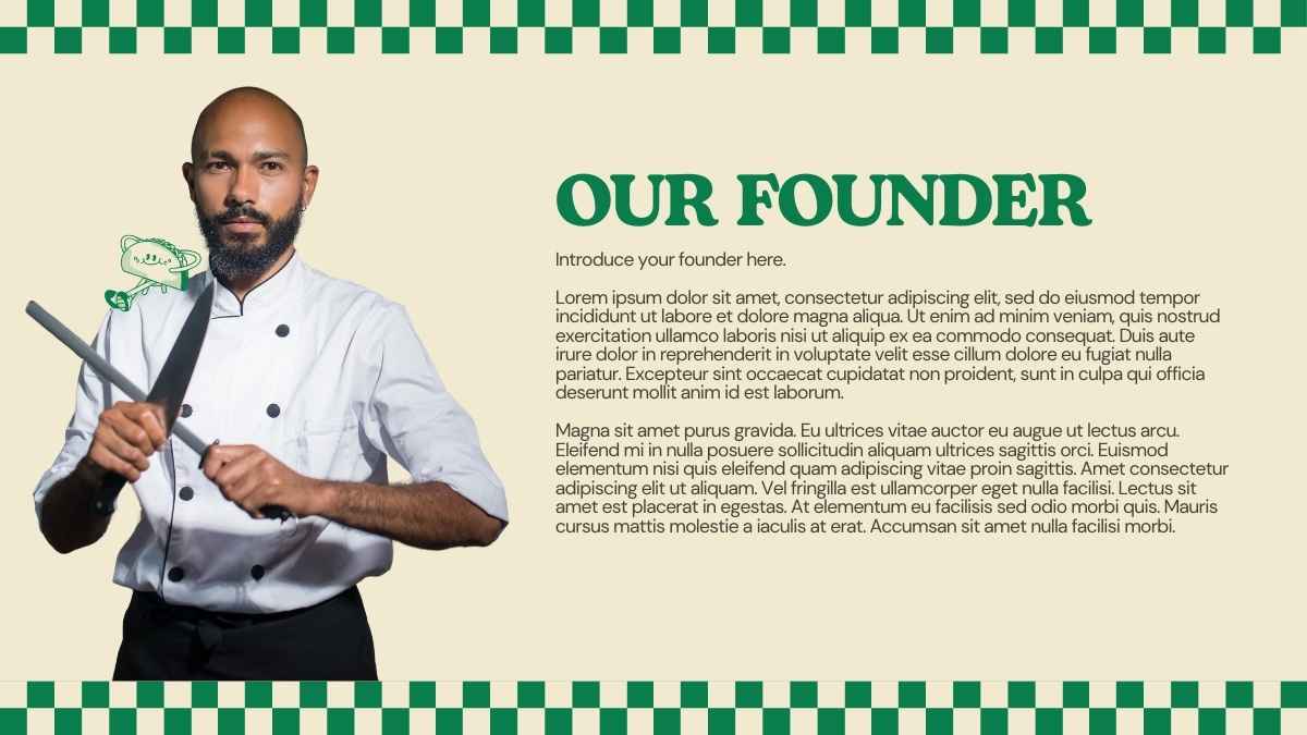
Templates using the font Dm Sans
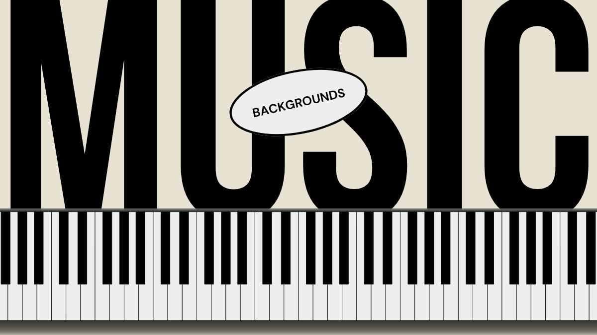
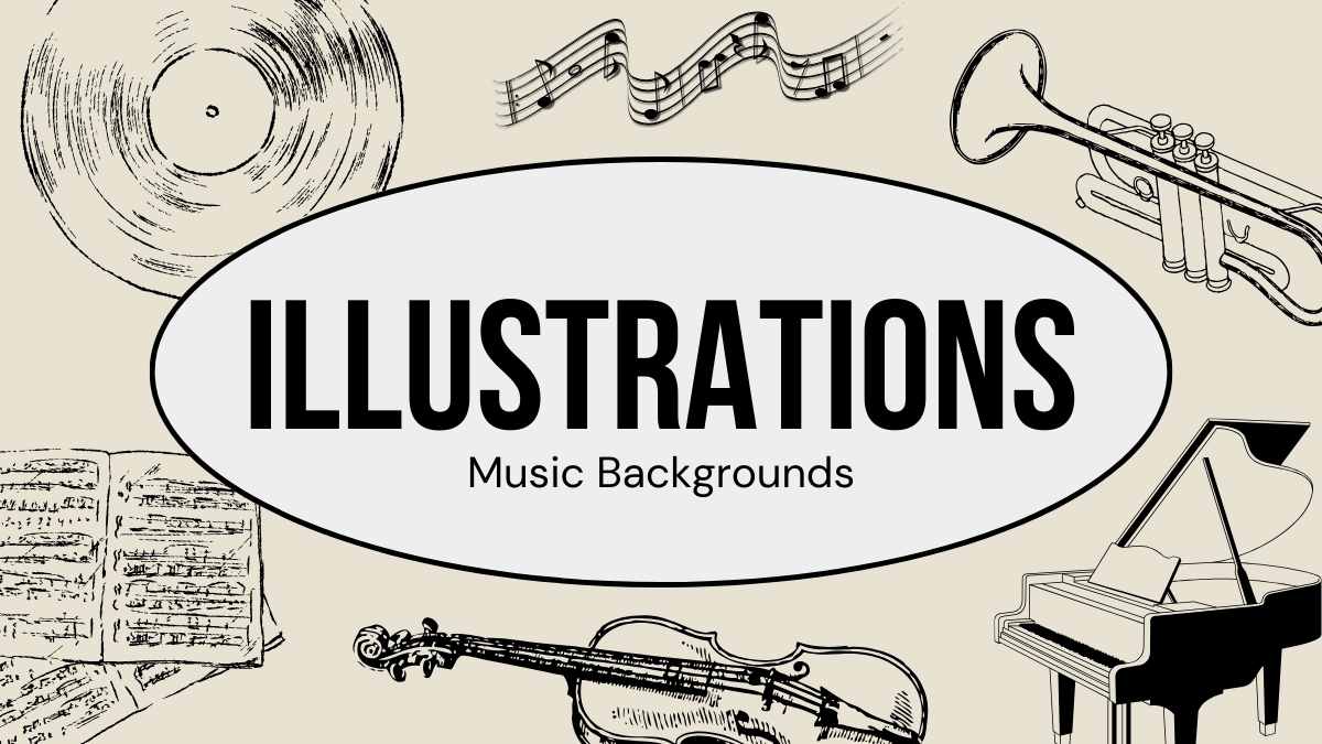
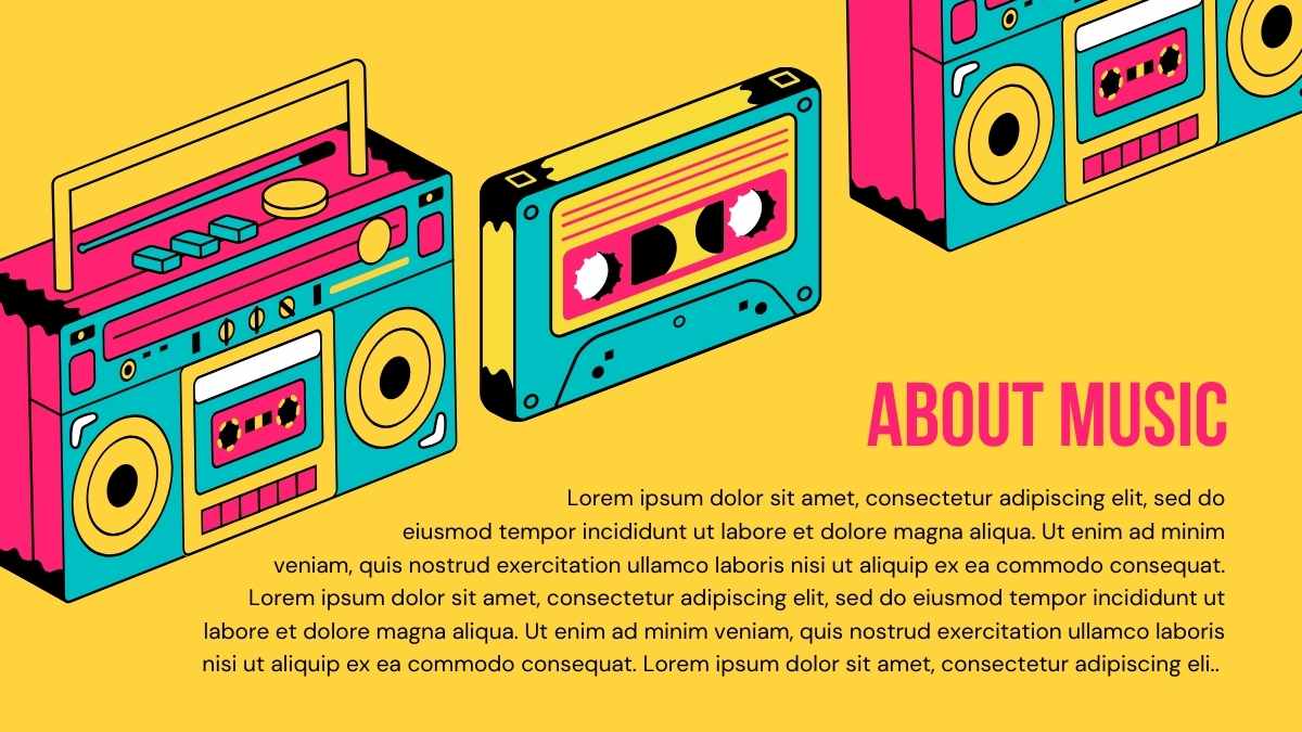
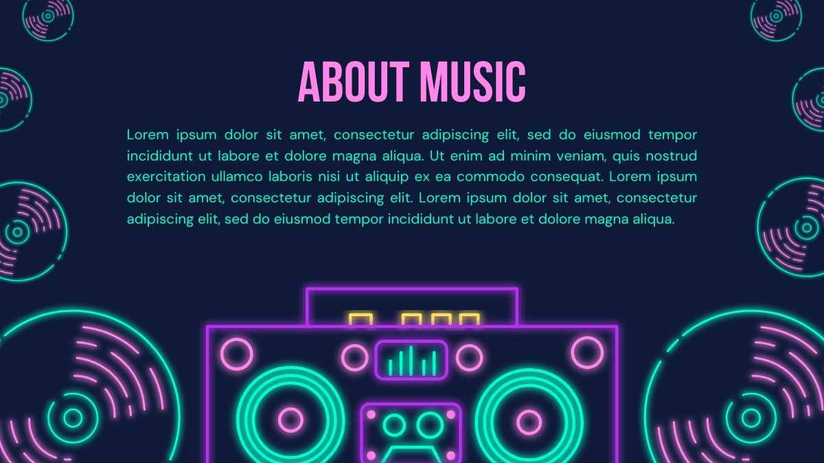
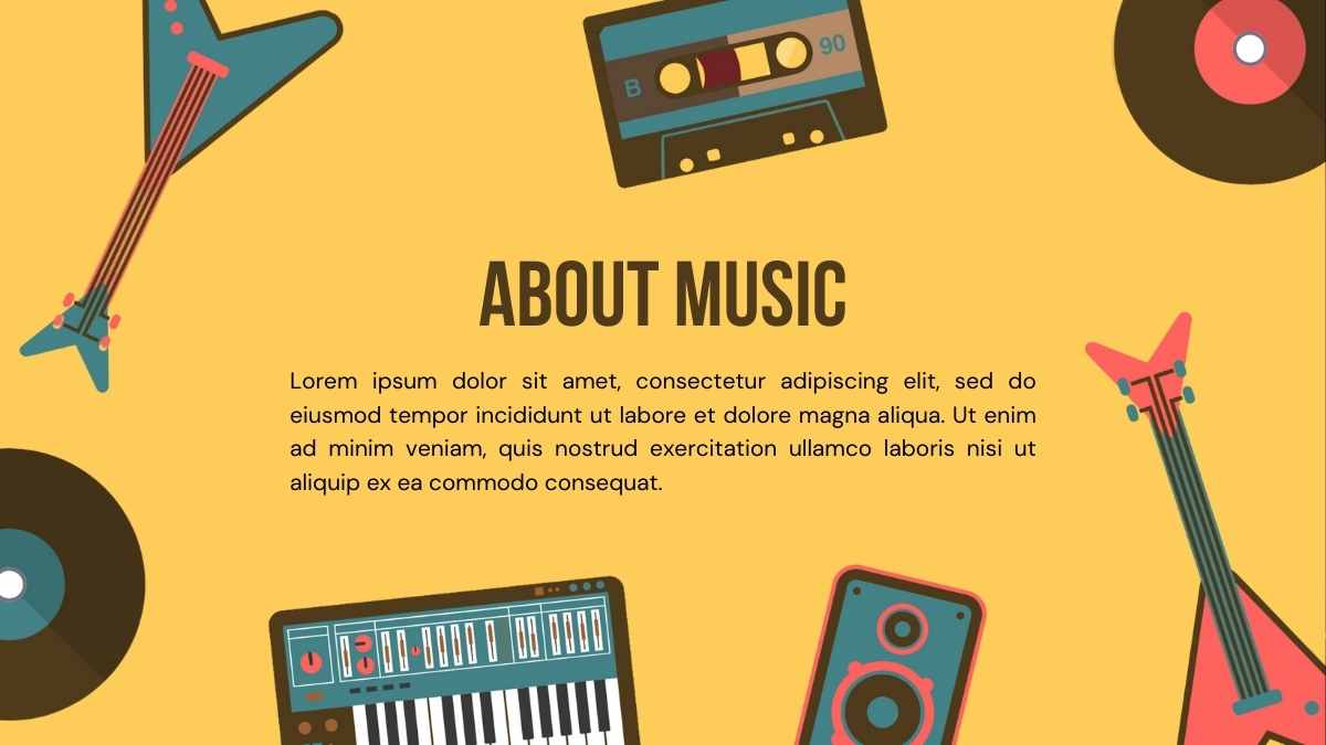
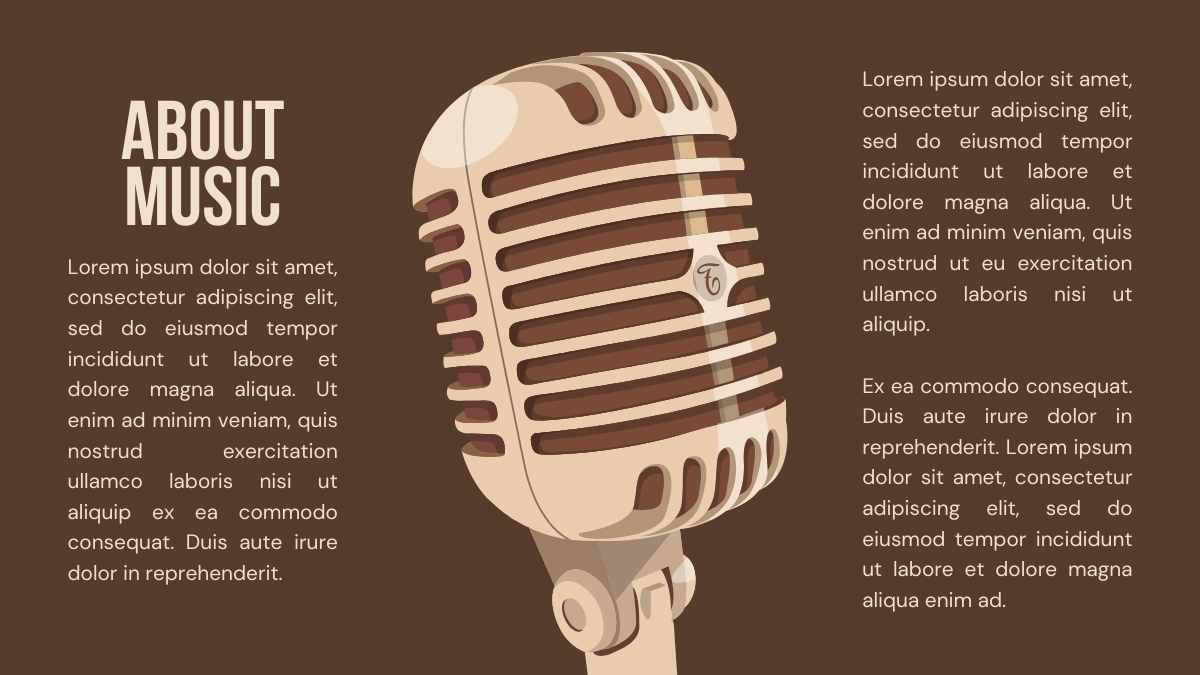
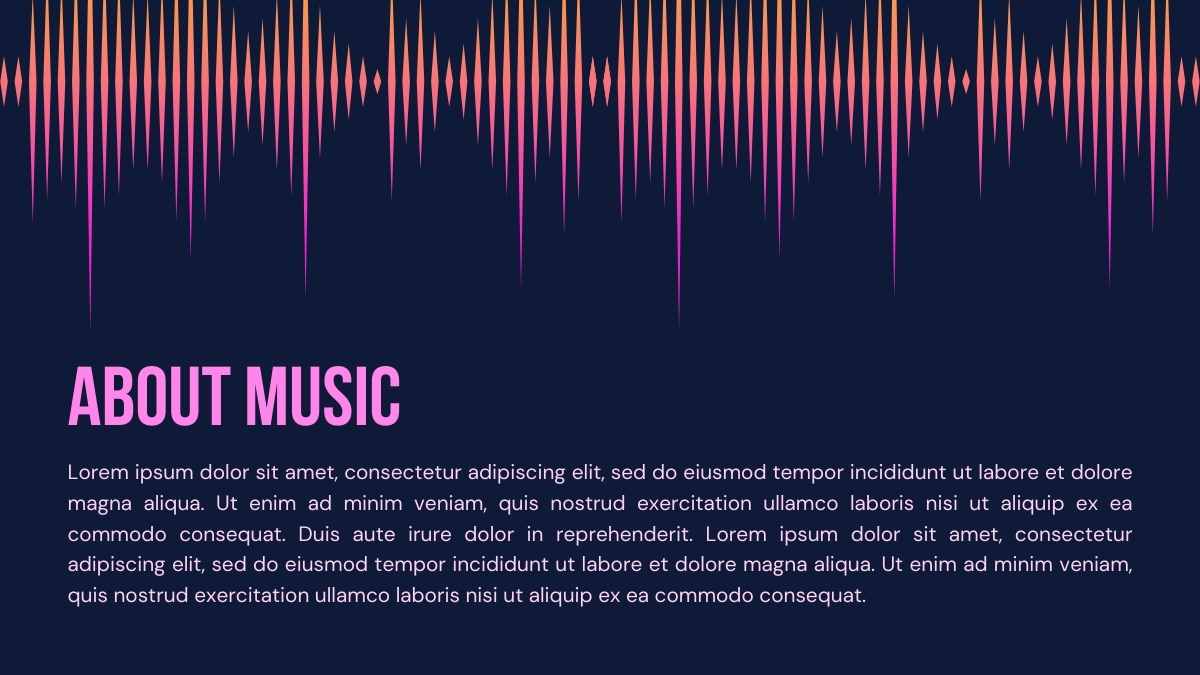
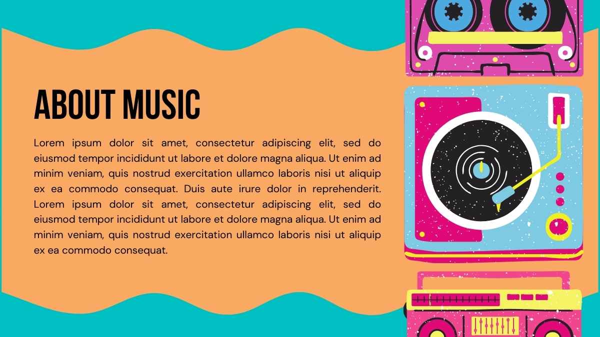
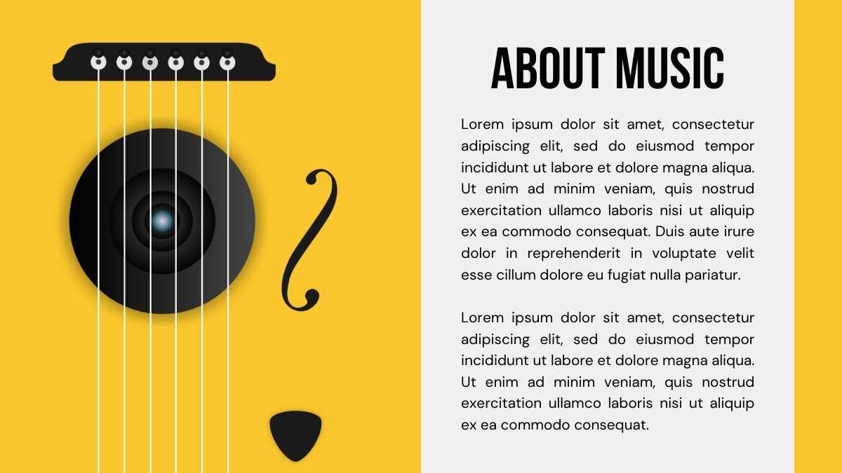
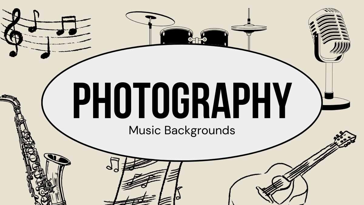
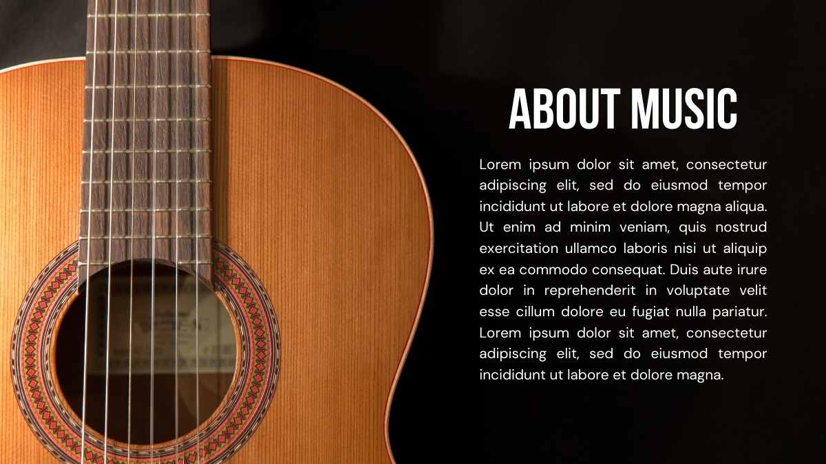

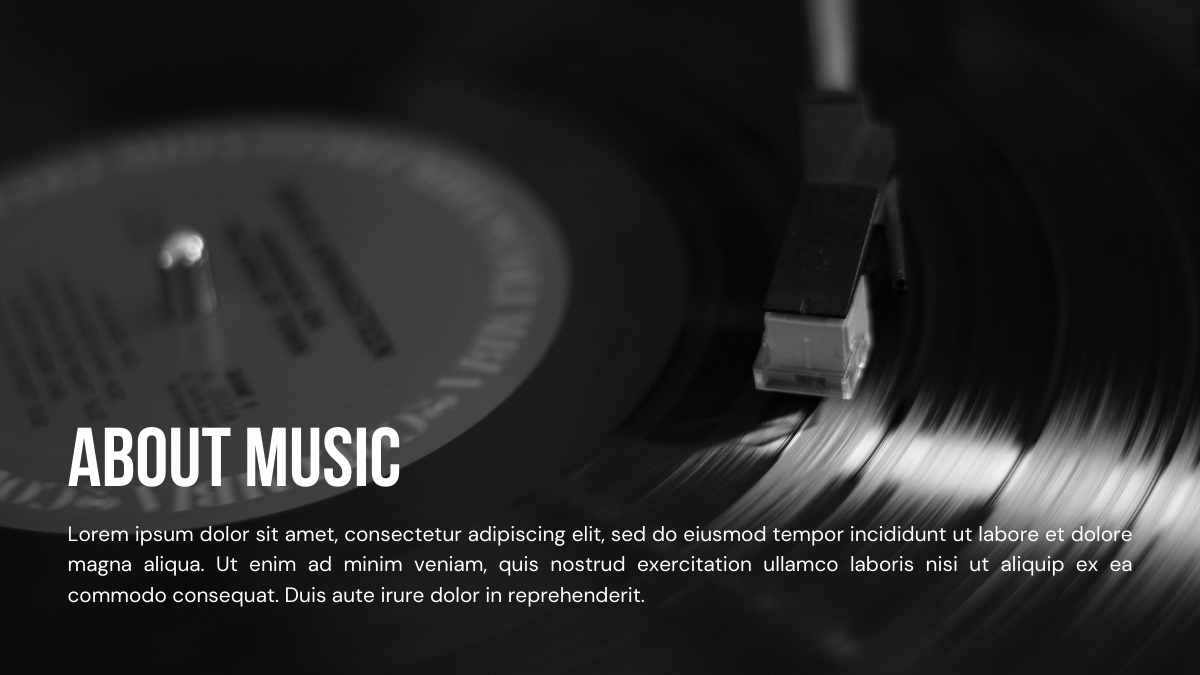

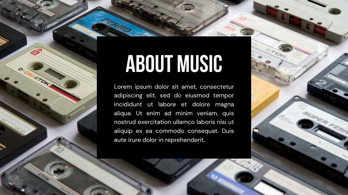
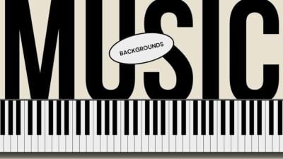


 15
15

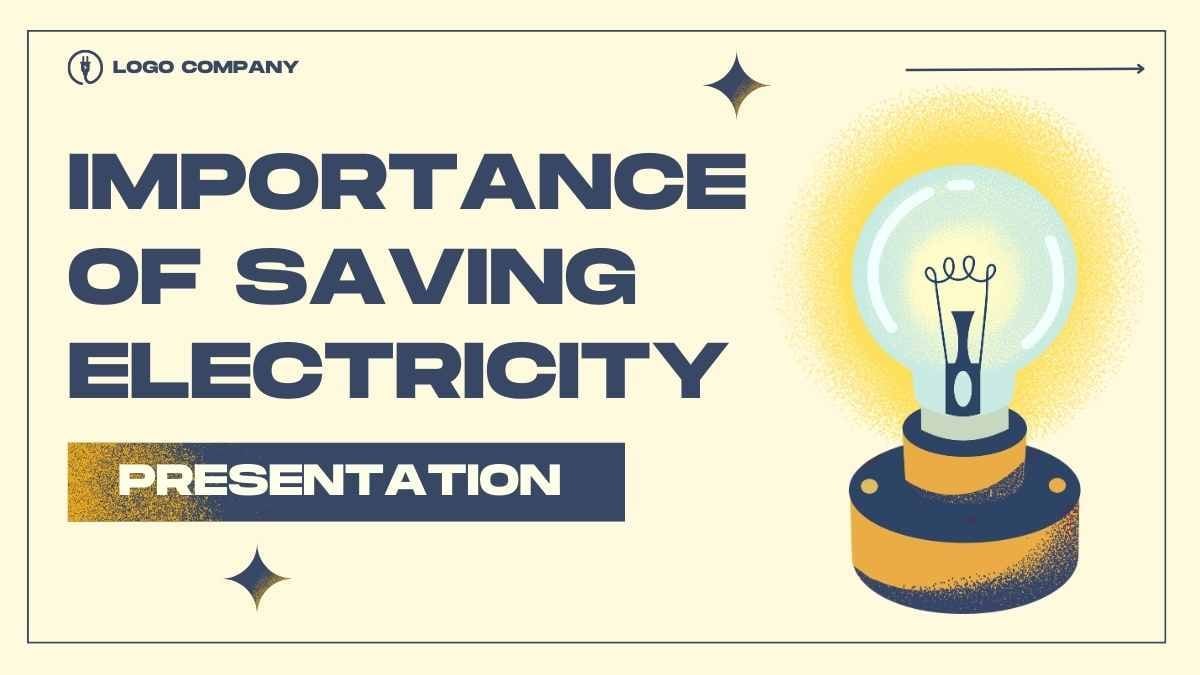
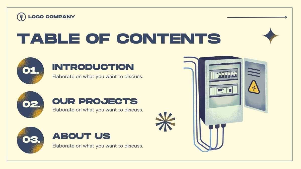

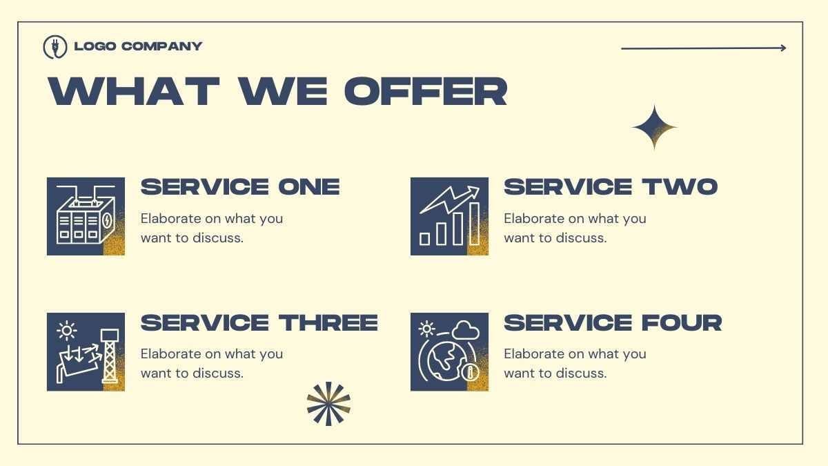


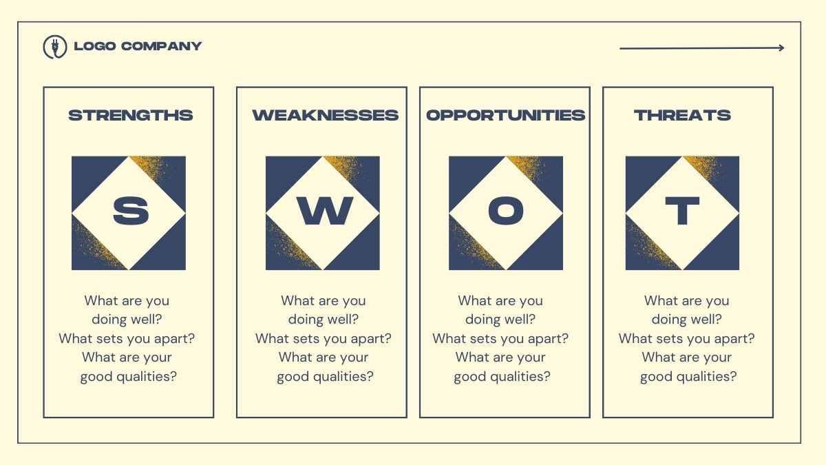

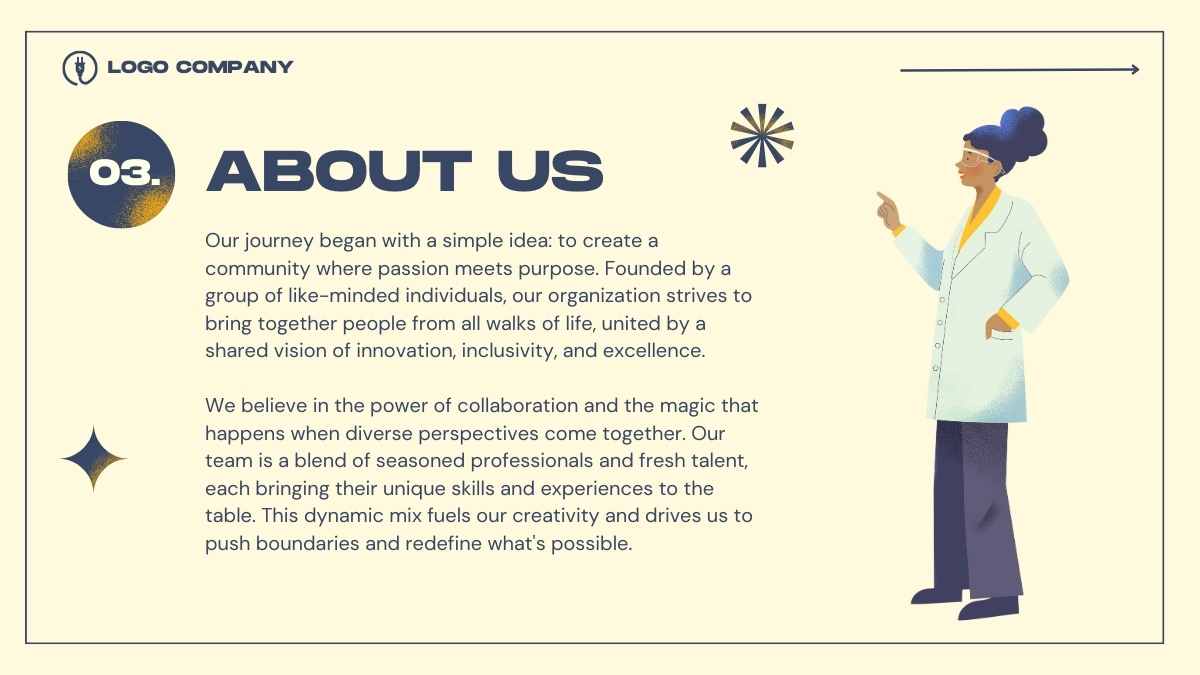

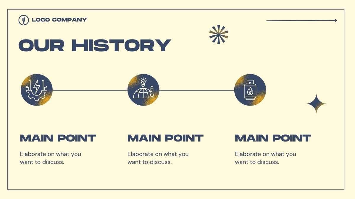

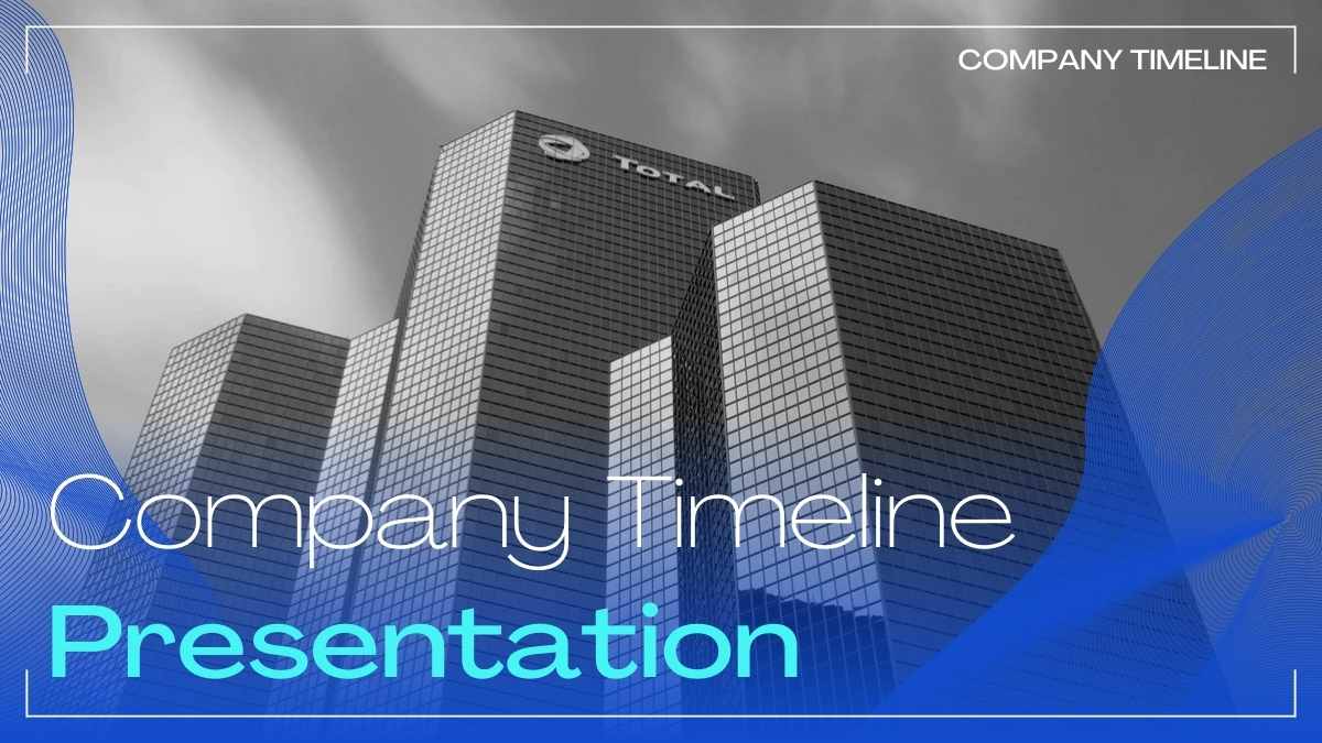
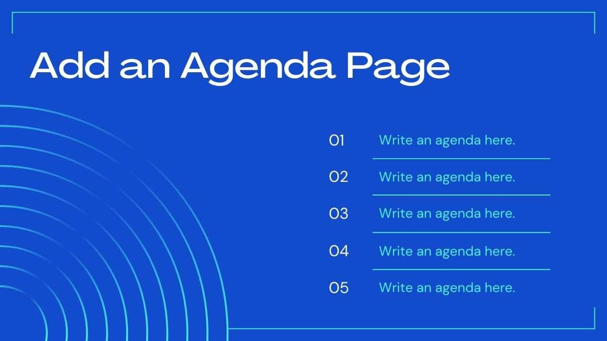
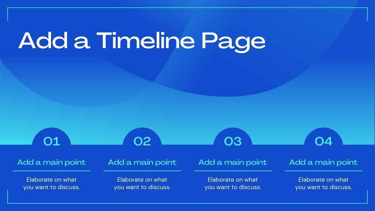
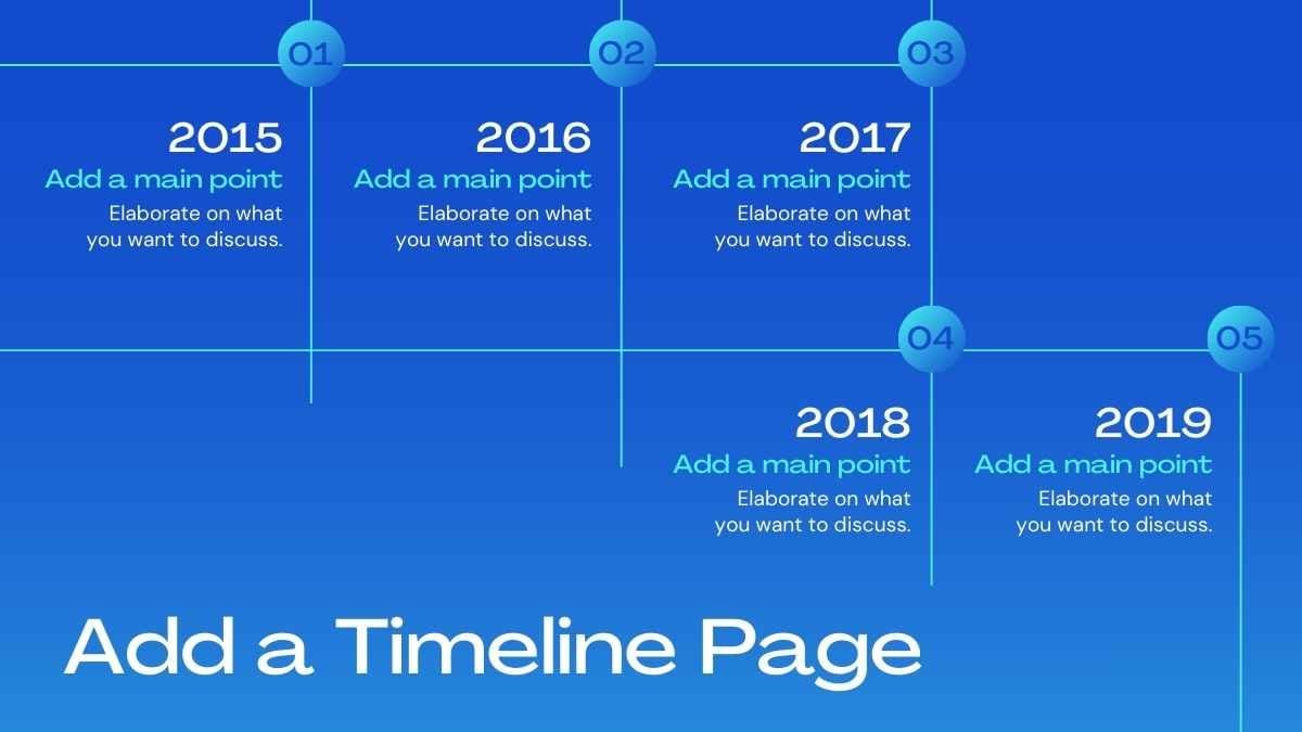
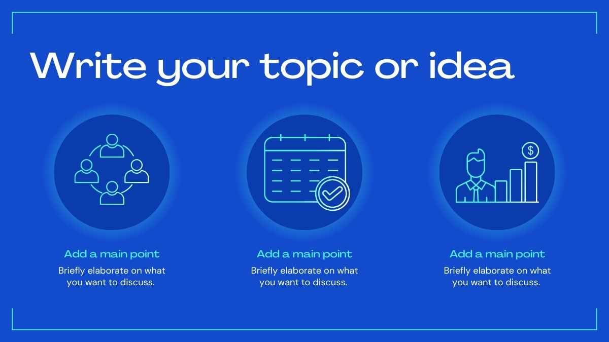


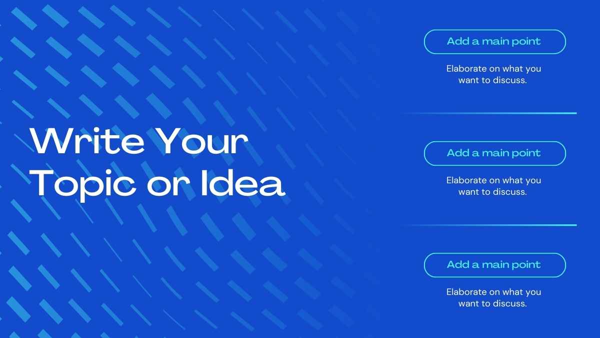
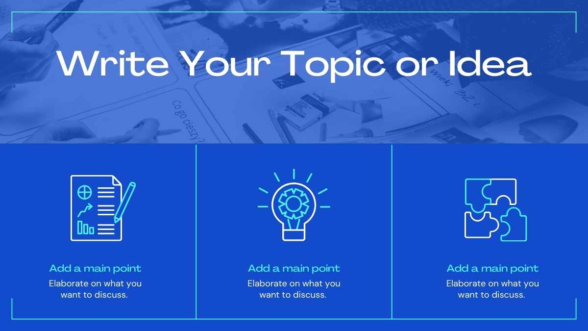
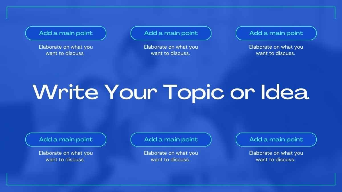


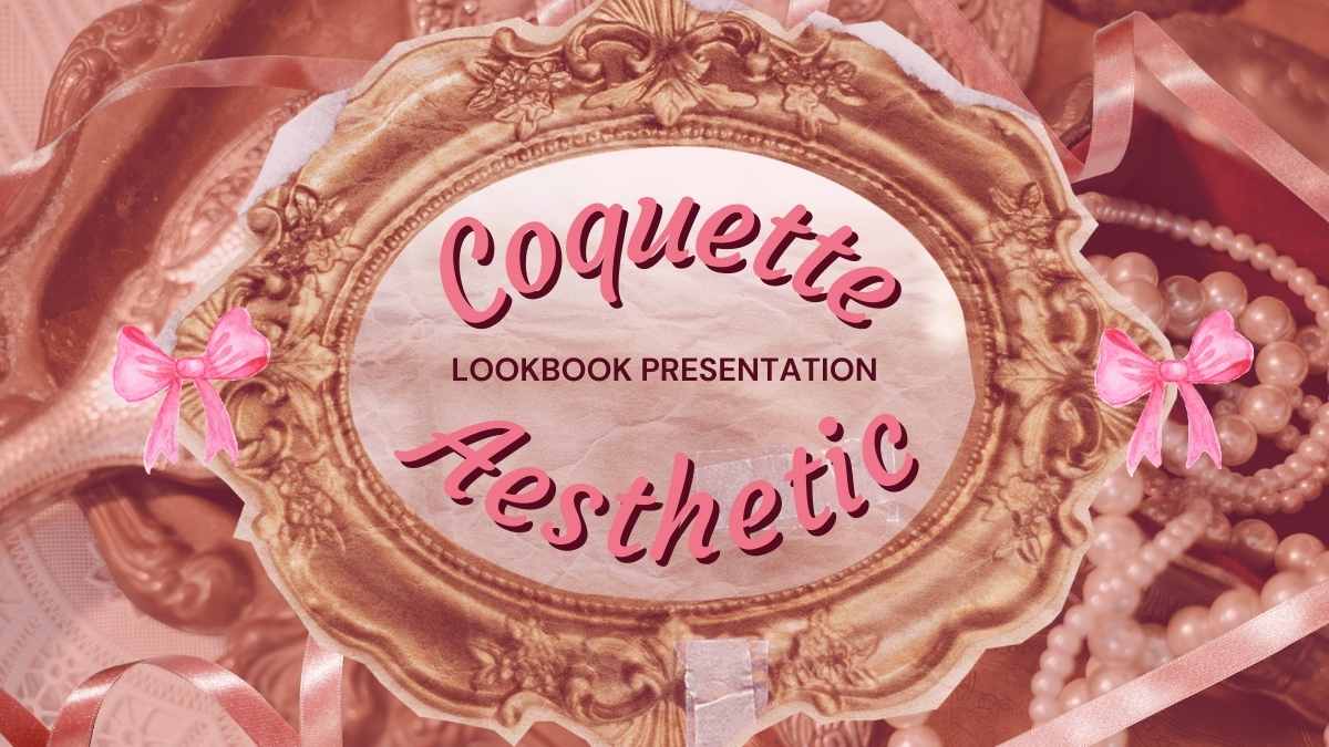
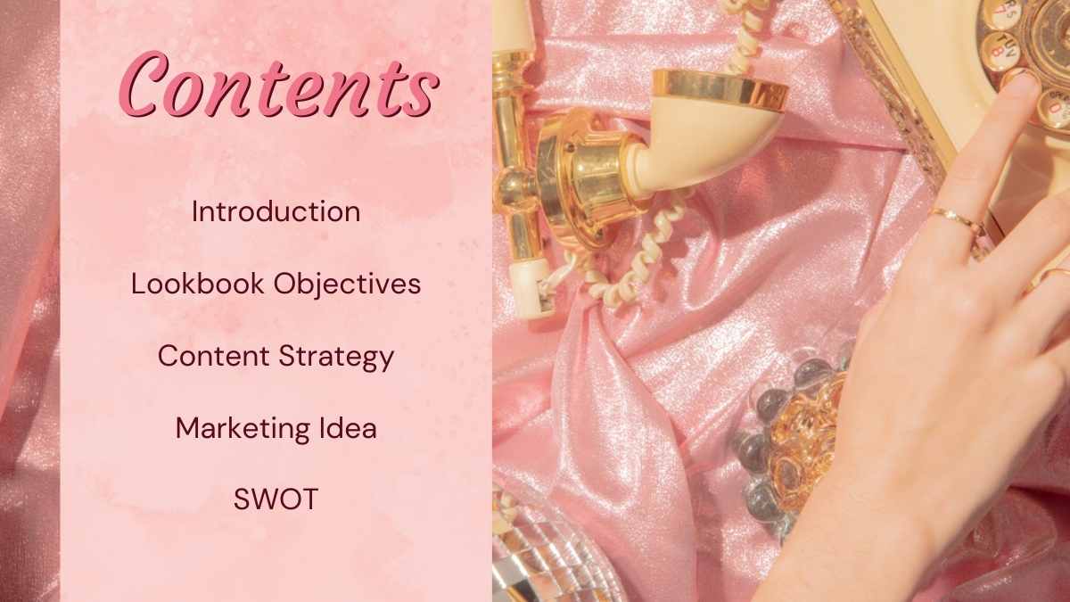
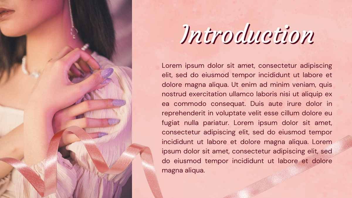
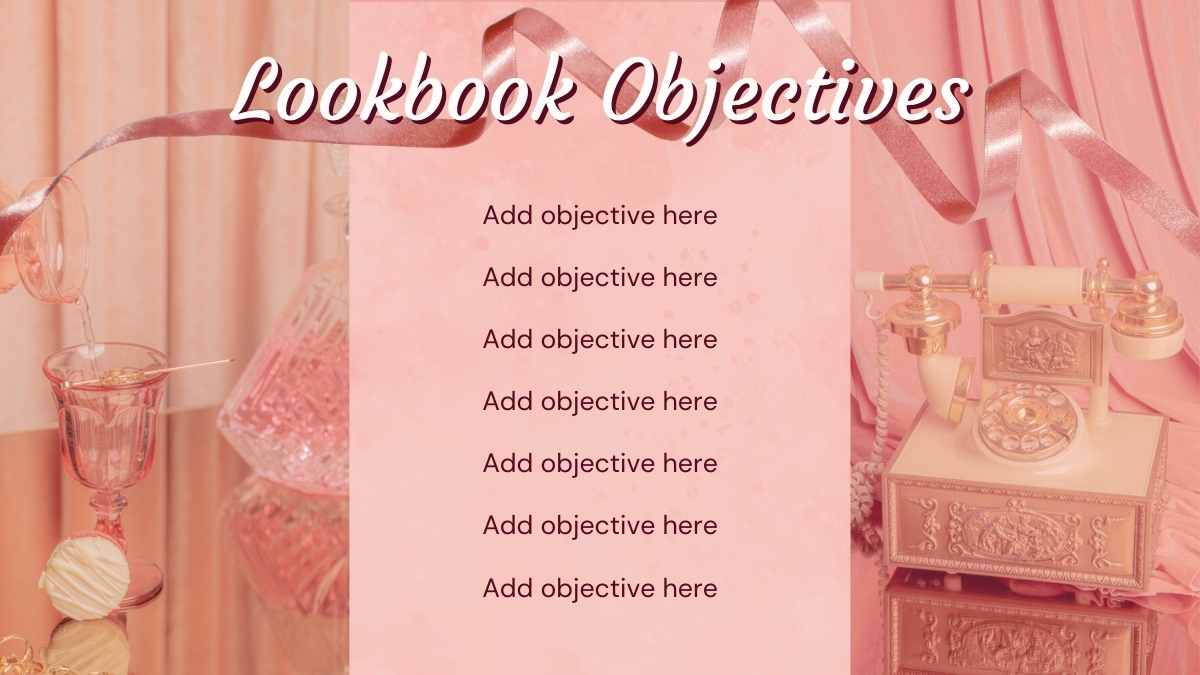





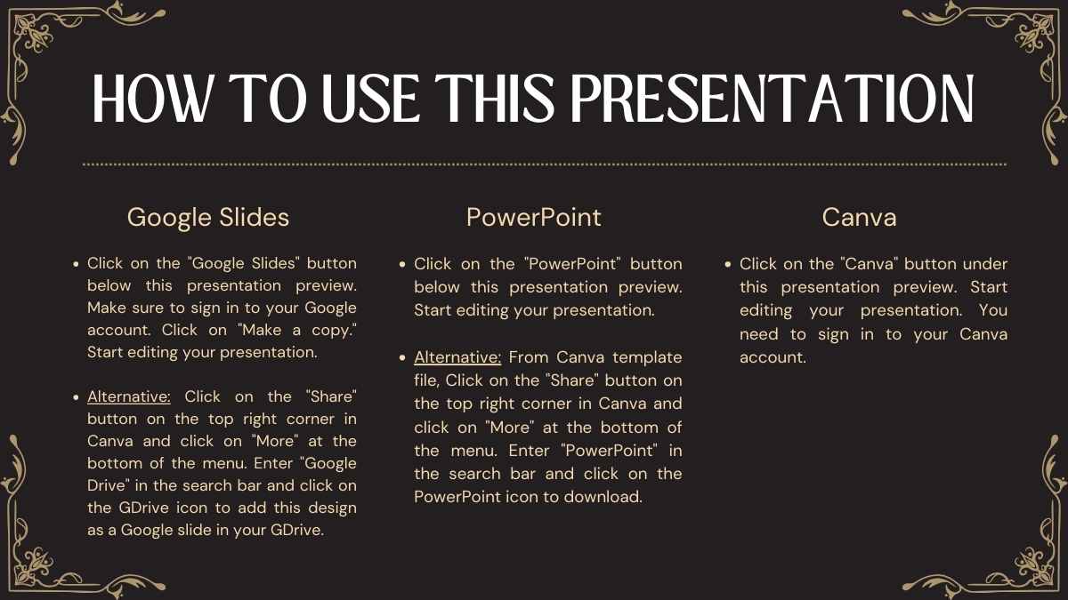
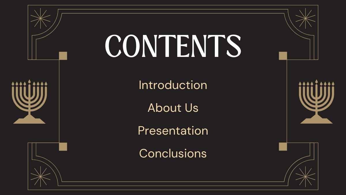
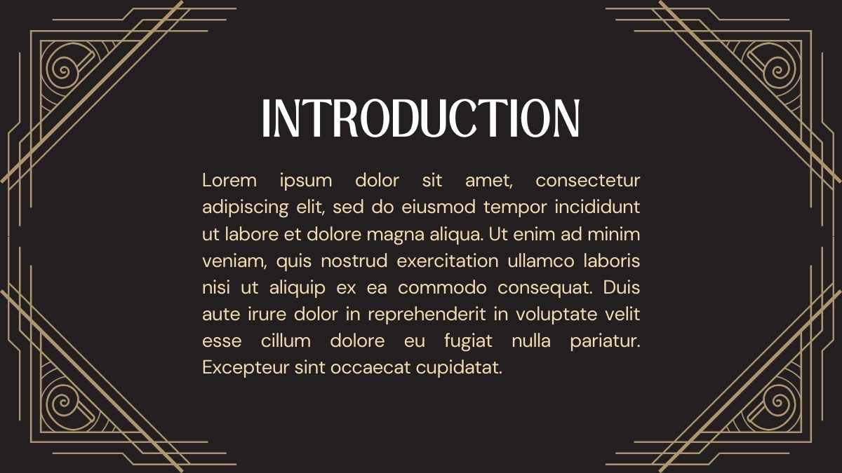
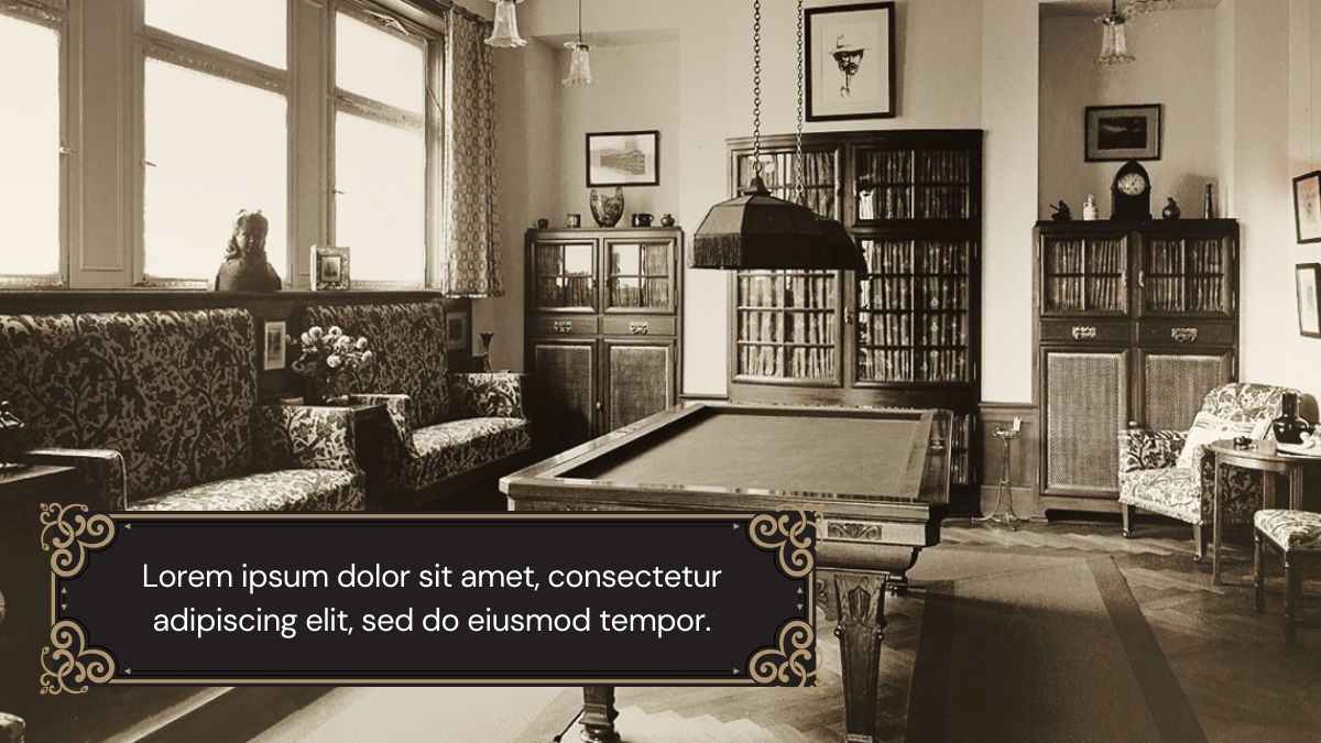
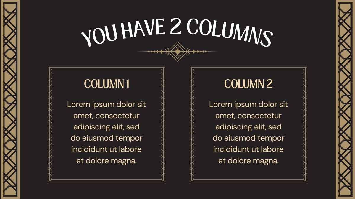
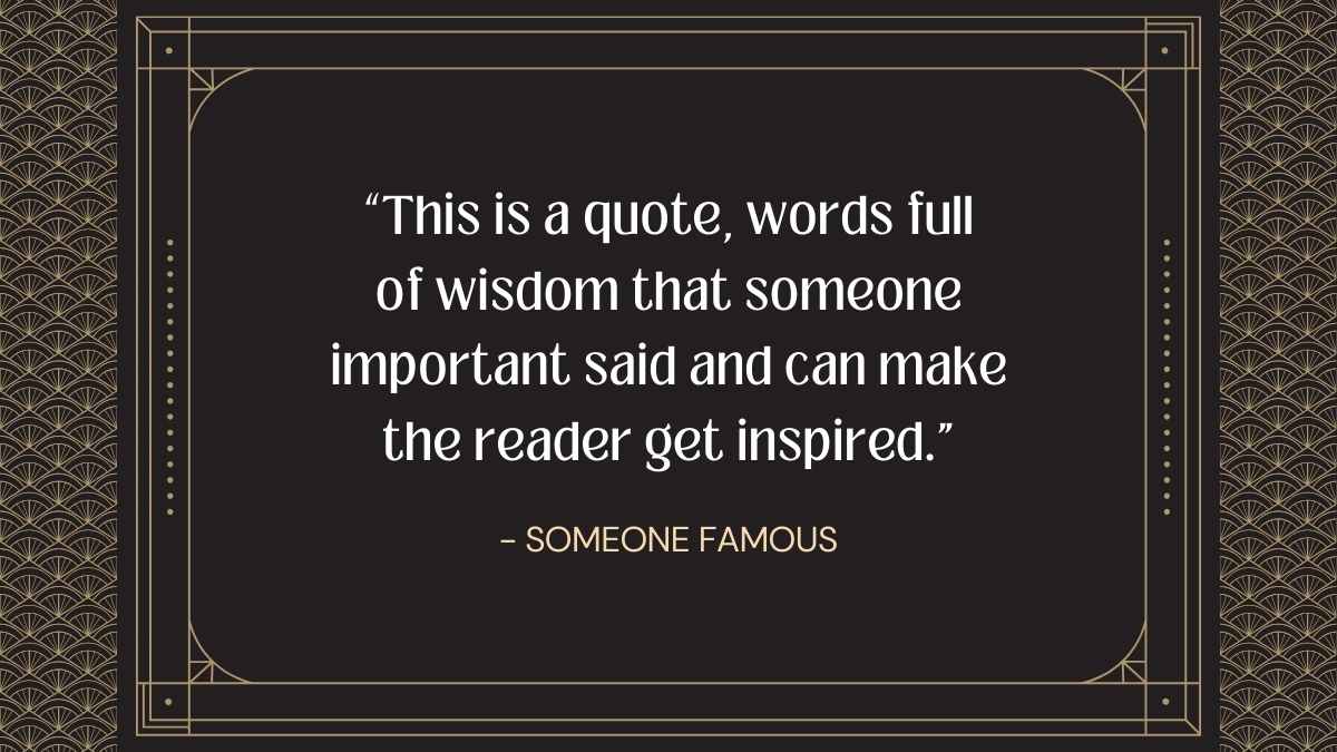
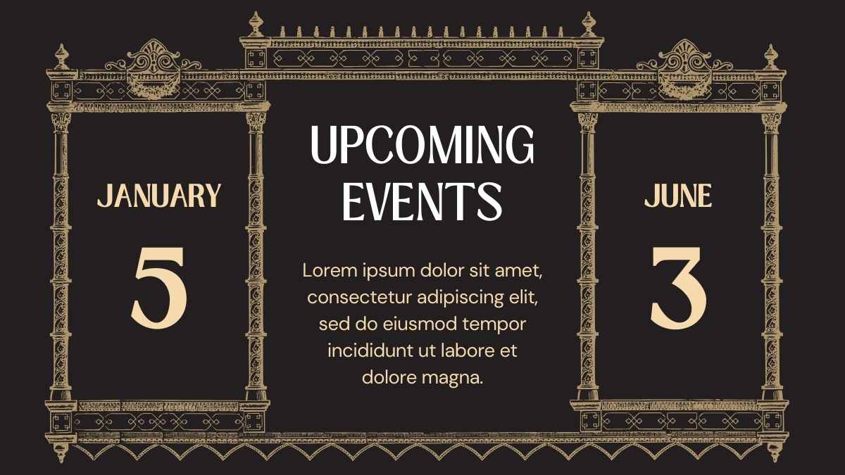

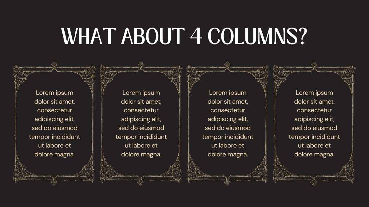
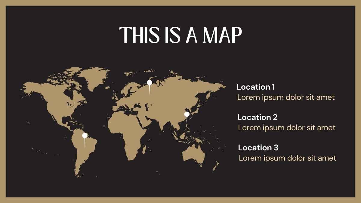
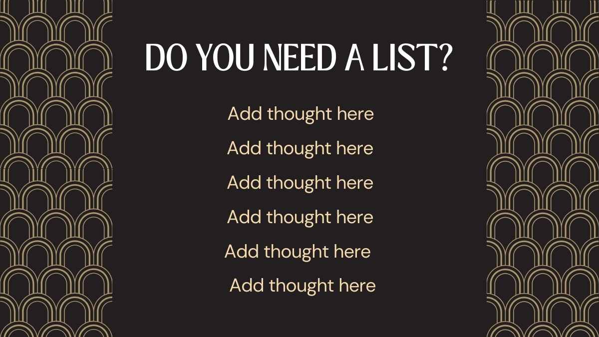
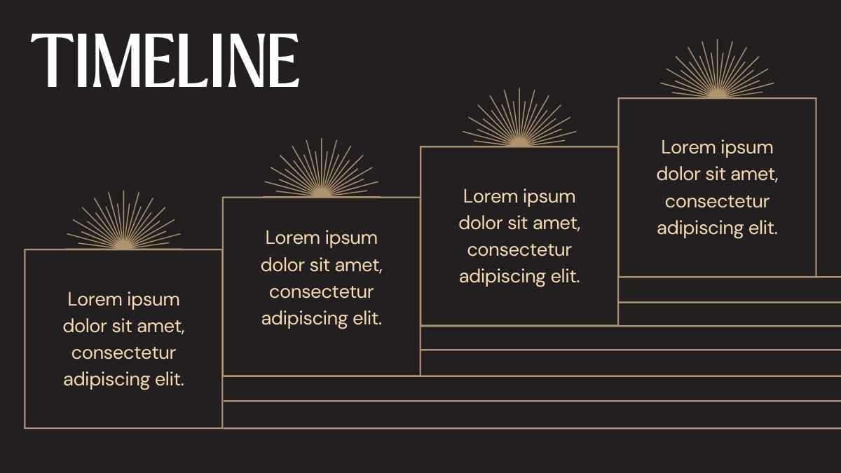
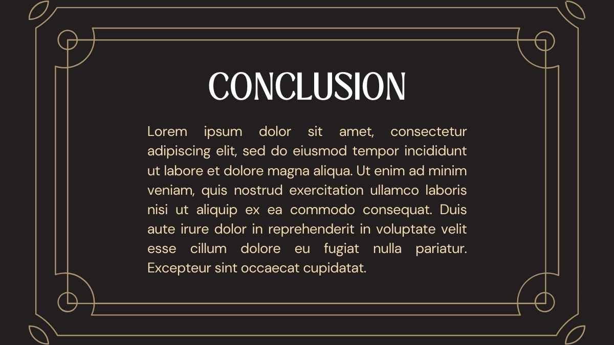









Best font pairs for Dm Sans
DM Sans pairs well with Inter for compact interfaces, its companion DM Serif Display for editorial contrast, and Roboto for business dashboards.
MODERN & MINIMAL
DM Sans + Inter
Tidy, compact headings
DM Sans and Inter were both drawn for legibility at small sizes, but Inter's taller x-height edges ahead in dense text, so DM Sans takes the headings and Inter the body. Built for interfaces and dashboards.
EDITORIAL CONTRAST
DM Serif Display + DM Sans
A bold display contrast
DM Serif Display and DM Sans come from the same DM family, so the serif headline and the low-contrast sans body share proportions and sit together without friction. A cohesive choice for editorial layouts and articles.
BUSINESS & CORPORATE
DM Sans + Roboto
Clear, efficient headings
DM Sans's low-contrast, geometric headings sit against Roboto's slightly humanist body, a subtle texture shift that keeps long UI text readable. A practical pairing for product interfaces and business dashboards.
Alternatives to Dm Sans
For an alternative to DM Sans, low-contrast geometric sans-serifs like Inter, Manrope, and Plus Jakarta Sans work well for screen and UI.
Inter
This is a Inter headline
And this is body text in Inter. It's worth considering as an alternative to Dm Sans.
View moreManrope
This is a Manrope headline
And this is body text in Manrope. It's worth considering as an alternative to Dm Sans.
View morePlus Jakarta Sans
This is a Plus Jakarta Sans headline
And this is body text in Plus Jakarta Sans. It's worth considering as an alternative to Dm Sans.
View moreHanken Grotesk
This is a Hanken Grotesk headline
And this is body text in Hanken Grotesk. It's worth considering as an alternative to Dm Sans.
View moreFigtree
This is a Figtree headline
And this is body text in Figtree. It's worth considering as an alternative to Dm Sans.
View moreWork Sans
This is a Work Sans headline
And this is body text in Work Sans. It's worth considering as an alternative to Dm Sans.
View moreRubik
This is a Rubik headline
And this is body text in Rubik. It's worth considering as an alternative to Dm Sans.
View moreSora
This is a Sora headline
And this is body text in Sora. It's worth considering as an alternative to Dm Sans.
View morePublic Sans
This is a Public Sans headline
And this is body text in Public Sans. It's worth considering as an alternative to Dm Sans.
View moreMulish
This is a Mulish headline
And this is body text in Mulish. It's worth considering as an alternative to Dm Sans.
View moreFrequently asked questions about Dm Sans
Is DM Sans free to use?

What kind of font is DM Sans?
What font pairs well with DM Sans?
Is DM Sans good for small text and interfaces?
What fonts are similar to DM Sans?