
Search


- English
Trends
VERSATILE GEOMETRIC FONT
Montserrat
Montserrat is a free geometric sans-serif from Google Fonts, born from the painted shop signs of Buenos Aires. Its clean, even letterforms made it one of the most used fonts on the web.
A quick look at Montserrat
Specimen
Montserrat started as a rescue mission. Julieta Ulanovsky grew up among the hand-painted signs and vintage lettering of the Montserrat district in Buenos Aires, and began digitizing those letterforms before the old storefronts modernized and erased them. What she saved became a geometric sans-serif now used on millions of sites.
Body Text / 18pt Regular
Montserrat Font Details
Aa
Thin
Aa
Light
Aa
Regular
Aa
Bold
Aa
Black
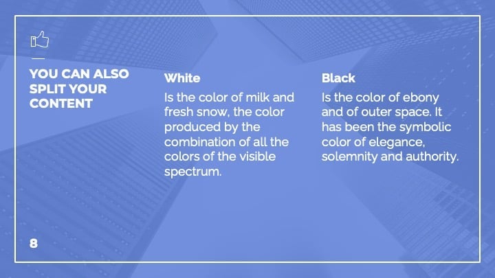
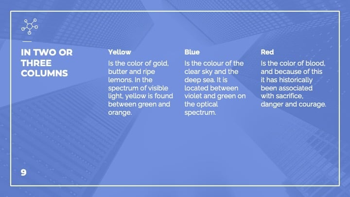
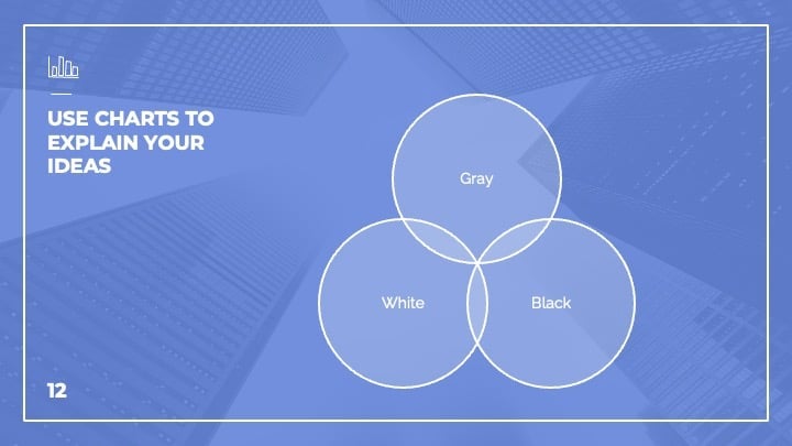
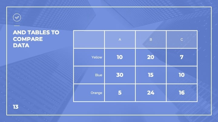
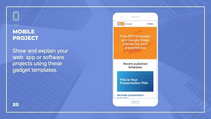
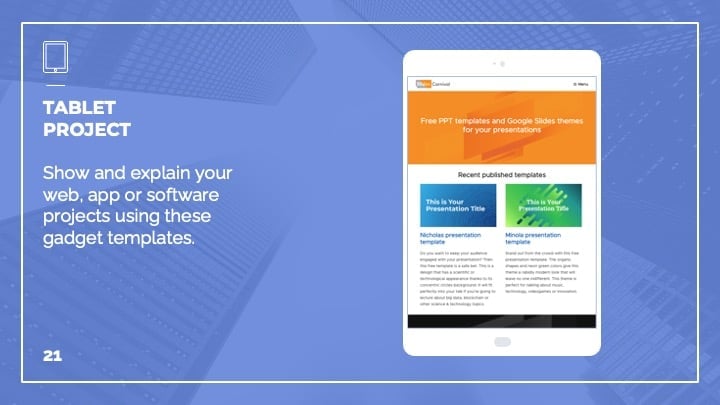
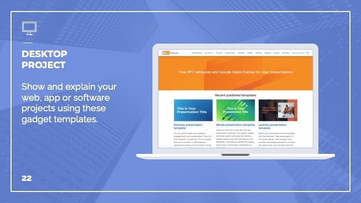
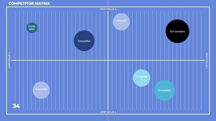
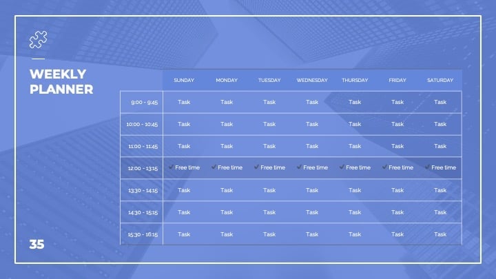
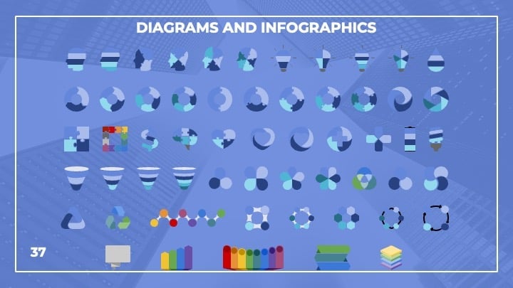
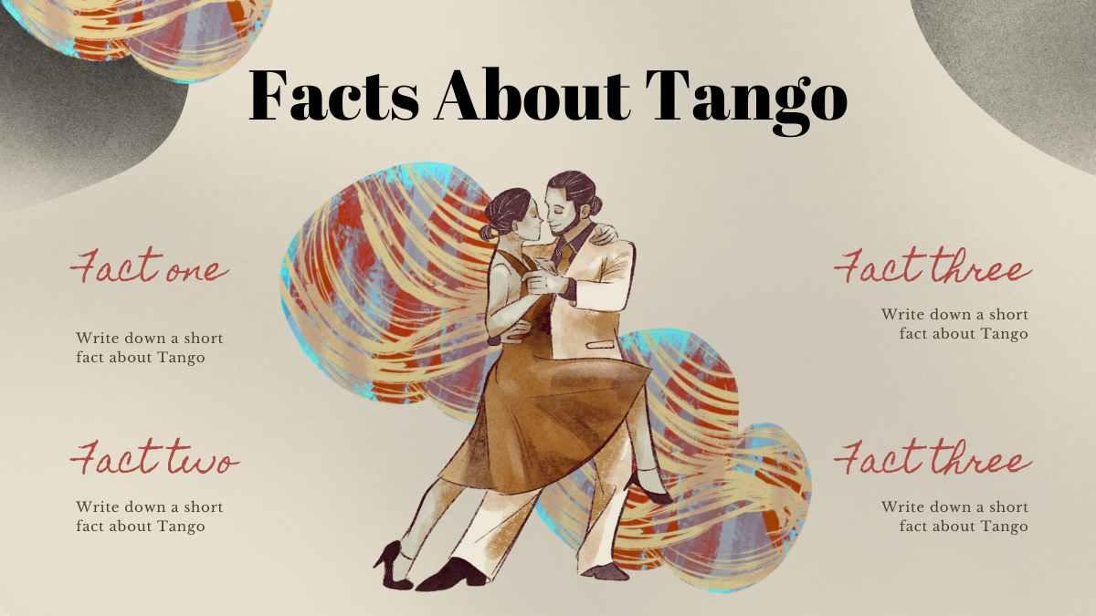
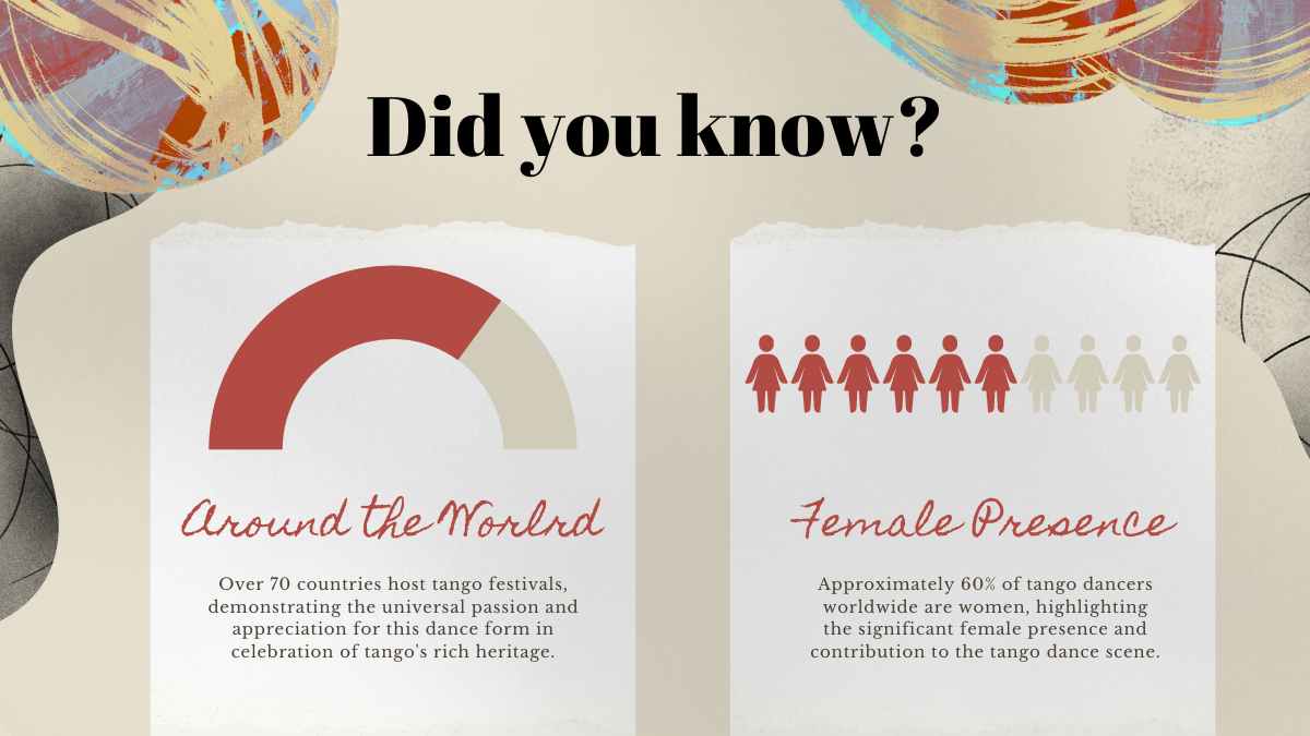
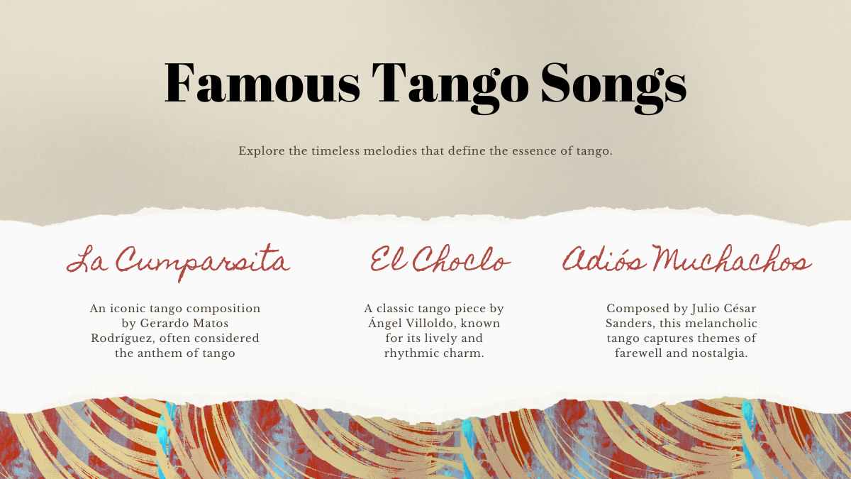
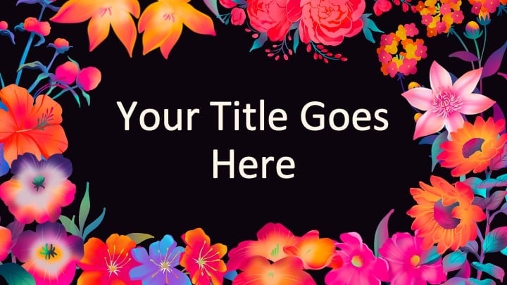
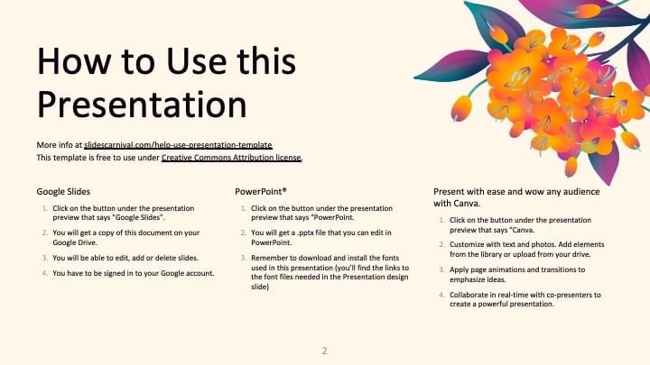
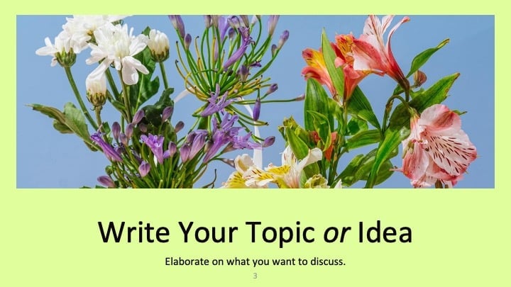
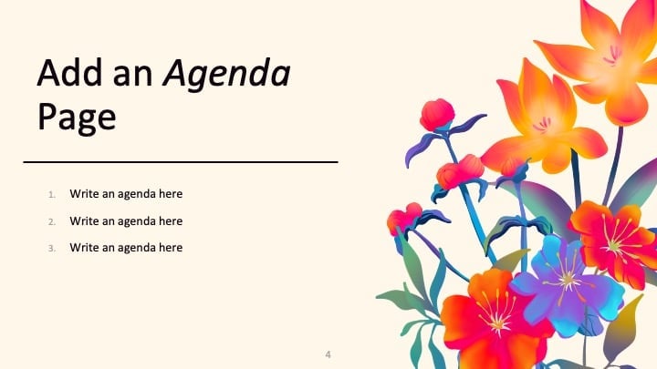
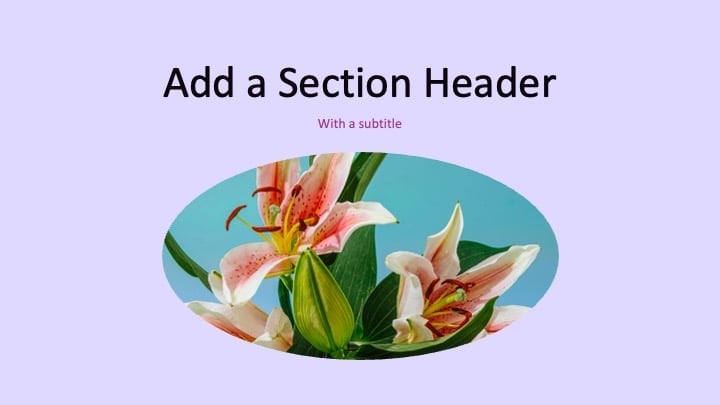
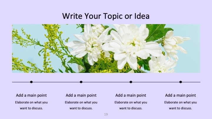
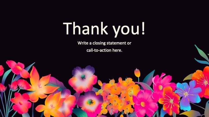
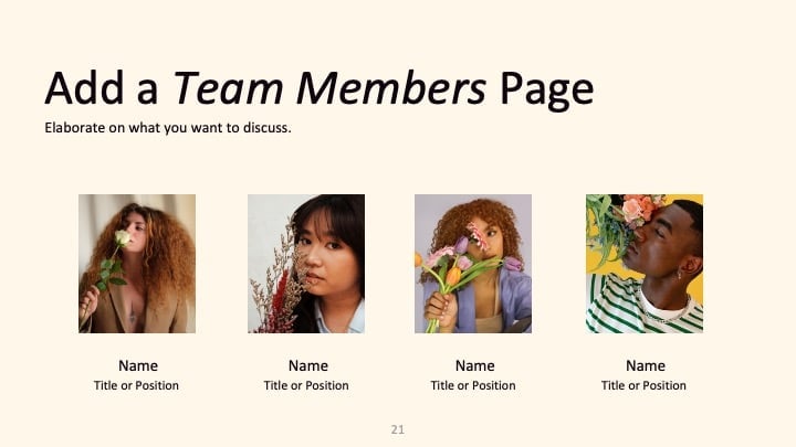
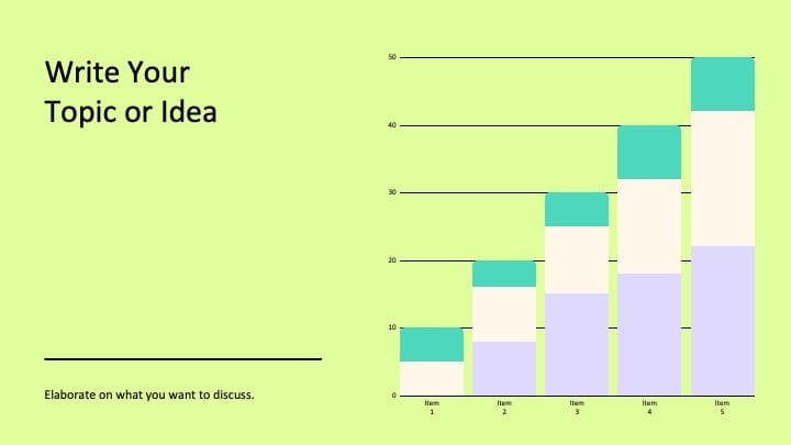
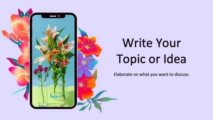
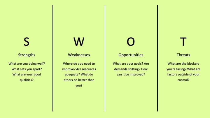
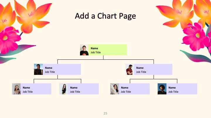
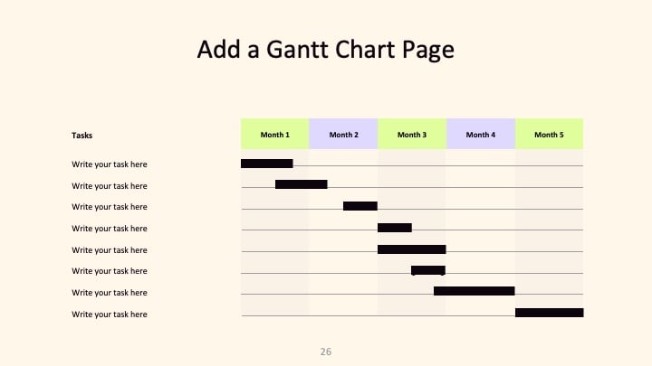
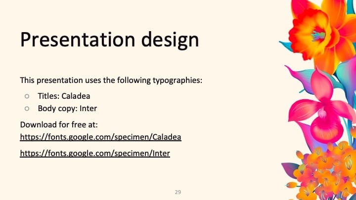
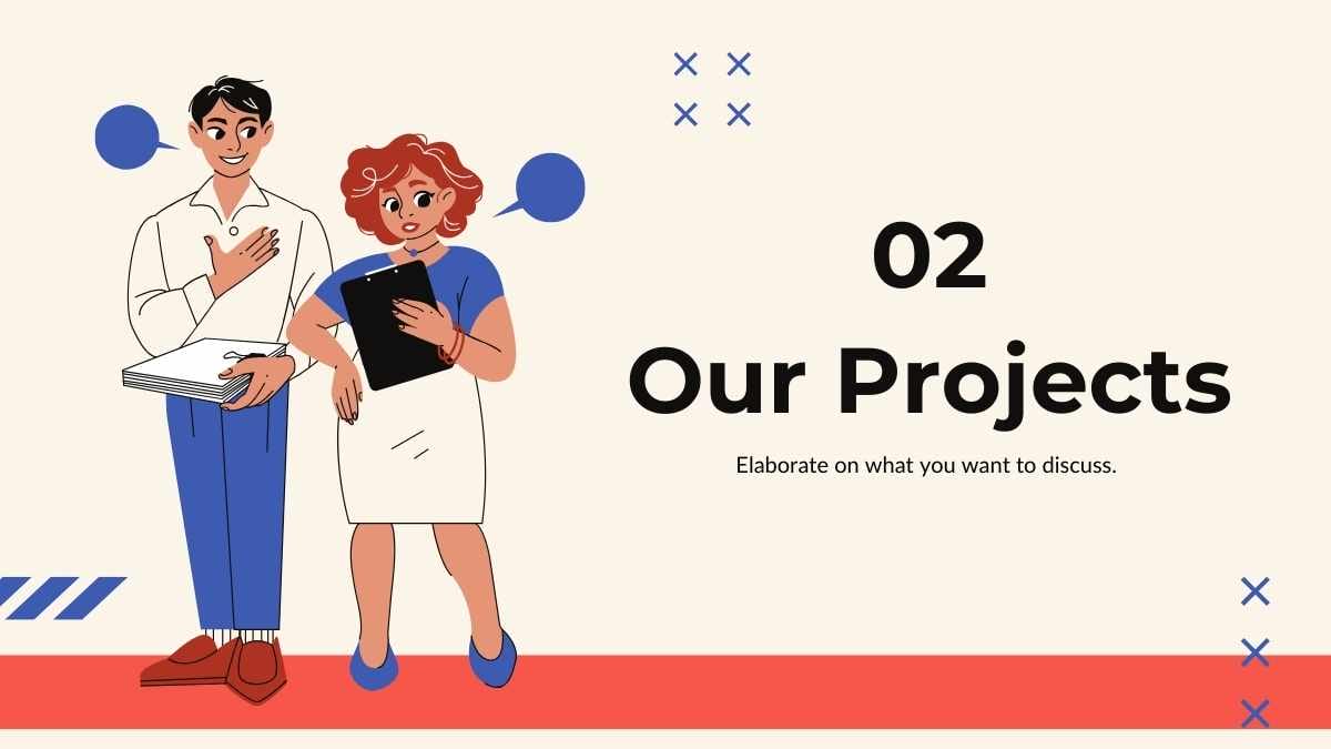
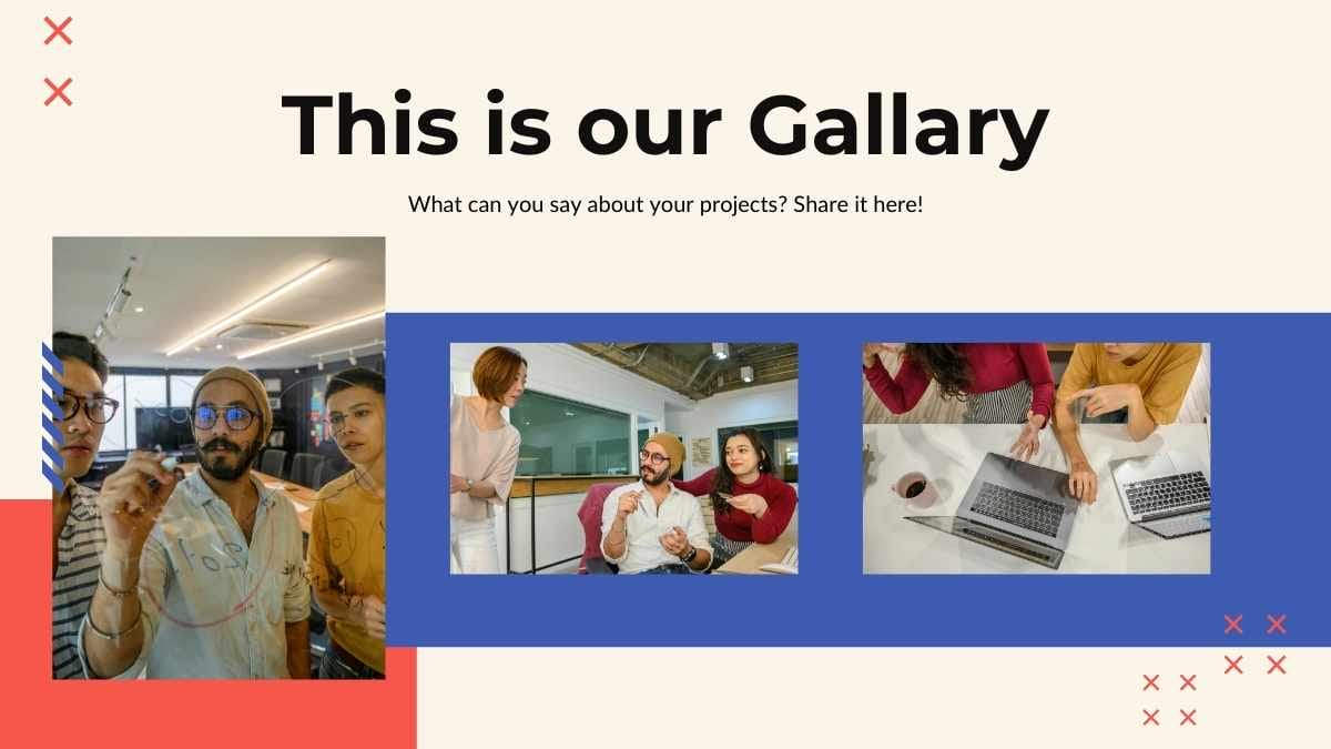
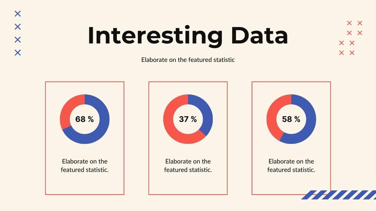
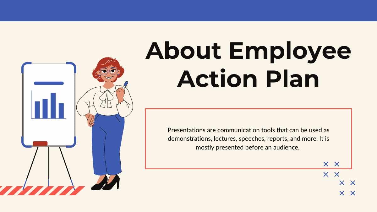
Templates using the font Montserrat

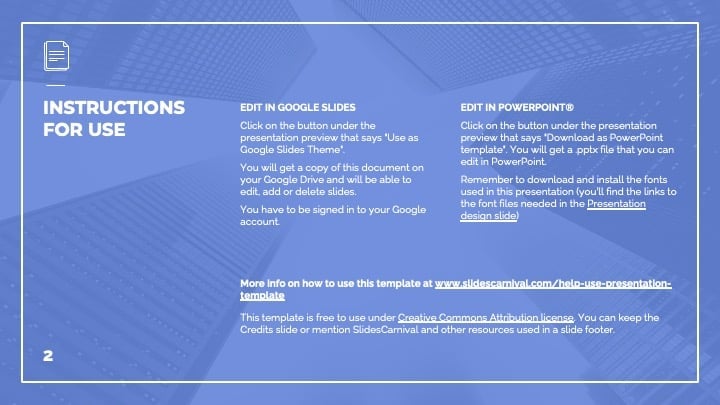
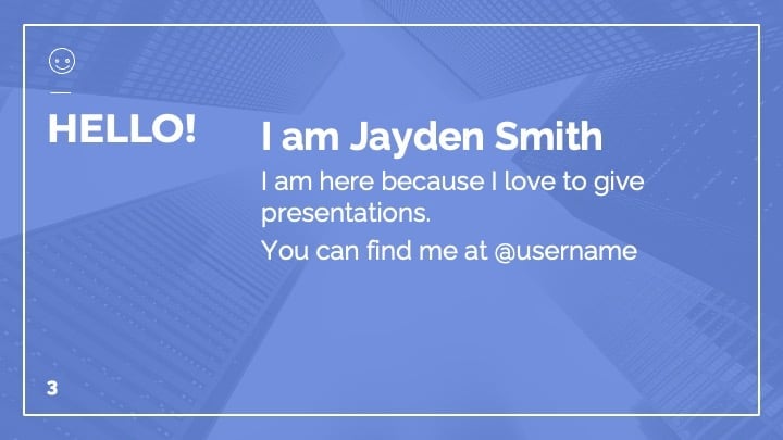

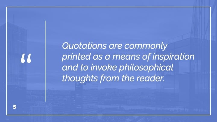
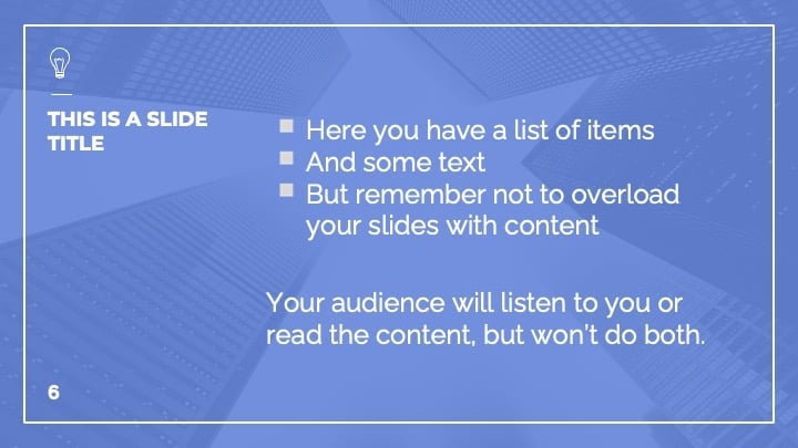




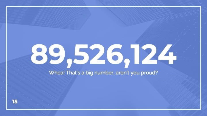

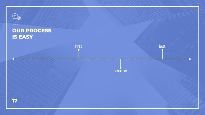
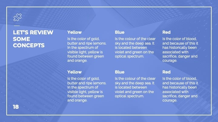
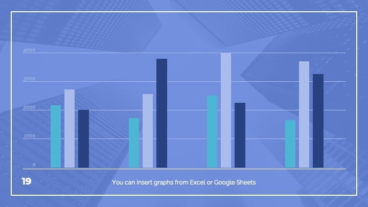
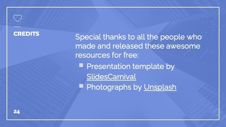
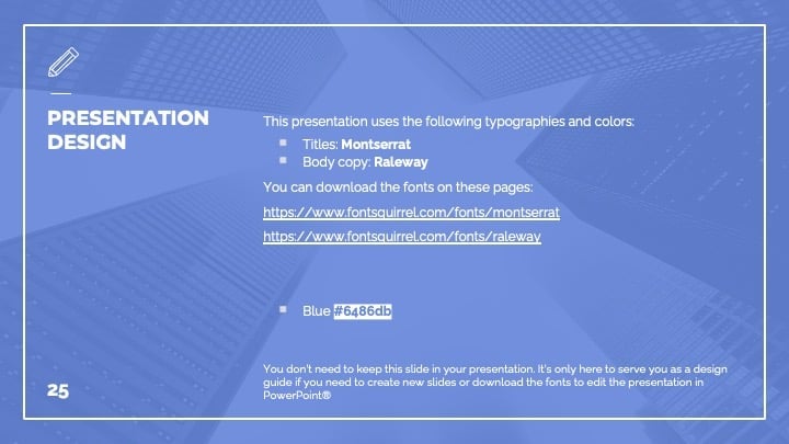

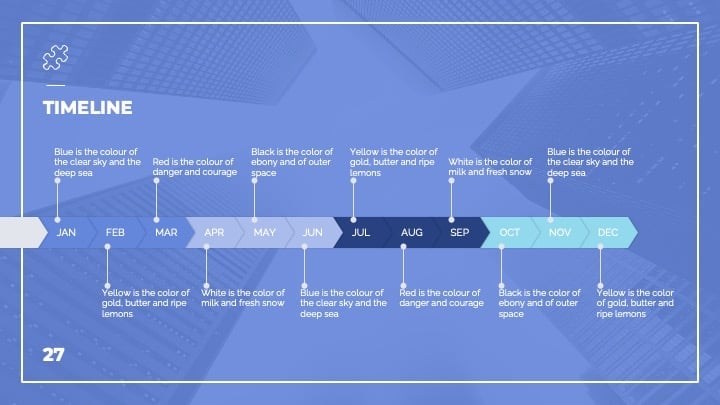
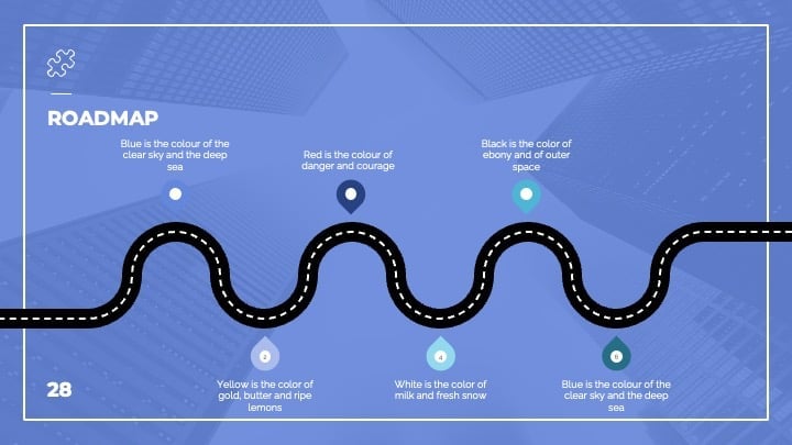
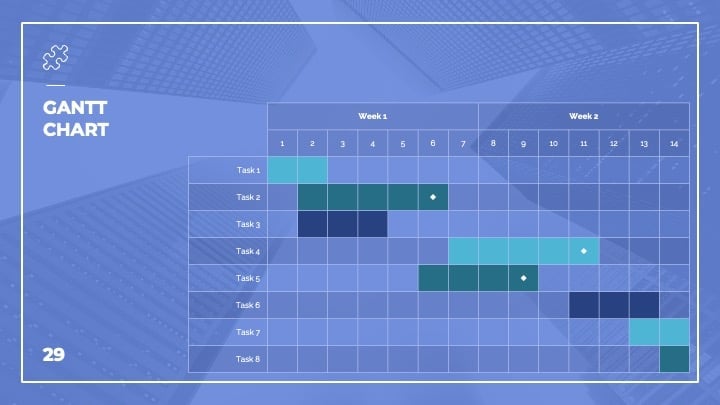
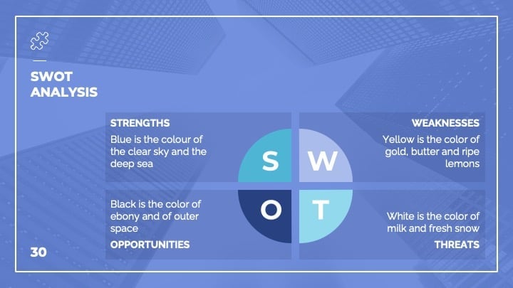
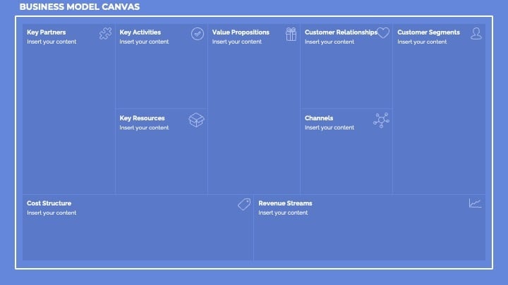
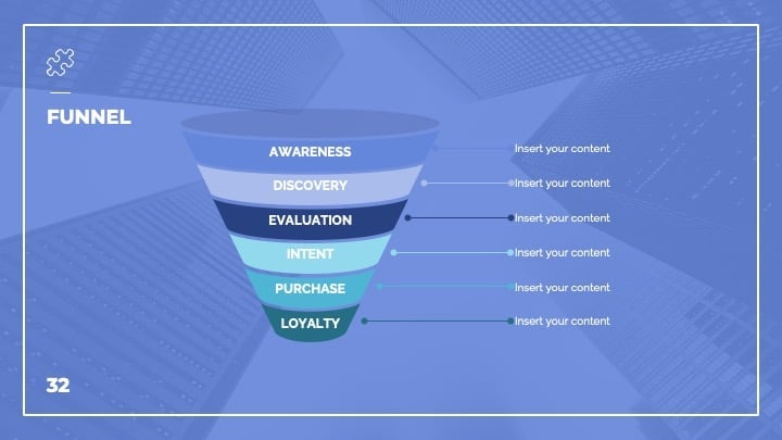




 39
39



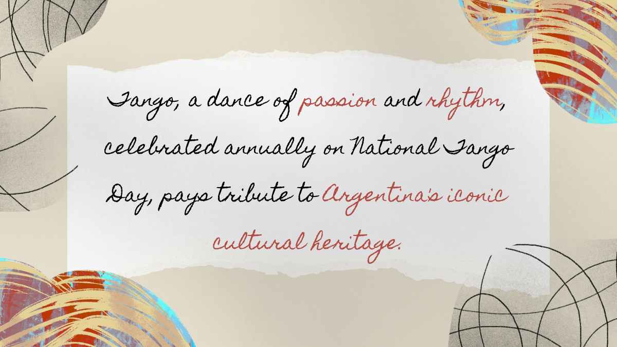
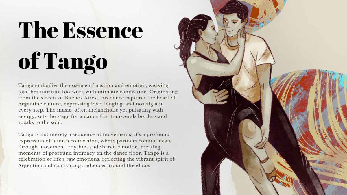

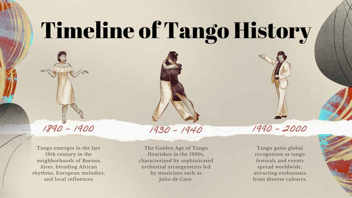
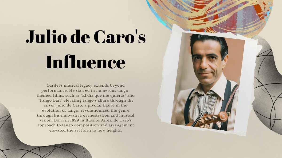





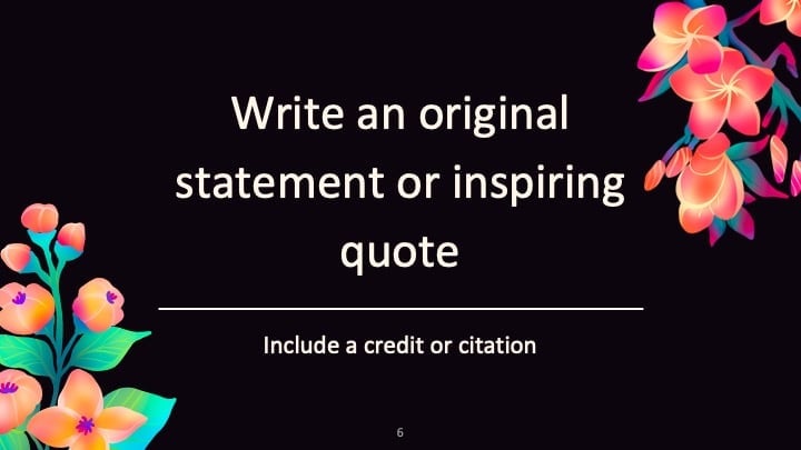
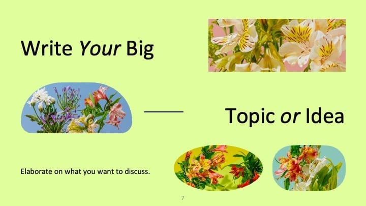
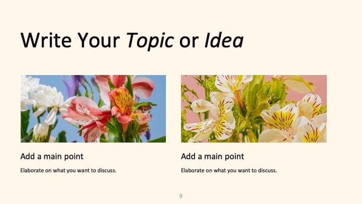







































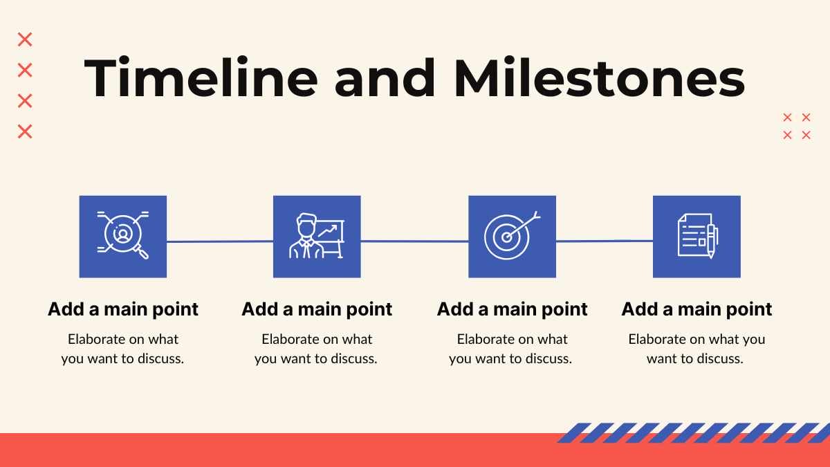


Best font pairs for Montserrat
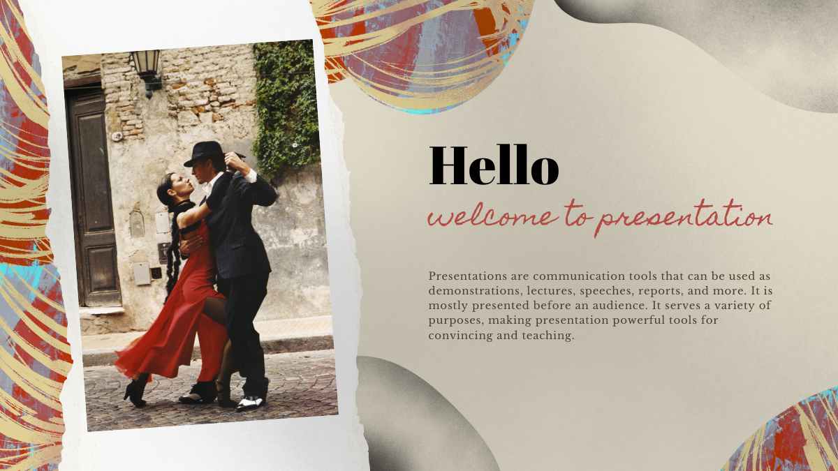
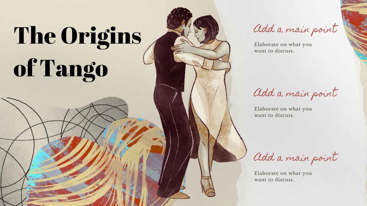
Montserrat pairs well with Inter for clean interfaces, Playfair Display for editorial contrast, and Roboto for business decks.
MODERN & MINIMAL
Montserrat + Inter
Crisp, modern headings
Montserrat and Inter share clean, even strokes, but Inter was drawn for screens with a taller x-height that holds at small sizes, so Montserrat takes the headings and Inter carries the body. Good for apps, dashboards, and product pages.
EDITORIAL CONTRAST
Playfair Display + Montserrat
An elegant editorial look
Playfair Display's hairline serifs and sharp thick-to-thin contrast give headlines a high-fashion edge, while Montserrat's near-monolinear body keeps the reading plain underneath. Playfair Display heads, Montserrat bodies, a strong fit for portfolios and editorial layouts.
BUSINESS & CORPORATE
Montserrat + Roboto
A strong, professional headline
Montserrat's wide, near-circular letters command a heading but eat space in a paragraph; Roboto's slightly narrowed, neutral forms set the body more economically. A practical split for business decks, with Montserrat up top and Roboto for the copy.
Alternatives to Montserrat
If you need an alternative to Montserrat, geometric sans-serifs like Poppins, Jost, and Raleway offer the same clean, modern feel.
Poppins
This is a Poppins headline
And this is body text in Poppins. It's worth considering as an alternative to Montserrat.
View moreRaleway
This is a Raleway headline
And this is body text in Raleway. It's worth considering as an alternative to Montserrat.
View moreJost
This is a Jost headline
And this is body text in Jost. It's worth considering as an alternative to Montserrat.
View moreWork Sans
This is a Work Sans headline
And this is body text in Work Sans. It's worth considering as an alternative to Montserrat.
View moreMulish
This is a Mulish headline
And this is body text in Mulish. It's worth considering as an alternative to Montserrat.
View moreQuestrial
This is a Questrial headline
And this is body text in Questrial. It's worth considering as an alternative to Montserrat.
View moreJosefin Sans
This is a Josefin Sans headline
And this is body text in Josefin Sans. It's worth considering as an alternative to Montserrat.
View moreMontserrat Alternates
This is a Montserrat Alternates headline
And this is body text in Montserrat Alternates. It's worth considering as an alternative to Montserrat.
View moreFrequently asked questions about Montserrat
Is Montserrat free to use?

What kind of font is Montserrat?
What font pairs well with Montserrat?
What is Montserrat used for?
Who designed Montserrat?