
Search


- English
Trends
VERSATILE SANS-SERIF FONT
Open Sans
Open Sans is a free humanist sans-serif from Google Fonts, designed for clarity on screens. Its neutral, highly legible forms suit body text, UI, and presentations.
Open Sans at a glance
Specimen
Open Sans was designed by Steve Matteson with an upright stress and open forms tuned for legibility. It reads cleanly on screens at small sizes, which is why it became one of the most widely used fonts on the web. It suits long passages, interfaces, and presentations.
Body Text / 18pt Regular
Open Sans Font Details
Aa
Light
Aa
Regular
Aa
SemiBold
Aa
Bold
Aa
ExtraBold
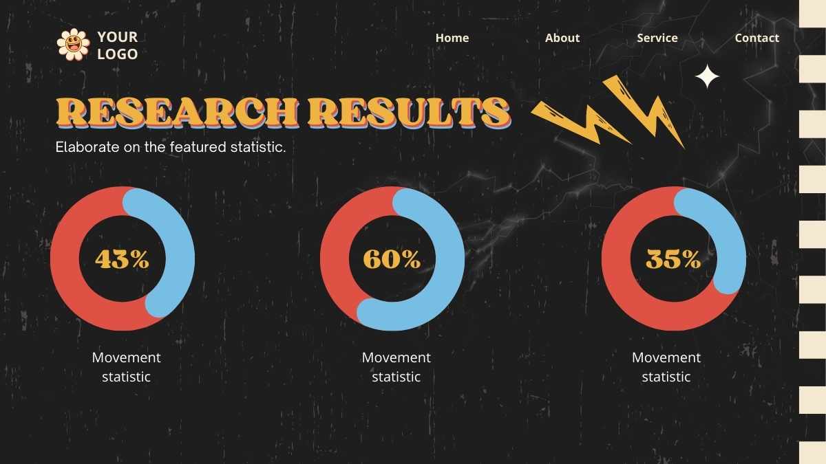
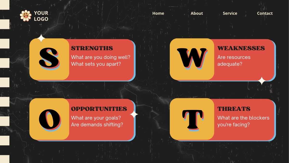
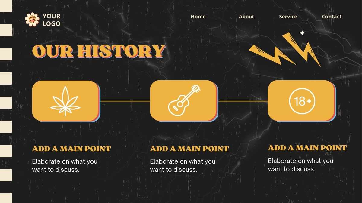
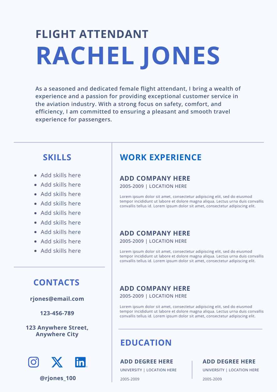
Templates using the font Open Sans


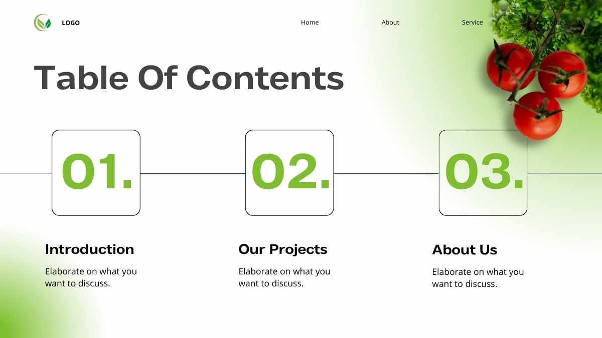
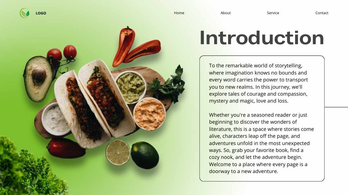
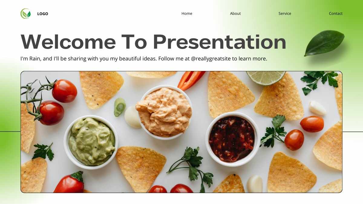
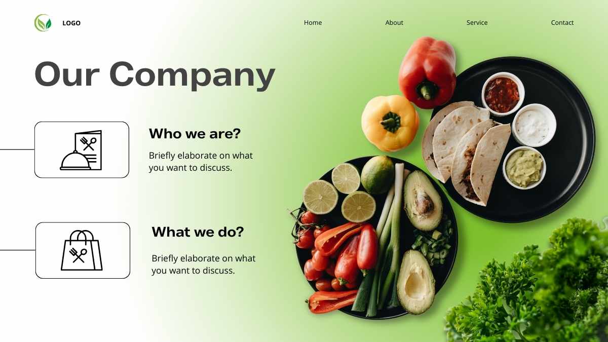
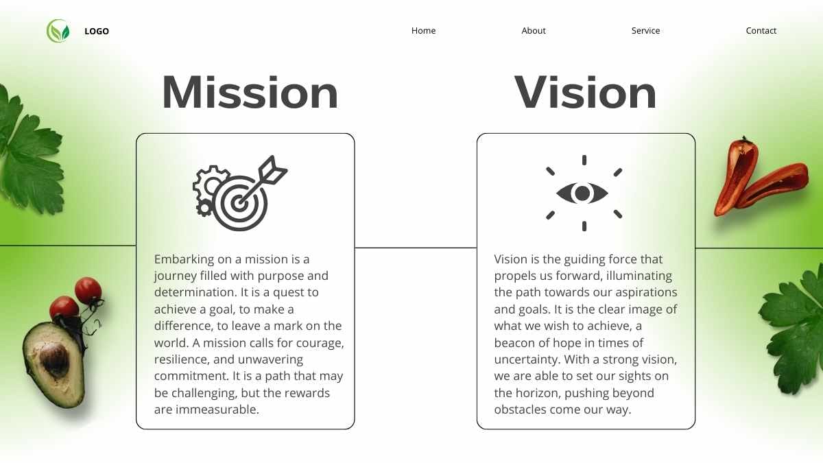

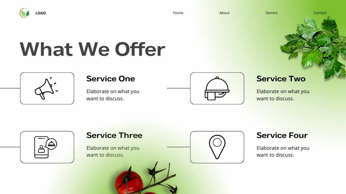
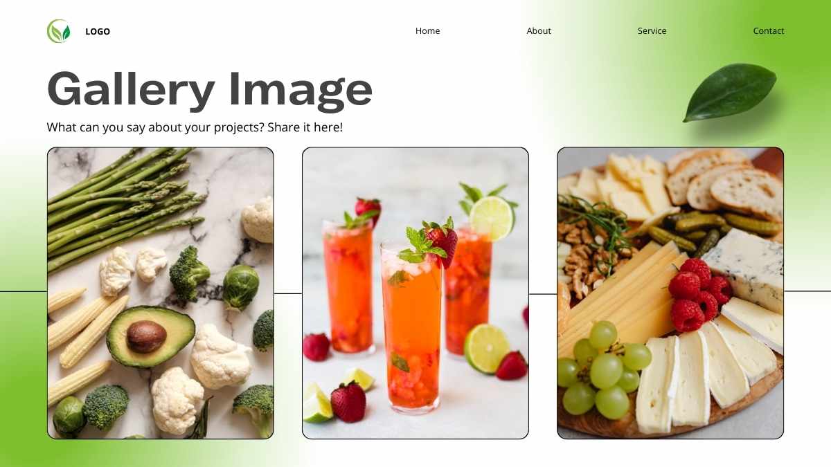

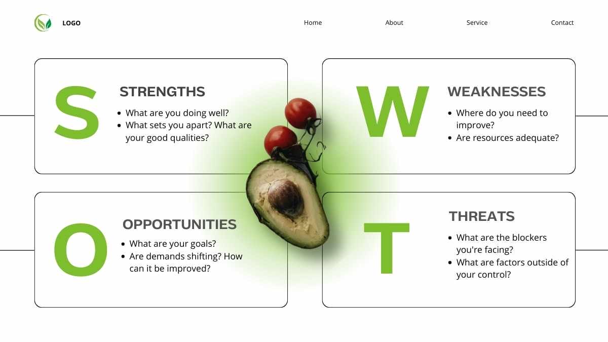



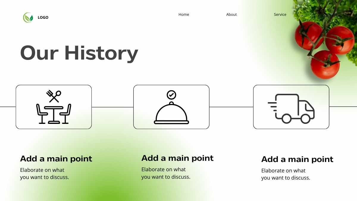



 16
16



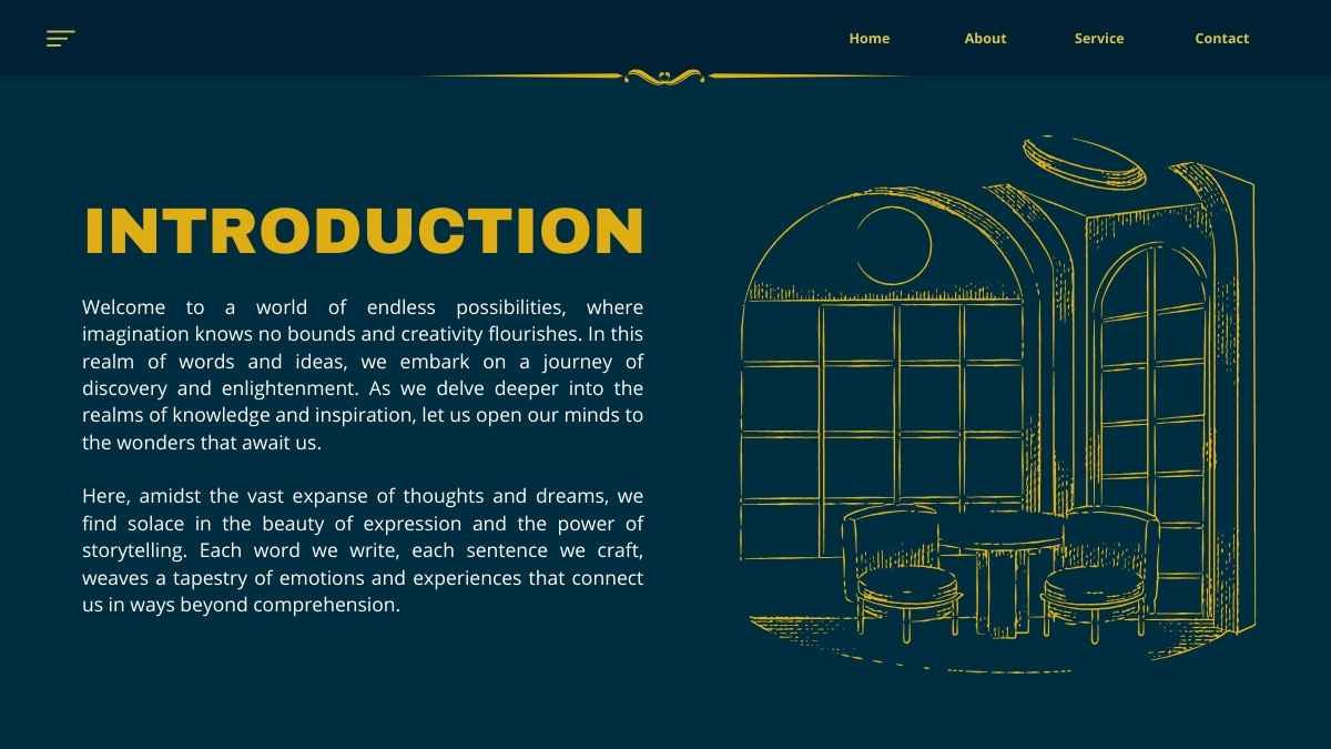
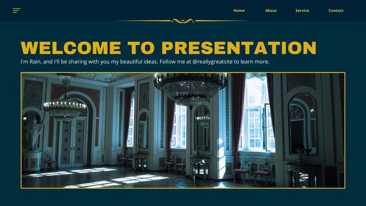


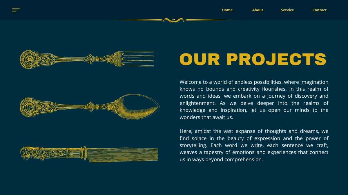











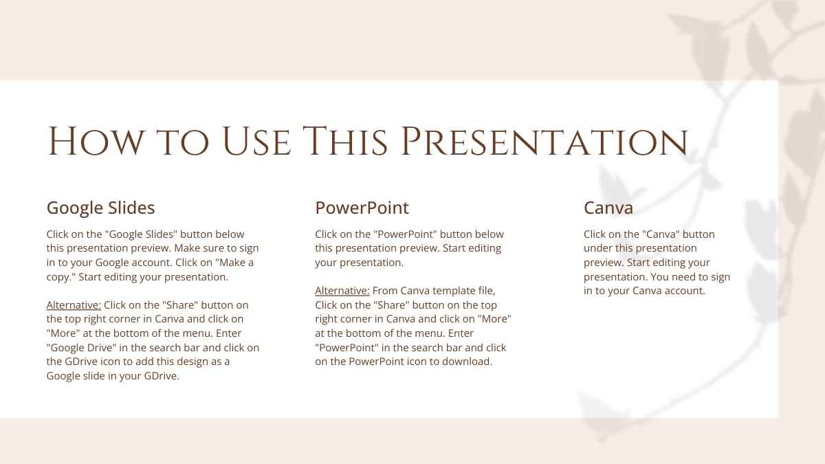




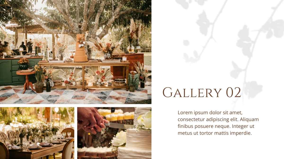






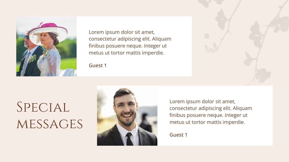









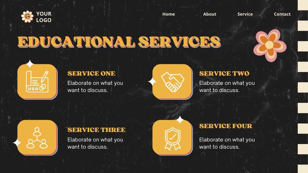






















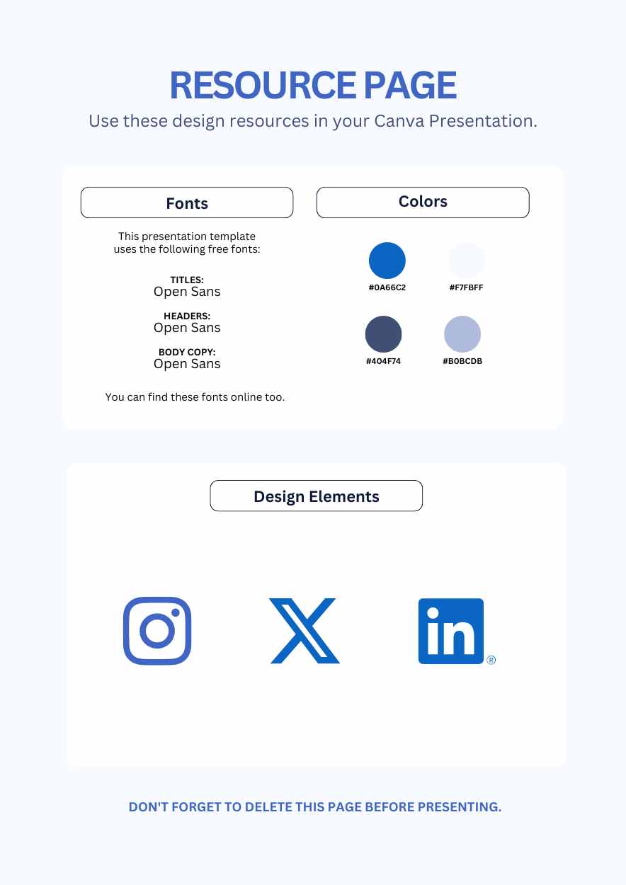

Best font pairs for Open Sans
Open Sans pairs well with Montserrat for clean interfaces, Playfair Display for editorial contrast, and Merriweather for easy reading.
MODERN & MINIMAL
Montserrat + Open Sans
A clean, modern headline
Montserrat's geometric, near-circular headings sit above Open Sans's humanist, upright body, whose open apertures stay legible at small sizes. Use Montserrat for headings and Open Sans for body on websites and presentations.
EDITORIAL CONTRAST
Playfair Display + Open Sans
An elegant editorial look
Playfair Display's steep stroke contrast gives an elegant headline, while Open Sans's neutral, highly legible body carries the detail underneath. A clean editorial pairing: Playfair Display for headings, Open Sans for text.
READABLE & FRIENDLY
Open Sans + Merriweather
Friendly headings, easy reading
Open Sans headings keep things plain and modern, then Merriweather's sturdy serif takes over for long body text it was specifically designed to make readable on screen. A dependable pairing for blogs and documentation.
Alternatives to Open Sans
If you need an alternative to Open Sans, neutral sans-serifs like Lato, Roboto, and Noto Sans give a similar clean, legible look.
Lato
This is a Lato headline
And this is body text in Lato. It's worth considering as an alternative to Open Sans.
View moreRoboto
This is a Roboto headline
And this is body text in Roboto. It's worth considering as an alternative to Open Sans.
View moreNoto Sans
This is a Noto Sans headline
And this is body text in Noto Sans. It's worth considering as an alternative to Open Sans.
View moreSource Sans 3
This is a Source Sans 3 headline
And this is body text in Source Sans 3. It's worth considering as an alternative to Open Sans.
View morePT Sans
This is a PT Sans headline
And this is body text in PT Sans. It's worth considering as an alternative to Open Sans.
View moreMulish
This is a Mulish headline
And this is body text in Mulish. It's worth considering as an alternative to Open Sans.
View moreHind
This is a Hind headline
And this is body text in Hind. It's worth considering as an alternative to Open Sans.
View moreFrequently asked questions about Open Sans
Is Open Sans free to use?

What kind of font is Open Sans?
What font pairs well with Open Sans?
Is Open Sans good for body text?
What fonts are similar to Open Sans?