What core principles do the best conference presentations share?
In a survey by Kelton Global:
- 90% of people questioned for a felt a solid narrative is key
- 55% of respondents agreed a good story holds their concentration throughout presentations better than anything else
- And 33% say visual stimulation is absolutely necessary to keep them engaged.
Narrative drive and concrete themes are clearly fundamental for the majority of people attending your presentation. But there’s another core component of effective conference presentations: design.
The visual texture of your slides has a real power to affect your audience’s experience.
Why?
Because they’re not just looking at you — they’re looking at your screen, too. And bland design will cause their minds to wander, especially when combined with an undefined narrative and/or muddled theme.
But don’t worry: we’ve compiled six essential tips to help you get your conference presentation design right.
Let’s go…
- Know your audience
- Stick to one point per slide
- Show, don’t tell
- Create text that leaps off the page
- Embrace the power of images
- Be consistent, be complete
- Best Conference Templates
#1: Know your audience
Ever found yourself losing track of a conference presentation after just a few minutes?
With research showing the average attention span is now almost four seconds shorter than it was just two decades ago, you’re probably not alone in your lack of focus. And one surefire way to lose an audience’s concentration is by failing to speak to their specific goals, experiences, and needs.
And it’s not just about covering the right material and speaking in a language your listeners understand. It’s about putting a presentation on the screen that holds their interest. It’s about creating a design that engages them fully.
But it’s essential to remember that different visuals work for different audiences. A conference dedicated to neurosurgery (for example) will have a far different atmosphere to one covering video games.
Attendees of the former are likely to expect a serious, professional presentation. Those at the latter will still look for professionalism, yet presentations have the flexibility to be more dynamic and vibrant.
Think about your audience and the conference’s overall style, then ask yourself:
- Is it formal and addressing serious themes?
- Is there room to be lighthearted and punchy?
- Is the conference’s logo and design scheme packed with color, or is it more subdued?
Once you’ve considered these questions, tailor your presentation’s design to reflect your answers and make maximum impact on your audience.
#2. Stick to one point per slide
Balancing information is key when creating an effective conference presentation. Packing too much of it into one slide can leave your audience overwhelmed by details and struggling to digest what you’re trying to say.
The best conference presentations allow the audience to instantly and intuitively grasp the concept of each slide — so save your audience the task of deciphering and decoding your presentation by sticking to one point per slide.

This ensures:
- You can narrow each slide’s focus, and really make it count
- Your slide will visually express the point, while you expand on it verbally
- Your audience is less likely to feel overloaded with information
- You can keep plenty of white space on each slide
If a point feels too big or important to restrict to one slide, try to find a fresh way to approach it. Work on breaking it down into two elements, if possible.
#3. Show, don’t tell
To follow on from our previous point, your audience can only take so much information onboard at once. Condensing information into a streamlined, easily-digestible form helps keep your presentation engaging — and so do visuals.
90% of all information transmitted to the human brain is visual, and that goes for 93 percent of our communication, too. That’s why one slide of cluttered text after another will bore your audience. And, potentially, inspire frustration, resentment, and even walk-outs.
90% of all information transmitted to the human brain is visual
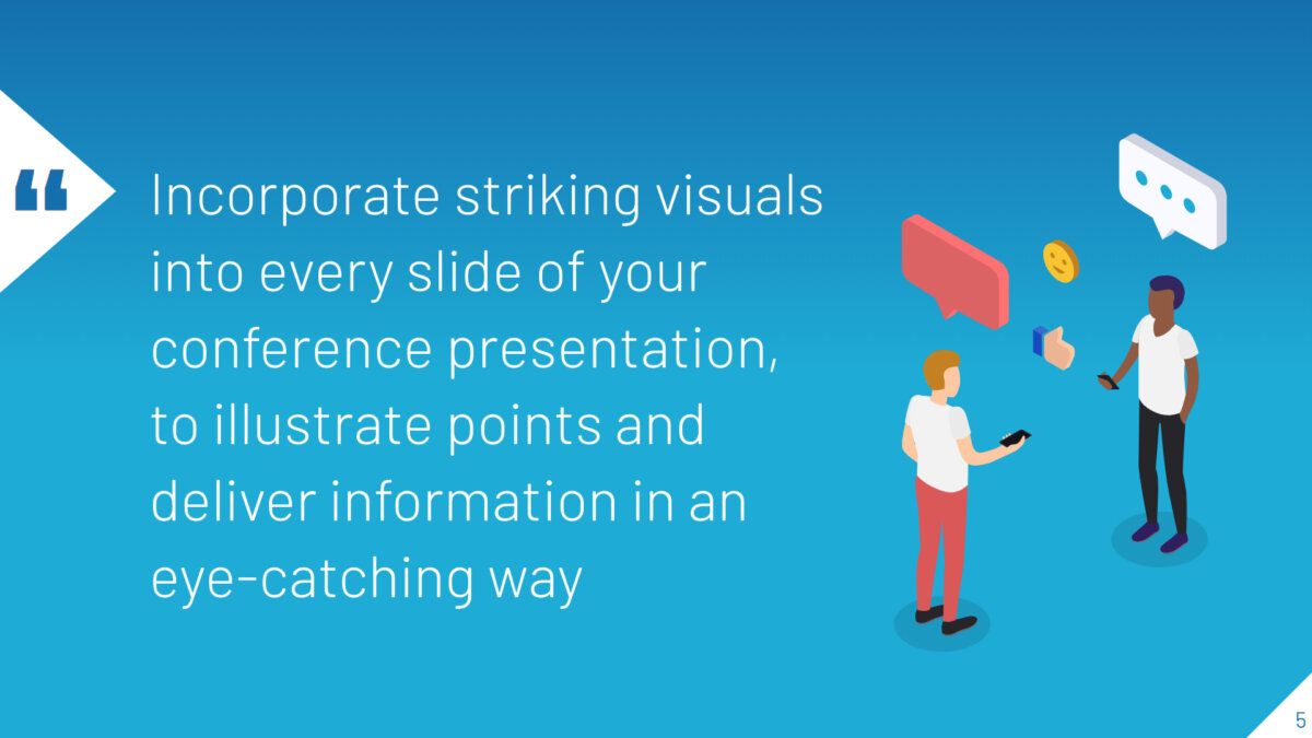
Make sure to incorporate striking visuals into every slide of your conference presentation, to illustrate points and deliver information in an eye-catching way. One of the simplest solutions is to search through design templates, which are available in a huge variety of styles. Pay attention to the different colors, images, fonts, and other aesthetic elements available.

You can also look to infographics for inspiration. Try accompanying stats and facts with a relevant illustration, to reinforce the meaning. Keep your text minimal.
If you get your presentation’s visual design right, your audience will recognize the slide’s aim and message instantly.
#4. Create text that leaps off the page
We’ve already established that too much text on a slide can be dangerous. But it’s not just the number of words you should worry about — it’s the way they look, too.
One of the most effective visual elements in an engaging presentation is contrasting colors. And that means your text should stand out against its background in every single slide. In some cases, it’s as simple as placing black over white, or vice versa.
But other times, you’ll need to be more creative. Experiment with your design to determine which fonts and colors are easiest on the eye — ensuring they always carry the right semiotic message.
Don’t forget to investigate the conference venue, either. Take a look at the lecture hall or auditorium in which you’ll deliver your presentation (whether this means visiting in person or taking a virtual tour online).

When it comes to your conference setting, you should think about:
- Lighting — is the venue dark enough that bright text is required for effective visibility?
- Scale — is the space so big you need a much bigger font than you expected for attendees in the back rows? Or can you keep your text smaller to prevent overwhelming those at the front?
#5. Embrace the power of images
Remember when we discussed the human mind’s ability to process visuals faster than text earlier?
This is why images are a terrific visual aid for any conference presentation, regardless of tone, atmosphere, theme, etc.

There’s a strong photograph or picture for every topic, from the most serious presentation to the most jovial and upbeat. Try to include images in every presentation you do — though not necessarily on every slide — even if it’s just a free stock photo you’ve pulled from a website.
But don’t just use any free stock image. Take the time to find one that looks professional, striking, and complements the rest of the slide’s design.
The crucial point to remember, though, is relevance: never add an image that looks or feels out of sync with the slide’s theme or message.
#6. Be consistent, be complete
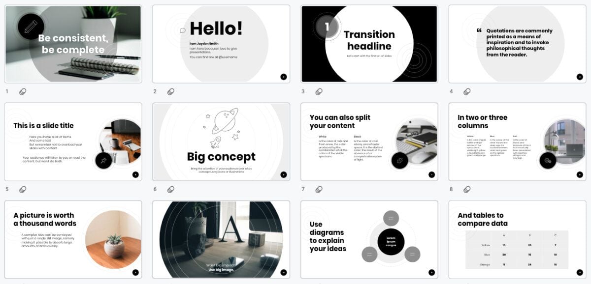
Finally, effective conference presentation design is consistent. Every element of the entire piece should complement the others harmoniously.
Understanding your audience, goals, and overall theme makes achieving consistency easier. But be prepared to check the presentation closely once you’ve finished: you may spot weaker aspects with the potential to distract your audience (such as clashing colors or low-res images).
Try to leave yourself enough preparation time for adjustments before you’re due to deliver your presentation — trying to make last-minute changes on the day of the conference can lead to mistakes. And these mistakes have the power to throw you off when you’re on stage, disrupting your entire presentation and weakening your message.

Now you’re conference ready!
Follow the six essential tips explored above and you’ll have created an effective conference presentation with a strong visual design.
Remember: your choice of colors, images, text, and content have a real impact — your delivery may be precise and polished, but you could lose your audience if your presentation is visually lacking.
Best Conference Templates
At SlidesCarnival we have many templates with a perfect professional look to impress your audience at your next conference. Take a look!
Looking for more presentation inspiration?
At SlidesCarnival, we have a huge library of free presentation templates that you can download, edit, and customize. Browse the collection to discover great design ideas that are sure to make your presentation stand out.


